12 Trending Pink Bedroom Ideas for a Grown-Up Look
Pink carries a reputation for feeling overly sweet or childish in a bedroom, but the right shade and pairing can push it toward sophisticated rather than saccharine. These twelve pink bedroom ideas cover full-wall commitments, smaller accent choices, and the materials that keep pink from reading as one-note. By the end, you’ll have specific shades and combinations that work whether you want a soft, barely-there blush or a bolder, more saturated rose throughout the room.
Trend & Background
Pink has shifted from a color largely associated with children’s rooms toward a genuine option for adult bedrooms, driven partly by muted, dusty versions of the shade that read as warm neutrals rather than overtly feminine or juvenile. Designers have leaned into pairing pink with black, charcoal, and dark wood specifically to counter its softer associations, which has opened the color up to a wider range of bedroom styles. This matters now because paint brands have responded with far more nuanced pink offerings, from dusty mauve to warm terracotta-pink, making it easier to land on a version that fits an adult space.
Key Takeaways
- Pink bedroom ideas range from pale blush to saturated rose, each reading more mature or more playful depending on the shade and pairing.
- Black, charcoal, and dark wood tones ground pink and keep it from feeling overly sweet or juvenile.
- Texture, like velvet, linen, and rattan, adds depth to a pink palette that flat paint alone can’t achieve.
- Metal finish matters as much as the shade itself, with brass reading warmer and chrome reading cooler against the same pink.
1. Blush Pink Walls
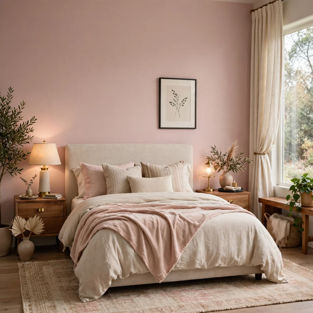
Blush is pale and warm enough to work across an entire bedroom without overwhelming the space, which makes it one of the more forgiving pink shades for a full repaint. It reads differently depending on the room’s light, leaning slightly peach under warm afternoon sun and cooler, more muted in north-facing rooms. Because it’s so soft, blush pairs easily with both white trim and black furniture, making it a flexible starting point regardless of the room’s existing style.
| Pink Shade | Undertone | Best Light Exposure |
| Blush | Warm, pale | South or west-facing |
| Dusty Rose | Warm, muted | Any exposure |
| Mauve | Cool, grayed | North or east-facing |
| Terracotta Pink | Warm, earthy | South-facing |
2. Dusty Rose Accent Wall
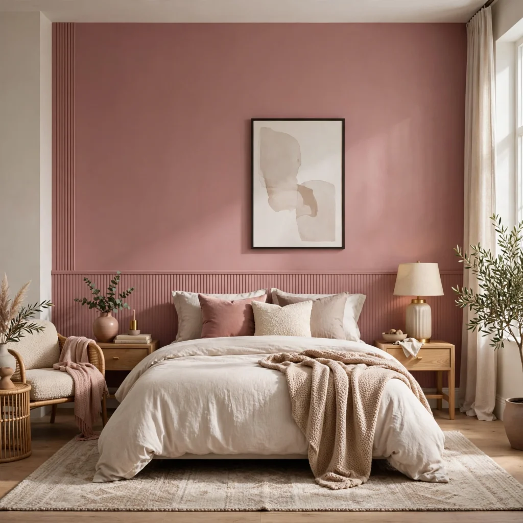
A single wall painted in a muted dusty rose adds color and warmth without the visual weight of covering an entire room in pink. Placed behind the headboard, it anchors the bed as the room’s focal point while the surrounding walls stay neutral. This pairing works especially well with black metal furniture or fixtures, since the contrast keeps the rose from reading too soft or overly romantic.
3. Mauve and Charcoal Palette
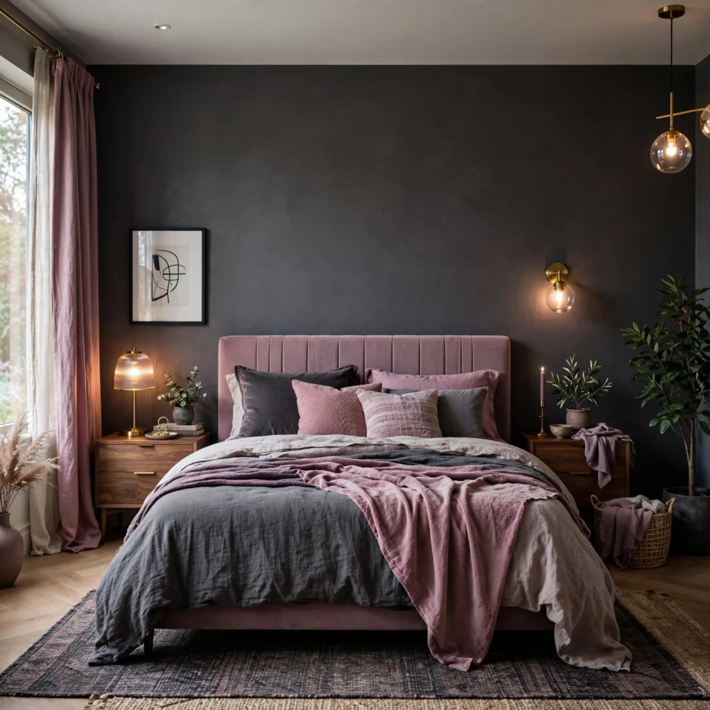
Pairing a cool, grayed-down mauve with charcoal furniture or bedding creates a palette that reads sophisticated rather than sweet, since the charcoal grounds the pink’s softer qualities. A charcoal upholstered headboard against mauve walls, for example, keeps the room feeling deliberate rather than pastel. This combination also tends to work well in bedrooms with limited natural light, since mauve doesn’t rely on brightness to read as intentional.
Find stylish bedroom colour ideas that suit every budget, home size, and interior design preference.
4. Velvet Pink Headboard
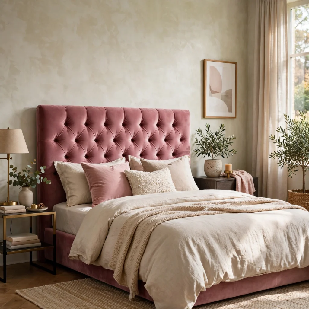
A headboard upholstered in a deep rose or dusty pink velvet adds texture and richness that flat pink paint alone can’t achieve. The velvet’s sheen catches light differently depending on the angle, giving the headboard visual depth even in a single solid color. This works particularly well against a neutral or white wall, where the headboard becomes the room’s main source of pink rather than competing with a painted wall.
5. Black Hardware Accents
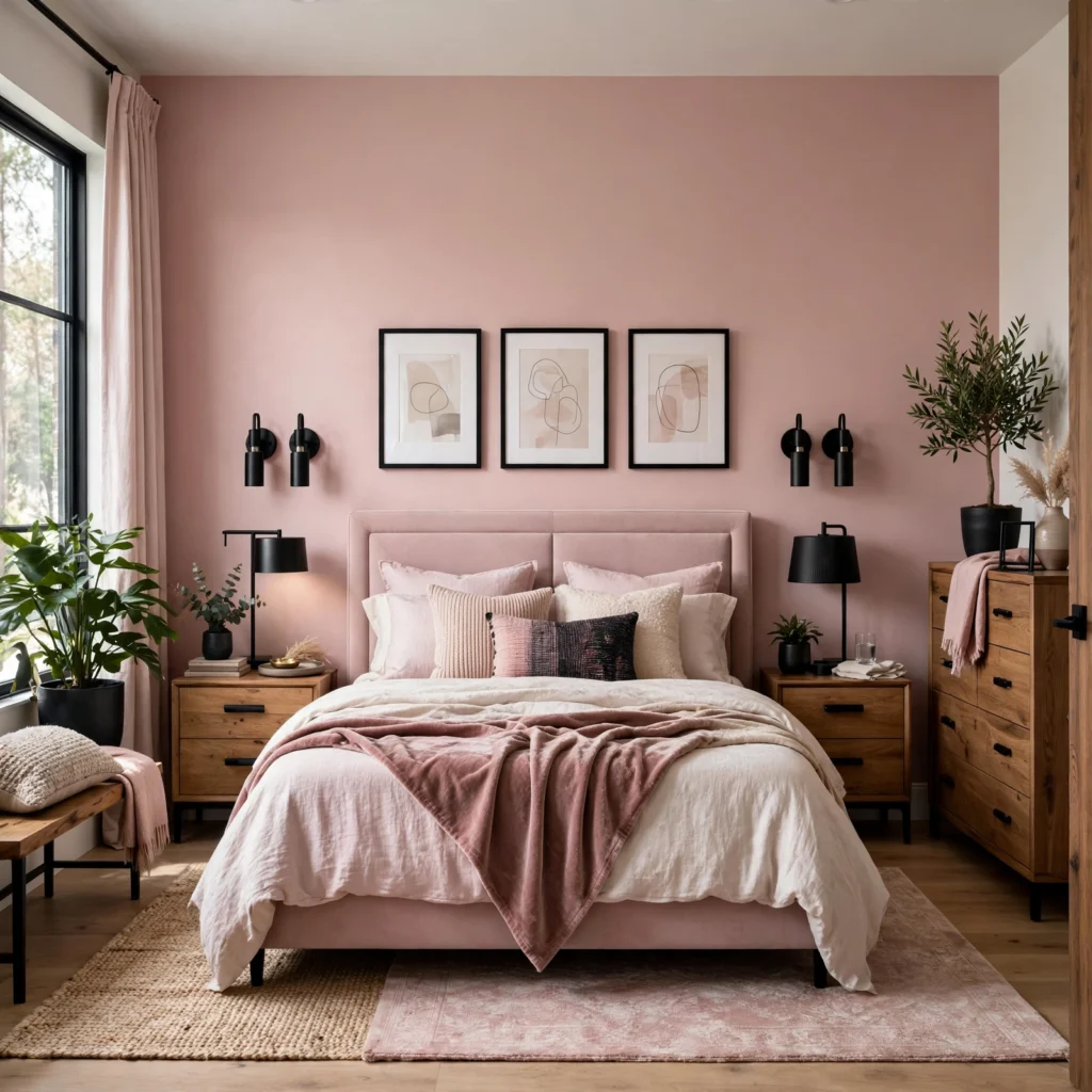
Black metal fixtures, from drawer pulls to lamp bases, add contrast to a pink bedroom that softer metals like brushed brass don’t provide in the same way. The sharp, dark tone keeps a pale or dusty pink from reading too delicate, grounding the palette with a more graphic, modern edge. Even small touches, like black switch plates or a single black picture frame, are enough to shift the overall feel without a full hardware overhaul.
6. Terracotta-Pink Linen Bedding
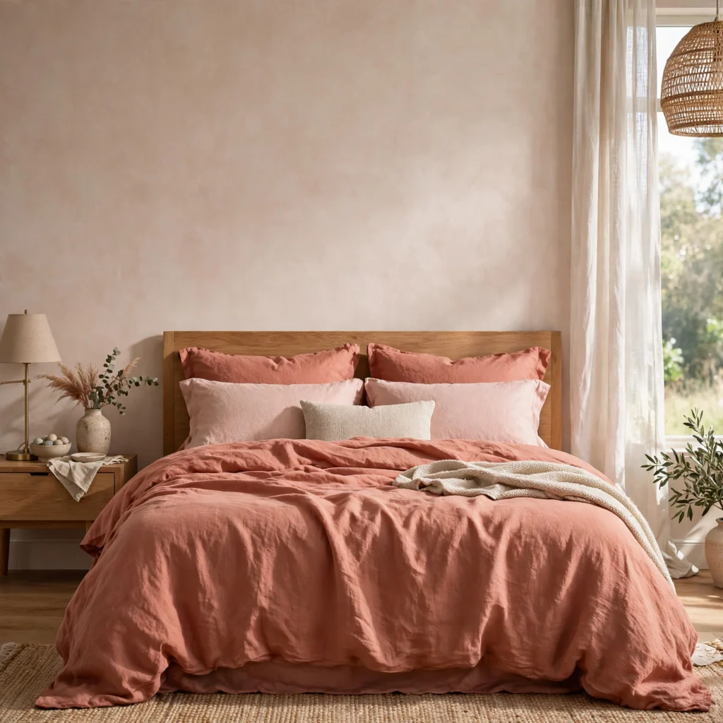
Linen bedding in a warm, terracotta-leaning pink introduces color through texture and softness rather than a painted surface, making it one of the lowest-commitment ways to bring pink into a bedroom. Linen’s slightly rumpled, matte texture keeps the color from reading too polished or precious, giving the room a relaxed, lived-in feel. This works particularly well in a bedroom with white or cream walls, where the bedding becomes the primary source of color in the room.
7. Pink and Black Palette
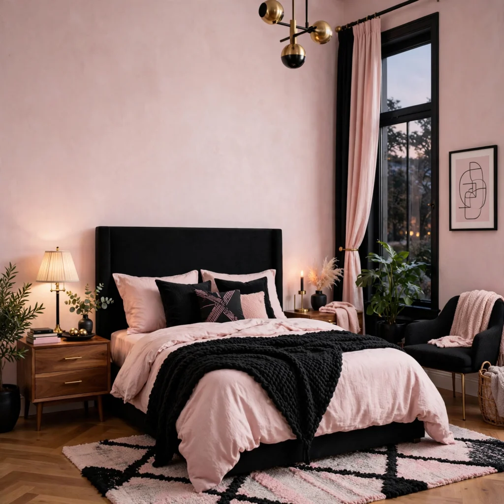
Pairing pink with black creates one of the most reliable ways to keep the color from feeling overly soft, since the black adds graphic contrast and visual weight. A black bed frame or black-framed art against blush or rose walls keeps the room from feeling one-note, while a scattering of black accents, like a lamp base or picture frames, ties the pairing together. This combination also tends to photograph well, since the contrast reads clearly in both natural and artificial light.
8. Dusty Rose Velvet Curtains
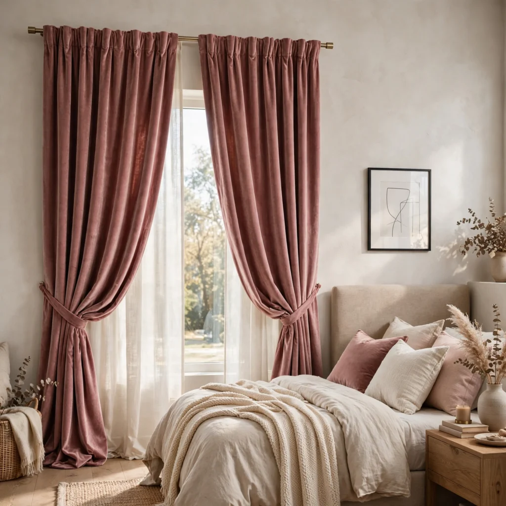
Floor-length curtains in a dusty rose velvet add color and texture at the window without committing to a full pink wall, while also framing the room’s natural light source. Because curtains are one of the easier elements to swap out later, velvet drapery in this shade is a lower-risk way to test a bolder pink before deciding whether to extend the color elsewhere in the room. Pairing them with a simple black curtain rod keeps the look aligned with cooler, more grounded accent choices elsewhere.
9. Wood Paneling with Pink Paint
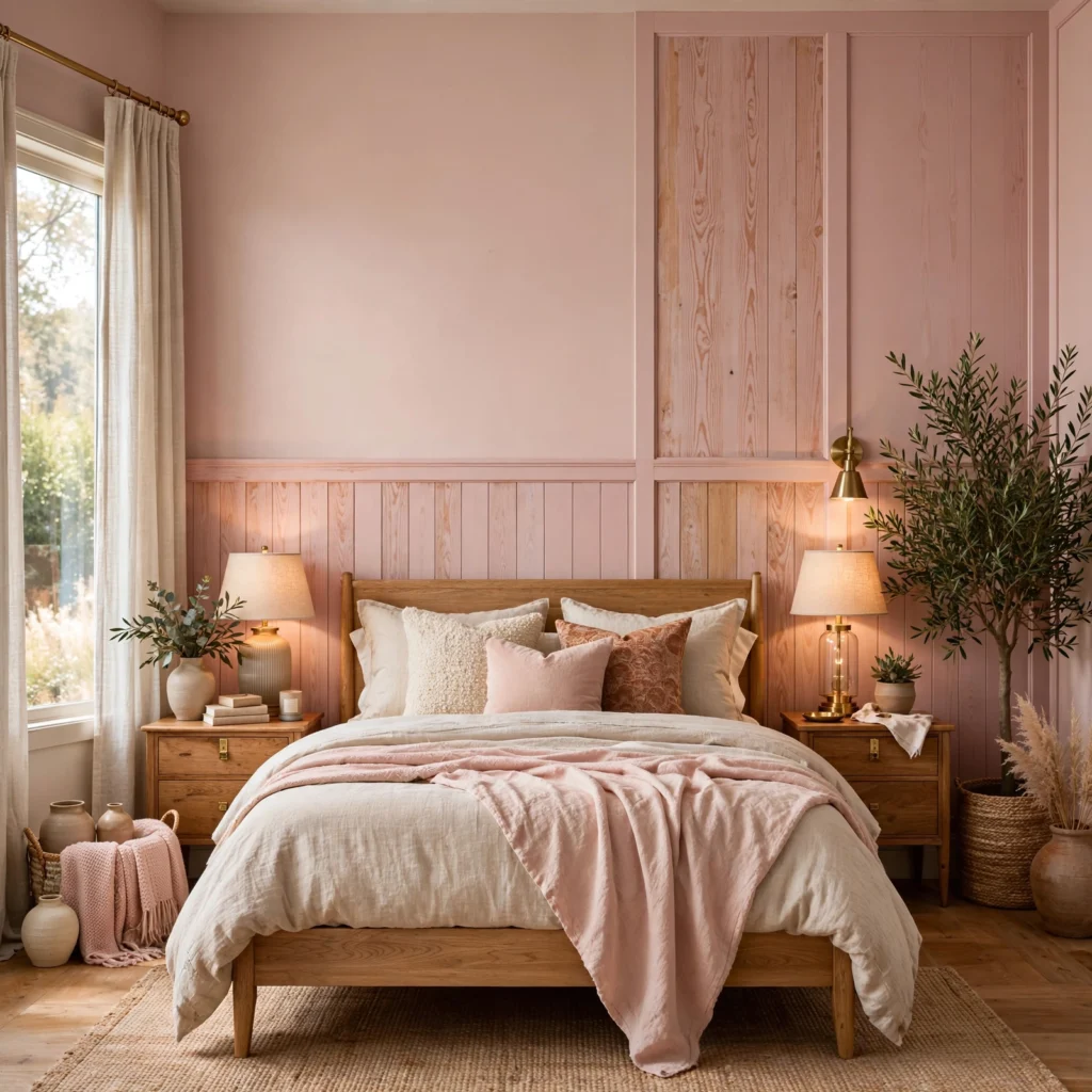
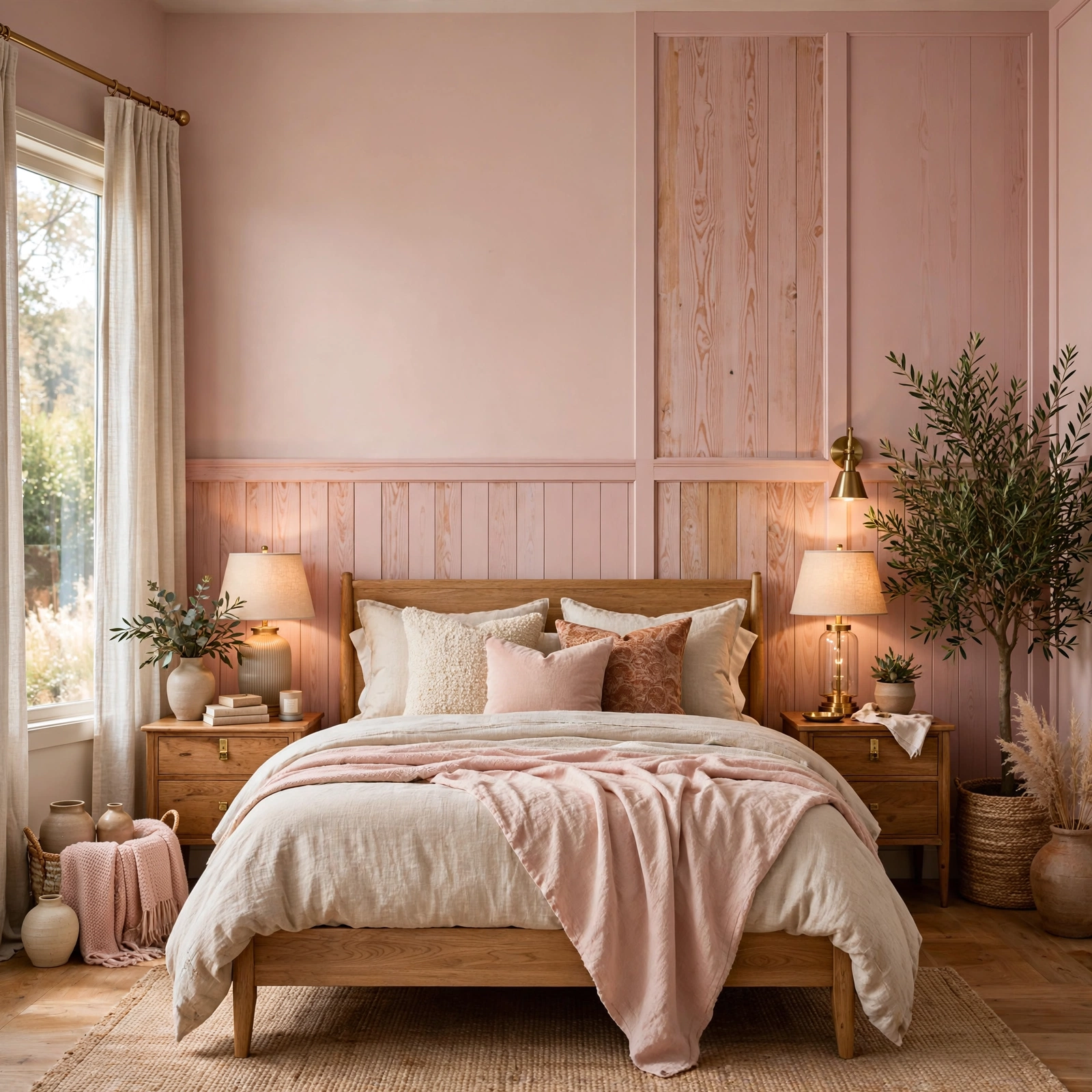
Vertical or horizontal wood paneling painted in a muted dusty pink adds texture and dimension to a wall in a way flat paint alone can’t achieve. The grooves and shadow lines in the paneling catch light differently throughout the day, keeping a single-color wall from feeling static. This approach works particularly well as a headboard-height treatment, stopping partway up the wall rather than covering it fully, which also keeps the cost lower than paneling an entire room.
10. Layered Pink Textiles
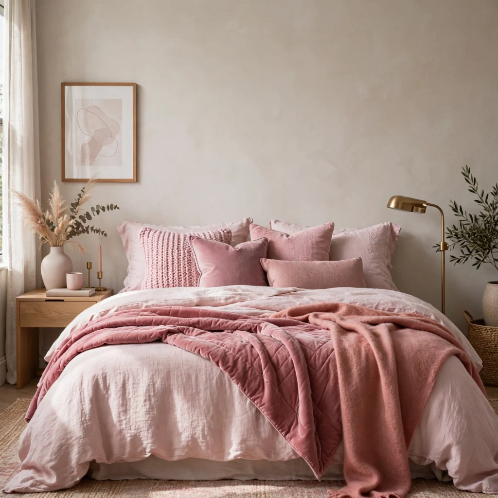
Combining several shades of pink across a throw blanket, accent pillows, and a window seat cushion creates depth without requiring any of the room’s larger surfaces, like walls or floor, to carry the color. Mixing a deeper rose pillow with a lighter blush throw, for example, avoids the flat look that comes from using a single shade across every textile in the room. This approach is especially useful in a rented space where painting isn’t an option but color variation is still desired.
11. Pink Ceiling Treatment
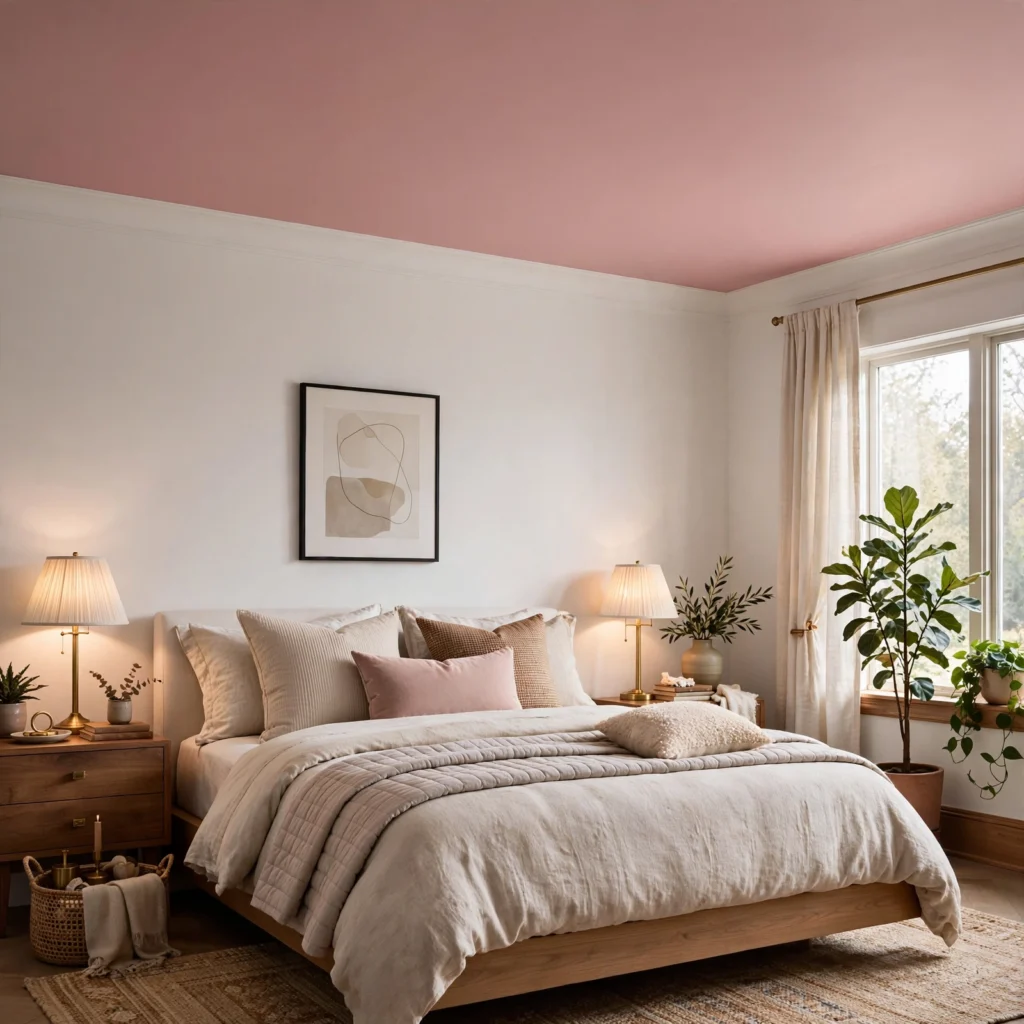
Extending a pink wall color up onto the ceiling, sometimes called “color drenching,” wraps the entire room in one continuous tone rather than stopping at the crown molding. This treatment works particularly well in bedrooms with lower ceilings, since it removes the visual break between wall and ceiling that can make a room feel shorter than it is. A slightly lighter shade of the same pink on the ceiling keeps the room from feeling like a solid box while still reading as one cohesive palette.
12. Rattan Accents Against Pink
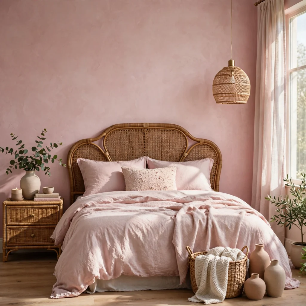
A woven rattan headboard or mirror pairs naturally with pink walls or bedding, since the warm, textured material offsets the smoothness of a painted surface. The open weave adds texture without adding visual weight, which keeps a pink room from feeling too flat or overly polished, especially in smaller bedrooms. Rattan also works across both pale blush and deeper terracotta-pink tones, making it a flexible pairing regardless of which shade anchors the room.
Shop the Look
A few specific pieces make these ideas easier to pull together. Look for a matte blush or dusty rose wall paint suited to bedrooms, a velvet upholstered headboard in a deep rose tone, terracotta-pink French linen bedding, a set of matte black drawer pulls sized for a standard dresser, and a pair of dusty rose velvet curtain panels in a floor-length size.
Common Mistake to Avoid
The most common mistake with pink bedroom ideas is pairing a soft pink with only white or cream accents, which can push the room toward reading as overly sweet or nursery-like rather than intentional. Without a grounding contrast, like black hardware or charcoal bedding, even a muted pink can feel more juvenile than planned. Adding at least one dark, graphic element, whether a black bed frame or a set of dark picture frames, keeps the palette balanced and adult.
FAQs
What color goes best with a pink bedroom?
Black, charcoal, and dark wood tones pair especially well with pink, since they ground the color and keep it from reading as overly soft or sweet. White and cream also work as a lighter option, though pairing pink with only pale neutrals tends to push the room toward a more youthful look than pairing it with darker contrast.
Is pink too juvenile for an adult bedroom?
Not if the shade and pairing are chosen carefully. Muted, dusty versions of pink, like mauve or terracotta-pink, read as adult and sophisticated, especially when paired with black hardware, charcoal textiles, or dark wood furniture rather than only white and pastel accents.
What shade of pink is best for a small bedroom?
Lighter, warmer shades like blush tend to work better in small bedrooms, since they reflect more light and avoid making the walls feel like they’re closing in. Deeper pinks like dusty rose or terracotta-pink can still work in a small space if used as a single accent wall rather than across the entire room.
How do I make a pink bedroom look sophisticated instead of sweet?
Grounding the pink with black or charcoal accents, choosing a muted rather than bright shade, and adding texture through velvet, linen, or rattan all help push a pink bedroom toward a more grown-up look. Avoiding an all-pastel palette, where pink is the only color present alongside white, tends to be the biggest factor in how mature the room reads.
Does pink bedroom paint need a lot of natural light?
Not necessarily, but the amount and direction of natural light significantly affects how pink reads on the wall. Rooms with limited natural light generally do better with warmer, more muted pinks like terracotta-pink, since cooler, more pastel pinks can read flat or washed out without strong sunlight.
Conclusion
These pink bedroom ideas work best when the shade is grounded with darker, more graphic accents rather than paired only with white or pastel elements. Whether you start with a full blush repaint or a smaller dusty rose curtain swap, each idea here scales to fit your space and how bold you want the color to read. Save this post to Pinterest for later, and check out our related guide on small bedroom storage solutions for more design inspiration.