12 Trending Bedroom Colour Ideas for Every Style
Choosing a bedroom colour comes down to more than picking a favourite shade, since the same paint can read completely differently depending on a room’s light, size, and existing materials. These twelve bedroom colour ideas walk through specific shades, from warm terracotta to cool slate, along with the pairings and lighting considerations that make each one work in a real bedroom rather than just on a paint swatch. By the end, you’ll have a shortlist of colours suited to your own room’s exposure and style.
Trend & Background
Bedroom colour choices have moved away from an era of all-white and greige walls toward more specific, saturated shades that reflect a clearer sense of personal style. Paint brands have responded by expanding their offerings well beyond the basics, releasing nuanced versions of green, blue, and terracotta that weren’t widely available a decade ago. This matters now because it’s become easier to find a shade tailored to a specific room’s light and mood rather than settling for a safe, generic neutral simply because the options felt limited.
Key Takeaways
- Bedroom colour ideas range from soft neutrals to saturated jewel tones, each shifting the room’s mood in a distinct direction.
- Undertone matters as much as the shade itself, since warm and cool versions of the same colour read very differently in a room.
- Pairing a bold colour with warm materials like wood and brass keeps the palette from feeling flat or cold.
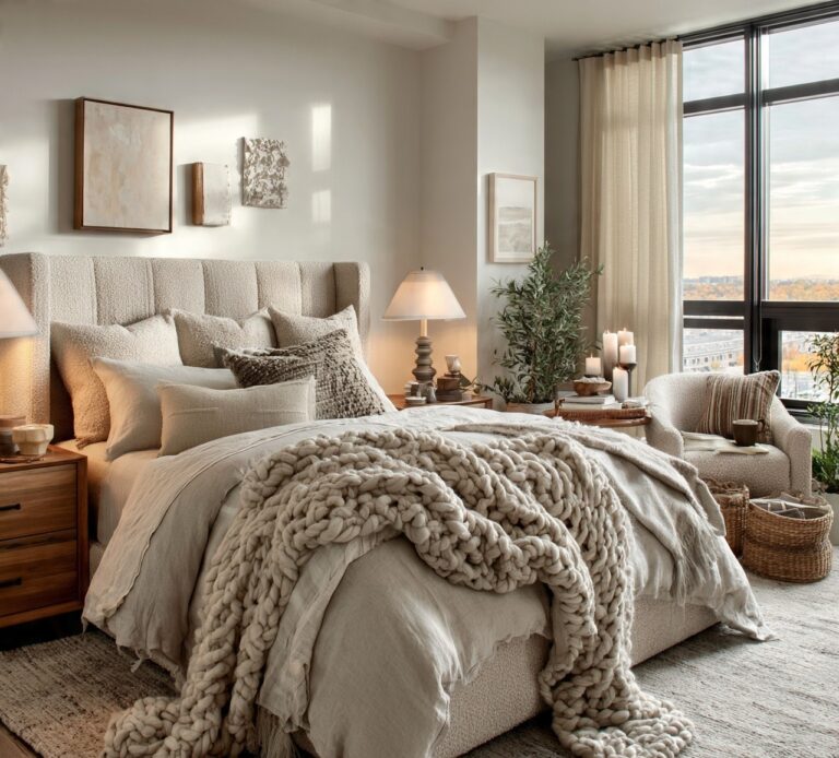
- Testing swatches directly on the wall, rather than relying on paint chips alone, prevents most colour mistakes before they become permanent.
1. Warm Terracotta
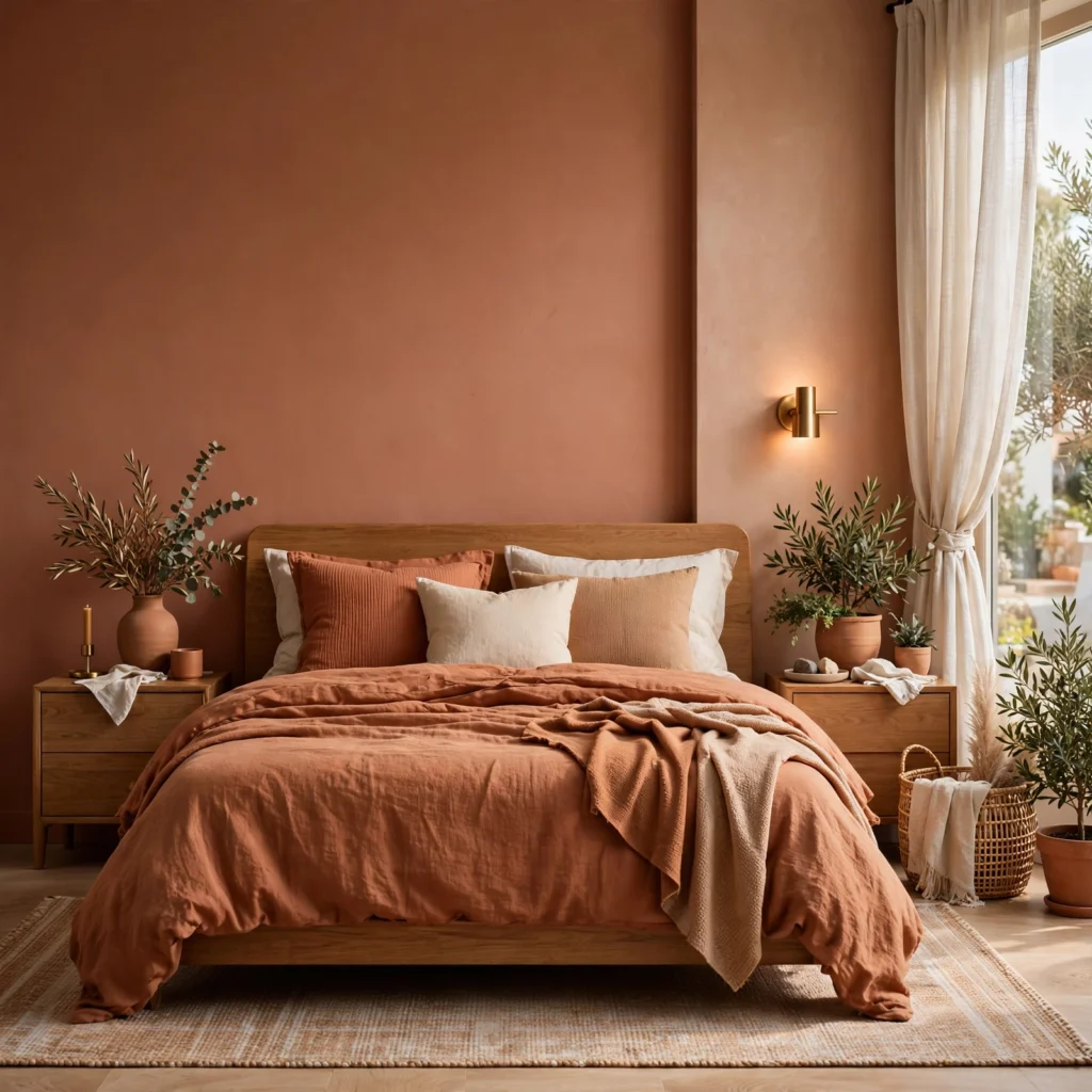
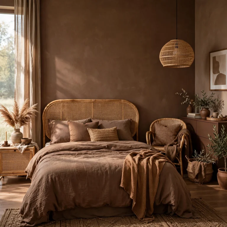
Terracotta brings an earthy, sun-baked warmth into a bedroom that neither a true red nor a true orange quite achieves on its own. It reads calm rather than intense because of its muted, clay-like undertone, making it more livable across an entire room than a brighter orange would be. This colour pairs particularly well with cream bedding and natural wood furniture, both of which pick up on the same warm, grounded palette.
| Colour | Undertone | Best Light Exposure |
| Terracotta | Warm, earthy | South or west-facing |
| Slate Blue | Cool, gray-blue | North or east-facing |
| Sage Green | Gray-green | Any exposure |
| Dusty Rose | Warm, muted pink | South-facing |
2. Slate Blue
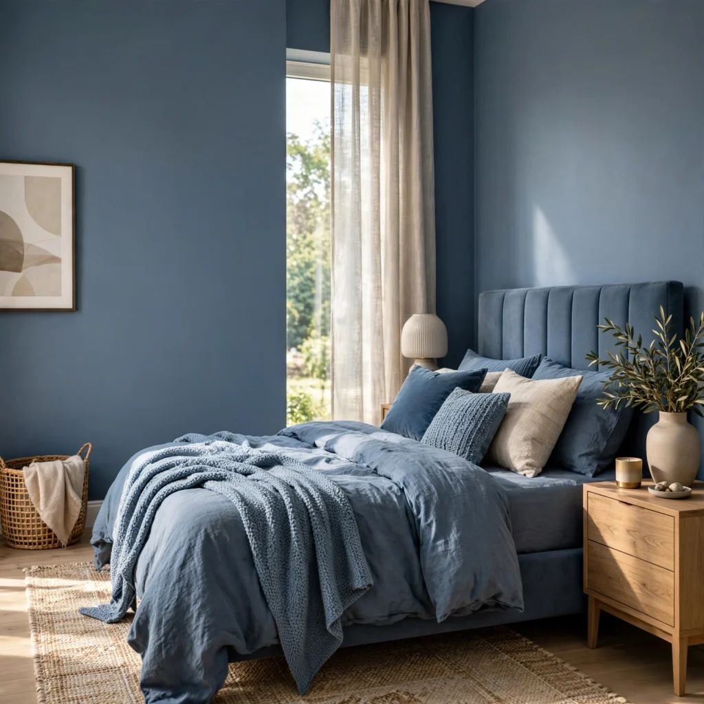
Slate blue sits between blue and gray, giving it a calm, grounded quality without leaning too cold or too saturated for a full-room application. It shifts noticeably with light direction, reading more blue in bright afternoon sun and more gray in a north-facing room with limited direct light. Because of that flexibility, it works well across a range of styles, from a modern minimal bedroom to a more traditional, layered one.
3. Sage Green
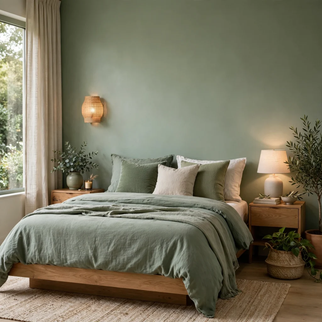
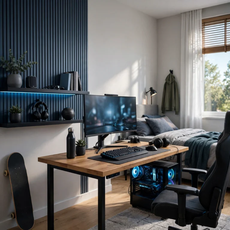
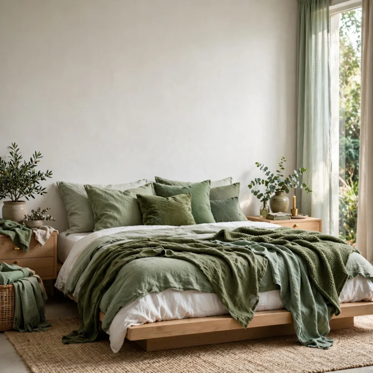
Sage sits between green and gray, making it one of the more forgiving shades to use across an entire bedroom without the colour feeling overwhelming. It pairs easily with both white trim and natural wood tones, which is part of why it’s become a common choice for bedrooms aiming for a calm, nature-inspired feel. This shade also tends to hold up well under both warm and cool lighting, unlike more saturated greens that can shift dramatically.
4. Dusty Rose
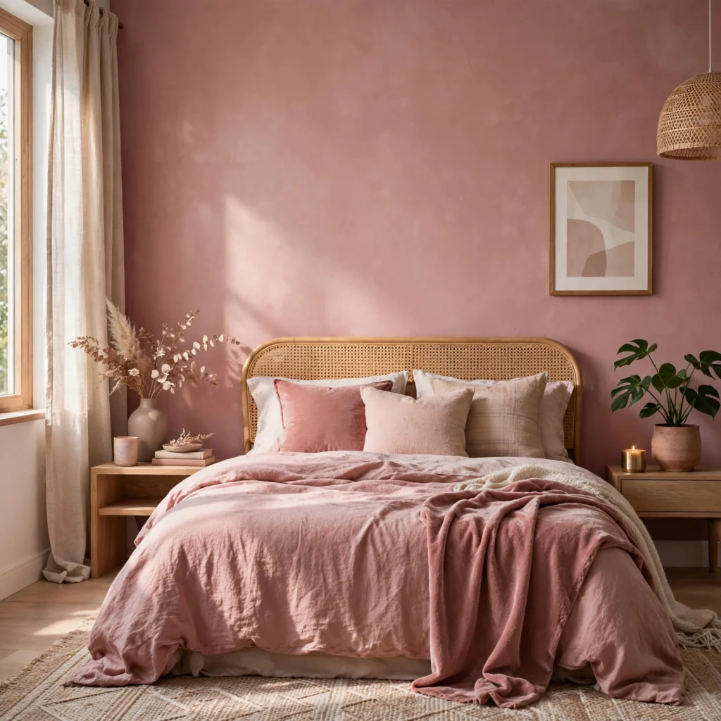
Dusty rose is a muted, grayed-down pink that avoids the overly sweet or juvenile associations of a brighter pink, making it a workable choice for an adult bedroom. It pairs particularly well with black or charcoal accents, which sharpen the softness of the pink rather than letting it read as purely pastel. This shade also tends to flatter warm lighting, making it a strong option for bedrooms used mostly in the evening.
5. Charcoal Gray
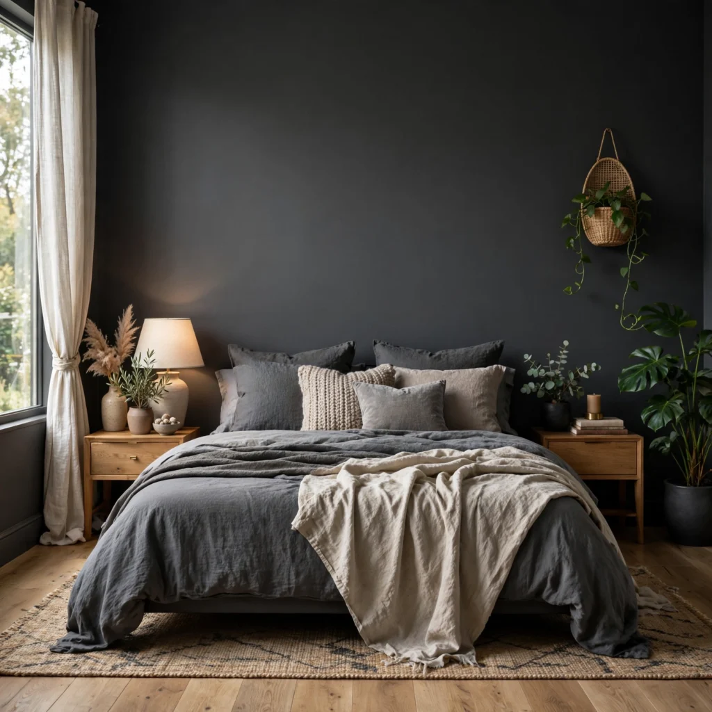
Charcoal adds depth and a sense of enclosure to a bedroom, working especially well as a single accent wall behind the headboard rather than across an entire small room. Because it’s dark without being pure black, charcoal tends to feel less severe and easier to live with day to day. Paired with white bedding and brass accents, it creates strong contrast without tipping into an overly stark, high-contrast look.
6. Soft Butter Yellow
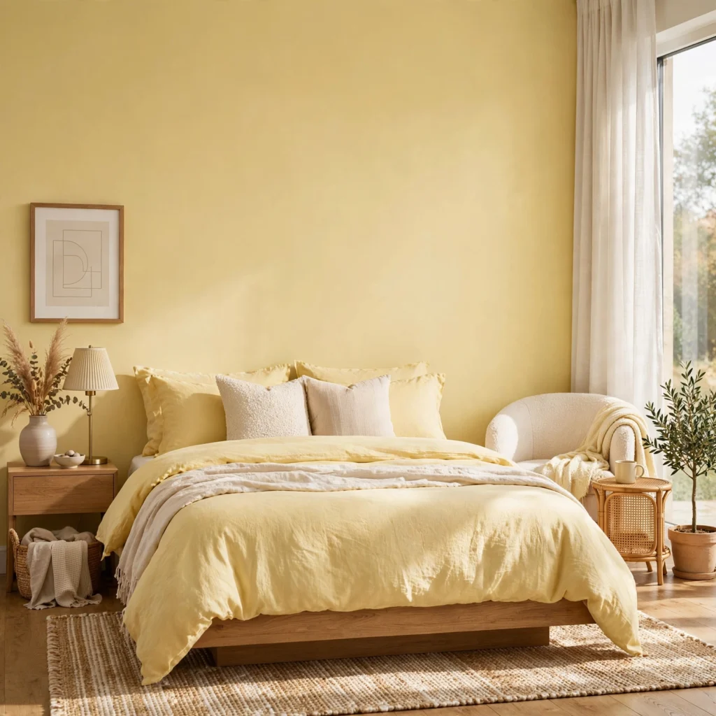
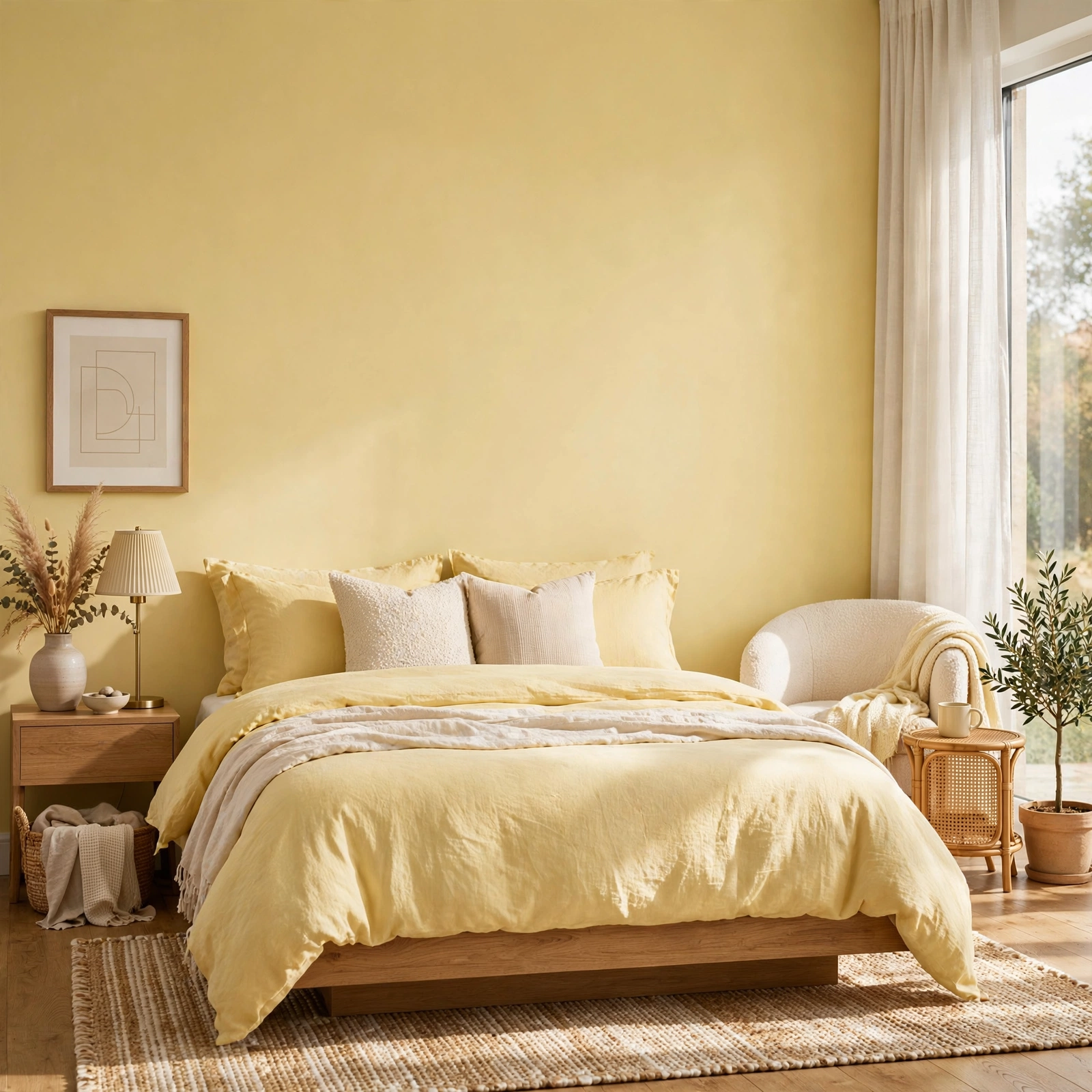
A muted, soft yellow brings warmth and brightness into a bedroom without the intensity of a bolder, more saturated version of the colour. This shade works particularly well in rooms with limited natural light, since it reads as sunny even on an overcast day. Pairing it with white trim and simple, uncluttered furniture keeps the colour from feeling overly bright or busy across a full room.
Discover beautiful tiny bedroom ideas for every style, from modern and minimalist to cozy farmhouse and luxury designs.
7. Deep Burgundy
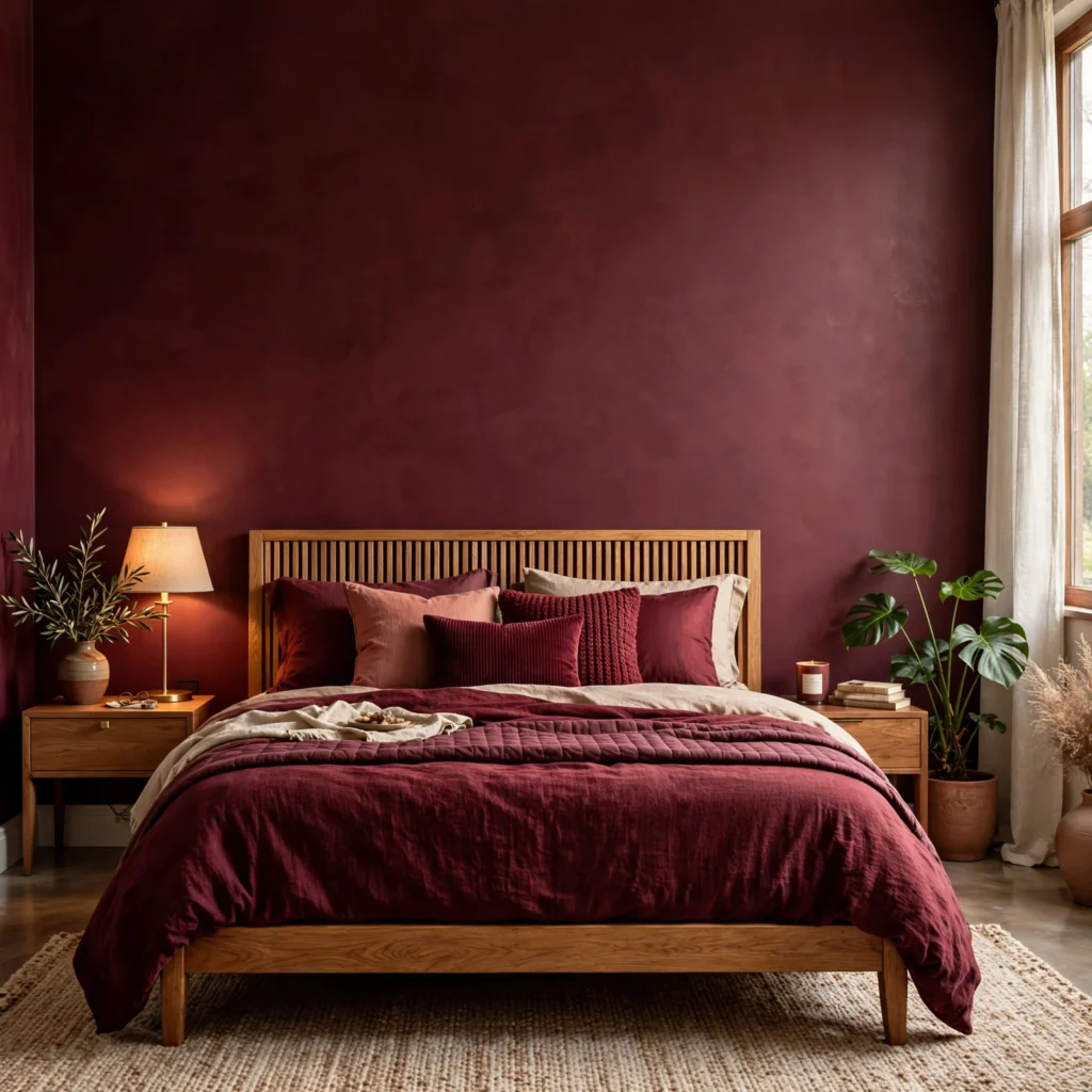
Burgundy adds a rich, formal quality to a bedroom, often used as an accent wall or paired with lighter neutrals to avoid overwhelming the space. Because it’s a deep, cool-leaning red, it tends to work best in rooms with strong natural light, where the colour can read as rich rather than cave-like. This shade pairs particularly well with gold or brass hardware, which lifts the overall look and keeps it from feeling too heavy.
8. Warm Greige
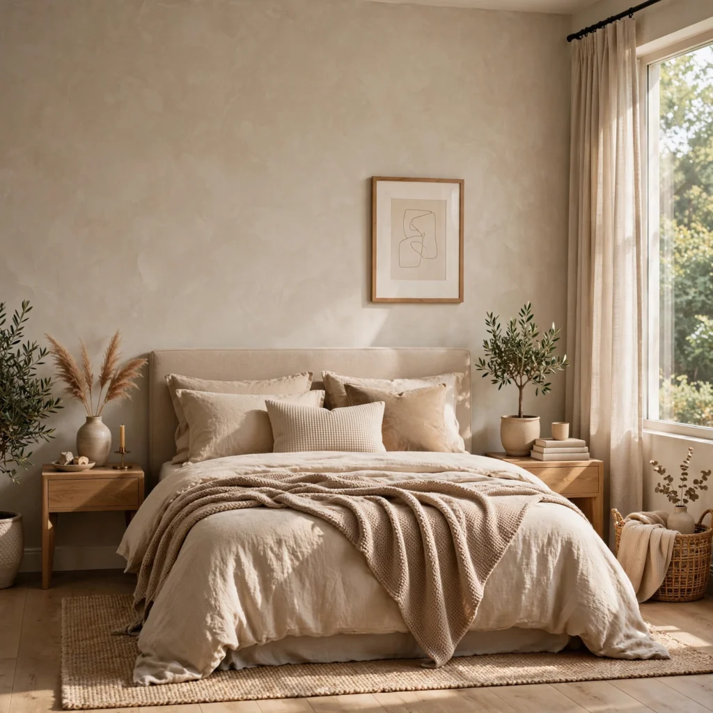
Greige blends gray and beige into a single neutral that avoids the coldness of a pure gray and the yellow undertone that can make some beige shades feel dated. It works as a safe, adaptable base colour for bedrooms that plan to layer in bolder colour through bedding, art, or furniture rather than the walls themselves. This shade also tends to hold its appearance consistently across different light conditions, making it one of the more predictable choices on this list.
9. Muted Teal
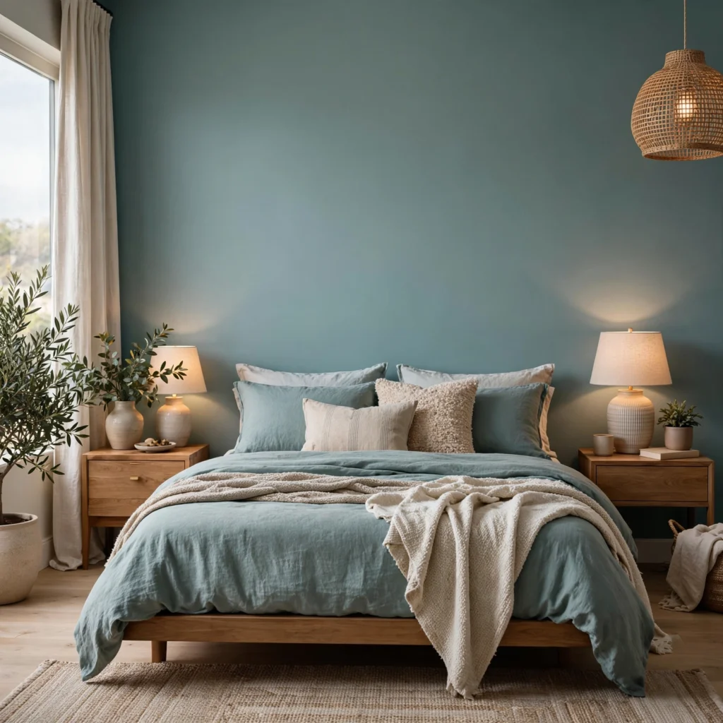
Teal combines blue and green in a way that reads sophisticated rather than overly bright, particularly in a more muted, grayed-down version of the colour. It works well as either a full-room colour in a bedroom with good natural light or as a single accent wall in a room with less exposure. This shade pairs especially well with warm wood tones and brass, both of which offset teal’s cooler undertone.
10. Warm White
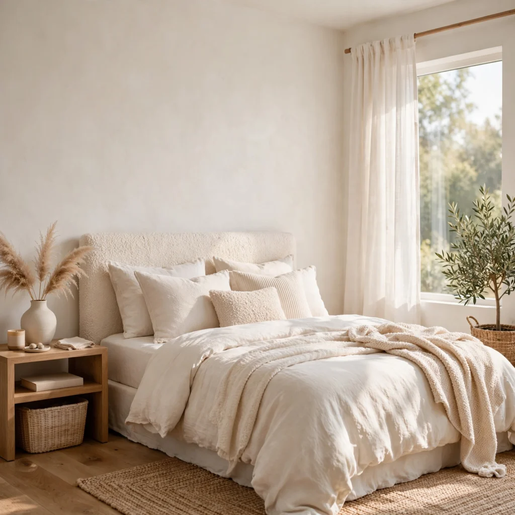
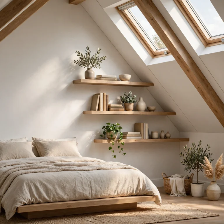
Not all whites read the same, and a warm white with a slight cream or beige undertone avoids the stark, clinical look that a cooler, blue-based white can create in a bedroom. This shade works as a flexible base for nearly any style, from minimal to more layered and textured, since it doesn’t compete with other colours introduced through furniture or textiles. It also tends to photograph and live well under both natural and warm artificial light.
11. Deep Forest Green
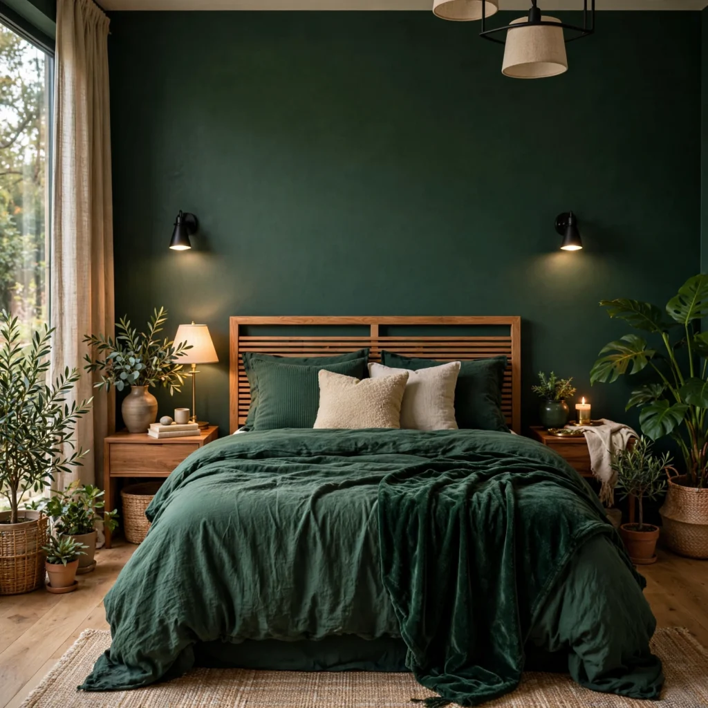
Forest green is more saturated and cooler than sage, giving it a dramatic, enveloping quality that works particularly well in a bedroom used mainly for rest rather than daytime activity. This shade tends to read best as either a full-room colour in a space with ample natural light or a single accent wall in a smaller, dimmer room. Pairing it with brass hardware and warm wood furniture keeps the depth of the colour from feeling too heavy or dark.
12. Blush Pink
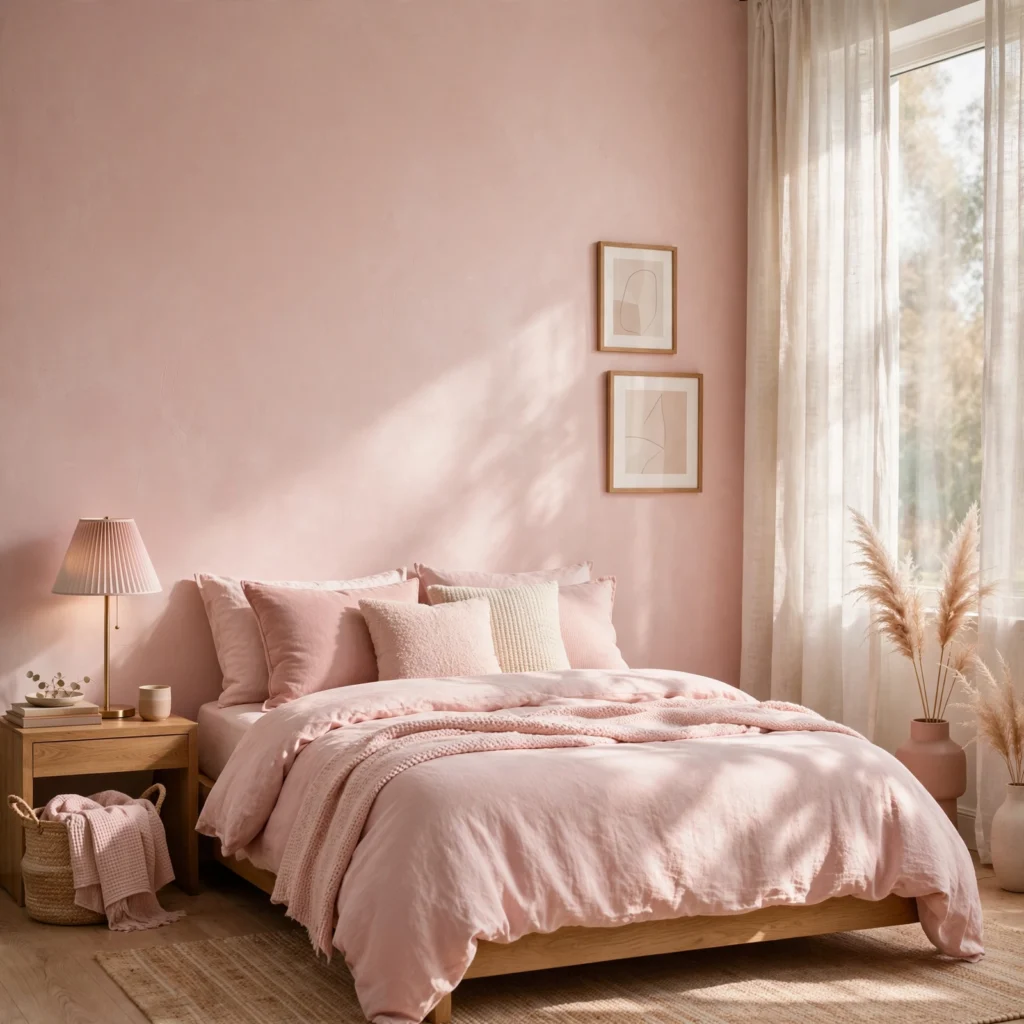
A soft, warm blush reads more neutral and grown-up than a brighter pink, making it workable as a full-room colour rather than just a small accent. It pairs particularly well with black or dark wood furniture, which grounds the softness of the pink and keeps the room from feeling overly delicate. This shade also tends to flatter warm, incandescent lighting, making it a strong choice for a bedroom used primarily in the evenings.
Shop the Look
A few specific products make testing these colours easier. Look for a set of large-format peel-and-stick paint swatches rather than small paper chips, a matte finish paint suited to bedroom walls, a set of brass drawer pulls to pair with warmer shades, a warm-white LED bulb for accurate colour testing at night, and a roll of painter’s tape for clean test-swatch edges.
Common Mistake to Avoid
The most common mistake with bedroom colour ideas is choosing a shade based on a small paint chip or an online photo without testing it directly on the actual wall, since colour shifts significantly based on a room’s specific light and the finish of the paint. A colour that looks perfect in a showroom or a photo taken in someone else’s home can read entirely differently under your room’s exposure and existing light fixtures. Always paint a large swatch directly on the wall and observe it at different times of day before committing to a full room.
FAQs
What is the most calming colour for a bedroom?
Muted, low-saturation shades like sage green, slate blue, and warm greige are generally considered the most calming, since they avoid the visual stimulation of brighter, more saturated colours. These shades also tend to work well regardless of a room’s specific light exposure, which adds to their reputation as safe, restful choices.
Should a small bedroom use light or dark colours?
Light colours generally make a small bedroom feel more open, since they reflect more available light around the room. That said, a dark colour can still work in a small space if used as a single accent wall rather than across the entire room, which adds depth without making the space feel closed in.
How do I choose a bedroom colour based on natural light?
Rooms with strong, direct natural light can generally handle deeper or cooler shades without feeling cave-like, while rooms with limited light tend to do better with warmer, lighter colours that don’t rely on sunlight to feel balanced. Testing a swatch at different times of day remains the most reliable way to confirm how a specific shade will actually read in your room.
What colours make a bedroom feel cozy?
Warm, muted tones like terracotta, deep burgundy, and soft butter yellow tend to read as cozier than cool, high-contrast colours like stark white or icy gray-blue. Pairing any of these shades with warm materials, like wood furniture and brass hardware, reinforces that cozy effect further.
Is it better to paint a bedroom one colour or use an accent wall?
Both approaches work, and the choice mostly comes down to how bold the shade is and how much natural light the room has. A single accent wall is generally the lower-risk option for deeper or more saturated colours, while a full-room application tends to work better with softer, more muted shades that won’t overwhelm the space.
Conclusion
These bedroom colour ideas work best when the shade is matched to your room’s actual light and paired with materials that add warmth and texture rather than relying on paint alone to carry the whole look. Whether you start with a full sage green repaint or a smaller charcoal accent wall, each idea here scales to fit your space and comfort level with colour. Save this post to Pinterest for later, and check out our related guide on small bedroom storage solutions for more design inspiration.