16 Clever Neutral Color Palette Ideas That Never Feel Flat
A neutral color palette has a reputation for being the safe, easy choice, but done well it requires just as much intention as a bold color scheme, since there’s no saturated hue to hide behind if the tones and textures don’t work together. This post covers sixteen neutral color palette ideas spanning warm cream, cool gray, and everything between, each with specific pairing guidance. You’ll get hex codes, material pairings, and room-specific recommendations so you can build a neutral palette that reads as considered rather than simply the absence of color.
Trend & Background
Neutral color trends have shifted significantly over the past several years, moving away from the cool, blue-gray dominated palettes that defined much of the previous decade toward warmer tones like greige, cream, and warm taupe that read as more inviting and less clinical. This shift has been driven partly by a broader design move away from stark minimalism toward warmer, more textural interiors, and partly by a growing recognition that cool gray palettes can feel dated and sterile in a way warmer neutrals generally avoid. This matters now because a well-built neutral palette, layered with the right undertones and textures, has become one of the more dependable long-term color choices in design, less prone to feeling outdated than many bolder trend-driven combinations.
Key Takeaways
- A neutral color palette works best when it layers several closely related tones and finishes rather than relying on a single flat neutral across an entire room.
- Warm neutrals like cream and greige have largely replaced the cool gray palettes that dominated design for much of the past decade.
- Texture, from matte to glossy and smooth to nubby, does as much work as color choice in keeping an all-neutral room from feeling flat or cold.
- A hex code and undertone comparison table is included so you can match a specific neutral tone to your project before ordering paint or fabric.
1. Warm White and Greige Duo
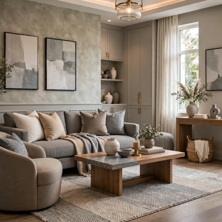
A warm white and greige duo pairs a soft, cream-leaning white with a warm gray-beige, producing one of the most broadly appealing and easy-to-live-with neutral combinations available. This pairing works particularly well as a whole-home color direction, since both tones share the same warm undertone and transition smoothly from room to room. Use greige on larger wall surfaces, with warm white reserved for trim and ceilings to maintain clear definition between the two.
2. Cream and Camel Combination
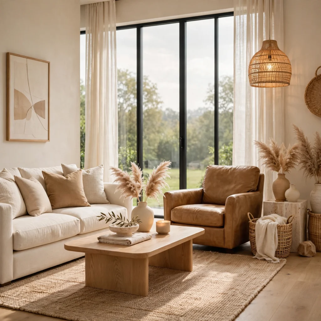
A cream and camel combination pairs a soft, warm off-white with a mid-tone tan, producing a cozy, layered neutral palette well suited to a living room or bedroom aiming for warmth without introducing any actual color. This combination benefits significantly from textural variation, like a boucle chair against a smooth linen sofa, since the tonal closeness between the two colors relies on texture to keep the room from reading as flat. Add a third, slightly darker neutral, like a walnut side table, for grounding contrast.
3. Charcoal and Ivory Contrast
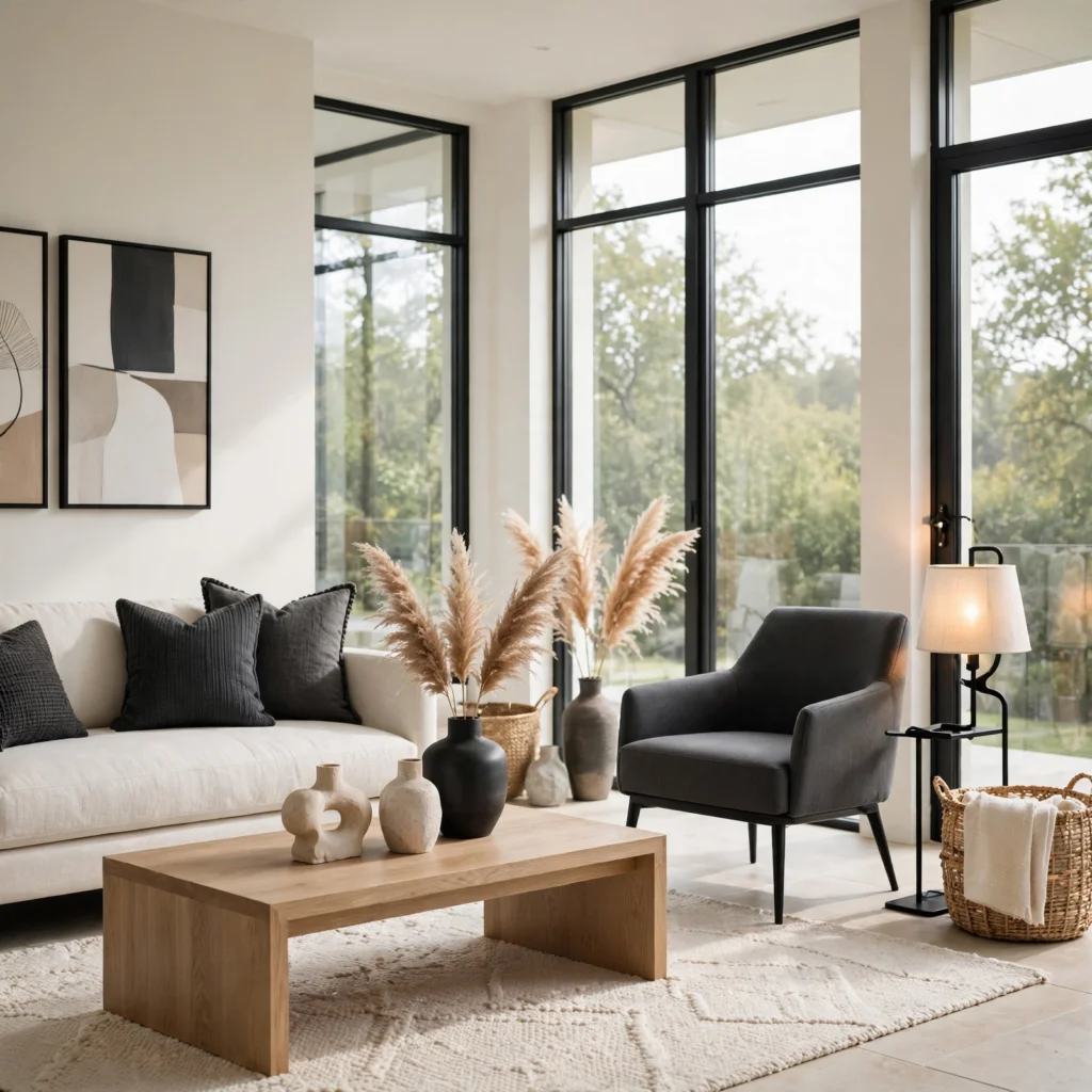
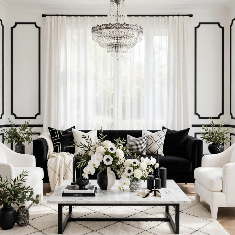
A charcoal and ivory contrast pairs a deep, near-black gray with a warm ivory, producing a high-contrast neutral palette that reads as sophisticated and current rather than the softer, low-contrast combinations elsewhere on this list. This works particularly well in a home office, dining room, or bedroom aiming for a more dramatic, defined look while staying within a fully neutral color story. Balance the pairing carefully, since too much charcoal relative to ivory can make a room feel heavy rather than intentionally bold.
4. Neutral Color Palette for Bedrooms
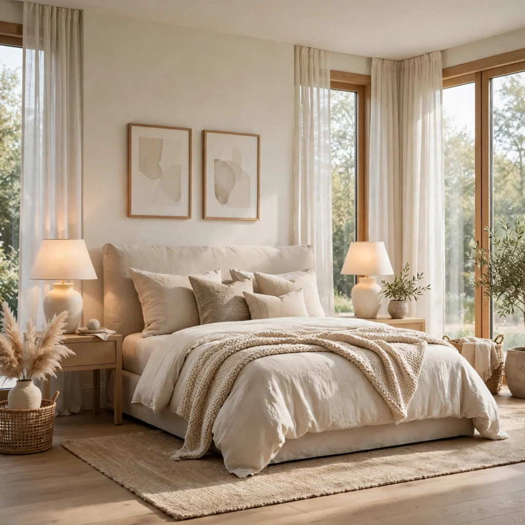
A neutral color palette for bedrooms generally favors warmer, softer tones like a warm white, a soft greige, or a light taupe rather than cooler grays, since warmth supports the restful atmosphere most bedrooms aim for. This approach has become one of the more common bedroom color directions in recent years, largely replacing the cooler, more clinical gray palettes popular in the previous decade. Layer in natural materials like linen bedding and a wool rug to reinforce the warmth beyond color alone.
| Neutral Shade | Approximate Hex Code | Undertone |
| Warm White | #F5F0E6 | Warm, cream-leaning |
| Greige | #B8AFA3 | Warm, balanced gray-beige |
| Taupe | #8B7D6B | Warm, brown-leaning |
| Charcoal | #36454F | Cool, near-black gray |
5. Beige and Terracotta Pairing
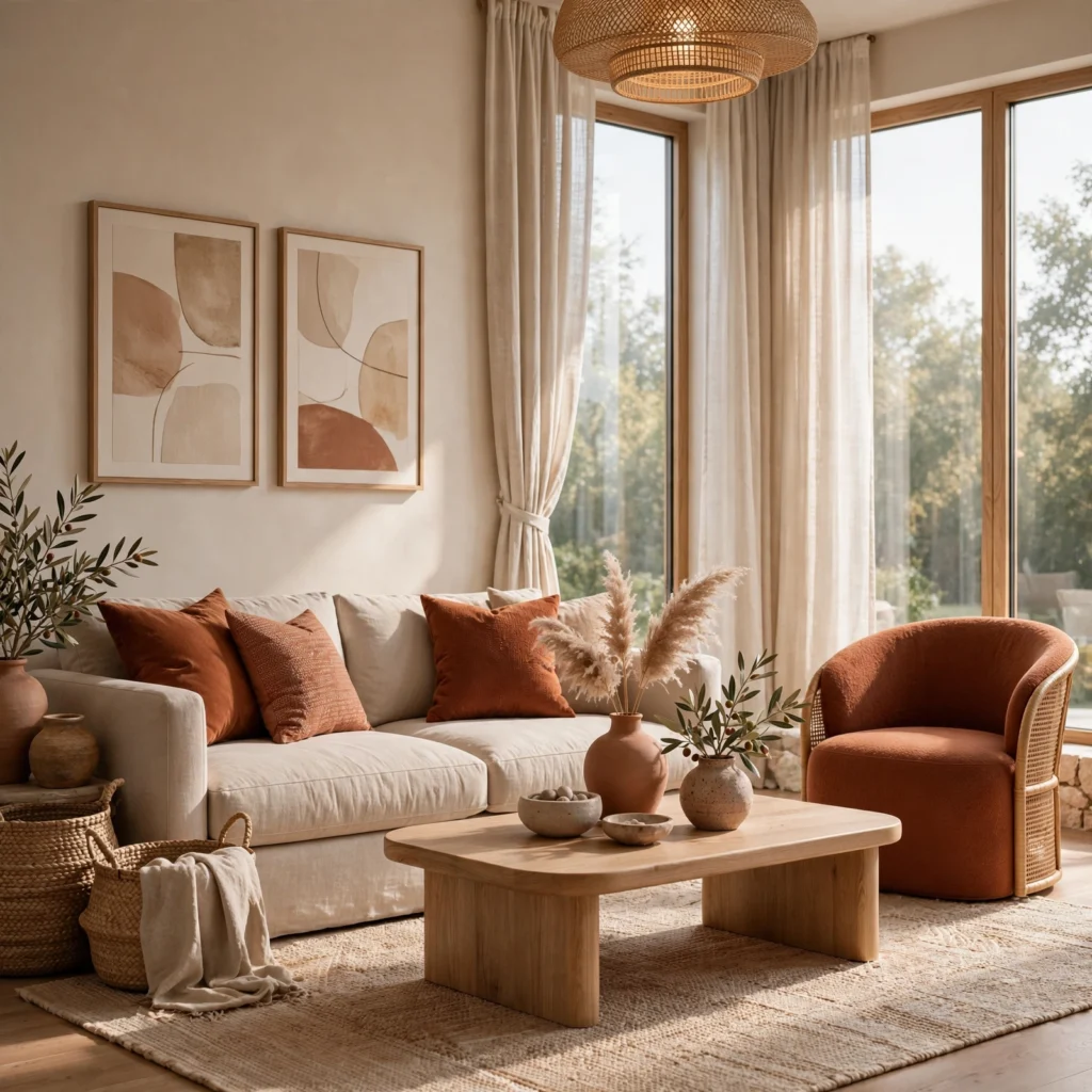
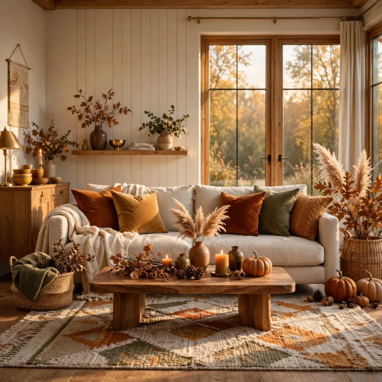
A beige and terracotta pairing combines a soft, warm beige with a deeper, earthier terracotta, producing a neutral palette with slightly more warmth and depth than a purely cream-and-white combination. This works particularly well in a living room or entryway aiming for a grounded, sun-warmed feel rather than a cool or clinical one. Use terracotta in smaller doses, like pillows, ceramics, or a single accent wall, against a beige base for the strongest, most balanced result.
Create a calm and relaxing environment with this wedding color palette.
6. Stone and Linen Combination
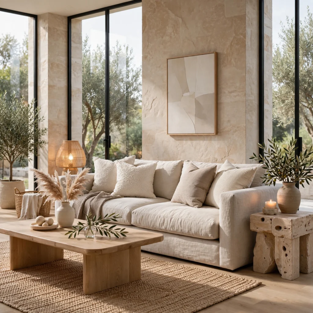
A stone and linen combination pairs a cool, slightly gray stone tone with a warm, textured linen color, producing a balanced neutral palette that bridges cool and warm undertones rather than committing fully to either. This combination works well in a living room or dining room where furniture and flooring already include both warm wood and cooler stone or concrete elements. Let the room’s existing material undertones guide which of the two neutrals should dominate the wall color versus the textile choices.
7. Oatmeal and Espresso Contrast
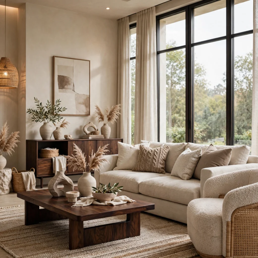
An oatmeal and espresso contrast pairs a light, warm, flecked neutral with a very deep, near-black brown, producing a grounded, high-contrast neutral palette well suited to a living room or bedroom aiming for definition without introducing actual color. Espresso reads as considerably softer than true black while still providing similar visual weight and contrast against a lighter neutral. Use espresso on lower or larger elements, like a sofa or bed frame, while oatmeal carries the walls and softer textiles.
8. Neutral Color Palette for Kitchens
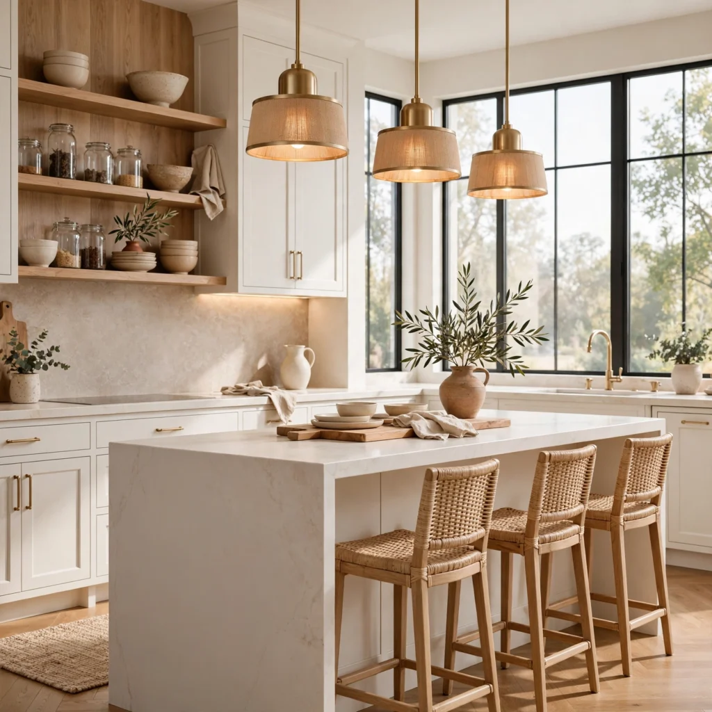
A neutral color palette for kitchens generally favors a warm white or a light greige on cabinetry, paired with a natural stone or quartz countertop that includes some tonal variation rather than a perfectly flat, uniform surface. This approach has remained one of the most consistently popular kitchen color directions, since it provides a flexible backdrop for accent colors introduced through smaller elements like a backsplash tile, hardware, or an island in a contrasting tone. Pair with warm wood open shelving or flooring to keep an all-neutral kitchen from feeling cold.
9. Sand and Driftwood Combination
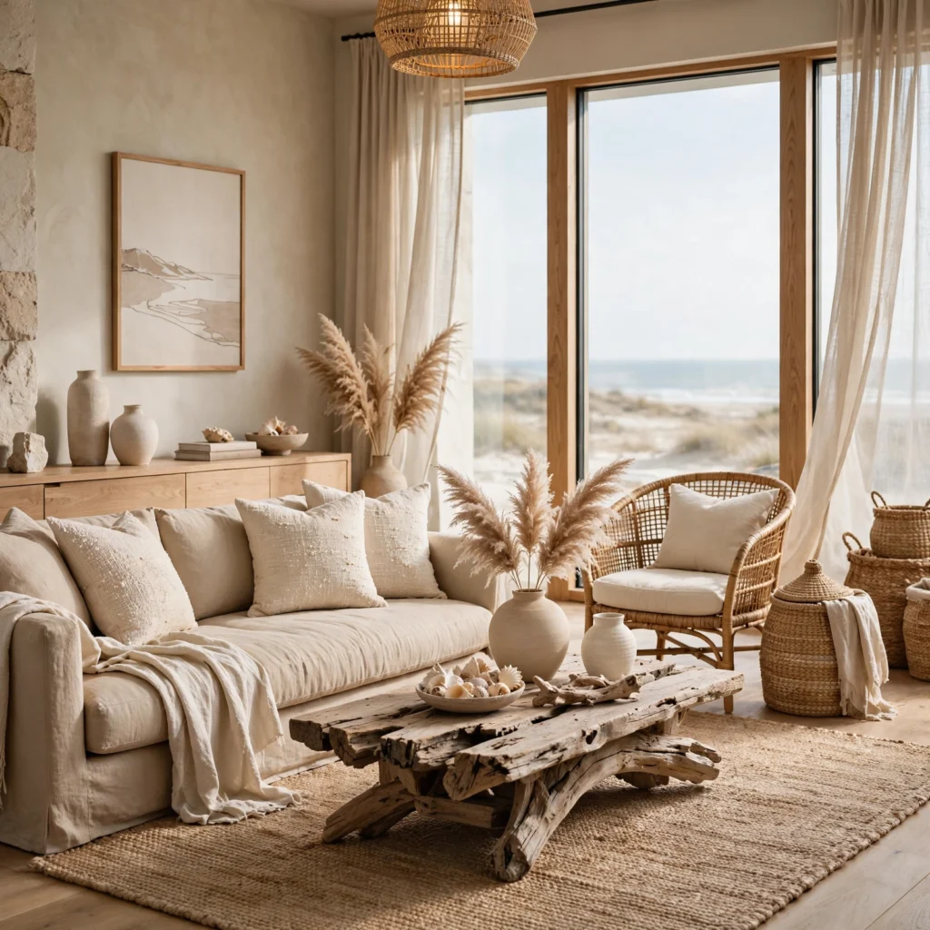
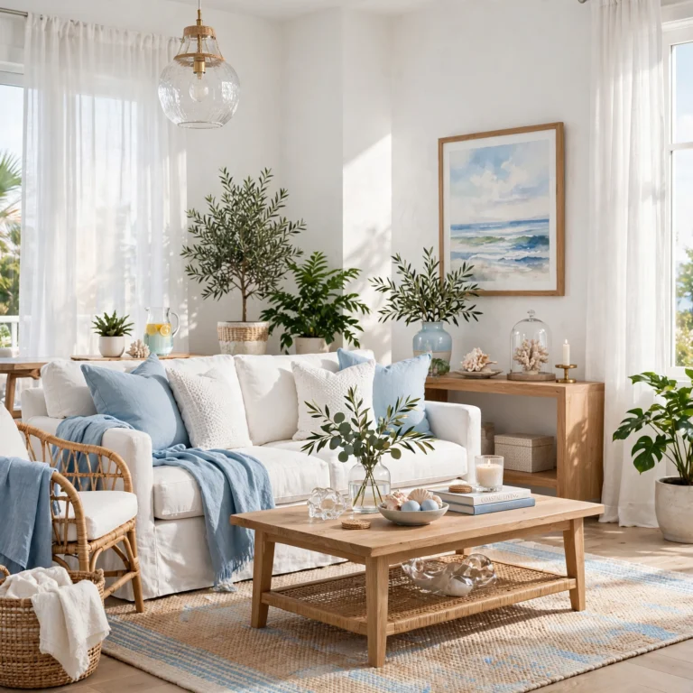
A sand and driftwood combination pairs a light, warm beige with a soft, weathered gray-brown wood tone, producing a coastal-adjacent neutral palette that reads as relaxed and airy without leaning into any bright or saturated coastal blues. This works particularly well in a living room, bedroom, or a home with significant natural light and existing wood flooring. Layer in a woven natural fiber rug and linen textiles to reinforce the relaxed, textural quality this pairing depends on.
10. Dove Gray and Blush Pairing
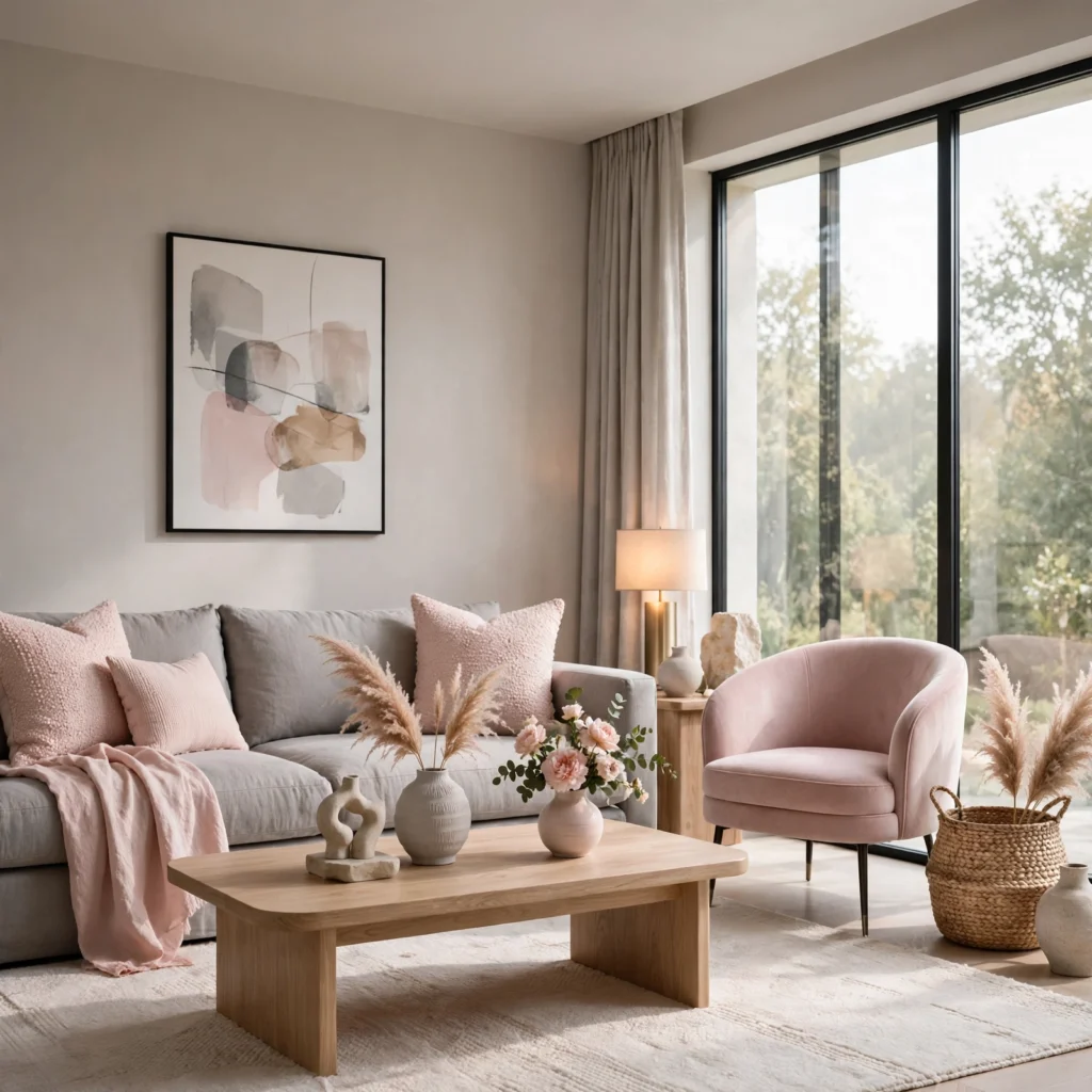
A dove gray and blush pairing combines a very soft, slightly warm gray with the faintest hint of pink, producing a delicate, almost-neutral palette that reads as considerably softer than a standard gray-and-white combination. This works well in a bedroom, nursery, or bathroom aiming for a gentle, quiet feel while staying largely within a neutral color range. Keep the blush extremely subtle and desaturated so it reads as a warming influence on the gray rather than an obvious pink accent.
11. Neutral Color Palette for Bathrooms
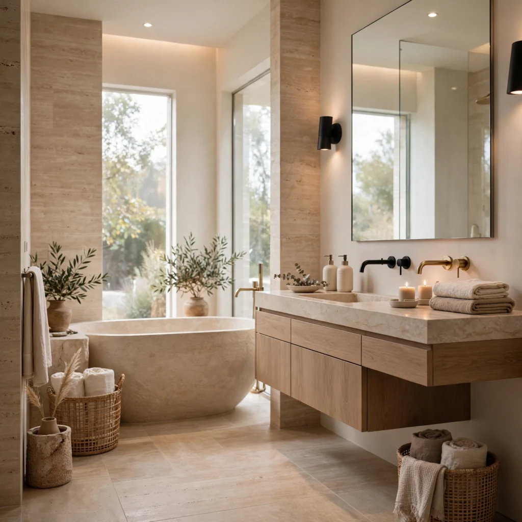
A neutral color palette for bathrooms typically favors a warm white or a light greige on walls, paired with natural stone or a stone-look tile in a similar tonal family, since this combination holds up well against moisture while avoiding the cold, clinical feel an all-white or all-gray bathroom can produce. Adding a warm wood vanity or brass hardware helps counterbalance the cooler undertones often found in bathroom stone and tile materials. This combination has become increasingly common as a warmer alternative to the all-white spa bathroom aesthetic.
12. Fog and Walnut Combination
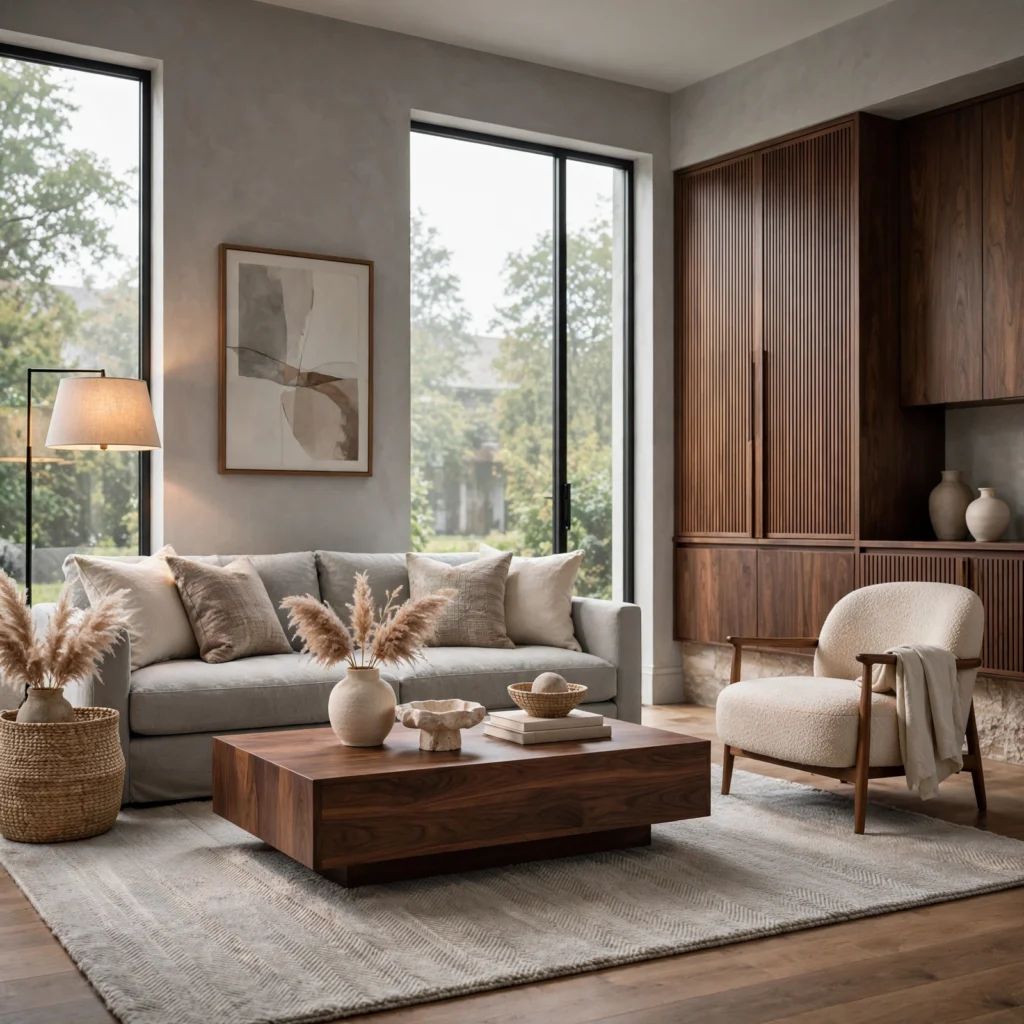
A fog and walnut combination pairs a soft, cool-leaning light gray with a rich, warm walnut wood tone, producing a balanced neutral palette that uses material warmth from the wood to offset the wall color’s cooler undertone. This works particularly well in a living room or bedroom with significant wood furniture already in place, since the pairing lets that existing material carry much of the room’s warmth. Keep metal accents warm, like brass or brushed gold, to reinforce rather than compete with the walnut’s undertone.
13. Alabaster and Honey Oak Pairing
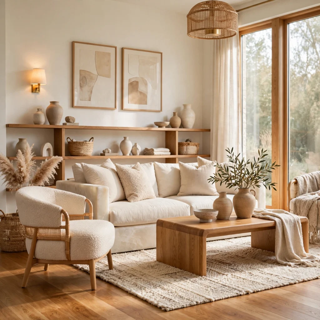
An alabaster and honey oak pairing combines a soft, warm off-white with a lighter, golden-toned wood, producing a bright, airy neutral palette well suited to a Scandinavian-influenced living room, kitchen, or bedroom. This pairing works particularly well with plenty of natural light, since both tones are light enough to reflect rather than absorb available light in the room. Add texture through boucle or sheepskin textiles to keep the palette from feeling too sparse or cold despite its light overall value.
14. Neutral Color Palette for Exteriors
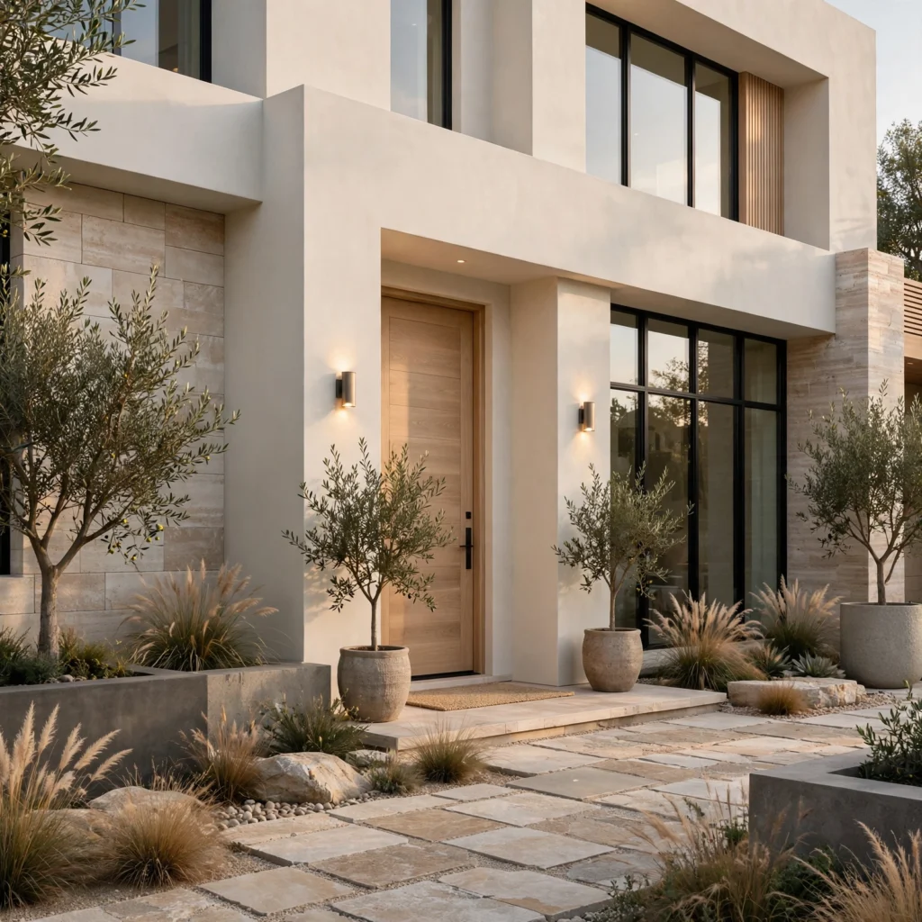
A neutral color palette for exteriors generally favors a warm white, a soft greige, or a light taupe on siding, paired with a slightly deeper trim color for definition, since these warmer neutral tones have largely replaced the cooler gray exteriors that were common in the previous decade. Pair with black or bronze window frames and hardware for a current, high-contrast look, or with a warm wood front door for a softer, more inviting result. Test any exterior neutral in full outdoor sunlight before committing, since undertones can shift noticeably outside compared to an indoor paint chip.
15. Putty and Rust Combination
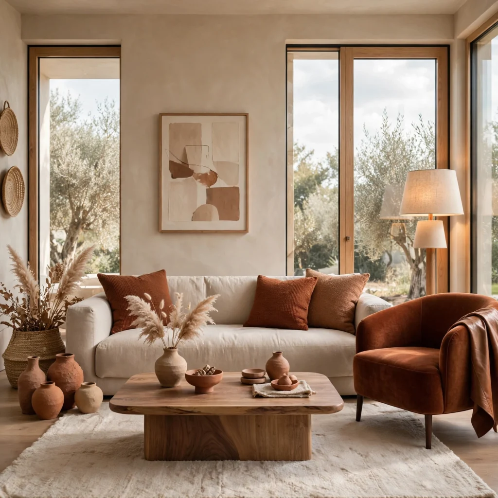
A putty and rust combination pairs a soft, warm grayish-beige with a deep, earthy rust, producing a neutral palette with a stronger anchor accent than most of the softer combinations on this list. This works particularly well in a living room or bedroom aiming for warmth and depth while keeping the overall palette largely within a neutral range. Use rust in smaller doses, like a single accent chair, pillows, or artwork, against a putty base for a grounded but not overwhelming result.
16. Warm Gray and Black Duo
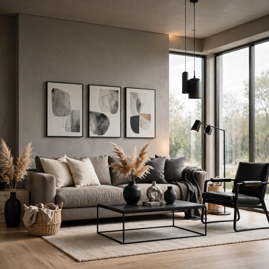
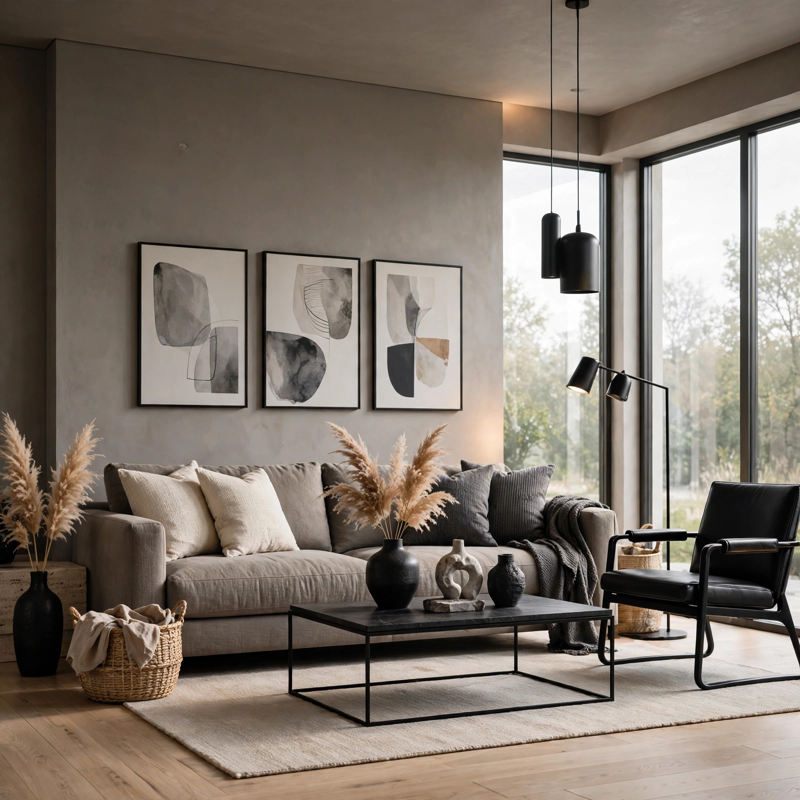
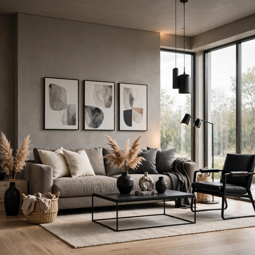
A warm gray and black duo pairs a softer, slightly beige-leaning gray with true black accents, producing a neutral palette with more definition and contemporary edge than an all-warm or all-soft combination. This works well in a home office, entryway, or kitchen aiming for a cleaner, more current look while still remaining within a broadly neutral color story. Use black in smaller architectural or hardware doses, like window frames or cabinet pulls, rather than as a large wall surface, to keep the warm gray as the dominant tone.
Shop the Look
A warm white linen sofa pairs well with a greige wool area rug and a set of walnut side tables for a soft, layered living room palette. A boucle accent chair in oatmeal and a set of brass table lamps round out a warmer, textural neutral scheme. For a bathroom or kitchen refresh, a stone-look tile in a warm greige pairs well with brushed brass hardware and warm wood open shelving.
Common Mistake to Avoid
The most common mistake with a neutral color palette is relying on color alone without varying texture or material, which leaves a room feeling flat regardless of how well the specific tones are chosen. A room painted entirely in one shade of white or beige, furnished with similarly smooth, matte materials throughout, tends to read as unfinished rather than intentionally restrained. A better approach is layering at least three distinct textures, such as smooth linen, nubby boucle, and warm wood grain, within the same neutral color family so the room reads as considered rather than simply empty of color.
5 FAQs
What is the difference between warm and cool neutrals?
Warm neutrals, like cream, greige, and taupe, carry yellow, orange, or red undertones that read as inviting and soft, while cool neutrals, like true gray or a blue-leaning white, carry blue or green undertones that read as cleaner and more clinical. Most current design trends favor warm neutrals over cool ones, largely as a reaction to the cool gray palettes that dominated design for much of the previous decade. Identifying a neutral’s actual undertone, rather than judging it as simply light or dark, is the most reliable way to predict how it will pair with existing materials in a room.
How do I keep an all-neutral room from feeling boring?
Layering multiple closely related neutral tones, varying texture significantly across materials like linen, boucle, wood, and stone, and adding at least one deeper anchor color, like charcoal or espresso, for contrast are the most effective ways to keep an all-neutral room from feeling flat or boring. Natural materials with visible grain or texture, like wood, stone, or woven textiles, also add visual interest that a flat painted surface alone can’t provide. A neutral palette generally needs more textural variation than a bold color scheme to read as intentional rather than simply plain.
What neutral colors are trending right now?
Warm white, greige, and soft taupe have remained the dominant neutral trends over the past several seasons, largely replacing the cooler gray palettes that were popular earlier in the previous decade. Deeper warm neutrals like a rich walnut brown or a soft, warm charcoal have also grown in use as accent or anchor tones within an otherwise lighter neutral palette. Checking current paint lines each season is the most reliable way to confirm the specific shades trending at any given time, since neutral undertones shift gradually rather than through dramatic seasonal swings.
Can a neutral color palette work in a small room?
Yes, a neutral color palette generally works particularly well in a small room, since light, warm neutrals reflect available light and help the space feel more open than a bold or dark color scheme might. Keeping wall, trim, and ceiling colors closely related, rather than introducing high contrast, further supports a sense of continuous, uninterrupted space in a smaller room. A single deeper neutral, like a charcoal accent wall, can still work in a small room if used sparingly rather than across the full space.
How many neutral tones should I use in one room?
Most successful neutral palettes use three to five related tones within a room, spanning from the lightest wall or ceiling color to a mid-tone furniture or textile color and a deeper anchor accent, rather than relying on just one or two flat tones throughout. Staying within a consistent undertone family, either all warm or all cool, across those multiple tones is generally more important than the specific number used, since mixing warm and cool neutrals without intention is a more common source of visual dissonance than simply using too many shades.
Conclusion
A neutral color palette rewards the same intention as a bold color scheme, relying on layered tones, varied texture, and consistent undertones to read as considered rather than simply the absence of color. Save this list to Pinterest for your next design project, and check out our related posts on brown color palette and green color palette for more ways to build out a full color scheme.