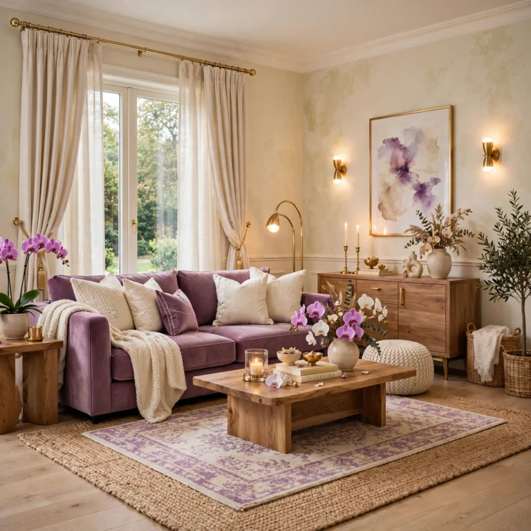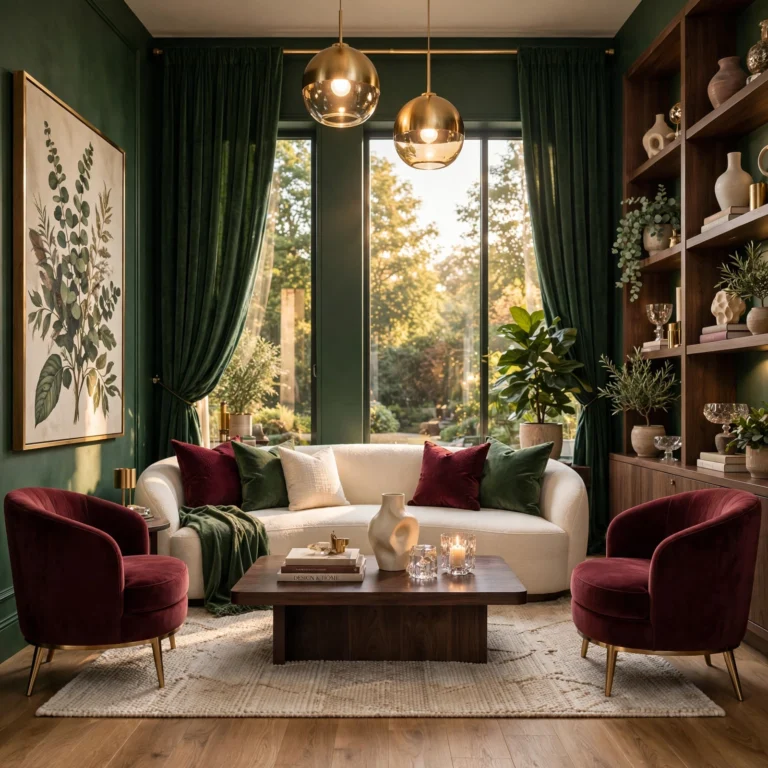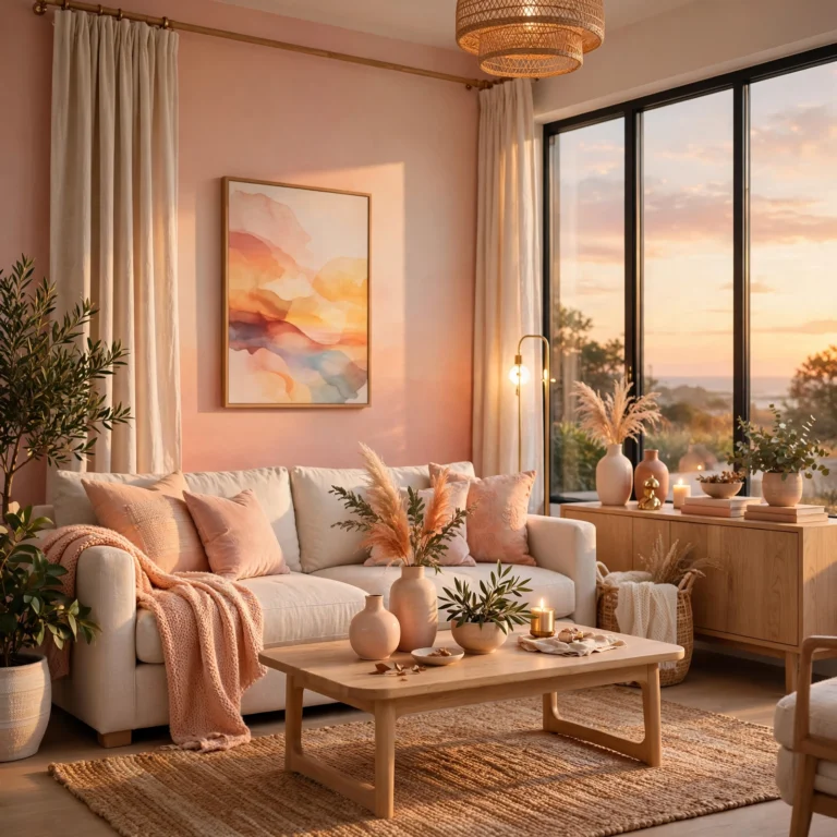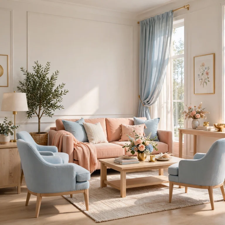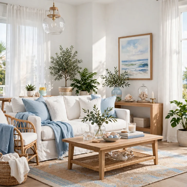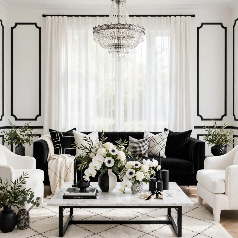
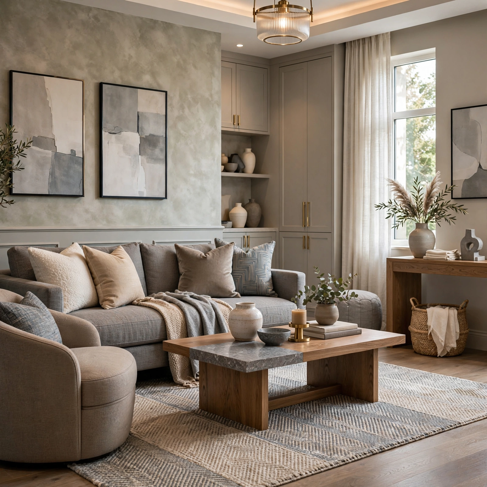
13 Creative Color Palette Design Ideas for a Balanced Scheme
Building a color palette that actually works in a real room comes down to a repeatable process, not just picking colors that look nice together on a screen, which is exactly where solid color palette design ideas start. This guide walks through thirteen practical techniques, from the 60-30-10 rule to a lighting test swatch method, that apply whether you’re designing a palette for one room or planning colors across an entire house. You’ll learn what tools and ratios actually produce a balanced scheme, roughly how to apply each method, and how to avoid the common mistake of choosing colors in isolation without testing how they behave together in real light. Each idea includes real ratios and specific techniques.
Trend & Background
Color palette design has become more systematic as digital tools have made it easier to test combinations before committing to paint or fabric, shifting the process away from purely intuitive color matching toward defined methods borrowed from the color wheel and traditional color theory. Ratio-based planning, like the 60-30-10 rule, and undertone matching have both become standard starting points because they solve a specific problem: a palette can look coordinated on a screen or a small swatch card and still clash once applied at full scale in a room’s actual lighting. This matters now because more paint and design apps have built these traditional color theory methods directly into digital tools, making a systematic approach more accessible than it was when it required manual color wheel knowledge alone.
Key Takeaways
- Thirteen ideas cover methods, tools, and rules for building a color palette rather than specific color combinations.
- Reference tables are included for color wheel angles, ratio percentages, and lighting temperature so you can plan before you buy.
- A defined ratio, like 60-30-10, does more to keep a palette balanced than the specific colors chosen.
- Most techniques apply whether you’re designing a palette for a single room or an entire house.
1. 60-30-10 Rule Application
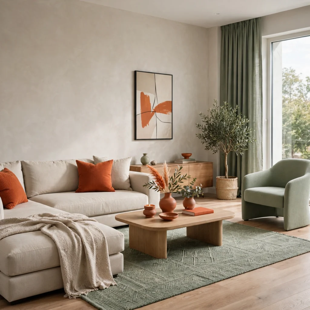
The 60-30-10 rule assigns 60% of a room to a dominant color, typically walls and large furniture, 30% to a secondary color through items like upholstery or curtains, and the remaining 10% to an accent color used sparingly through smaller details. Measure your intended color choices against this ratio before committing, since palettes that skip a clear dominant color in favor of three roughly equal tones tend to feel unbalanced once applied to actual room-sized surfaces.
| Ratio | Role | Typical Application |
| 60% | Dominant | Walls, large furniture, flooring |
| 30% | Secondary | Upholstery, curtains, rugs |
| 10% | Accent | Pillows, art, small decor |
2. Complementary Color Wheel Pairing
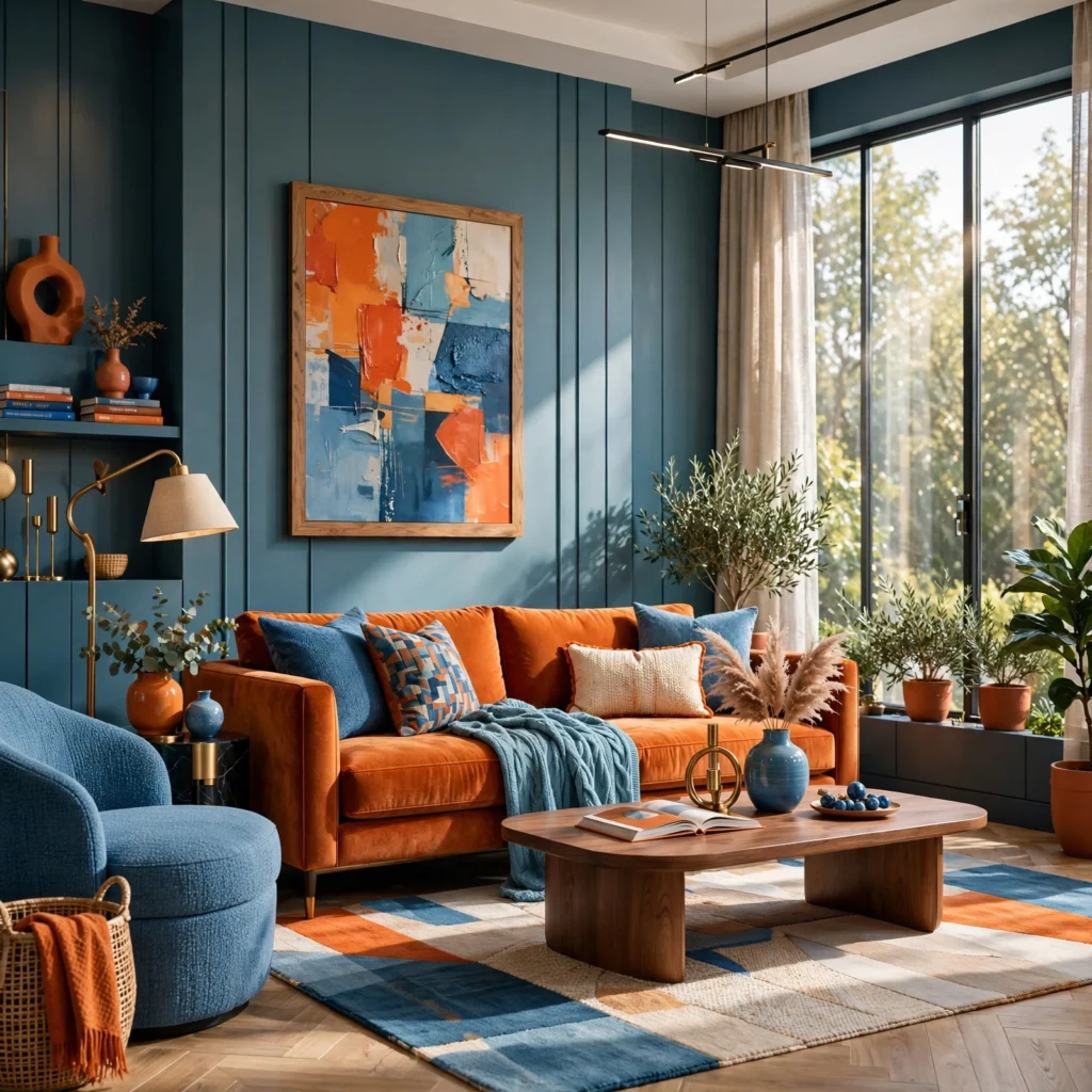
Complementary colors sit directly opposite each other on the color wheel, such as blue and orange or red and green, and produce the highest possible contrast between two hues. Use a physical or digital color wheel to identify the exact opposite of your starting color, then mute one of the two tones slightly, since two fully saturated complementary colors used at equal intensity can feel visually aggressive rather than balanced in a full room application.
3. Analogous Color Scheme
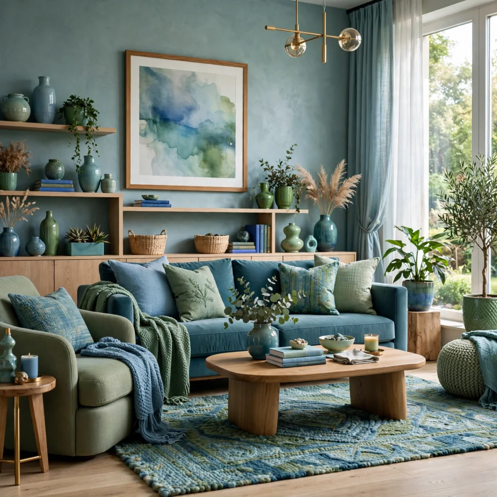
An analogous scheme uses three colors that sit next to each other on the color wheel, such as blue, blue-green, and green, producing a palette that feels cohesive and low-contrast by design. Choose one of the three hues as the dominant tone and let the adjacent two support it in smaller quantities, since this scheme’s built-in harmony makes it one of the more forgiving methods for beginners to apply without risking a clashing result.
| Wheel Position | Example Hues | Contrast Level |
| Adjacent (analogous) | Blue, blue-green, green | Low |
| Opposite (complementary) | Blue, orange | High |
| Triadic (evenly spaced) | Blue, yellow, red | Medium-high |
4. Triadic Color Scheme
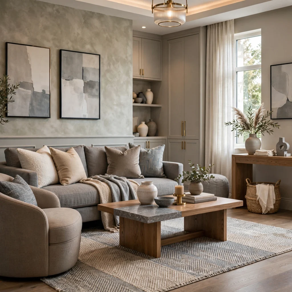
A triadic scheme selects three colors evenly spaced around the color wheel, roughly 120 degrees apart, such as a primary red, yellow, and blue, producing a vibrant palette with built-in balance despite using contrasting hues. Mute or desaturate at least two of the three colors to avoid an overly bold, primary-color effect, and apply the ratio unevenly, letting one hue dominate while the other two act as accents, rather than giving all three equal visual weight.
Not sure which colors work together? Explore our summer color palette for ideas that match your style.
5. Color Palette Design Moodboard
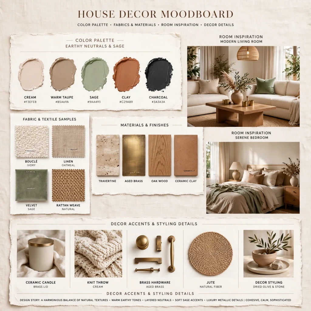
A moodboard acts as a physical testing ground where you pin paint chips, fabric swatches, and material samples together while working through a chosen color theory method before committing to final selections. Build one from a cork panel wrapped in linen, framed with thin wood trim, and lay out competing ratio or scheme options side by side so you can compare a 60-30-10 application against an analogous scheme directly, rather than deciding from mental visualization alone.
6. Monochromatic Tint and Shade Scale
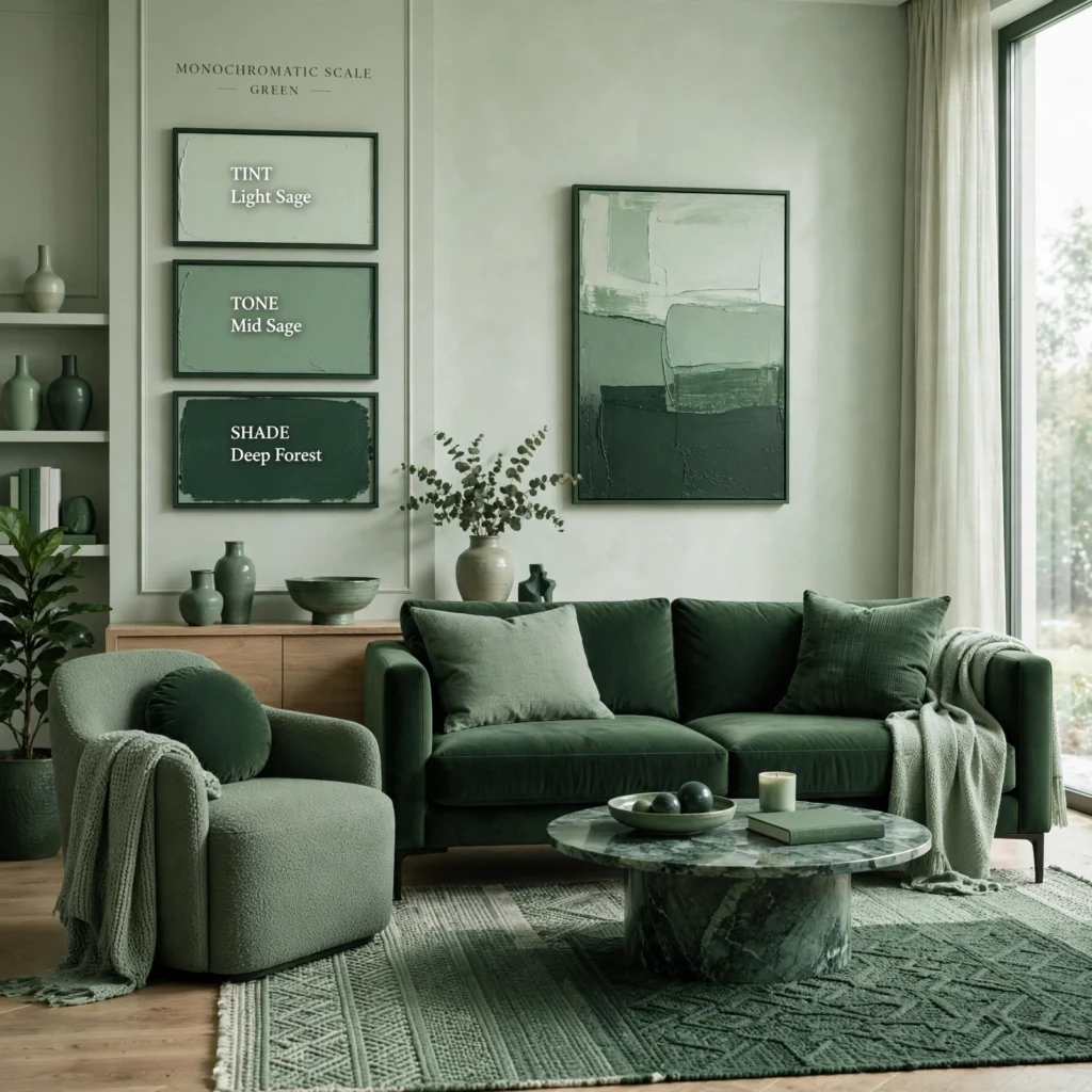
A monochromatic scale takes a single base hue and builds a full palette from its tints, made by adding white, and shades, made by adding black, producing a cohesive scheme without introducing a second color at all. Apply the lightest tint to walls, a mid-tone to larger furniture, and the darkest shade to smaller accents, since this progression from light to dark as the eye moves through the room is what keeps a monochromatic palette from reading as flat.
7. Undertone Matching Technique
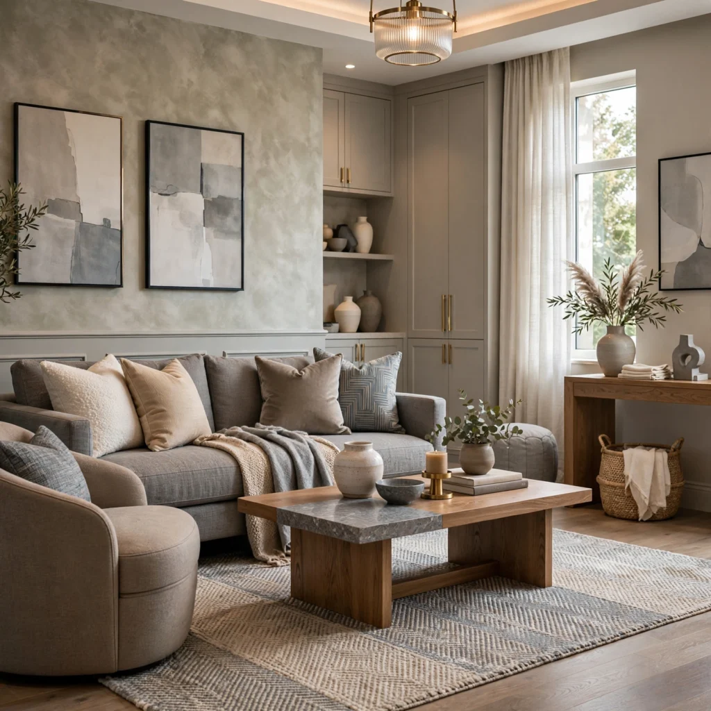
Every color, even seemingly neutral whites and grays, carries an underlying warm or cool undertone, and matching undertones across a palette prevents the subtle clashing that happens when a warm-toned white sits next to a cool-toned gray. Hold paint chips against a pure white sheet of paper in natural daylight to reveal each color’s true undertone more clearly than viewing it in isolation or under artificial store lighting, then group only colors sharing a consistent temperature into one palette.
8. Split-Complementary Scheme
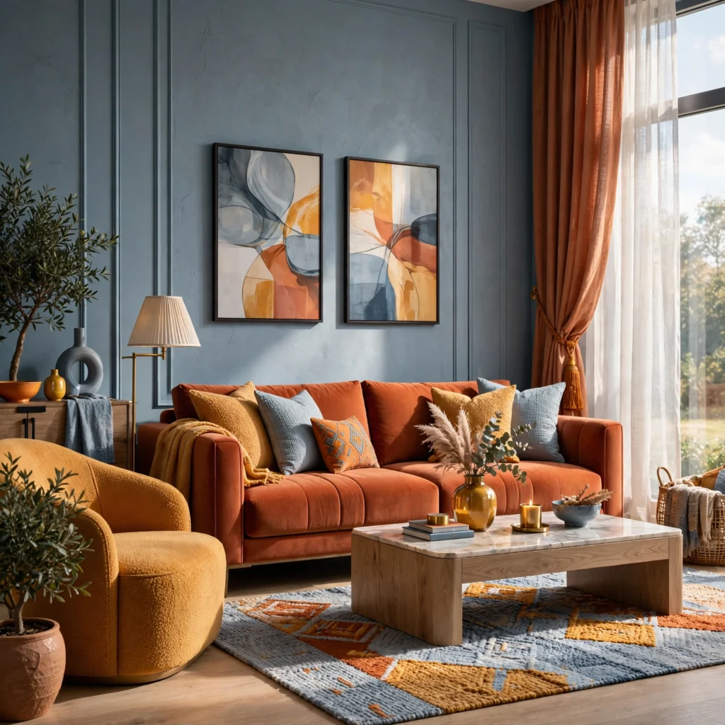
A split-complementary scheme takes a base color and pairs it with the two hues adjacent to its direct complement, rather than the complement itself, producing strong contrast with slightly less visual tension than a true complementary pairing. For a blue base, this means pairing it with red-orange and yellow-orange rather than pure orange, giving the palette more nuance while still delivering meaningful contrast against the dominant blue tone.
| Scheme Type | Number of Hues | Contrast Character |
| Complementary | 2 | High, direct |
| Split-complementary | 3 | High, softer |
| Triadic | 3 | Medium-high, balanced |
9. Nature-Inspired Palette Extraction
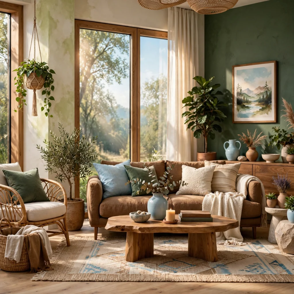
Pulling a color palette directly from a photograph of a landscape, a piece of fabric, or another naturally occurring source often produces more successful combinations than colors chosen independently, since naturally occurring color relationships tend to already follow harmonious proportions. Use a color-picker tool on a digital photo to extract five or six exact hex codes from the image, then apply those extracted colors using a ratio method like 60-30-10 rather than using all of them at equal weight.
Create a calm and relaxing environment with these Neutral Color Palette Ideas.
10. Digital Color Palette Generator Tool
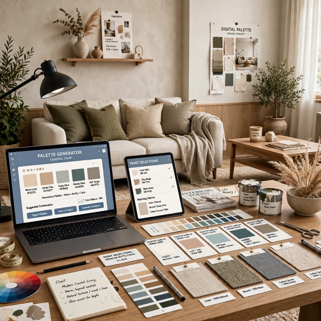
Online palette generator tools build coordinated color sets automatically based on a single starting hue and a chosen scheme type, like complementary or analogous, speeding up the early exploration phase considerably compared to manually working through a physical color wheel. Generate several palette options from the same base color across different scheme types, then narrow down to two or three finalists to test physically with paint or fabric samples, since a palette that looks correct on a screen doesn’t always hold up under real lighting.
11. Fabric Swatch Layering Method
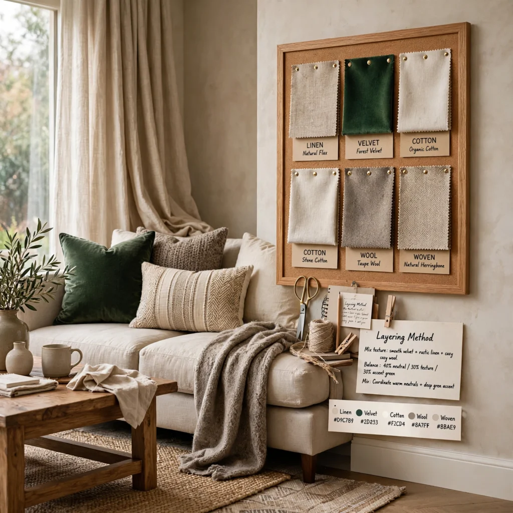
Physically layering fabric swatches for upholstery, drapery, and rugs on top of each other reveals how textures and colors interact in a way that flat paint chips alone cannot, since fabric introduces sheen, weave, and pattern scale into the color relationship. Order actual fabric samples rather than relying on a manufacturer’s digital photo, and layer them in the proportions you intend to use in the final room, checking the combination under both daytime and evening lighting before ordering full yardage.
12. Lighting Test Swatch Method
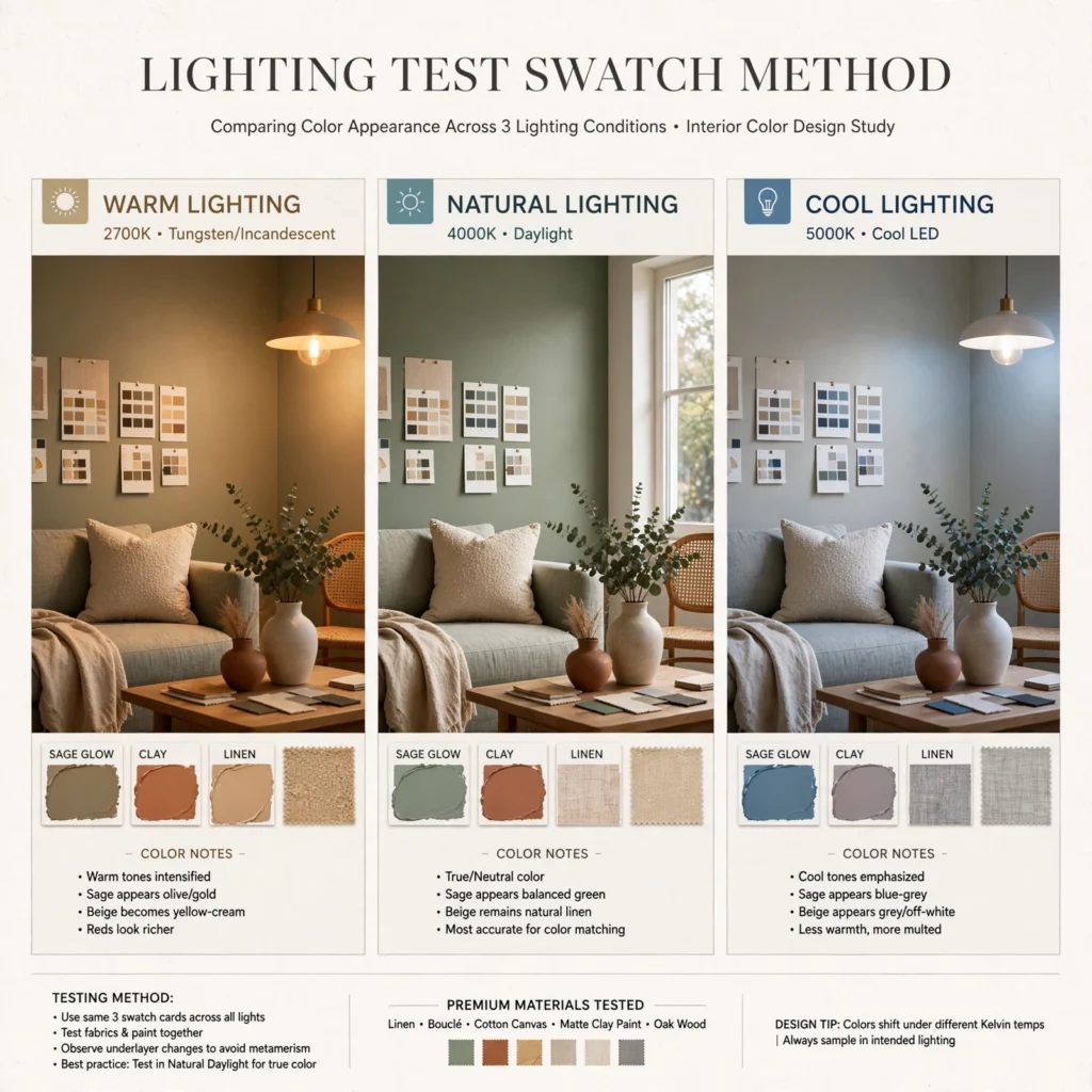
Painting large sample squares, at least two feet by two feet, directly on the wall and observing them at multiple points throughout the day reveals how a color shifts under changing natural and artificial light, which a small paint chip or digital swatch cannot predict accurately. Check the sample in morning light, midday light, and again after dark with the room’s actual light fixtures on, since a color that reads as a soft gray in daylight can shift distinctly blue or purple under warm incandescent lighting.
| Time of Day | Light Source | What to Check |
| Morning | Natural, cooler | True undertone visibility |
| Midday | Natural, neutral | Most accurate baseline read |
| Evening | Artificial, warm | Shift under room’s actual bulbs |
13. Accent Color Ratio Planning
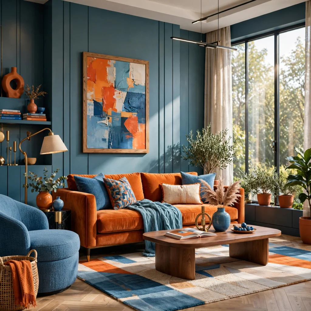
Deciding the exact proportion of an accent color before shopping, rather than adding accent pieces reactively as they’re found, keeps a palette from becoming accidentally overloaded with a color meant to stay minimal. Set a target, such as limiting a bold accent color to no more than three or four objects in a room, and track those instances as you shop, since accent colors are the most common element to unintentionally multiply past their intended visual weight in a finished space.
Shop the Look
A few specific tools make these color palette design methods easier to execute well. Coolors and Adobe Color are reliable free digital palette generator tools for exploring complementary, analogous, and triadic schemes quickly. Samplize offers peel-and-stick, large-format paint swatches that work better for the lighting test method than small paint chips. Benjamin Moore’s in-store color wheel tool is a useful physical reference for undertone matching. For fabric layering, ordering swatch memo sets directly from retailers like Kravet or Schumacher provides accurate color and texture samples before committing to yardage.
Common Mistake to Avoid
The most common mistake in color palette design is finalizing a palette based on how it looks in a digital tool or under store lighting without testing it physically in the actual room’s natural and artificial light. A palette that reads as perfectly balanced on a screen or a small paint chip can shift noticeably once applied at full scale, particularly with colors that have subtle undertones. Always move from digital or small-scale testing to a large physical sample in the actual space before finalizing any palette decision.
People Also Ask
What is the easiest color palette design method for beginners?
An analogous scheme, using three colors positioned next to each other on the color wheel, is generally the easiest method for beginners because the built-in harmony between adjacent hues makes clashing far less likely than with higher-contrast schemes like complementary or triadic pairings. Pairing this method with the 60-30-10 ratio rule gives a straightforward, repeatable formula that reliably produces a balanced result without requiring deep color theory knowledge.
How do I use the color wheel to design a palette?
Start by choosing a single base color, then use the color wheel to identify related hues based on the scheme type you want: directly opposite for complementary contrast, adjacent for analogous harmony, or evenly spaced for a triadic scheme. Most digital color wheel tools will calculate these relationships automatically once you input a starting hex code, removing the need to manually count degrees around a physical wheel.
What is the 60-30-10 rule in color palette design?
The 60-30-10 rule divides a room’s color scheme into three proportions: 60% dominant color typically applied to walls and large surfaces, 30% secondary color applied to medium-sized elements like furniture upholstery, and 10% accent color reserved for small details like pillows or art. This ratio prevents any single color from either overwhelming a space or getting lost, and it remains one of the most widely used starting frameworks in professional color palette design.
How many colors should a well-designed palette include?
Most successful color palettes include three to five colors total: one dominant tone, one or two secondary tones, and a single accent color. Palettes built from color theory methods like analogous or triadic schemes naturally land within this range, since going beyond five colors typically requires more careful ratio planning to avoid the palette feeling scattered or difficult to apply consistently across a room’s surfaces.
Why does a color palette look different on screen versus in person?
Screens display color using emitted light through red, green, and blue pixels, while physical materials like paint and fabric reflect light and are affected by the room’s actual light sources, which is why a palette that looks correct in a digital tool can shift noticeably once applied physically. This is also why undertones become more apparent in person, since natural and artificial light reveal warm or cool undertones that a backlit screen often doesn’t accurately represent.
Conclusion
These thirteen color palette design ideas show that a balanced scheme comes down to following a repeatable method, whether that’s a defined ratio like 60-30-10 or a color wheel relationship like analogous or complementary, rather than choosing colors purely by instinct. Start with one method, test it physically under your room’s actual lighting, and refine from there before finalizing paint or fabric orders. If this guide helped, save it to Pinterest for your next design project, or check out our related post on color palette ideas for specific combinations built using these same methods.