
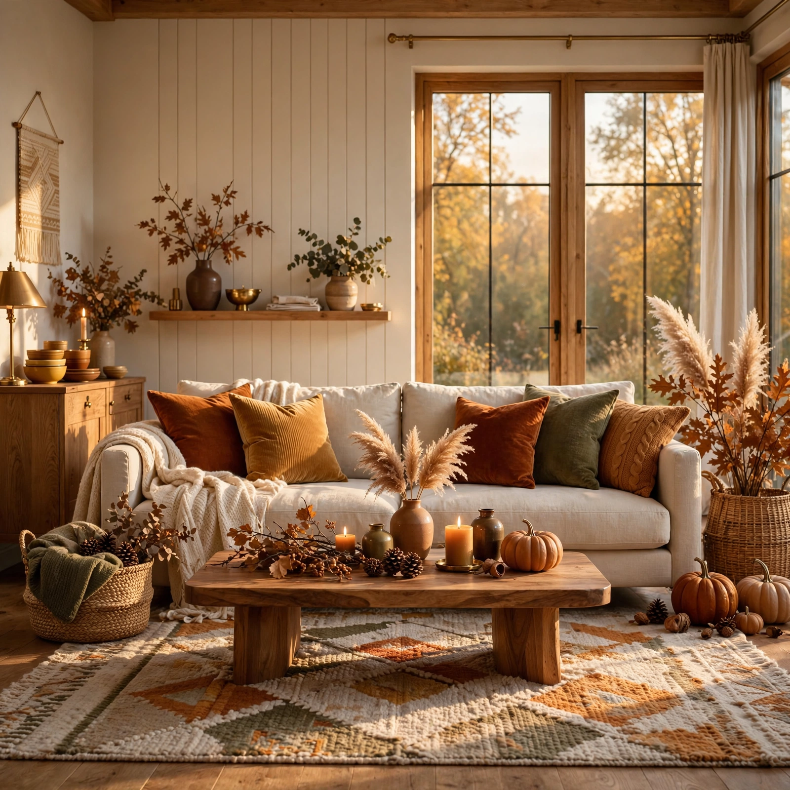
15 Trendy Modern Living Room Color Palette Ideas to Transform Your Home
Choosing the right color palette can make or break how a living room feels day to day, yet most homeowners default to whatever shade is trending on social media without considering their own light, furniture, or lifestyle. This guide walks through fifteen distinct color palette combinations, each built around real paint names, fabric pairings, and accent materials so you can picture the result before committing. By the end, you’ll have a shortlist ready to test in your own space.
Trend & Background
Interior color trends have shifted noticeably away from the all-white, all-gray interiors that dominated the last decade. Homeowners are now gravitating toward warmer, more saturated tones like terracotta, olive, and burgundy, paired with natural materials such as walnut, rattan, and brass. This shift matters now because paint and fabric costs have risen, making a well-chosen palette a longer-term investment rather than a seasonal refresh. Getting the combination right the first time saves both money and the hassle of repainting within a year or two.
Key Takeaways
- A well-planned color palette anchors furniture, lighting, and textiles into one cohesive room instead of a collection of mismatched pieces.
- Warm neutrals, earthy tones, and jewel accents remain the most reliable starting points for 2026 living rooms.
- Pairing two or three dominant hues with a metal or wood accent keeps a palette from feeling flat or dated.
- Testing paint swatches under real lighting conditions prevents the most common and costly color mistakes.
1. Warm Terracotta and Cream
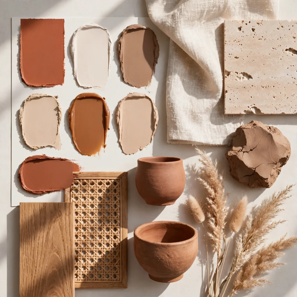
Terracotta walls or accent furniture paired with cream upholstery create a grounded, sun-warmed living room that feels inviting without leaning rustic or dated. This combination works especially well in rooms with southern or western light, where the orange undertone in terracotta glows rather than overwhelms. To execute it, keep terracotta to one or two surfaces, such as a feature wall or a set of dining chairs, and let cream dominate the sofa, rug, and drapery for balance.
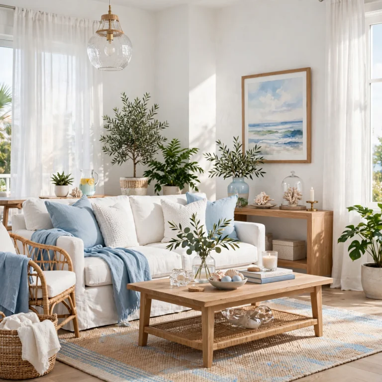
2. Coastal Blue and Driftwood
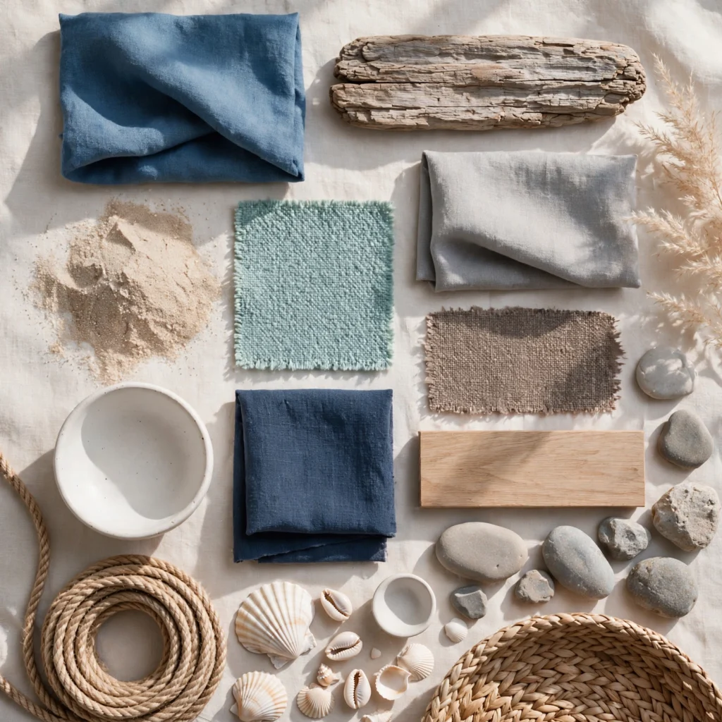
Coastal blue, a soft mid-tone somewhere between denim and slate, paired with driftwood-finished wood furniture brings a relaxed, breezy quality to a living room without resorting to literal nautical decor. This palette suits rooms with abundant natural light and works particularly well in open-concept spaces where it can visually connect to an adjacent kitchen. Use the blue on walls or a large sectional, and let driftwood tones appear in flooring, coffee tables, or window frames to keep the look grounded.
3. Sage Green and Ivory
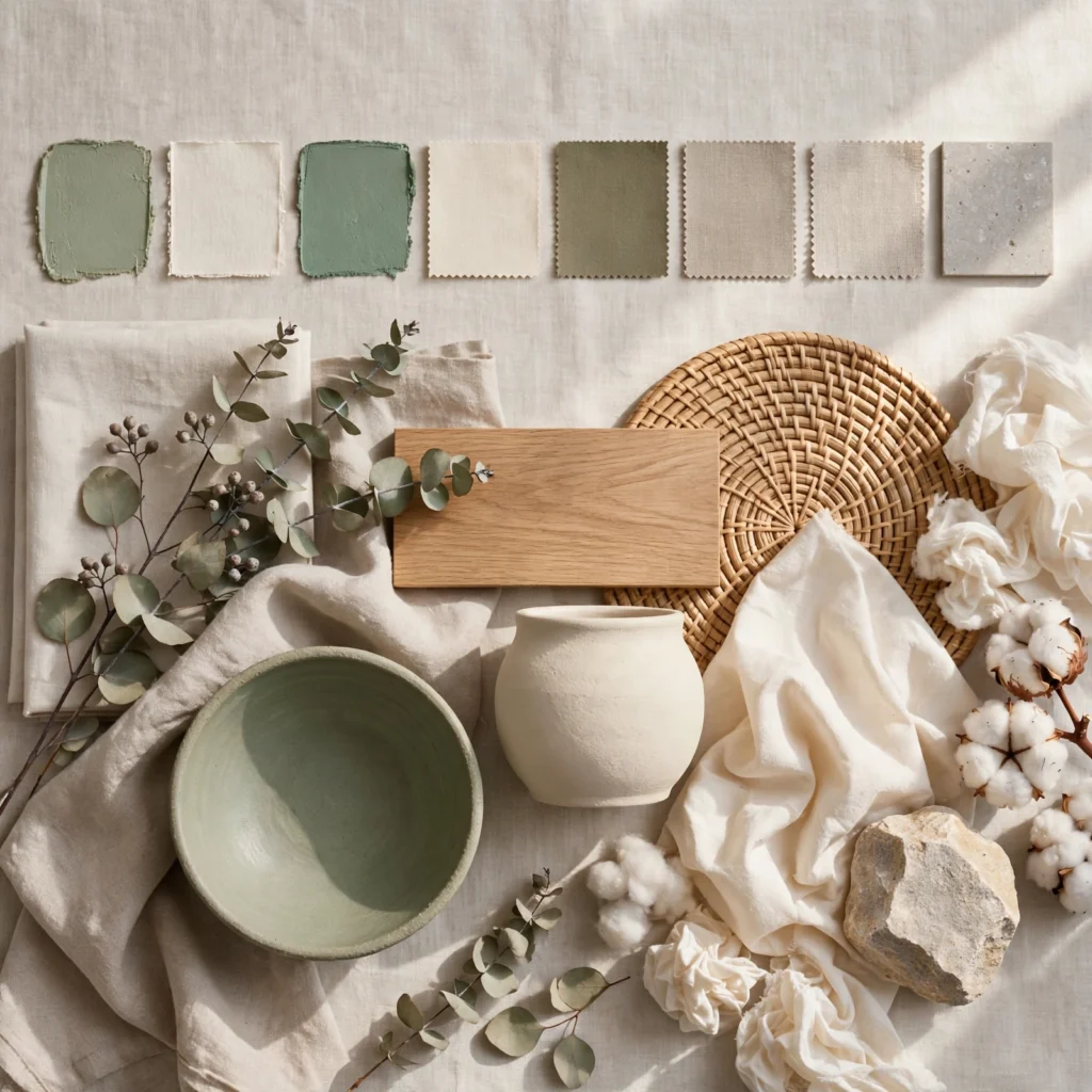
Sage green has become one of the most requested neutrals in living room design because it reads as calm and organic rather than trendy or bold. Paired with ivory trim, curtains, and seating, sage creates a soft backdrop that flatters both cool and warm-toned wood furniture. This palette works in low and high light rooms alike, since sage shifts subtly between gray-green and true green depending on the hour, giving the space a quietly dynamic quality throughout the day.
In order to see more options for modern kitchen design CLICK HERE
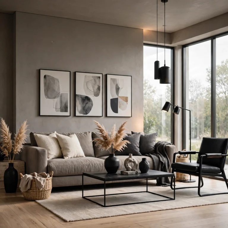
4. Charcoal and Brass
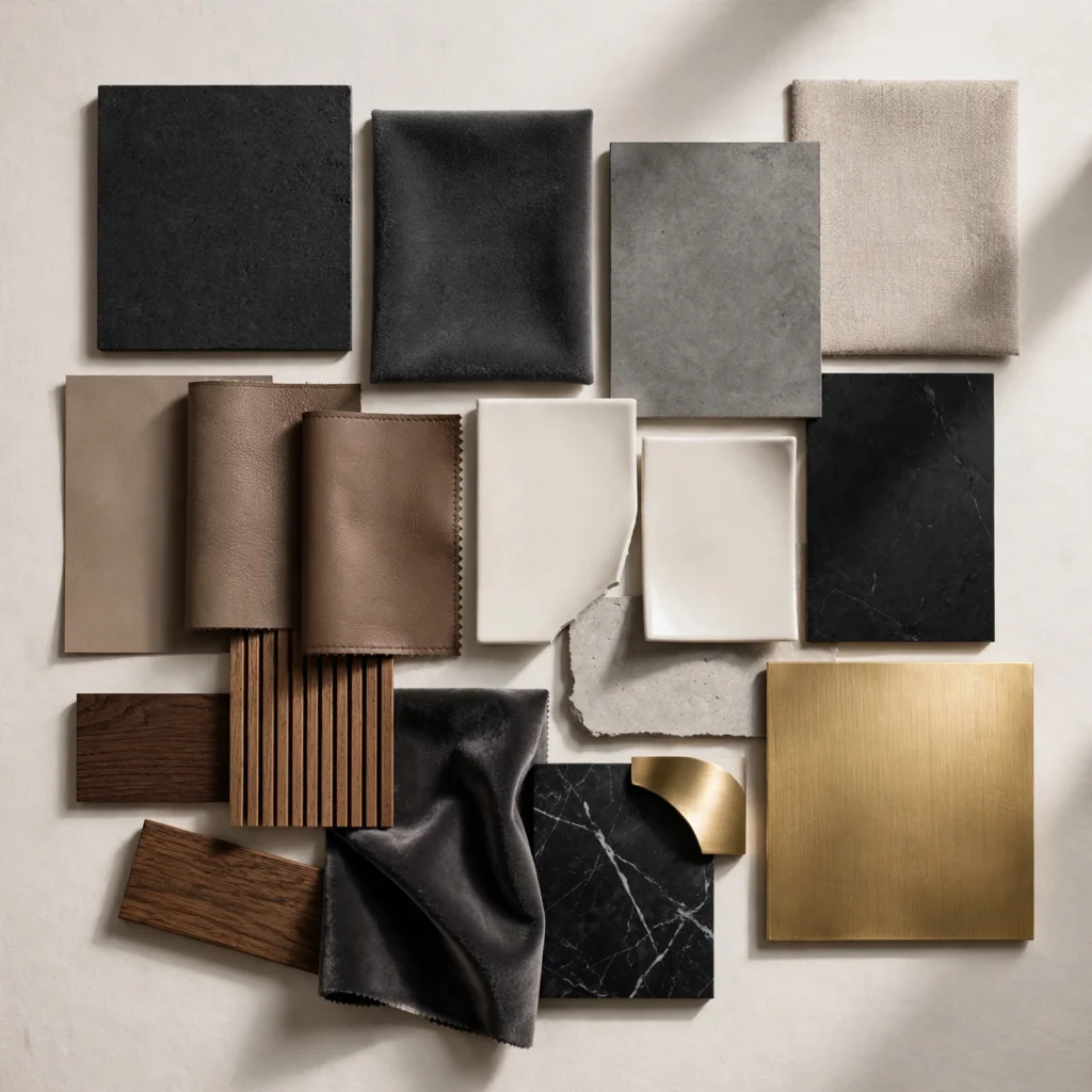
Charcoal walls or a charcoal sectional paired with brass hardware, lighting, and picture frames deliver a moody but polished living room that photographs well and ages gracefully. This combination suits smaller rooms surprisingly well, since charcoal recedes visually while brass catches light and adds sparkle without requiring extra square footage. To execute it, limit brass to fixtures and hardware rather than large furniture pieces, keeping the metal as an accent rather than a competing dominant material.
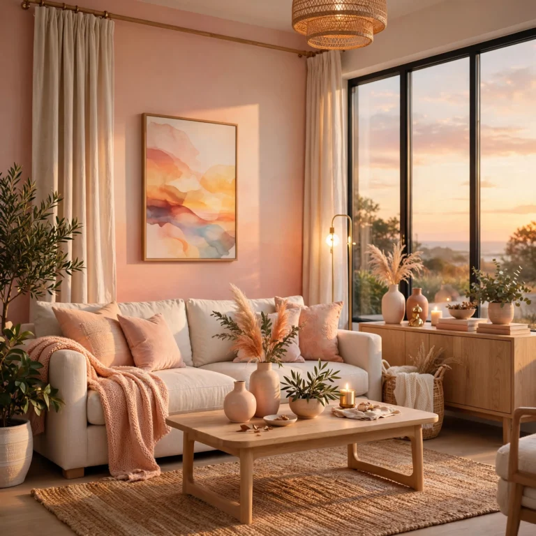
5. Blush Pink and Walnut
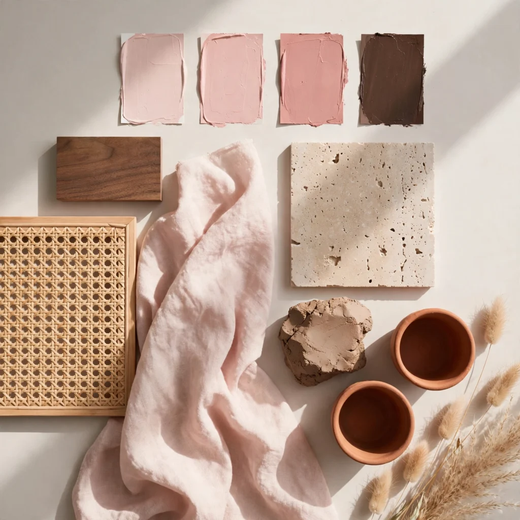
Blush pink, when muted rather than bubblegum-toned, pairs beautifully with rich walnut furniture to create a living room that feels warm, layered, and distinctly grown-up rather than juvenile. This palette works well for smaller apartments or reading nooks where a softer, more intimate mood is the goal. Keep blush to textiles like throw pillows, an accent chair, or drapery, while letting walnut anchor the coffee table, media console, and shelving for structural weight.
6. Deep Navy and Camel
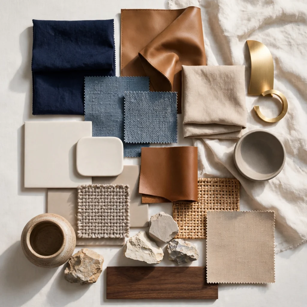
Navy blue walls or a navy sofa paired with camel-colored leather or wool upholstery create a classic, almost menswear-inspired living room that suits both traditional and contemporary furniture styles. This combination reads as timeless rather than trend-driven, making it a strong choice for households not looking to repaint every few years. Execute this by using navy as the darker anchor on walls or large upholstery, with camel appearing in an accent chair, ottoman, or leather-bound coffee table books.
7. Mustard Yellow and Slate Gray
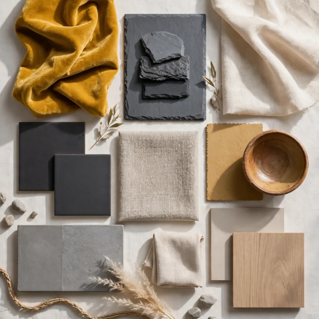
Mustard yellow accents against a slate gray backdrop create contrast and energy without tipping into the overly bright yellow palettes of past decades. This combination works particularly well in living rooms that lack strong natural light, since mustard adds warmth while slate keeps the overall mood sophisticated rather than cold. Use mustard sparingly, on a single accent chair, throw pillows, or artwork, while slate gray takes over walls, rugs, and larger upholstered furniture pieces.
8. Olive and Rust
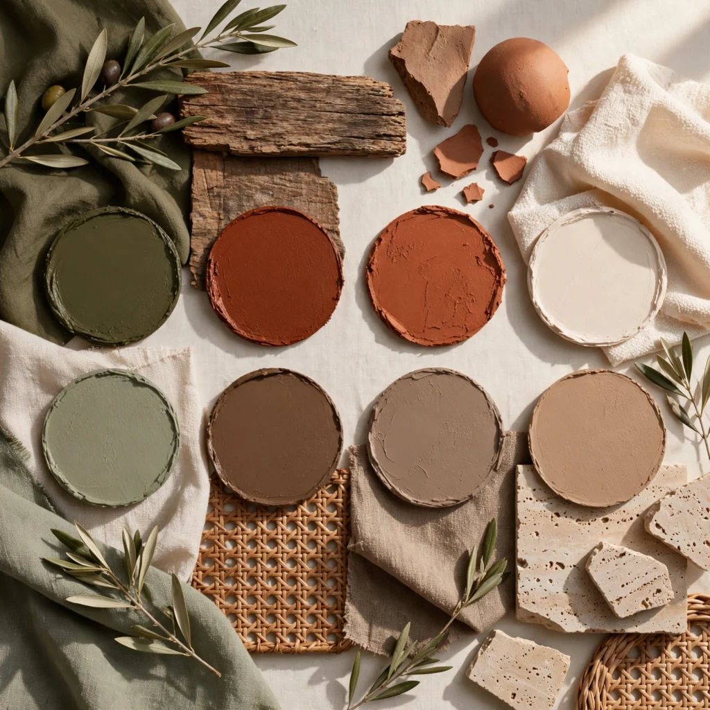
Olive green and rust orange, both deeply saturated earth tones, pair naturally together because they echo the colors found in autumn foliage and clay pottery. This palette suits living rooms with exposed wood beams, brick, or other natural architectural features, since the tones complement rather than compete with raw materials. Apply olive to larger surfaces like walls or a sectional, and reserve rust for smaller accents such as a vase, throw blanket, or single accent wall.
9. Monochrome Greige
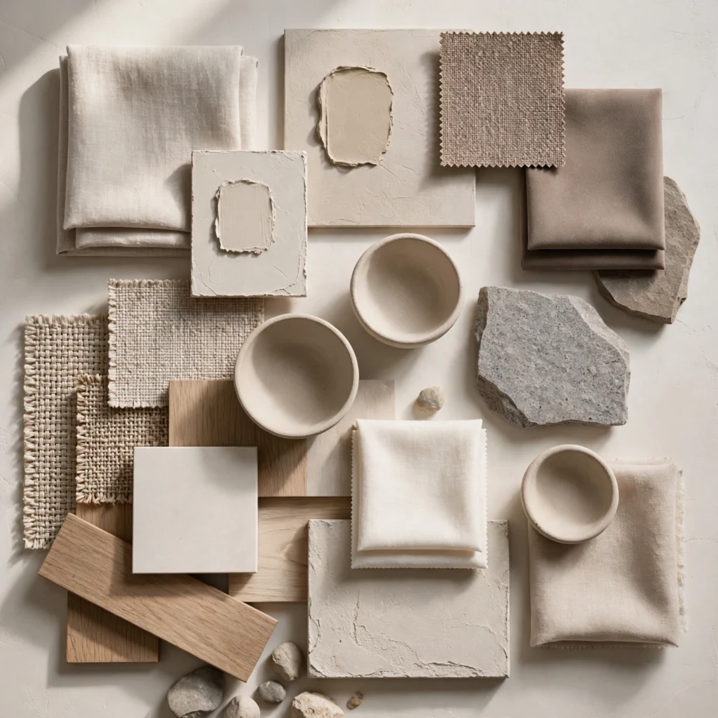
A monochrome greige palette, layering multiple shades of the same gray-beige tone, produces a calm and cohesive living room that works especially well for open floor plans flowing into other rooms. Because greige sits between warm and cool, it pairs with almost any wood tone or metal finish, making it a flexible long-term choice. The table below compares common greige paint options by brand, undertone, and typical price per gallon to help narrow a swatch selection.
| Paint Name | Brand | Undertone | Price per Gallon |
| Accessible Beige | Sherwin-Williams | Warm | $65-$75 |
| Agreeable Gray | Sherwin-Williams | Neutral | $65-$75 |
| Edgecomb Gray | Benjamin Moore | Warm | $70-$80 |
| Repose Gray | Sherwin-Williams | Cool | $65-$75 |
| Balboa Mist | Benjamin Moore | Neutral | $70-$80 |
10. Burgundy and Forest Green
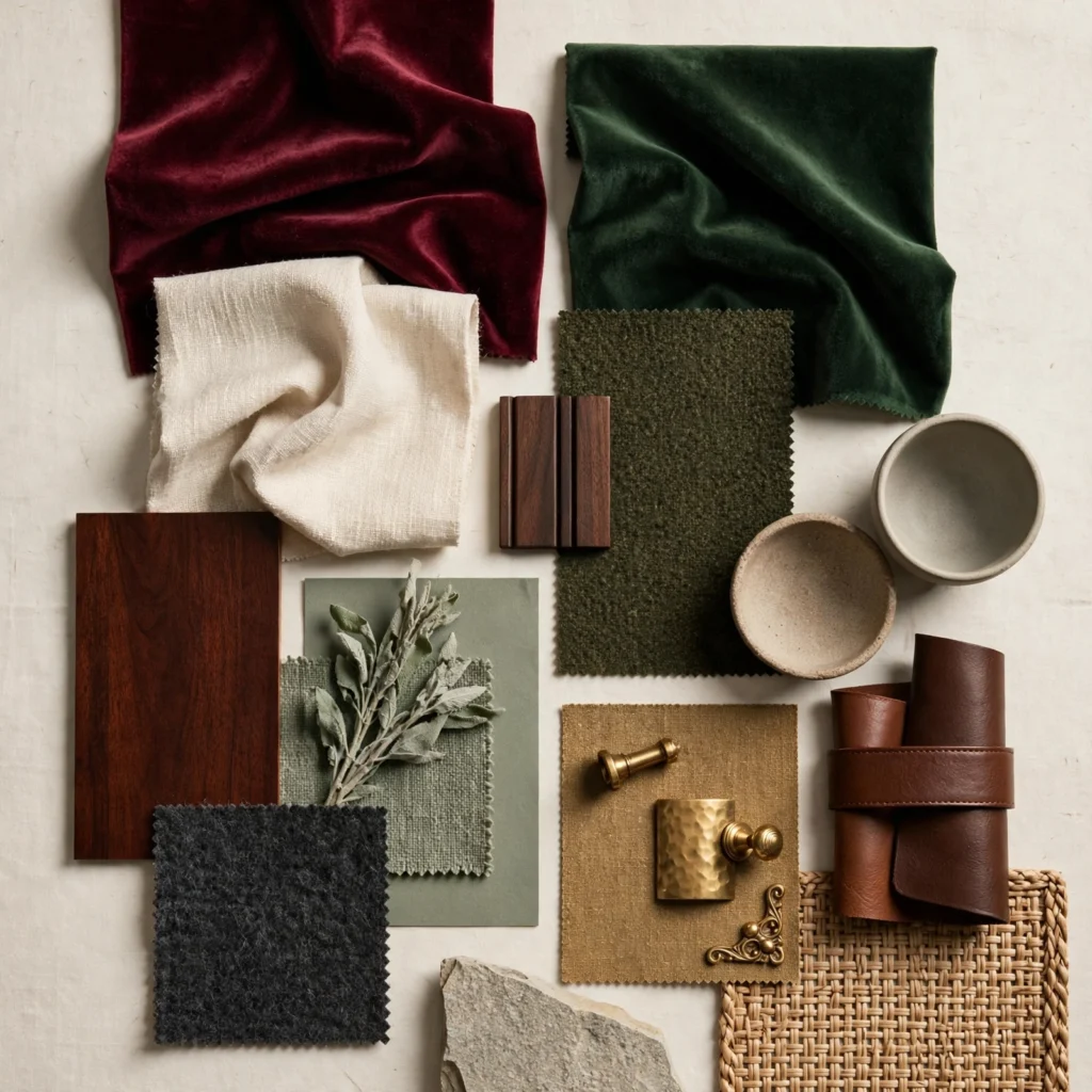
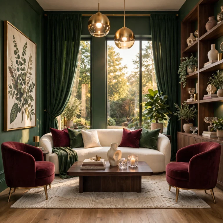
Burgundy and forest green, two deep jewel tones, create a rich, library-inspired living room that feels formal without being sterile or overly traditional. This palette suits rooms with dark wood floors or built-in shelving, since the depth of both colors matches naturally with stained wood. Apply burgundy to a velvet sofa or accent wall, and let forest green appear in drapery, throw pillows, or a secondary armchair to keep the two tones balanced rather than competing for attention.
11. Dusty Lavender and Oatmeal
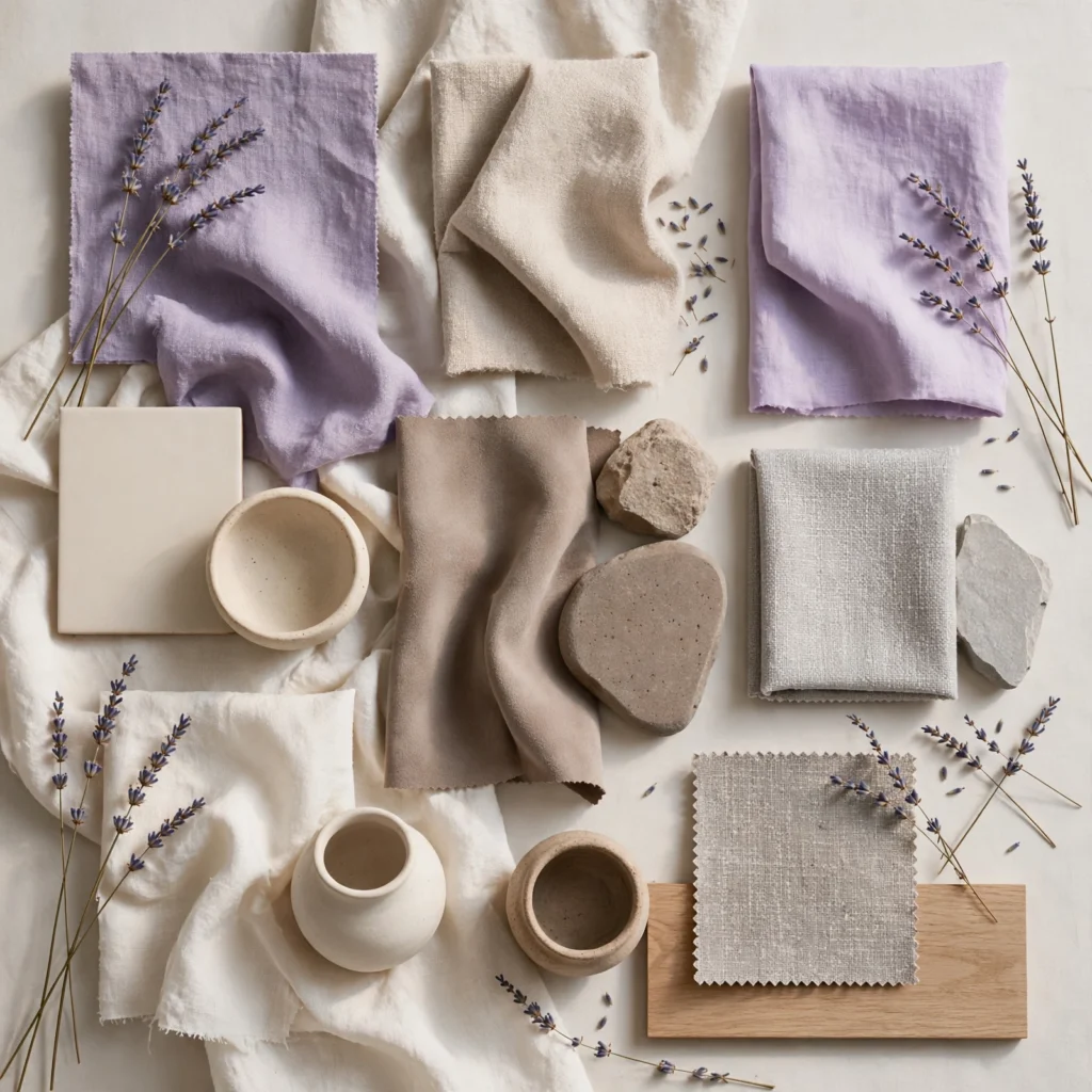
Dusty lavender, a muted purple-gray rather than a true violet, pairs softly with oatmeal-toned linen upholstery to create a living room with a quiet, textural quality. This combination suits rooms used for relaxing or reading rather than high-traffic entertaining spaces, since the palette leans calm rather than energetic. Use lavender on an accent wall or a single upholstered piece, and let oatmeal dominate the rug, drapery, and larger sofa to keep the room from feeling overly saturated.
12. Black and White Contrast
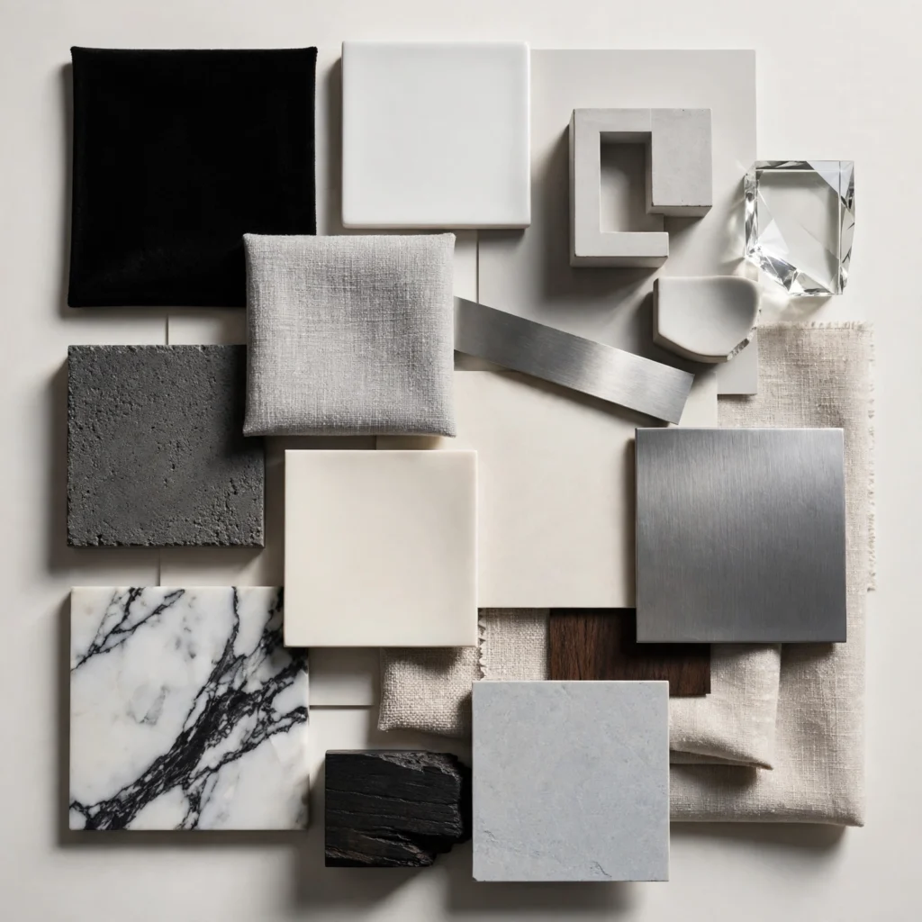
A black and white palette, executed through black window frames, trim, or furniture against white walls, creates sharp architectural definition in a living room without introducing any additional color decisions. This combination suits modern and transitional homes alike and photographs particularly well in real estate listings. Keep black to structural elements like trim, a coffee table, or lighting fixtures, while white dominates walls and larger upholstery, preventing the contrast from feeling too stark or clinical.
13. Earth Tone Clay and Sand
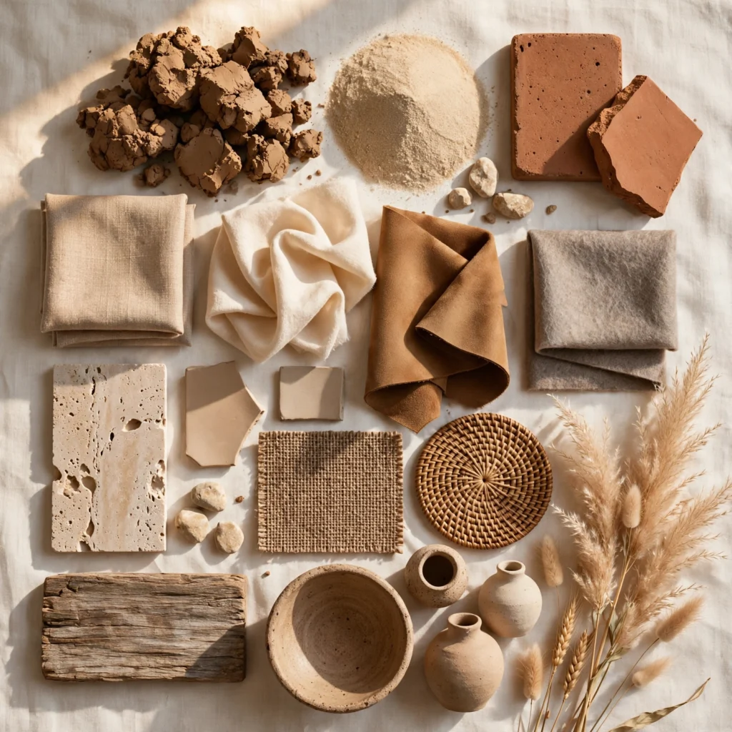
Clay red paired with sand beige produces a warm, Mediterranean-inspired living room palette that works particularly well with plaster walls, woven textures, and terracotta pottery accents. This combination suits homes aiming for a lived-in, travel-inspired aesthetic rather than a polished showroom look. Apply clay to an accent wall or a single upholstered piece, and let sand tones carry through the rug, curtains, and larger seating to keep the palette feeling airy rather than heavy.
14. Teal and Copper
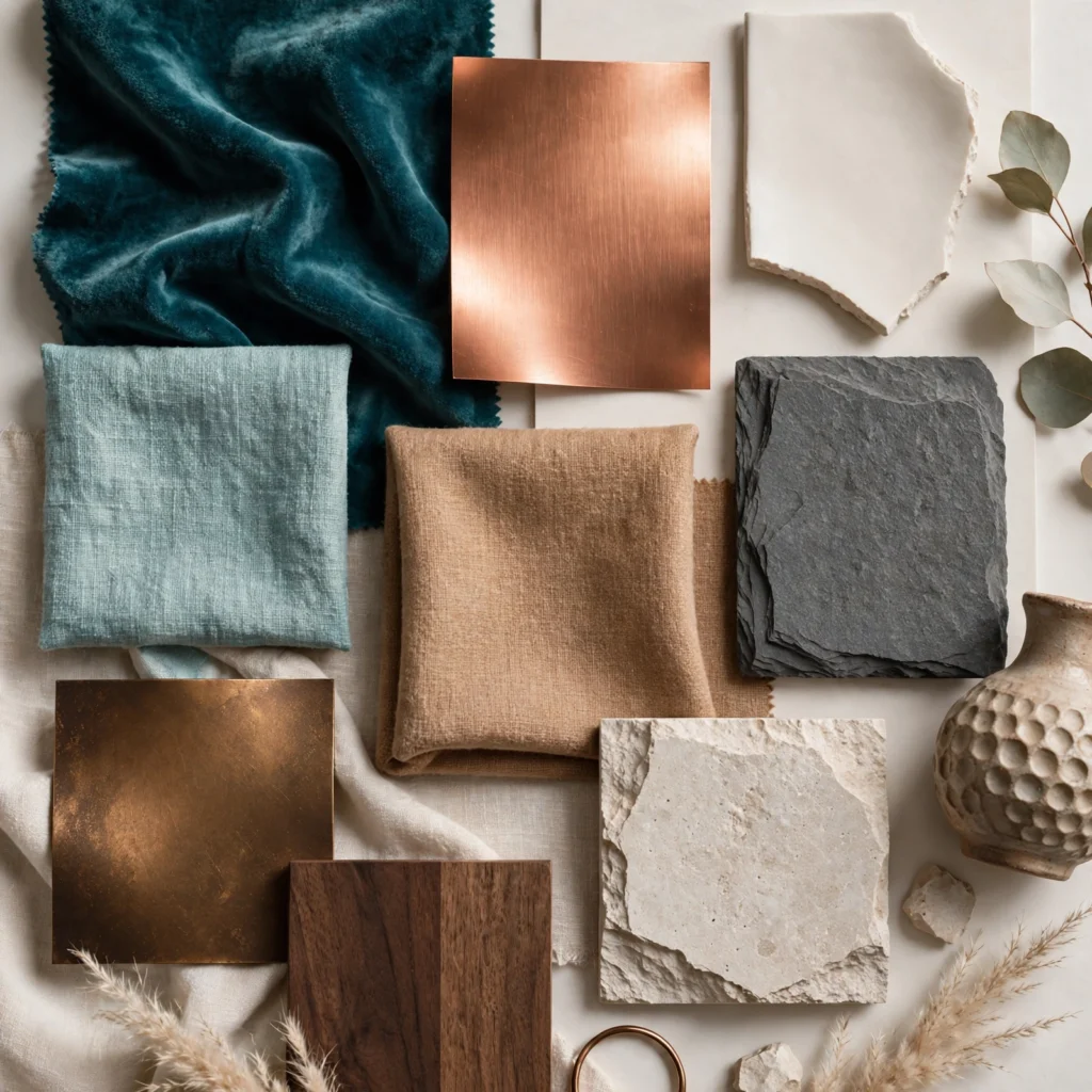
Teal, a deep blue-green, paired with copper metal accents creates a living room palette with strong visual depth and a slightly glamorous edge. This combination works well in rooms with ample artificial lighting, since copper reflects light and adds warmth to counterbalance teal’s coolness. Use teal on a velvet sofa, accent wall, or drapery, and reserve copper for lighting fixtures, picture frames, or a drink cart to keep the metal accent intentional rather than overwhelming.
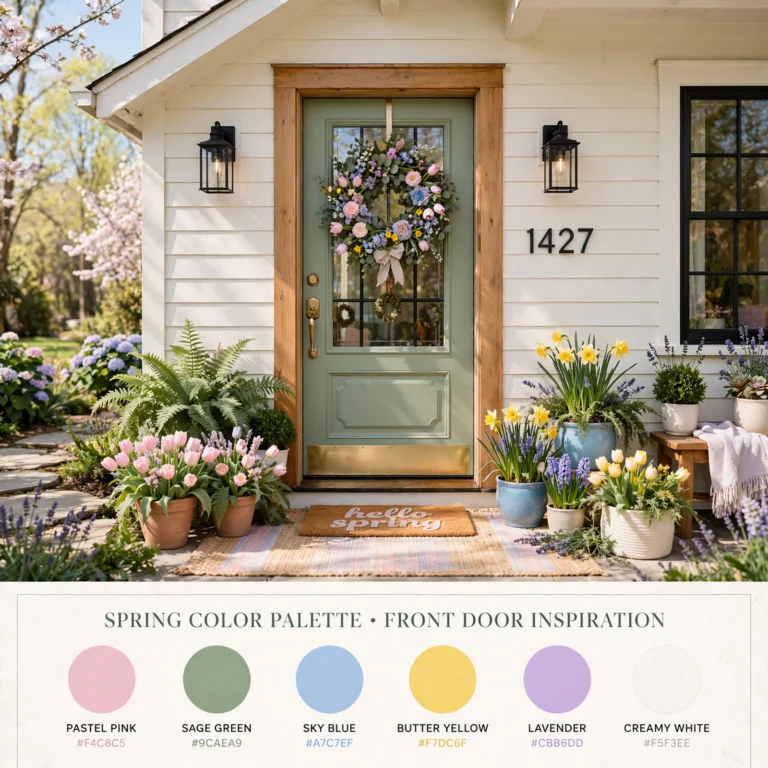
15. Soft Pastel Multicolor
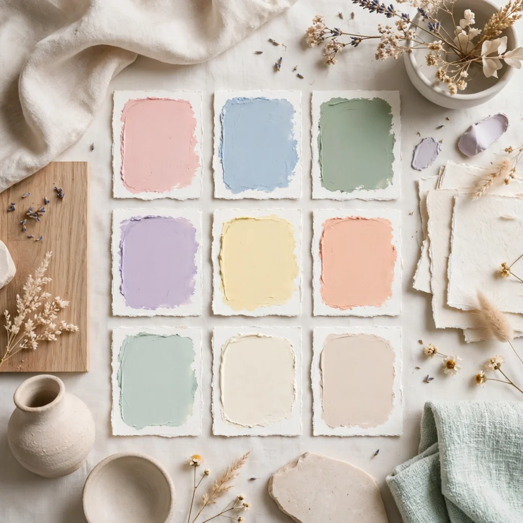
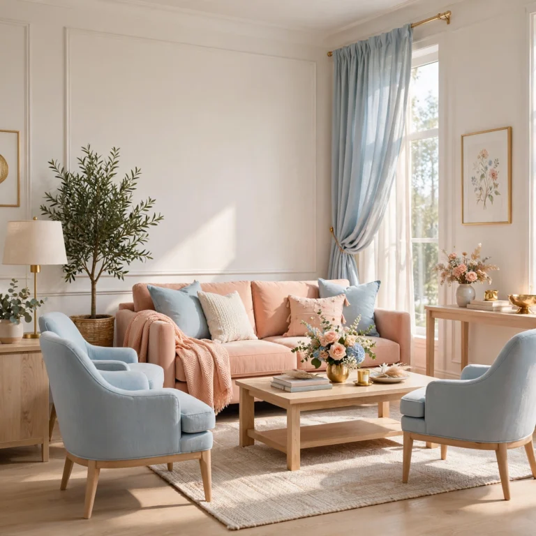
A soft pastel multicolor palette, mixing muted blush, sage, and powder blue in small doses, creates a gentle, collected living room look without requiring a single dominant color choice. This palette suits eclectic or maximalist-leaning homes that want variety without visual chaos. Keep the base walls and largest furniture piece in a neutral tone, then introduce each pastel through smaller items like throw pillows, artwork, or a single accent chair to maintain overall balance.
Shop the Look
For a warm terracotta and cream palette, look for a boiled wool throw in cream, a set of terracotta ceramic vases, and a linen sofa slipcover in a matching neutral. For the charcoal and brass combination, a brass-finished arc floor lamp, a charcoal bouclé accent chair, and brass picture ledges complete the look. Those leaning toward navy and camel can start with a camel leather ottoman, a navy wool area rug, and brass-trimmed coffee table books for texture.
Common Mistake to Avoid
The most common mistake homeowners make is choosing a paint color from a small swatch or a photo online without testing it on their actual walls under both daytime and evening lighting. A color that reads as a soft sage on a screen can shift dramatically toward gray or yellow depending on north-facing versus south-facing light, existing trim color, and the temperature of nearby light bulbs. Painting a large sample board and moving it around the room for several days prevents costly repainting later.
Common Mistake to Avoid
What is the most popular color palette for living rooms right now?
Warm neutrals paired with earthy accent tones, such as terracotta, olive, and clay, are currently the most requested combinations among homeowners and designers alike. This shift moves away from the cooler grays and stark whites that dominated the previous decade, favoring instead colors that feel grounded and connected to natural materials like wood, stone, and woven textiles throughout the living space.
How many colors should a living room palette include?
Most successful living room palettes rely on two to three main colors, typically one dominant neutral, one secondary color, and one accent tone carried through metal finishes or smaller decor pieces. Sticking to this range keeps a room feeling intentional rather than chaotic, while still allowing enough variation across walls, furniture, and textiles to create visual interest and depth throughout the space.
Does a small living room need a lighter color palette?
Not necessarily, since darker palettes like charcoal and brass can actually make a small room feel more intentional and cozy rather than cramped, especially when paired with good lighting and reflective metal accents. The key factor is contrast and lighting rather than color depth alone, so a well-lit dark room often reads as more sophisticated than a poorly lit light one.
How do I choose a color palette that matches my existing furniture?
Start by identifying the undertone of your largest furniture piece, typically the sofa, and build the wall color and accents around that undertone rather than fighting against it. Warm wood tones like walnut pair naturally with terracotta, mustard, or camel, while cooler wood tones like ash or gray oak pair better with sage, navy, or charcoal-based palettes.
Should ceiling color match the wall color palette?
Ceilings are traditionally painted a lighter tint of the wall color or a simple off-white, though painting a ceiling the same saturated tone as the walls has become a popular technique for making a room feel enveloping and cozy. This approach works particularly well with jewel tones like navy or forest green in rooms with lower ceiling heights.
Conclusion
A thoughtful color palette turns a living room from a random assortment of furniture into a space that feels finished and intentional, and any of these fifteen combinations offers a solid starting point depending on your lighting, existing furniture, and personal style. Save this guide to Pinterest for reference while shopping swatches, and check out our related post on choosing the right paint sheen for high-traffic rooms.
One Comment
Comments are closed.