15 Stylish Timeless Blue Color Palette Ideas for Designers and Creators
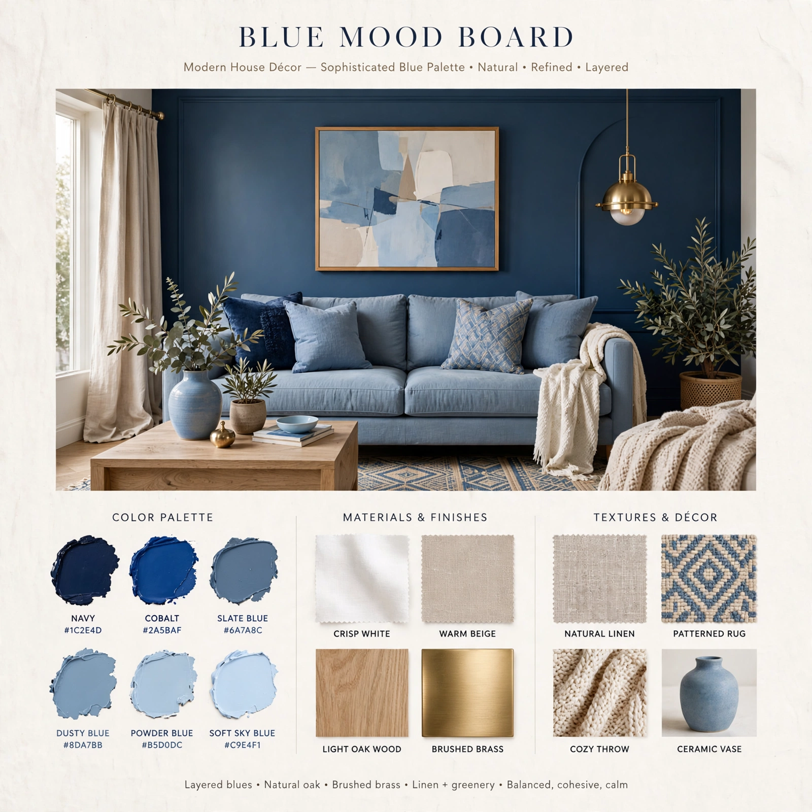
Blue is one of the most versatile colors to build a palette around, but it’s also one of the easiest to get wrong, since a shade that reads calm and coastal in one light can look flat or cold in another. This guide breaks down fifteen distinct blue color palette combinations, from muted dusty tones to bold navy and jewel-toned pairings, each with real hex codes and pairing notes so you can move straight from inspiration to an actual paint can, fabric swatch, or design file. Whether you’re working on a room, a brand, or a single accent piece, there’s a palette here built around a specific mood and setting.
Trend & Background
Blue has moved beyond the flat, single-note navy or sky blue combinations that dominated interiors and branding for years, expanding into deeper teal-adjacent tones, near-neutral dusty blues, and richer combinations paired with warm metals like brass and terracotta. This shift mirrors a broader move toward palettes with more complexity and warmth built in, even within a fundamentally cool color family. Understanding undertone, whether a blue leans slightly green, slightly gray, or slightly violet, matters more now than ever, since mixing undertones within the same palette is one of the fastest ways for a combination to feel accidentally mismatched.
Key Takeaways
- Fifteen palettes ranging from soft, muted neutrals to bold, saturated combinations for interiors, branding, and design work
- Hex codes are included for every palette so you can pull exact colors into paint, print, or digital projects
- Reference tables cover undertone pairing and lighting considerations so a palette reads correctly in the final space
- Five FAQs cover which blues work with which metals, undertones, and small spaces
1. Dusty Blue Neutral Palette
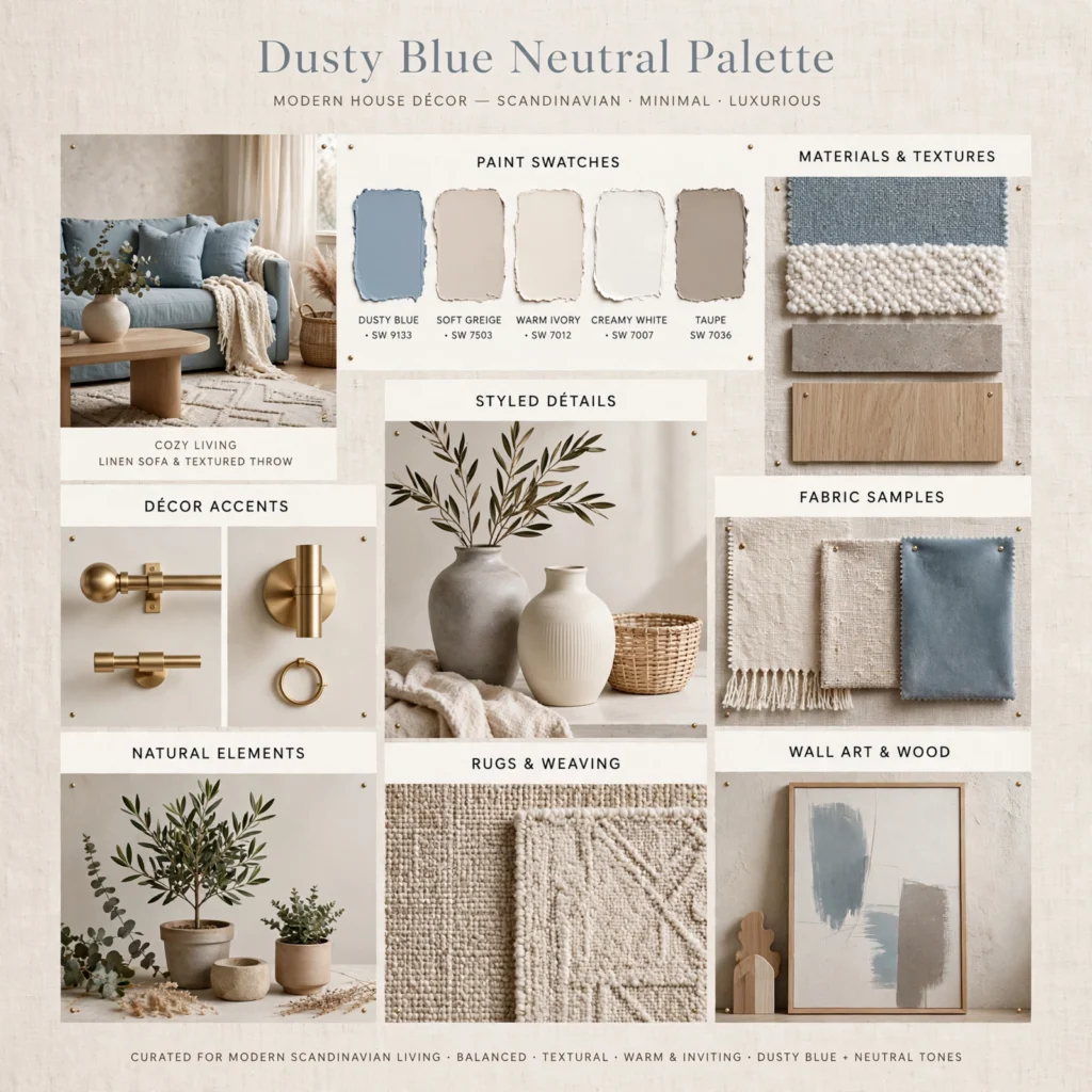
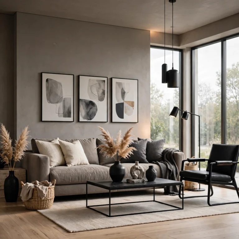
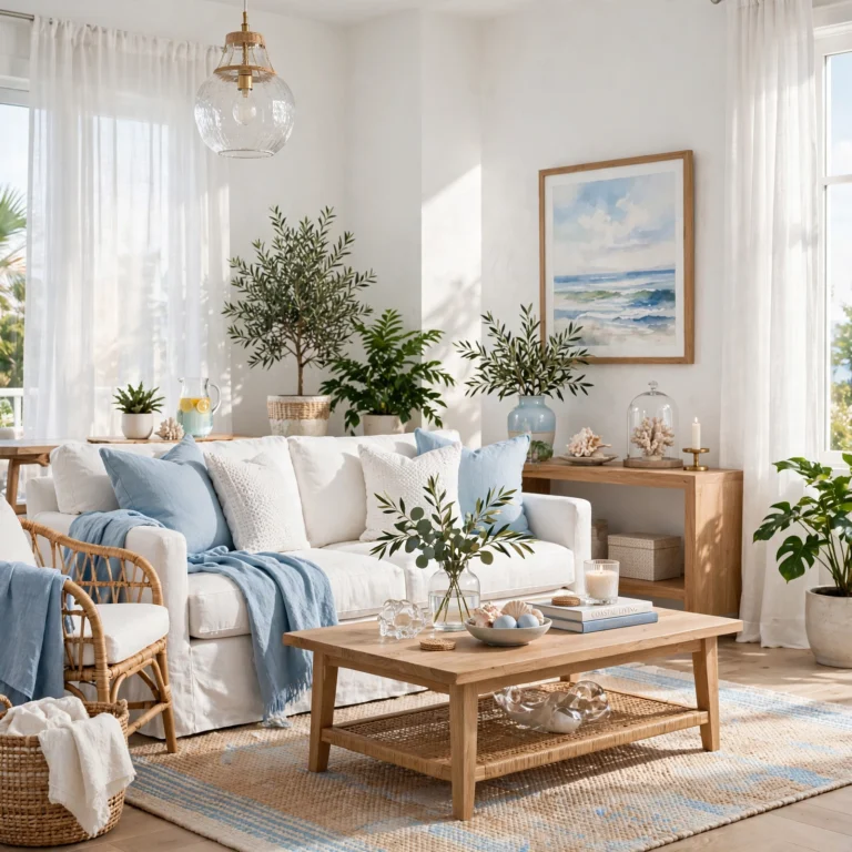
Dusty blue pairs a muted, slightly grayed blue with warm neutrals like sand and taupe, creating a palette soft enough to use as a wall color without feeling cold or overly saturated. This combination works especially well in bedrooms and living rooms, since the grayed-down blue reads closer to a neutral than a bold color statement. Pair dusty blue with warm wood tones and brushed brass rather than cool metals like chrome, since the warmth in both elements balances the blue’s natural coolness rather than reinforcing it.
| Color | Hex Code | Role |
| Dusty Blue | #7C93A3 | Primary |
| Warm Sand | #D9C7B8 | Secondary |
| Soft Taupe | #A89A8C | Accent |
| Warm White | #F5EFE9 | Base |
2. Classic Navy and White Palette
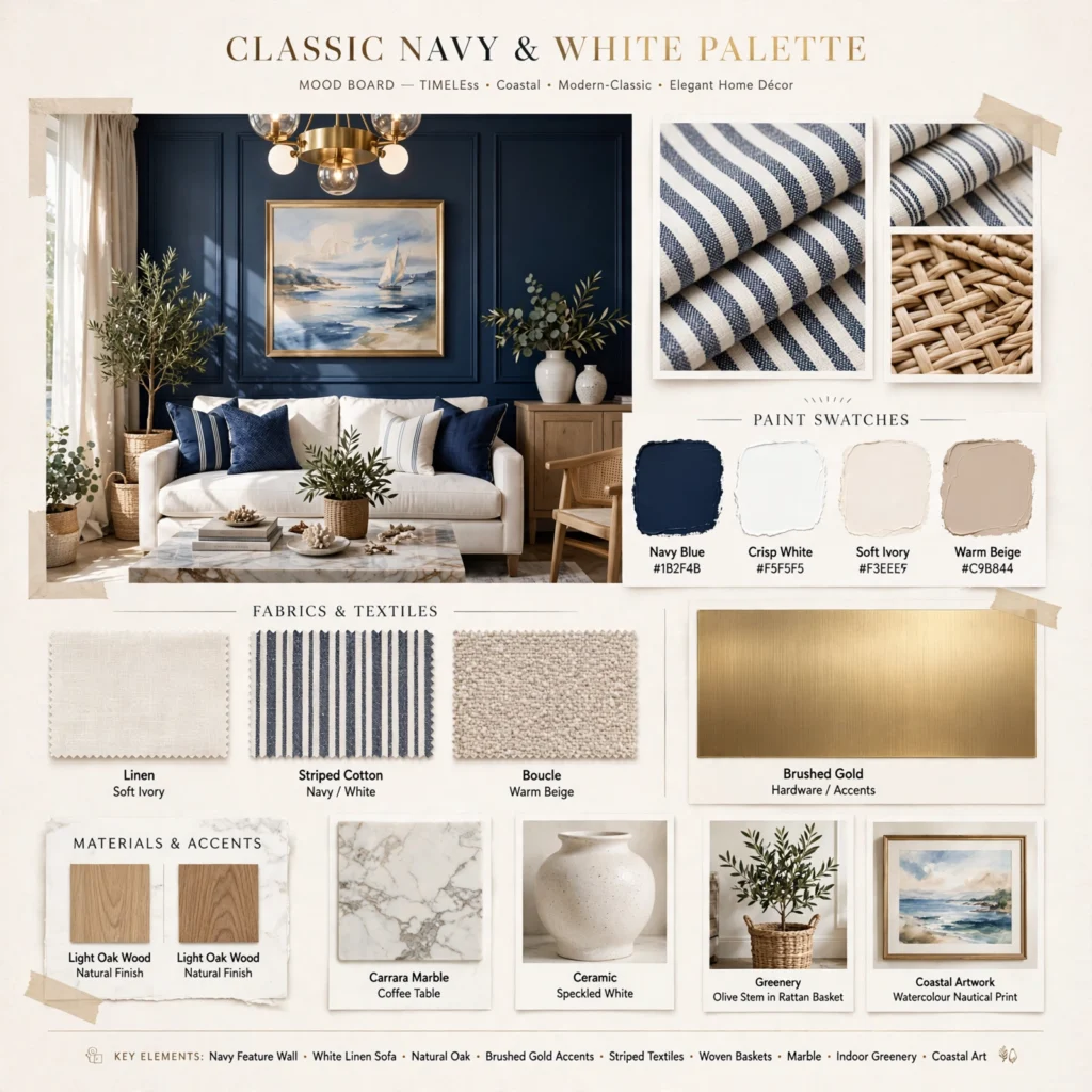
Navy paired with a crisp white remains one of the most enduring blue color palette combinations, since the high contrast reads as clean and traditional without leaning into anything trend-driven. This combination suits a coastal-adjacent living room, exterior trim, or a brand wanting a timeless, trustworthy feel rather than a bold statement. Keep white as the larger base and use navy in roughly a third of the composition, since too much navy across large surfaces can start to feel heavy rather than crisp.
In order to see more options for color palette CLICK HERE
3. Teal and Coral Palette
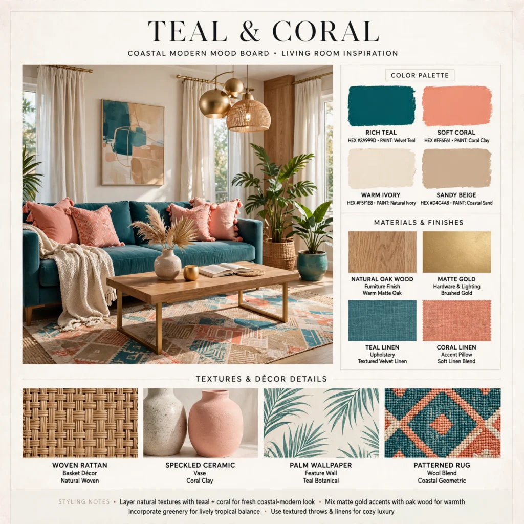
Pairing a saturated teal with a warm coral creates a palette with real energy, using complementary contrast to make both colors read more vivid than either would alone. This combination works especially well in a living room, a hospitality-adjacent brand, or a statement piece of furniture wanting to feel lively rather than restrained. Balance the ratio toward teal as the dominant color, using coral in smaller accents like pillows or signage details, since two equally saturated complementary colors at full strength can compete rather than complement each other.
4. Powder Blue and Cream Palette
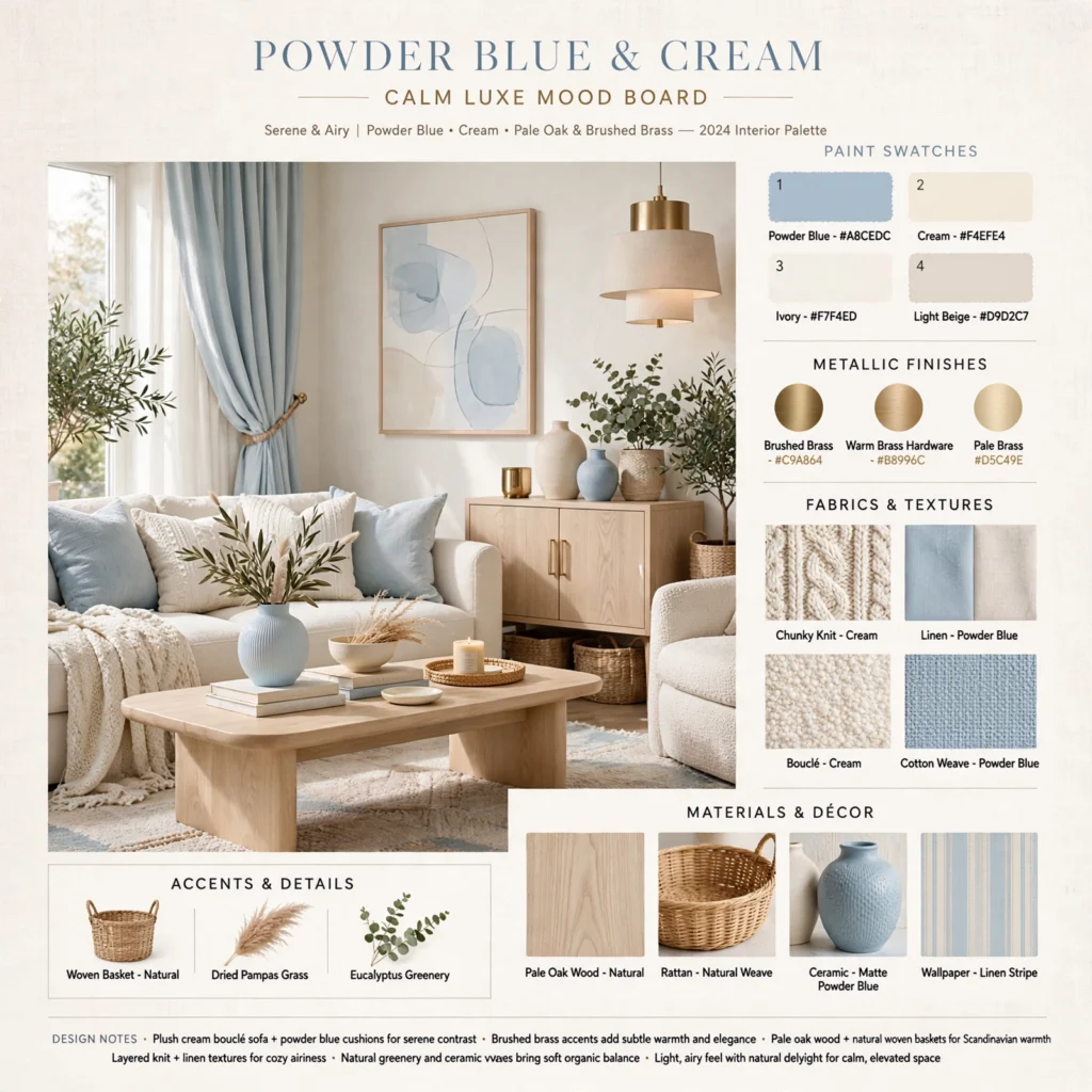
Powder blue paired with cream and a soft warm white creates one of the gentlest blue palettes available, close enough to neutral that it works in spaces wanting softness without an obvious color statement. This combination suits a nursery, bathroom, or bedroom where a barely-there wash of color feels more appropriate than a bold accent. Layer in varied textures, linen, boucle, and a matte ceramic finish, since a palette this close to neutral relies on texture rather than contrast to stay visually interesting.
5. Cobalt and Mustard Palette
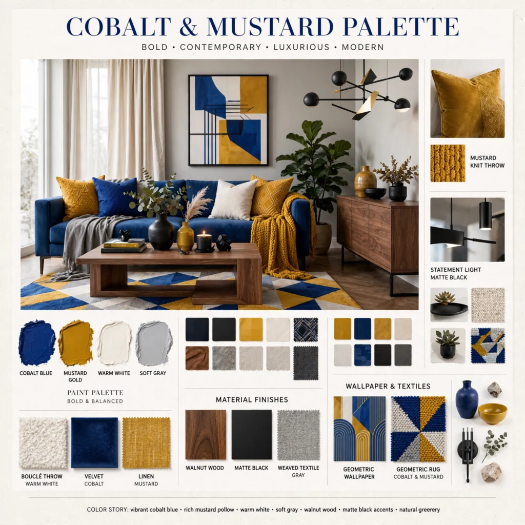
A cobalt blue paired with mustard yellow produces a bold, eclectic palette that trades the calm most blue combinations aim for in favor of real visual energy. This pairing works especially well in a dining room, kitchen, or a brand wanting to feel confident and distinct from softer, more muted competitors. Keep the mustard to smaller accents rather than large surfaces, since cobalt carries enough visual weight to remain the clear dominant color, with mustard functioning as a sharp, warm counterpoint rather than an equal partner.
6. Slate Blue and Charcoal Palette
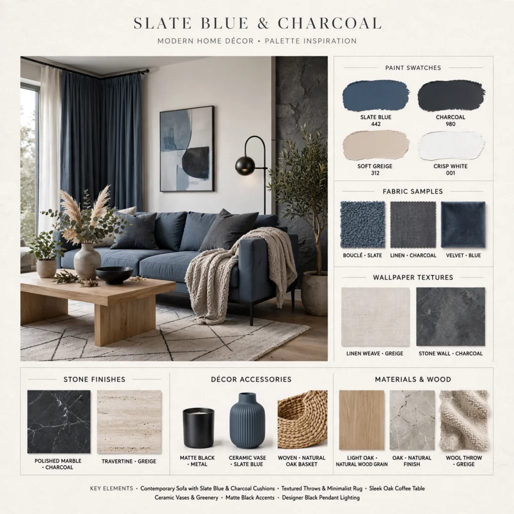
Pairing a deep, slightly gray slate blue with charcoal creates a palette with far more visual weight than a typical soft blue combination, making it suitable for a bedroom or home office wanting a moodier, more grown-up feel. Use slate blue as the dominant wall or upholstery color and reserve charcoal for trim, frames, or a single accent piece so the darker tone grounds the space without overwhelming it. Matte black hardware and fixtures complete this palette better than polished or warm metals.
7. Sky Blue and Blush Palette
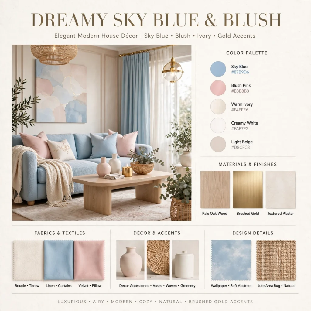
A soft sky blue paired with a gentle blush pink creates an unexpected, playful combination that works well without leaning into anything overly gendered or literal. This palette suits a nursery, a home office, or a brand wanting a light, cheerful feel rather than a bold statement. Keep sky blue as the larger, calmer base color and use blush in smaller accents, since the pink can otherwise pull the overall palette toward feeling too soft or one-note without a clear color hierarchy in place.
| Color | Hex Code | Role |
| Sky Blue | #A9C6DB | Primary |
| Soft Blush | #E8C4BE | Accent |
| Warm White | #FBF8F1 | Base |
| Warm Gray | #A99B8B | Secondary |
8. Deep Ocean and Gold Palette
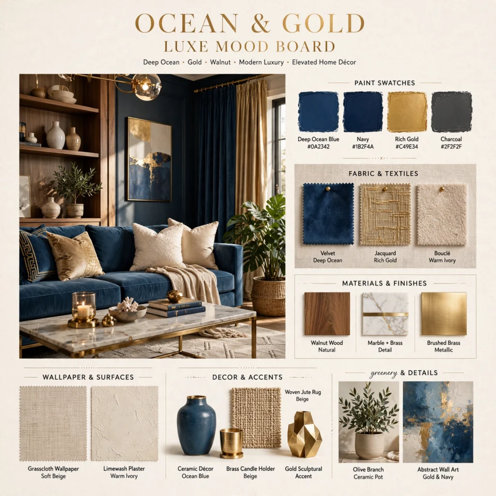
Combining a deep, near-navy ocean blue with warm gold accents produces an elevated, evening-appropriate blue color palette, suited to a formal dining space, a hospitality brand, or a statement piece of furniture. Keep gold to metallic accents, hardware, and small detail work rather than large painted surfaces, since a metallic finish loses its impact when overused across an entire room. This palette works especially well under warm evening lighting, where the gold picks up additional warmth and the deep blue reads as rich rather than simply dark.
9. Periwinkle and Lavender Palette
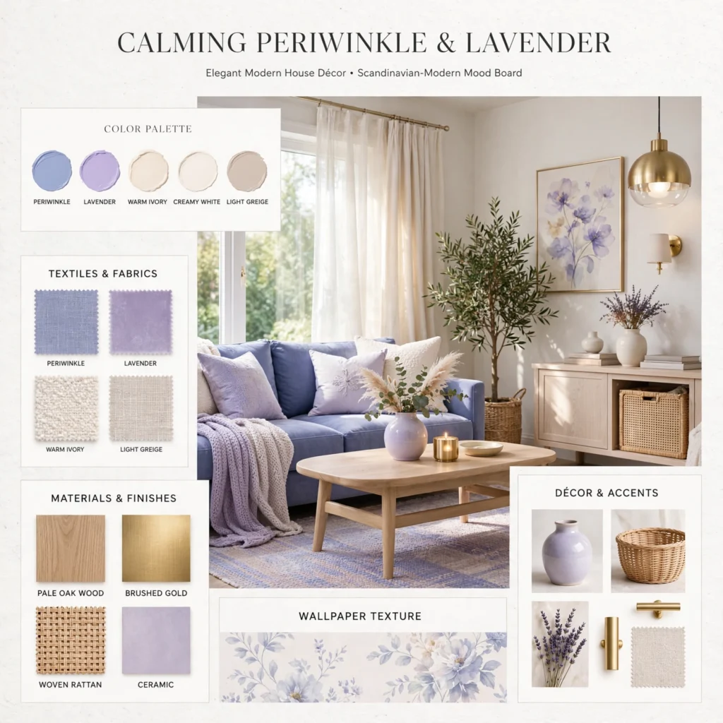
Periwinkle, a blue with a distinct violet undertone, paired with a true lavender creates a soft, dreamy palette that sits between blue and purple rather than committing fully to either. This combination suits a bedroom, a creative studio space, or a brand wanting a slightly whimsical, imaginative feel. Keep both colors close in saturation and value so neither dominates the composition, and add a warm cream base to prevent the two cool-leaning tones from feeling too chilly together without any grounding neutral.
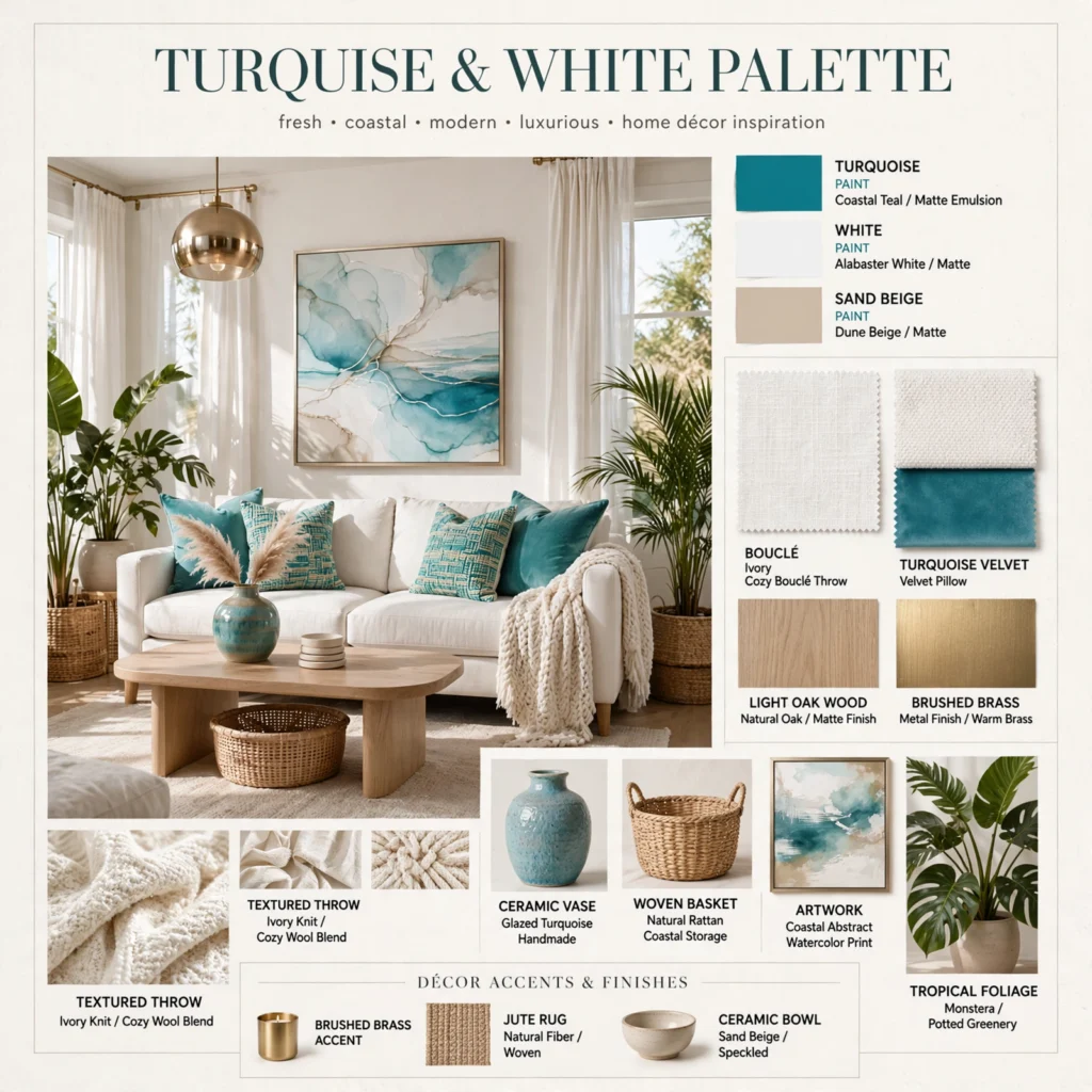
10. Turquoise and White Palette
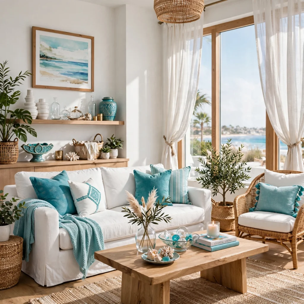
Turquoise paired with a crisp, true white produces a clean, high-contrast palette that reads as fresh and energetic rather than muted or traditionally coastal. This combination suits a bathroom, an outdoor living space, or a brand wanting a modern, lively take on blue rather than a calm one. Keep white as the dominant base, using turquoise in roughly a quarter to a third of the overall composition, since too much saturated turquoise across large surfaces can start to feel closer to a swimming pool than a livable interior.
11. Steel Blue and Rust Palette
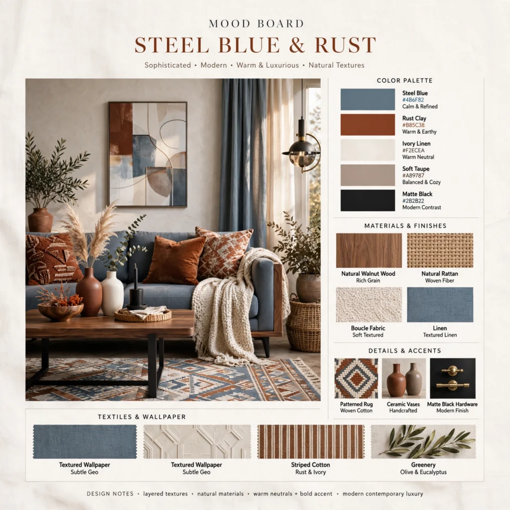
Steel blue paired with rust uses a complementary color relationship to create warmth and contrast within an otherwise cool-leaning palette. This combination works particularly well in a living room or office wanting to avoid the flat, one-temperature feel that an all-blue palette can sometimes carry. Keep steel blue as the dominant color across large surfaces and use rust in smaller doses, upholstery piping, a single chair, or ceramic accents, so the warmer tone functions as a deliberate counterpoint rather than competing for attention.
12. Baby Blue and Gray Palette
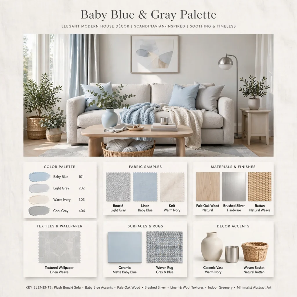
Pairing a soft baby blue with a range of grays, from light dove gray to a deeper charcoal, produces a palette that feels current and restrained rather than overtly playful. This combination suits a modern nursery, home office, or brand identity wanting a single color accent within an otherwise neutral, minimal palette. Keep the baby blue to under twenty percent of the overall color usage in a room, reserved for a single wall, chair, or accent piece, so the grays remain the dominant, grounding tone throughout the space.
13. Indigo and Terracotta Palette
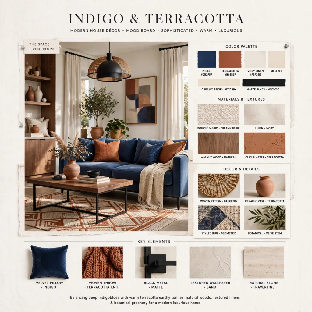
Indigo, a deep, slightly violet-leaning blue, paired with terracotta produces a rich, earthy palette that reads as more sophisticated and grounded than lighter blue combinations. This pairing works especially well in a dining room, home library, or hospitality-adjacent brand identity, where a smaller, more contained space can handle the visual weight of two saturated colors without feeling overwhelming. Brass or aged bronze hardware bridges the two colors effectively, since the warm metal picks up terracotta’s warmth while still reading elegant against the cooler indigo.
14. Aqua and Sand Palette
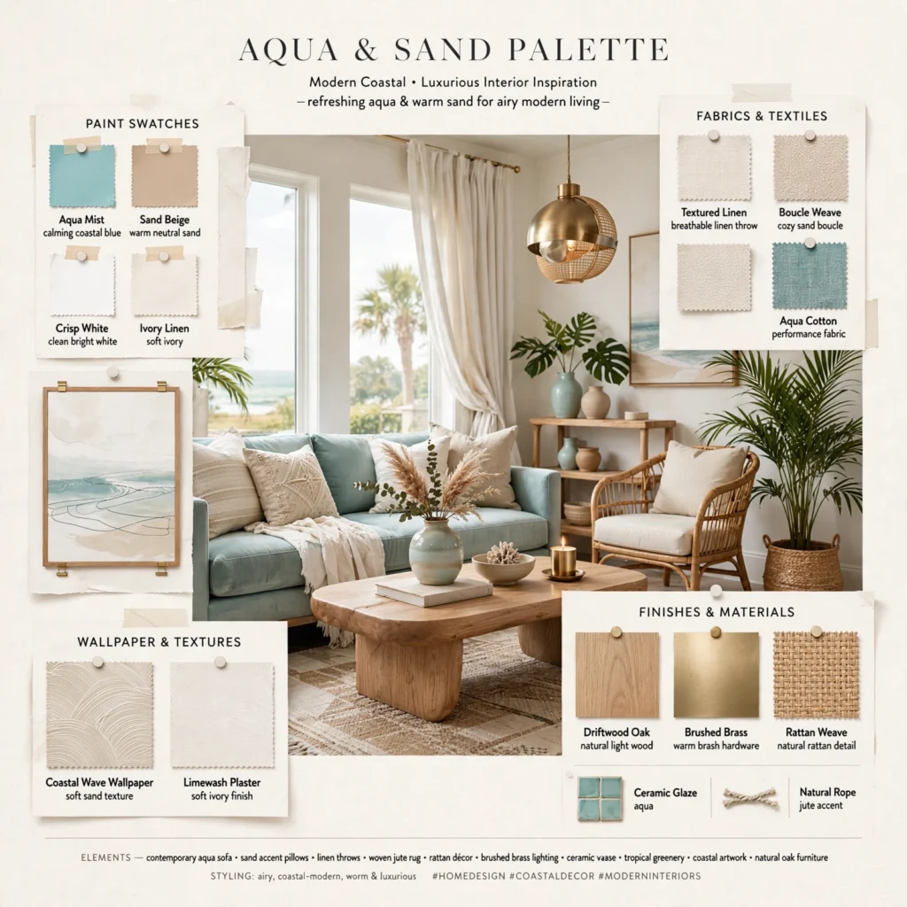
Aqua paired with warm sand and a soft driftwood gray creates a breezy, coastal-adjacent palette suited to exterior trim, a beach house interior, or a brand wanting a light, relaxed feel without much risk. Keep aqua slightly muted rather than a pure saturated hue, since a softer aqua reads as more current and less like a generic pool-tile color. This palette pairs naturally with natural wood tones and woven textures as a third element, keeping the combination from feeling too cool or clinical on its own.
15. Midnight Blue and Silver Palette
Midnight blue, nearly black in low light, paired with silver or brushed nickel accents produces a formal, modern palette suited to a dining room, an office, or a brand wanting a sleek, sophisticated feel rather than a warm or casual one. Unlike most blue palettes on this list, this combination favors cool metals over warm ones, since silver and brushed nickel reinforce the palette’s cooler, more polished overall temperature. Keep midnight blue as the dominant color and use silver sparingly in hardware and small detail work to avoid an overly cold, sterile result.
Shop the Look
For dusty blue paint, look at Benjamin Moore’s “Wolf Gray” or Sherwin-Williams’ “Underseas.” Navy and white coastal textiles are easiest to source through Serena & Lily or Ballard Designs. Teal and coral performance fabrics from Sunbrella cover the bold outdoor palette idea directly. For indigo and terracotta ceramics, look at options from Anthropologie or a local pottery studio, and brushed nickel or brass hardware from Emtek rounds out most of the palettes above depending on their overall warmth.
Common Mistake to Avoid
The most common mistake with any blue color palette is mixing undertones without realizing it, pairing a warmer, slightly green-leaning teal with a cooler, violet-leaning periwinkle in the same room, for example, which reads as slightly off even to someone who can’t identify exactly why. Hold physical paint or fabric swatches next to each other in the actual room’s lighting before committing, since undertone differences that are invisible on a screen or in a store’s fluorescent lighting often become obvious in daylight or warm evening light at home.
What metal finish pairs best with a blue color palette?
Warm metals, brass, gold, and aged bronze, generally pair well with warmer, deeper blues like indigo, cobalt, or navy, since the metal’s warmth balances the blue’s natural coolness. Cooler, more muted blues like slate blue, midnight blue, or a true steel blue tend to pair more naturally with silver, chrome, or brushed nickel, since both the metal and the color share a similar cool temperature. Testing a small metal sample against your specific blue swatch is worth doing before committing to fixtures, since the pairing can look noticeably different depending on the blue’s exact undertone.
Does blue make a room feel cold or uninviting?
Blue can read as cold if used without any warmth elsewhere in the room, but pairing it with warm wood tones, brass or gold accents, and warm-toned neutrals like sand or cream generally keeps a blue room feeling inviting rather than sterile. Muted, complex blues like dusty blue or slate blue tend to feel warmer than flat, highly saturated blues like a pure sky blue or cobalt, since the added gray in a muted blue softens its overall coolness. Warm lighting throughout the room also does more to counter blue’s coolness than almost any material choice alone.
Can blue work in a small room without making it feel smaller?
Lighter, more muted blues like powder blue, baby blue, or dusty blue generally work well in small rooms since their lower saturation keeps walls from visually advancing the way a highly saturated blue can. Reserving a bolder, more saturated blue like cobalt or midnight blue for a single accent wall, rather than all four walls, is the safer approach in a smaller space, since it adds color impact without the enclosing effect a fully saturated room can create. Pairing any blue with a lighter ceiling color also helps a small room continue to feel open.
How do I choose a blue color palette that won’t feel too trendy in a few years?
Muted, complex blues with some gray or green mixed into their base, like dusty blue, slate blue, or steel blue, tend to age more gracefully than flat, single-note blues like a pure sky blue or a very saturated cobalt, since the added complexity reads less as a specific design moment and more as a genuine neutral. Building the palette around one of these more complex blues as the dominant color, then using a brighter or trend-driven blue only in small, easily replaceable accents like pillows or accessories, keeps the overall space flexible as trends shift.
What blue pairs best with natural wood tones?
Warmer blues like dusty blue, steel blue, and slate blue generally pair best with natural wood tones, since both share enough warmth to feel connected rather than working against each other. Cooler, more saturated blues like a true navy or midnight blue can still work with wood, but tend to look best against warmer wood species like walnut or a richer stained oak rather than a very pale, cool-toned ash or birch. Testing the specific wood tone alongside the blue swatch in natural light helps confirm the pairing feels intentional rather than accidental.
Conclusion
The fifteen palettes above cover soft neutrals, bold contrasts, and everything in between, giving you enough range to find a blue color palette suited to almost any room, brand, or project. Whether you start with a quiet dusty blue or commit to a bold cobalt and mustard combination, the goal is a palette built around undertone and proportion rather than a single shade picked at random. Save this list to Pinterest for your next project, or check our related post on summer color palette ideas for more warm-weather color pairing guidance.
I’ve spent the last six years consulting on color selection for residential interiors and small brand identities, which means I’ve watched which blue palettes actually hold up under real lighting and which ones only work in a single styled photo.