15 Smart Spring Color Palette Ideas for a Fresh Seasonal Refresh
Spring color palettes tend to be reduced to pastel Easter eggs, but the season’s actual color range is considerably broader, drawing from new growth greens, blossom pinks, and the deeper earth tones that appear as gardens wake up from winter. This post covers fifteen spring color palette ideas that go beyond the basic pastel set, each with specific pairing guidance. You’ll get hex codes, material pairings, and application notes so you can bring a genuine seasonal refresh into a room, a table setting, or a smaller styling project.
Trend & Background
Spring color trends have shifted over the past few seasons away from uniformly soft, muted pastels toward palettes that pair a pastel or light tone with one deeper, more saturated anchor color, producing combinations that read as fresh without tipping into the overly delicate territory pastel-only palettes can fall into. This mirrors a broader design trend toward tonal depth over flat, single-value color schemes across every season, not just spring. This matters now because a well-built spring palette can extend well past a few weeks of seasonal decorating and work as a genuinely durable color direction for a room, provided it’s built with enough contrast and variation to avoid feeling like a single passing trend.
Key Takeaways
- A spring color palette works best when it pairs at least one soft pastel with a deeper anchor tone, rather than relying on pastels alone across an entire room.
- Botanical greens, soft pinks, and warm yellows are the most consistently used building blocks across current spring palettes.
- Several palettes here suit a full room refresh, while others work better as smaller seasonal accents like textiles, florals, or a single accent wall.
- A hex code and pairing comparison table is included so you can match a specific spring combination to your project before ordering paint or fabric.
1. Blossom Pink and Sage Duo
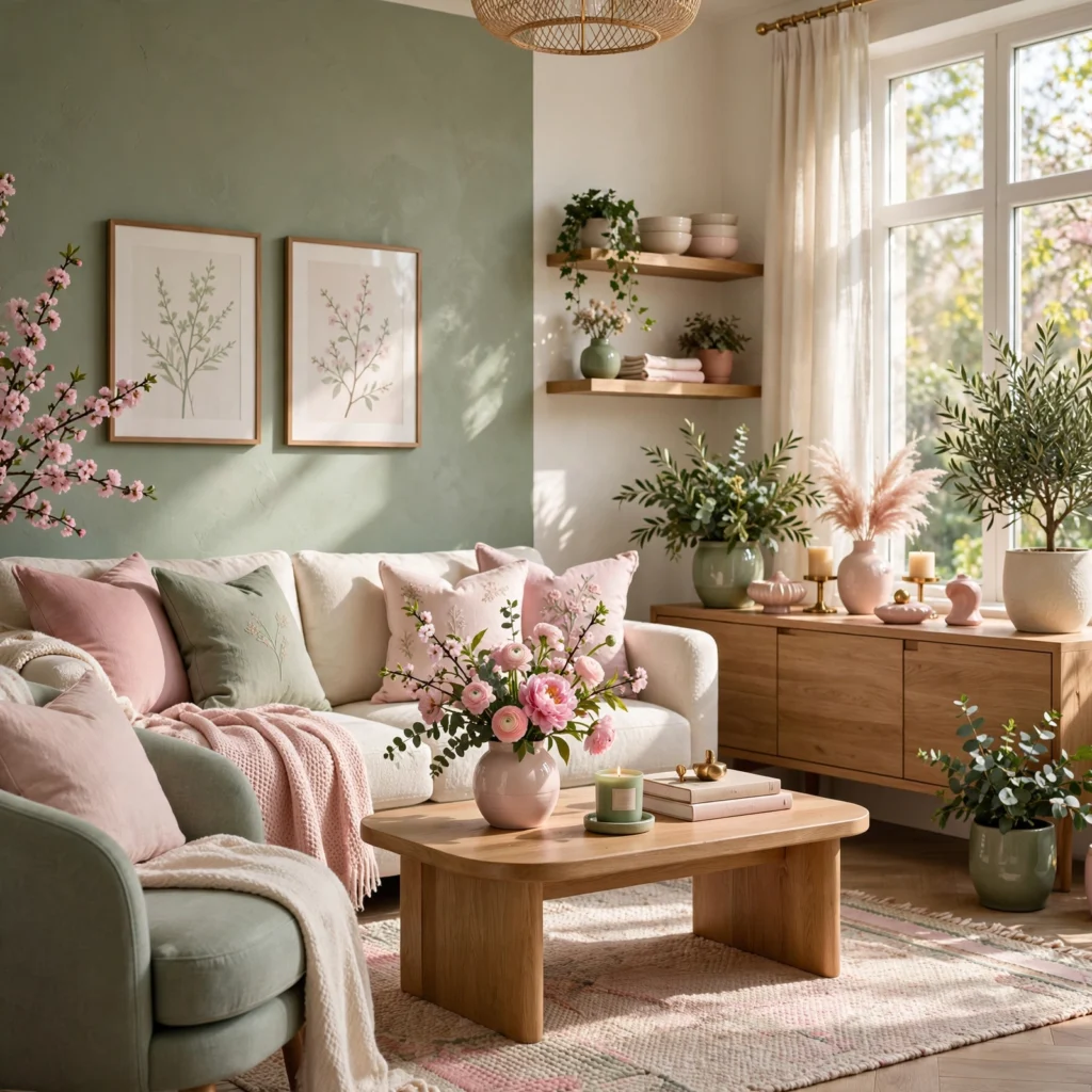
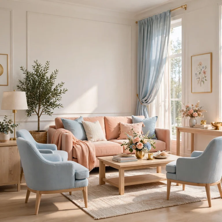
A blossom pink and sage duo pairs a soft, warm pink with a muted green, directly referencing the color combination found on flowering trees in early spring. This pairing works particularly well in a bedroom, nursery, or dining room aiming for a gentle, botanical feel without leaning into a more saturated floral palette. Keep sage as the dominant tone on larger surfaces like walls, with blossom pink introduced through textiles, florals, or a single accent piece.
2. Buttercup Yellow and Cream Combination
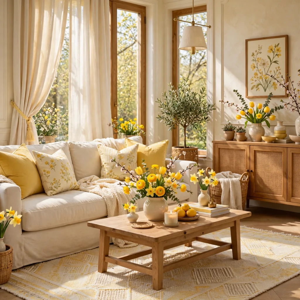
A buttercup yellow and cream combination pairs a warm, saturated yellow with a soft cream, producing one of the more energetic spring palettes without requiring a full bold-yellow room. This combination works well in a kitchen, breakfast nook, or entryway where a cheerful, welcoming feel is the goal. Use buttercup yellow in smaller doses, like a door, cabinetry, or accent chair, since a full room in this saturated yellow can read as overwhelming rather than fresh.
3. Lilac and Mint Pairing
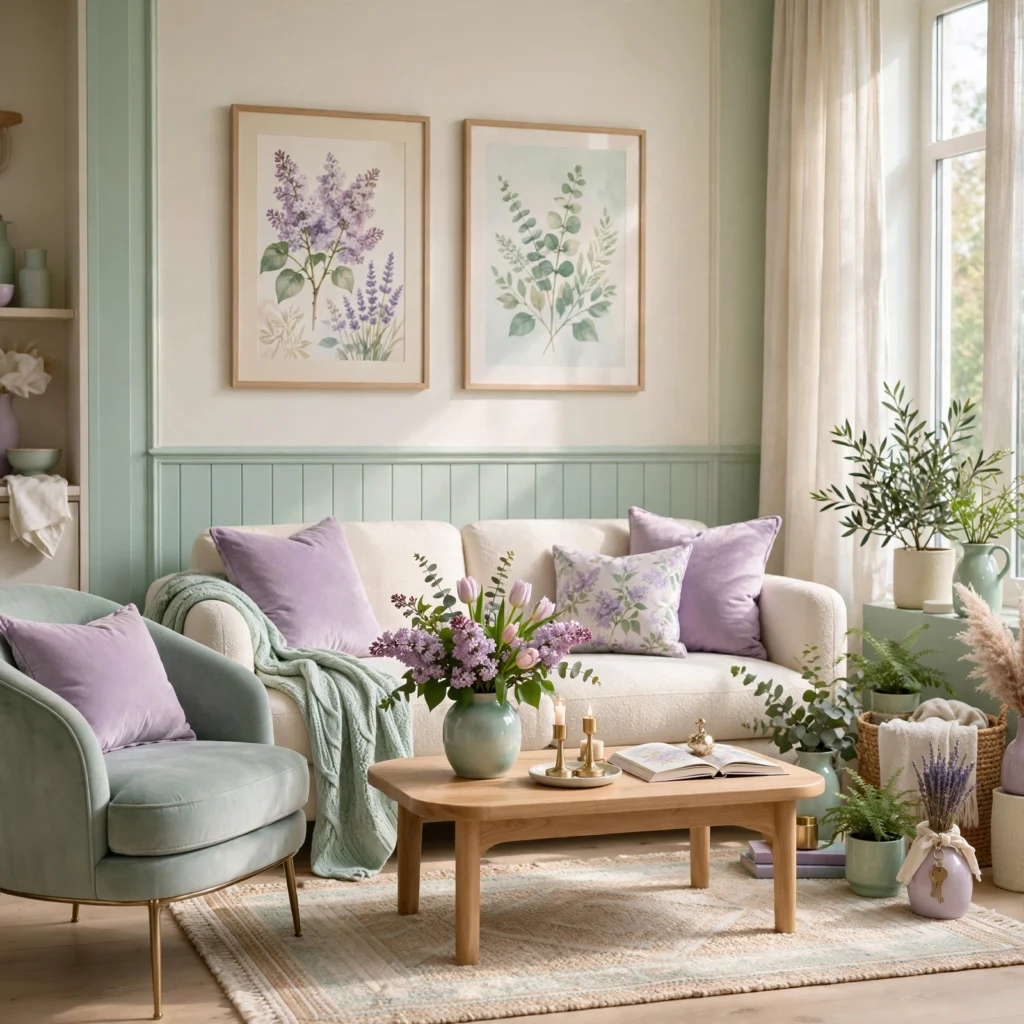
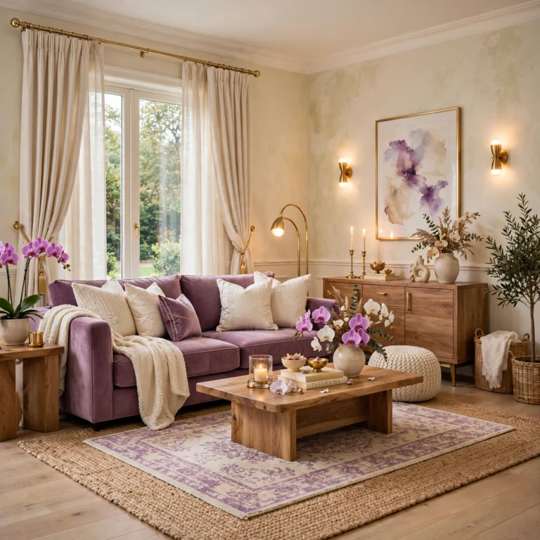
A lilac and mint pairing combines a light, cool-toned purple with a pale, blue-leaning green, producing a soft, slightly retro spring combination reminiscent of classic Easter color schemes without leaning fully into pastel territory alone. This pairing works particularly well in a bathroom, nursery, or a bedroom aiming for a light, airy feel. Keep both colors at a similar light value so neither one dominates the pairing, and add a warm white trim to keep the combination from feeling too cool overall.
4. Spring Color Palette for Tablescapes
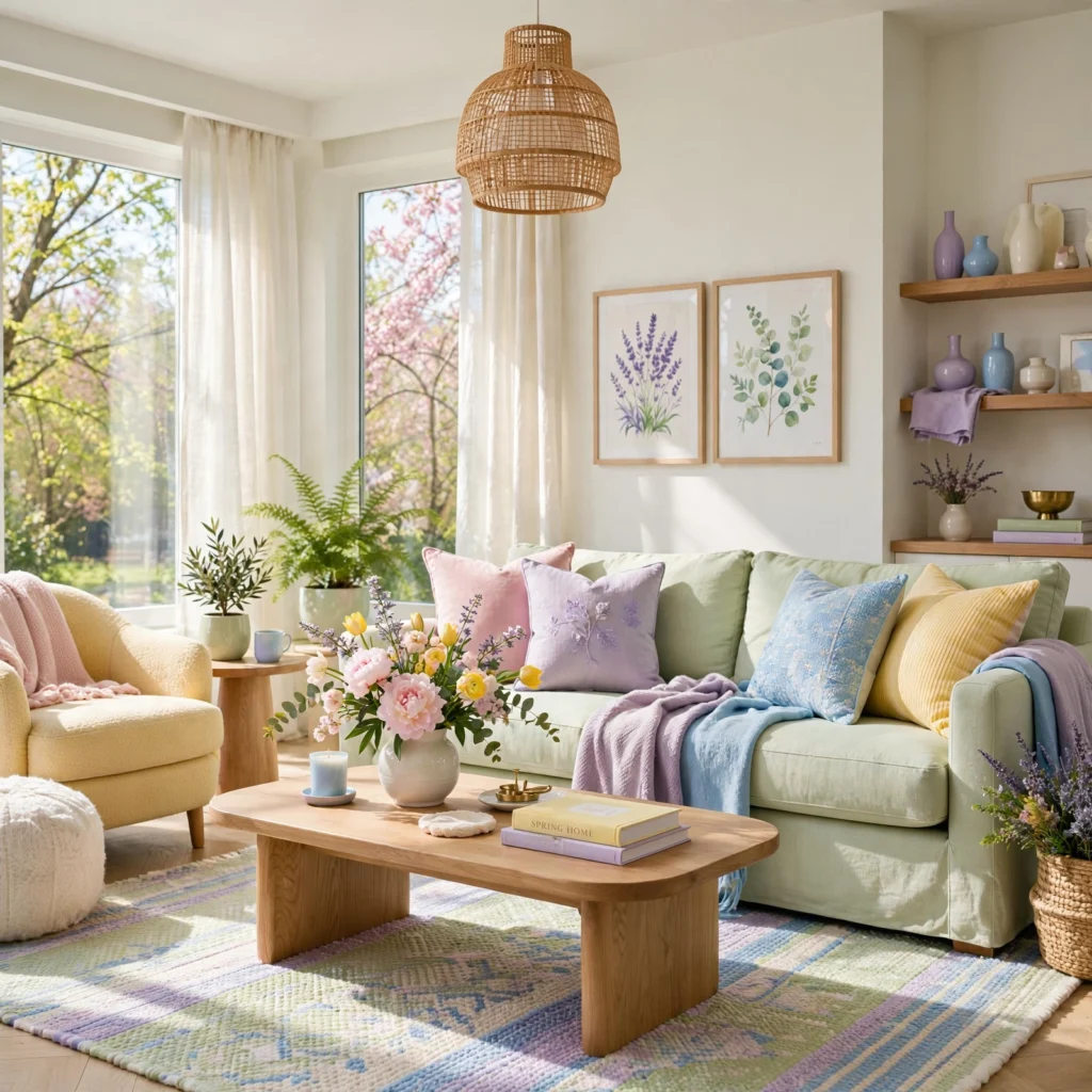
A spring color palette for tablescapes typically layers a neutral linen base with two or three seasonal accent colors through florals, napkins, and ceramics, rather than committing the entire table setting to a single bold color. Fresh greenery, like eucalyptus or ranunculus stems, works as a natural bridge between a neutral base and brighter accent colors on plates or glassware. Rotate accent colors seasonally on the same neutral base rather than replacing the full table linen set each season.
| Palette Style | Best Room Application | Anchor Color |
| Blossom Pink and Sage | Bedroom, dining room | Sage |
| Coral and Terracotta | Living room, entryway | Terracotta |
| Periwinkle and Charcoal | Home office, study | Charcoal |
5. Coral and Terracotta Duo
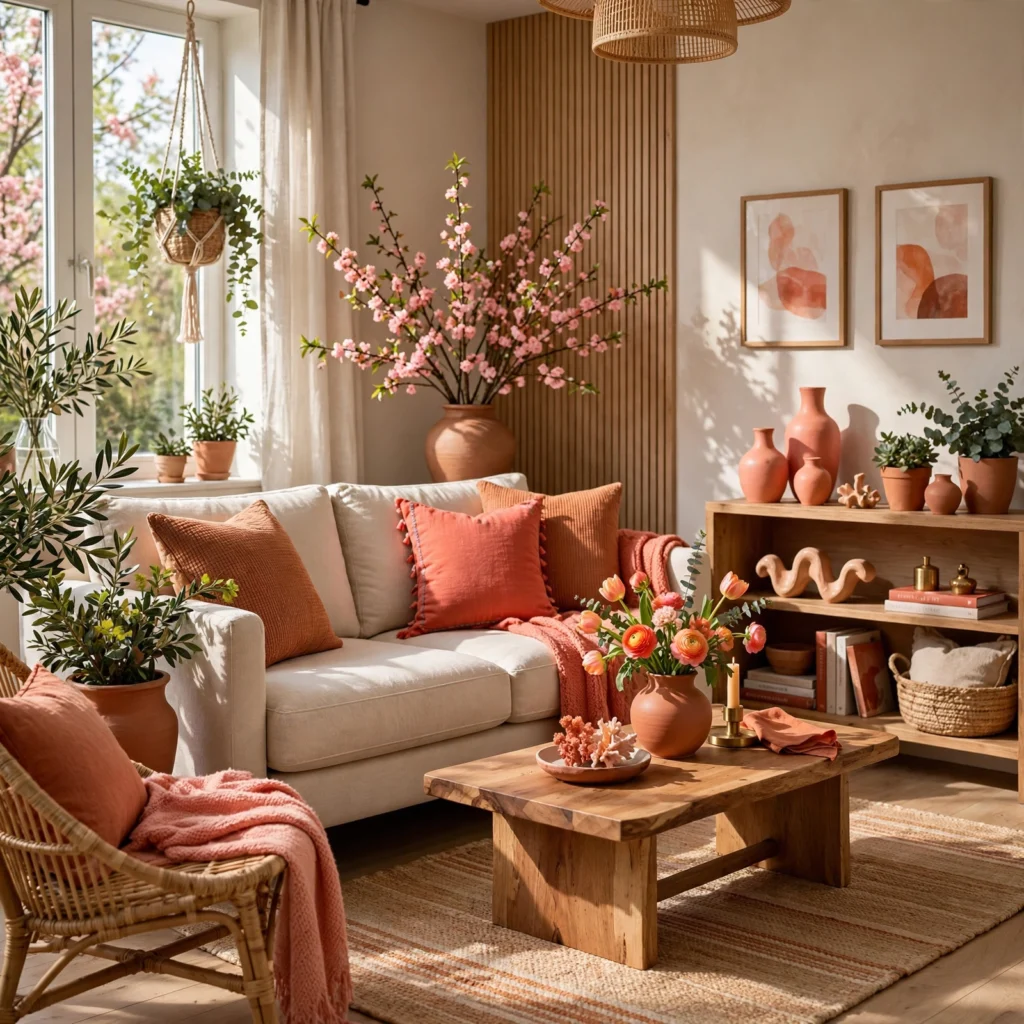
A coral and terracotta duo pairs a bright, warm pink-orange with a deeper, earthier terracotta, producing a spring palette with more warmth and saturation than the softer pastel combinations on this list. This works particularly well in a living room or entryway aiming for an energetic, sun-warmed feel rather than a delicate one. Use coral as the lighter accent tone against a terracotta base, or reverse the ratio depending on how bold a result is desired.
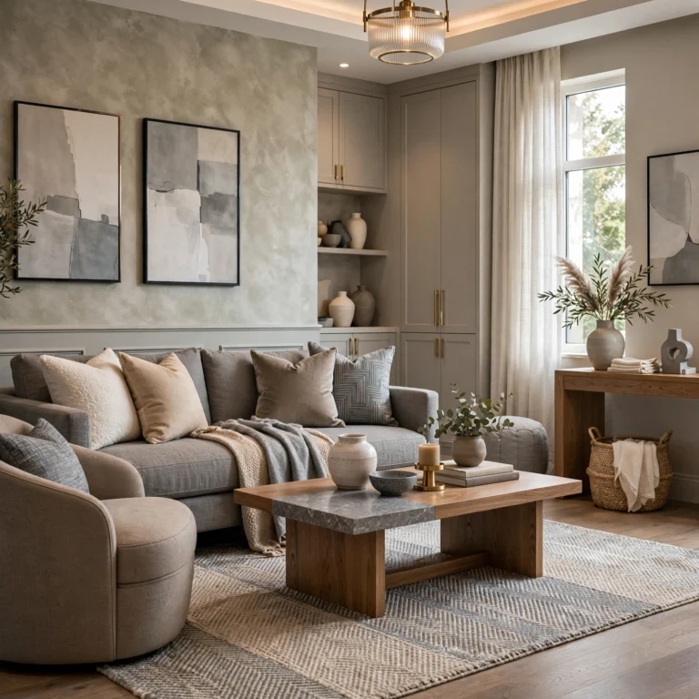
Create a calm and relaxing environment with this color palette design.
6. Pistachio and Blush Combination
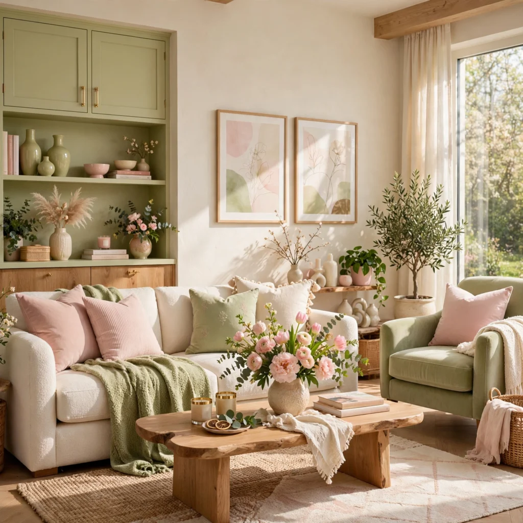
A pistachio and blush combination pairs a light, slightly gray-green with a soft pink, producing a quieter, more tonal version of the classic pink-and-green spring pairing. This combination works well in a bathroom or bedroom aiming for a restrained, current take on a traditionally sweeter color pairing. Keep both tones at a similar muted saturation level so the combination reads as sophisticated rather than overly delicate.
7. Periwinkle and Charcoal Contrast
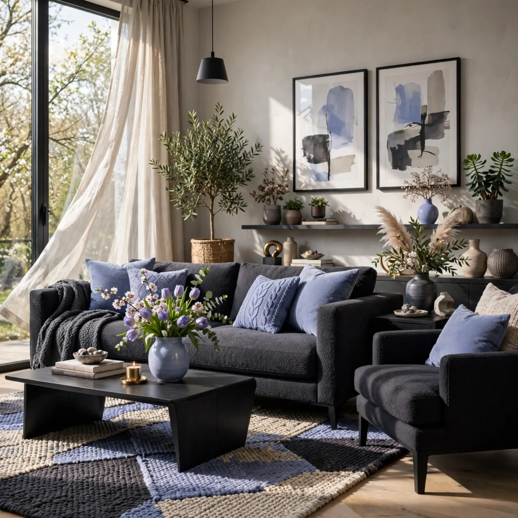
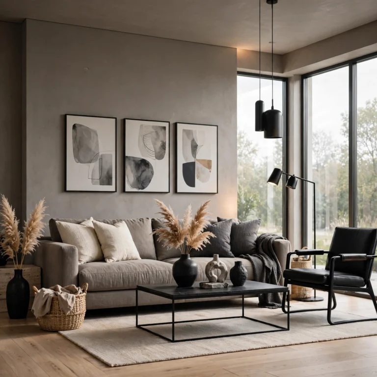
A periwinkle and charcoal contrast pairs a soft, blue-leaning purple with a deep charcoal gray, producing a spring palette with more depth and contemporary edge than most other combinations on this list. This works particularly well in a home office or study aiming for a seasonal refresh without a fully soft or pastel-driven result. Use periwinkle in smaller doses, like textiles or artwork, against a charcoal or deep gray base for the strongest contrast.
8. Tulip Red and Cream Pairing
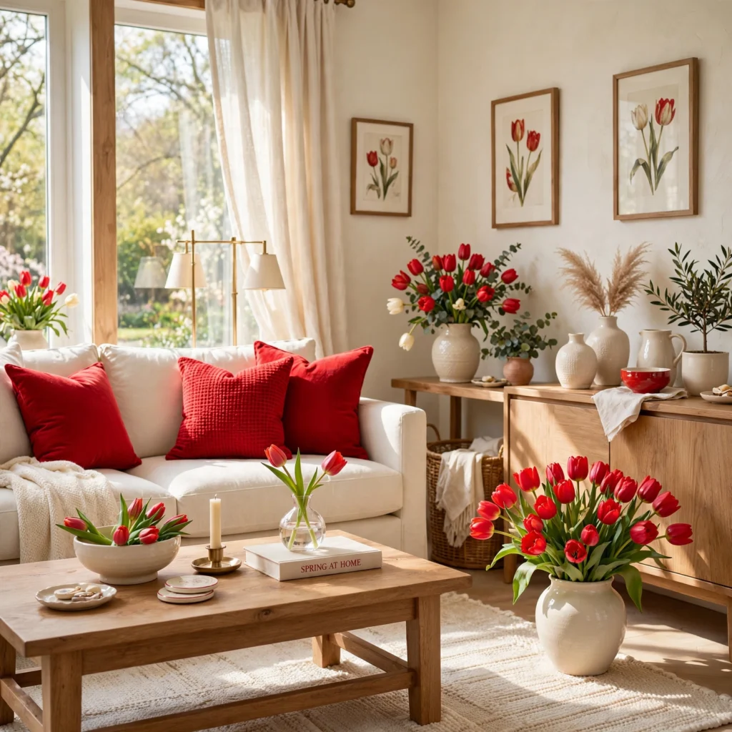
A tulip red and cream pairing combines a warm, slightly orange-leaning red with a soft cream, referencing one of spring’s most recognizable flower colors without relying on pink or pastel tones at all. This combination works well as a smaller accent, like a front door color or a set of table linens, rather than a full room, since the saturation carries significant visual weight. Balance with plenty of cream or white elsewhere so the red reads as a deliberate accent rather than an overwhelming statement.
9. Spring Color Palette for Nurseries
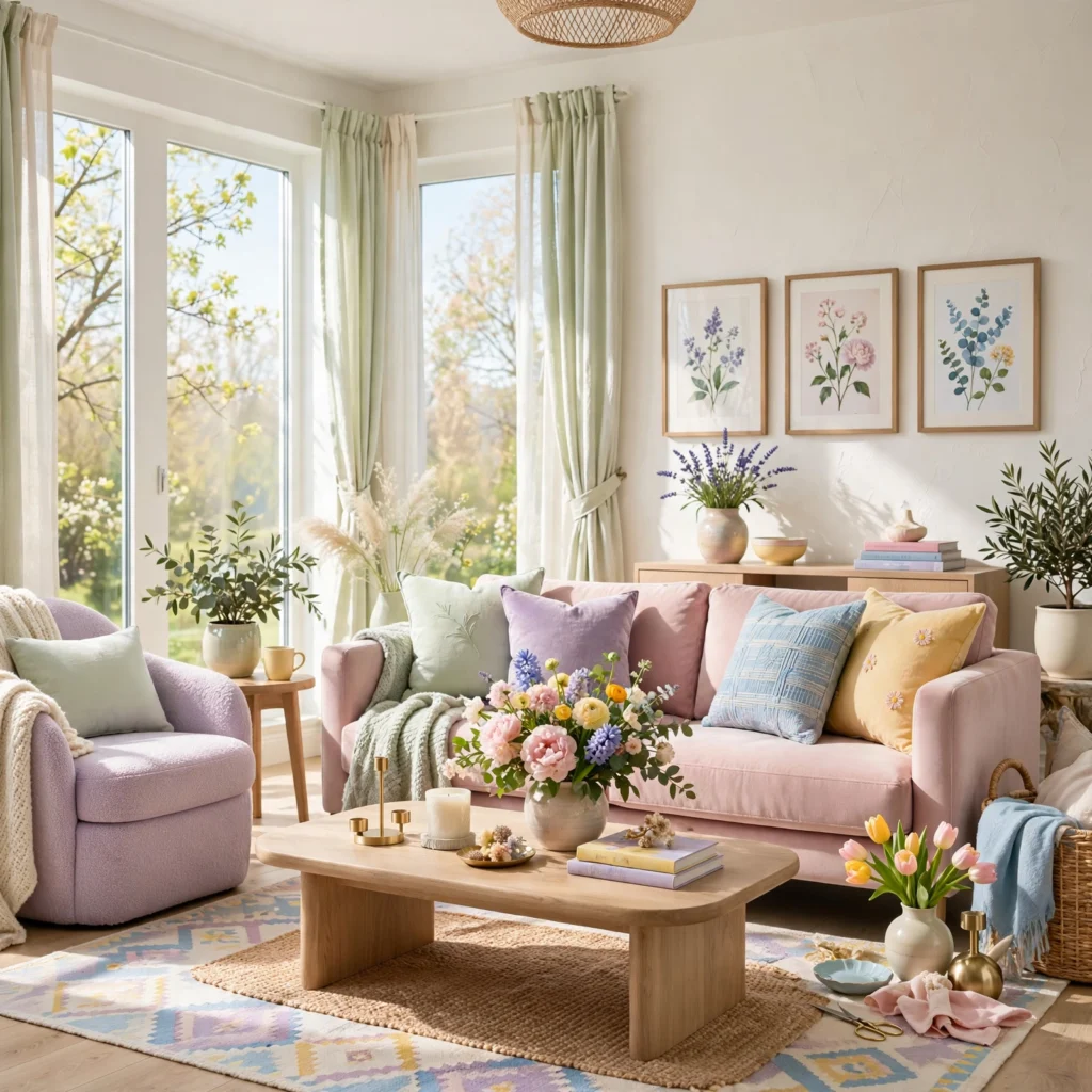
A spring color palette for nurseries generally favors soft, muted tones like a pale sage, a dusty lilac, or a warm cream rather than brighter, more saturated spring colors, since a calmer palette supports the room’s primary function as a restful space. Botanical wallpaper or a mural in a soft green and cream combination has become a particularly common way to bring a spring feel into this kind of room without relying on a bold paint color. Add a single warmer accent, like a blush or soft yellow textile, rather than introducing several bright colors at once.
10. Fern Green and Ivory Combination

A fern green and ivory combination pairs a rich, true green with a warm ivory, producing a fresher, more saturated version of a botanical spring palette than the softer sage and cream pairings elsewhere on this list. This works particularly well in a living room or sunroom with a lot of natural light and existing houseplants, since the green tone directly reinforces that greenery. Use fern green on a smaller surface area, like an accent wall or cabinetry, given its higher saturation relative to sage.
11. Peony Pink and Gold Accent
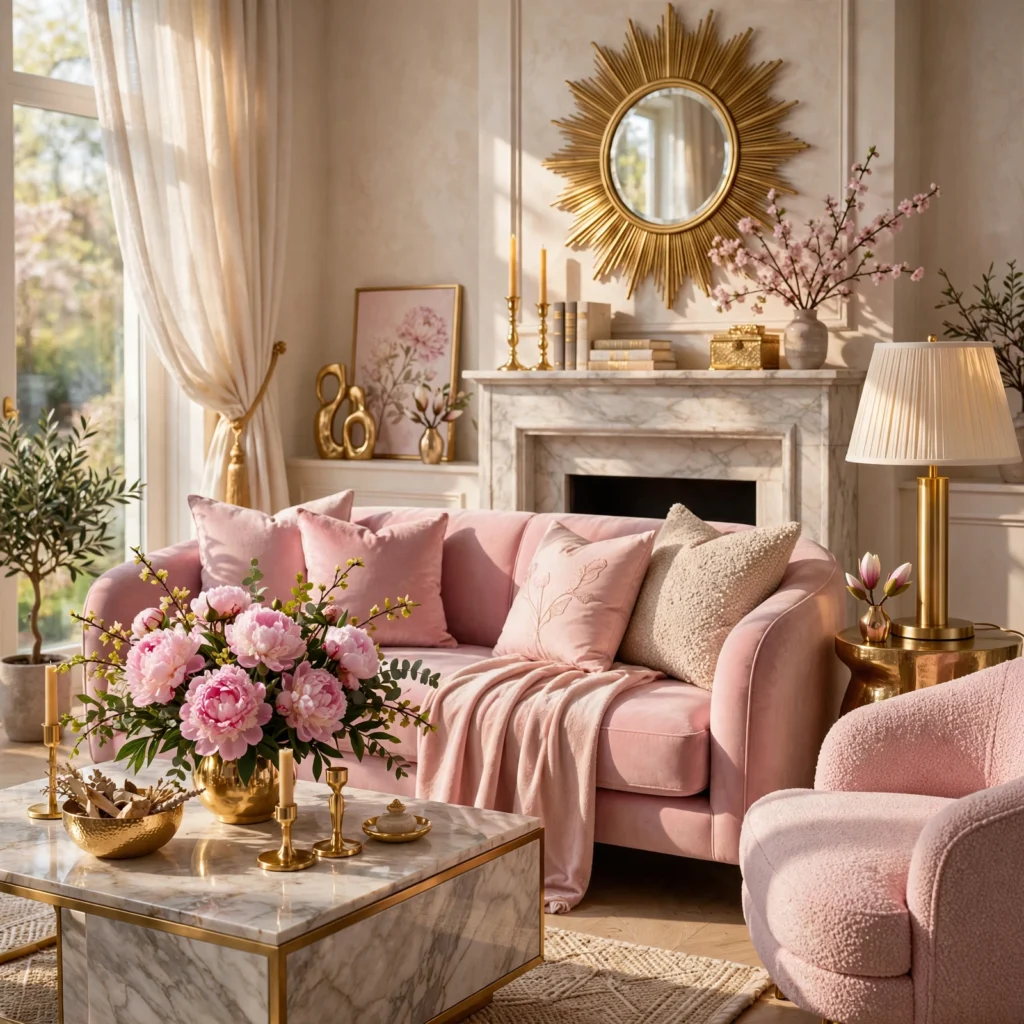
A peony pink and gold accent pairs a rich, saturated pink with warm metallic gold, producing a more glamorous, dressed-up version of a spring palette than the softer pastel combinations on this list. This works well in a powder room, dressing area, or as a table setting for a spring event or celebration. Use gold sparingly, in hardware, flatware, or a single decorative object, rather than as a large surface area, to keep the metallic from overwhelming the pink base.
12. Robin’s Egg Blue and White Duo
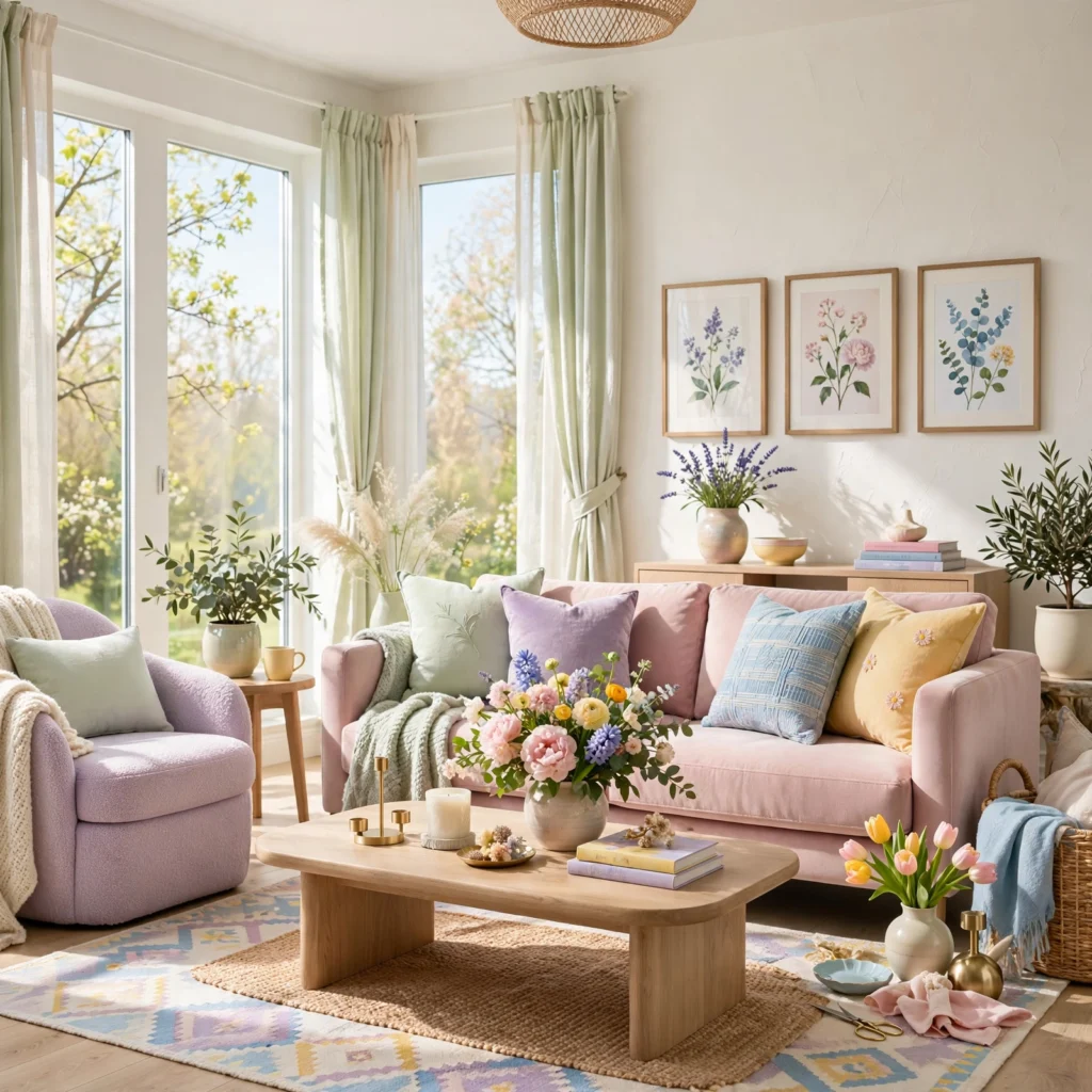
A robin’s egg blue and white duo pairs a soft, slightly green-leaning blue with crisp white, referencing one of spring’s most classic seasonal color associations through birds’ nests and eggs. This combination works particularly well in a bathroom, kitchen, or nursery aiming for a clean, fresh feel. Keep the ratio close to even between the two colors, since both are light enough that neither one needs to dominate for the pairing to read clearly.
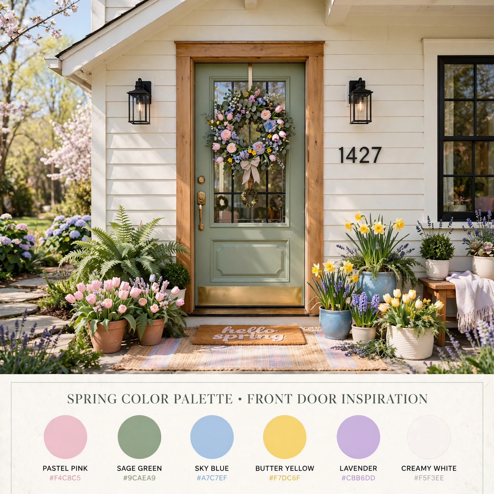
13. Spring Color Palette for Front Doors
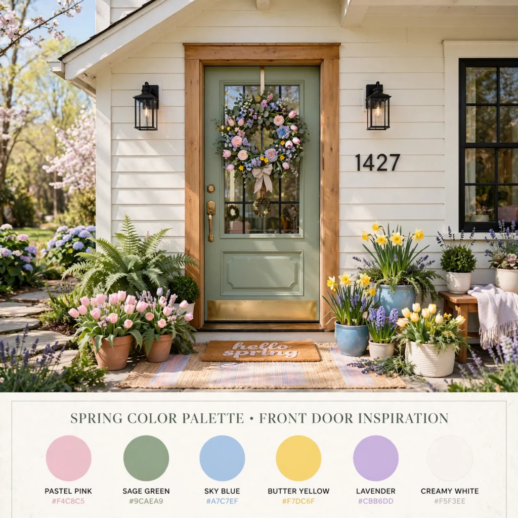
A spring color palette for front doors typically favors a single bold seasonal color, like a saturated coral, buttercup yellow, or soft sage, applied against an otherwise neutral exterior facade, since the door functions as the one element of an exterior most homeowners are comfortable changing seasonally or as a mood-driven update. Choose an exterior-rated paint formulated to hold color against direct sun exposure, since a bold spring color fades more visibly than a neutral tone over time. Limit the bold color to the door itself rather than extending it to shutters or trim for the cleanest, most intentional result.
14. Honeydew and Apricot Pairing
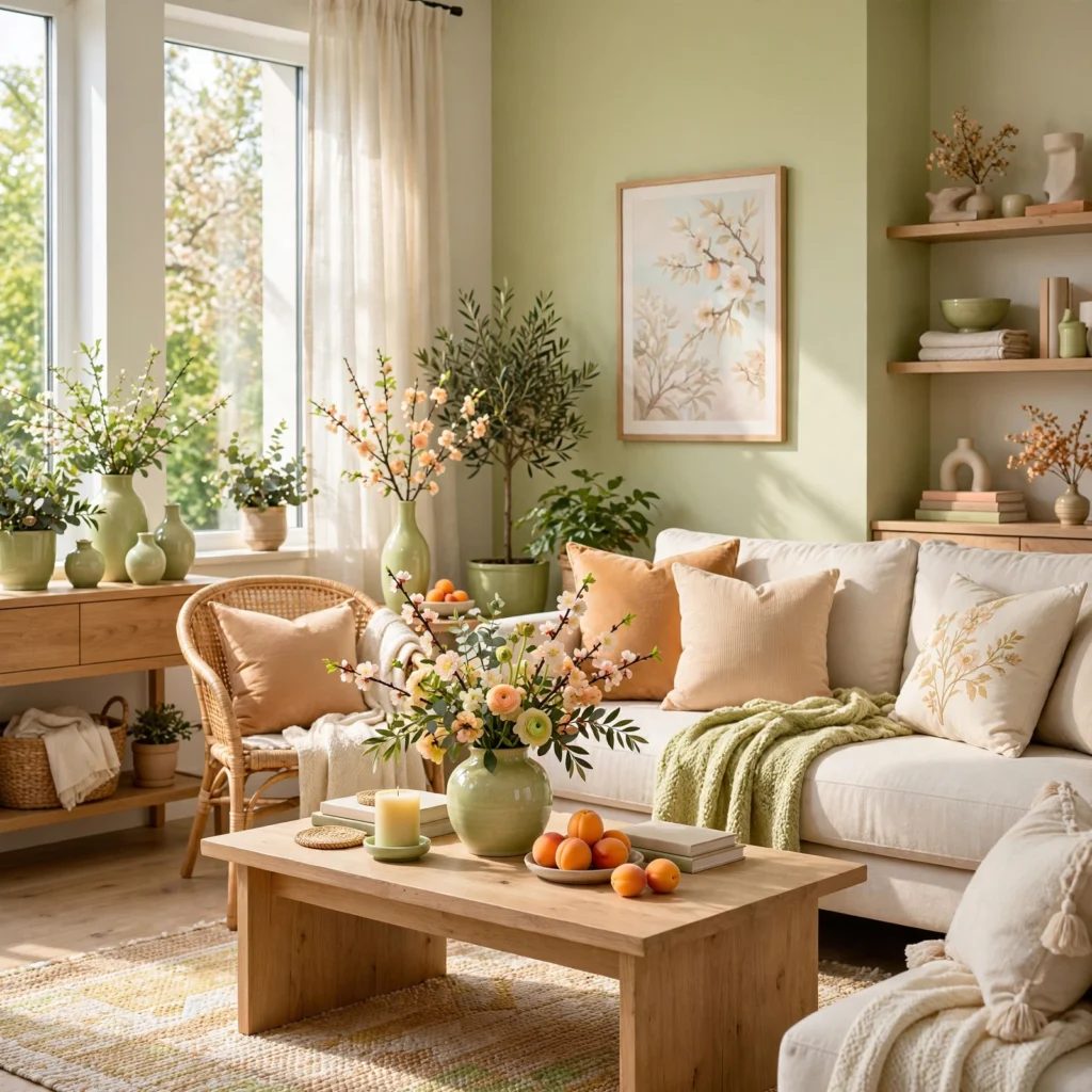
A honeydew and apricot pairing combines a very pale, yellow-green with a soft, warm orange, producing a fresh, fruit-inspired spring combination with slightly more warmth than most green-and-pastel pairings on this list. This works particularly well in a kitchen or breakfast nook aiming for a cheerful, appetite-friendly color story. Keep honeydew as the dominant wall or cabinetry color, introducing apricot through smaller accents like ceramics, textiles, or a single piece of art.
15. Wisteria and Moss Combination
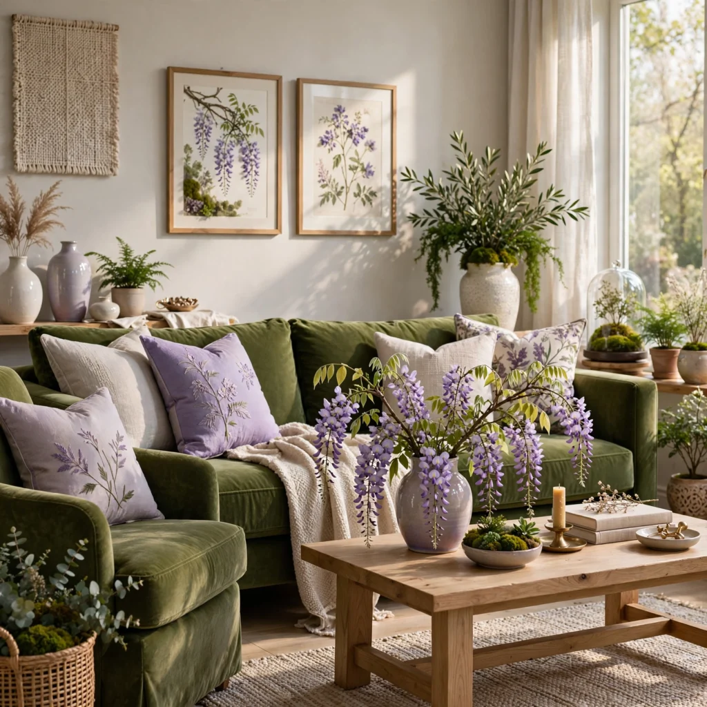
A wisteria and moss combination pairs a soft, blue-leaning purple with a deeper, more grounded green, producing a spring palette with more depth than the lighter pastel pairings elsewhere on this list while still referencing the season’s characteristic new-growth colors. This works well in a living room or bedroom aiming for a slightly moodier, garden-inspired feel rather than a bright or overtly cheerful one. Use moss as the dominant base tone, with wisteria introduced through textiles, art, or a single accent piece for contrast.
Shop the Look
A sage green performance-fabric sofa pairs well with blush throw pillows and a set of brass botanical-motif candlesticks for a soft, seasonal living room refresh. A set of pastel ceramic vases in lilac and mint tones works well for a rotating spring tablescape. Round out a nursery or bedroom refresh with botanical wallpaper in fern green and ivory and a set of cream linen bedding.
Common Mistake to Avoid
The most common mistake with a spring color palette is relying entirely on light pastel tones without any deeper anchor color, which can leave a room feeling washed out or overly delicate rather than genuinely fresh. A better approach is pairing at least one pastel or light tone with a deeper, more saturated anchor color, like sage paired with a rich forest green accent or blush paired with a deeper terracotta, so the palette holds visual structure rather than reading as flat.
5 FAQs
What are the most popular spring colors this year?
Current spring color trends favor a mix of botanical greens like sage and fern, soft warm pinks like blossom and peony, and a deeper anchor tone like terracotta or charcoal paired alongside them, rather than the uniformly pastel palettes associated with spring in past years. This reflects a broader design shift toward tonal depth across all seasonal palettes rather than flat, single-value color schemes. Checking current paint and textile lines each season is the most reliable way to confirm the specific shades trending at any given time.
How do I add a spring color palette without repainting a whole room?
Textiles, like throw pillows, table linens, and a seasonal throw blanket, along with fresh florals and ceramics, are the fastest and lowest-commitment ways to bring a spring color palette into a room without any paint or permanent changes. A single front door color update also delivers a strong seasonal refresh relative to its cost and effort. These smaller updates can be swapped again for the next season without any lasting commitment to a specific spring color.
What spring colors work well together?
Pairing a soft pastel, like blush, lilac, or mint, with a deeper anchor color, like sage, terracotta, or charcoal, consistently produces a more balanced and durable spring palette than combining multiple pastels alone. Botanical greens in particular pair well with nearly every other spring color, from pink and yellow to purple and blue, making green a reliable base to build a broader palette around. Testing combinations against existing furniture and flooring undertones helps confirm a pairing will work in the actual room rather than just on a color chart.
Is a spring color palette too seasonal for a full room?
Not necessarily, as long as the palette includes enough depth and contrast to avoid reading as a strictly seasonal, temporary color scheme. Palettes built around a deeper anchor color, like fern green or terracotta, paired with a lighter accent tone, tend to hold up well as a year-round color direction rather than feeling specific to spring alone. Reserving the lightest, most delicate pastel tones for smaller, easily swapped accents rather than major surfaces helps keep a room adaptable across seasons.
What’s the difference between a spring and summer color palette?
Spring color palettes generally lean toward softer, newer-growth tones like pale green, blossom pink, and soft yellow, reflecting the season’s association with new plant growth and milder weather, while summer palettes tend to shift toward more saturated, sun-bleached tones like bright coral, turquoise, and deeper botanical greens. The transition between the two is gradual rather than a hard line, with many spring palettes deepening naturally into summer versions simply by increasing saturation rather than changing hues entirely.
Conclusion
A spring color palette works best when it pairs at least one soft seasonal tone with a deeper anchor color, giving the combination enough structure to read as considered rather than purely decorative. Save this list to Pinterest for your next seasonal refresh, and check out our related posts on green color palette and purple color palette for more ways to build out a full color scheme.