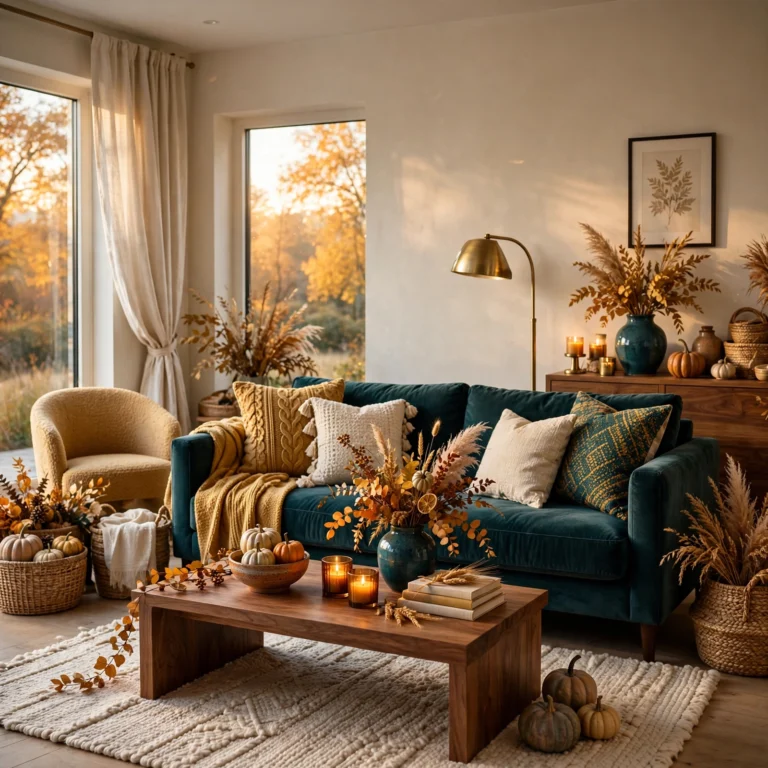
17 Stunning Pastel Color Palette Combinations for a Soft Space
Pastels can read as either soft and sophisticated or flat and washed out, and the difference almost always comes down to which specific pastel color palette gets paired together rather than the individual shades alone. This guide walks through seventeen practical combinations, from lavender and buttercream to a full pastel rainbow gradient, that you can apply to a single accent wall, a full room, or just textiles and accessories. You’ll learn which pastel undertones actually complement each other, roughly where to use each palette, and how to avoid the common mistake of pairing pastels with the wrong saturation level. Each idea includes real hex codes and material pairings.
Trend & Background
Pastel palettes have moved well beyond their traditional nursery-only association, showing up increasingly in full living rooms, kitchens, and even exterior paint choices as designers lean into softer, more muted tones after years of stark, high-contrast interiors. Combining two or three pastels at slightly varied saturation levels, rather than a single flat pastel across every surface, has become the more common approach, because it solves a specific problem: a room painted in one uniform pastel can read as flat or overly sweet without the depth a varied palette provides. This matters now because paint brands have responded with expanded pastel lines specifically formulated with more complex, layered undertones than earlier pastel offerings.
Key Takeaways
- Seventeen pastel color palette pairings cover soft, muted combinations for nurseries, bedrooms, and living spaces.
- Reference tables are included for hex codes, paint sheen, and best room applications so you can plan before you buy.
- Pairing two or three pastels rather than a single flat tone keeps a room from feeling washed out or overly sweet.
- Most palettes work as an accent wall or textile combination rather than requiring every surface to change color.
1. Pastel Pink and Mint
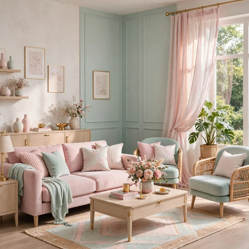
Pastel pink paired with mint creates a classic, gentle contrast that works well in a bedroom or nursery without feeling overly saccharine, especially when both tones are kept at a similarly soft saturation level. Use pink as the dominant wall or bedding color, and bring in mint through a single accent chair, curtains, or a rug, since balancing the ratio toward one dominant tone keeps the combination from competing for attention.
| Color | Hex Code | Best Use |
| Pastel pink | #F4C6C6 | Walls, bedding |
| Mint | #B8E0D2 | Accent chair, textiles |
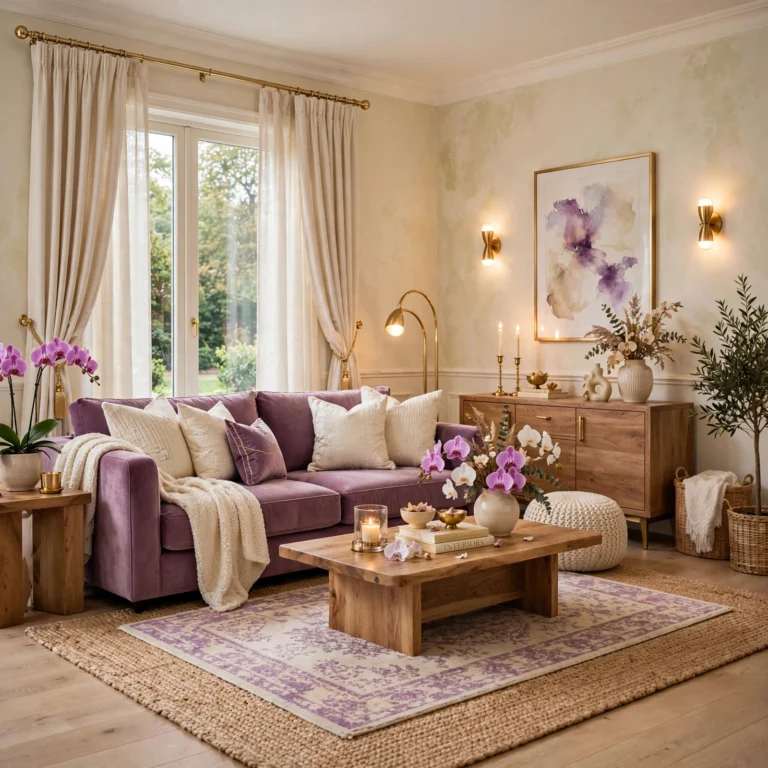
2. Lavender and Buttercream
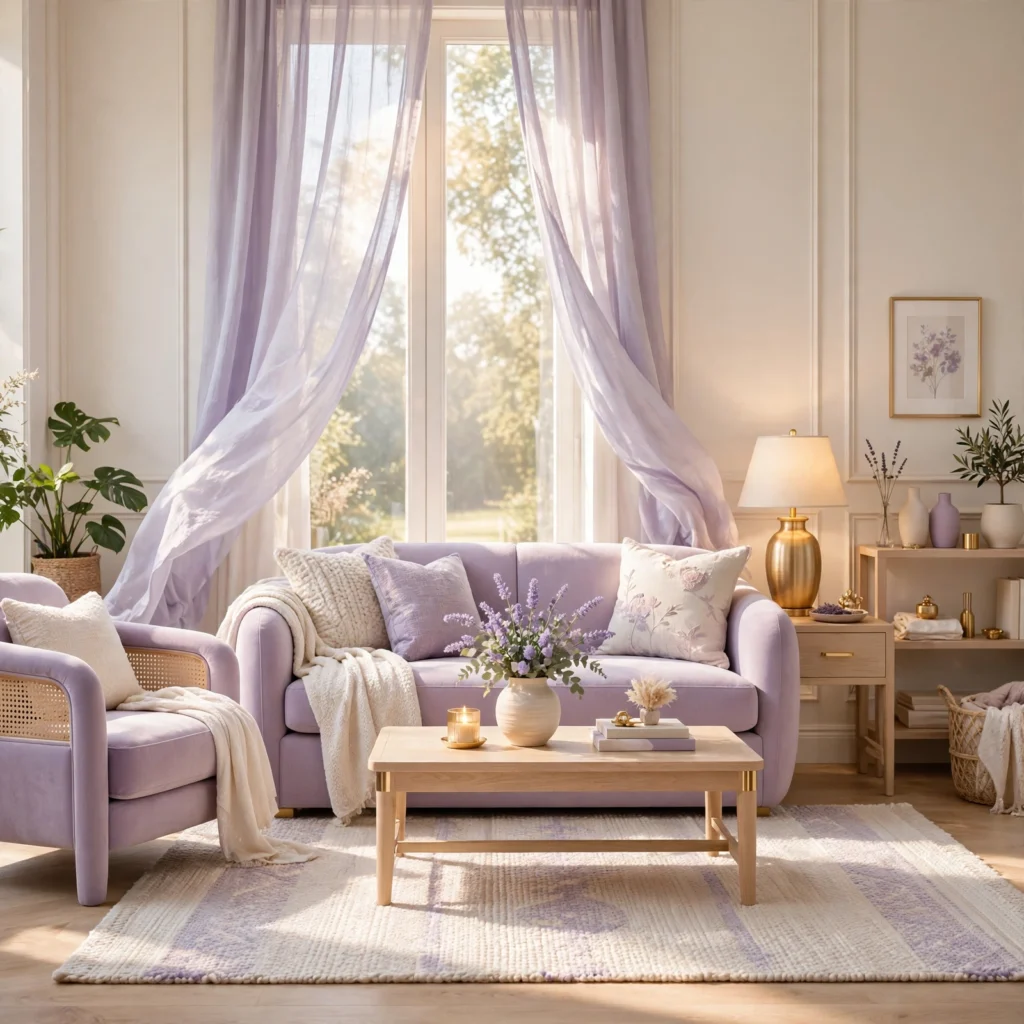
Lavender paired with a warm buttercream, rather than a stark white, softens this combination and keeps it from reading as cold. Use lavender on an accent wall or upholstery, and let buttercream carry the surrounding trim and larger furniture pieces, since the warmth in buttercream balances lavender’s cooler, slightly blue-leaning undertone particularly well in rooms with limited natural light.
| Color | Hex Code | Best Use |
| Lavender | #D8C6E8 | Accent wall, upholstery |
| Buttercream | #F5EAD0 | Trim, larger furniture |
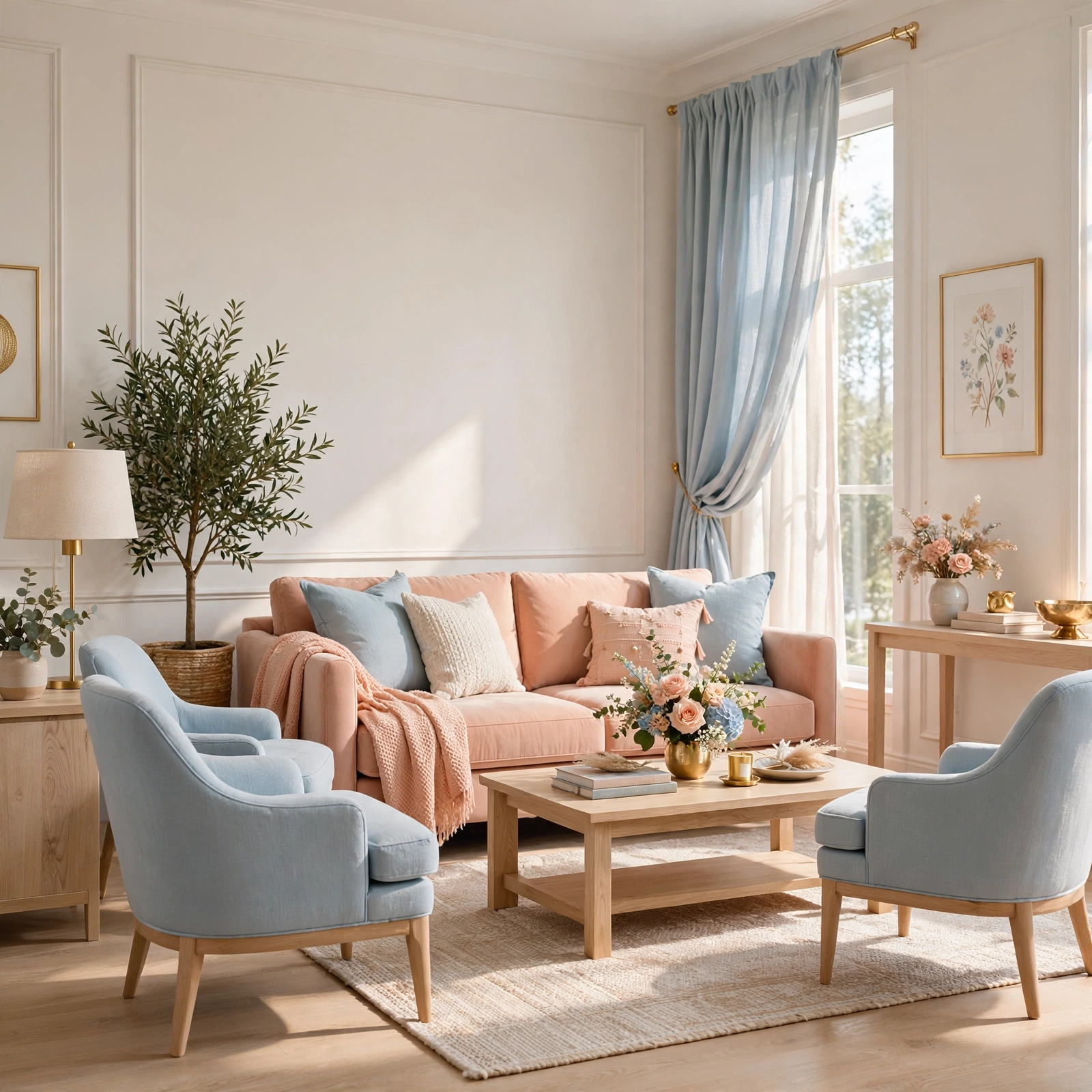
3. Baby Blue and Peach
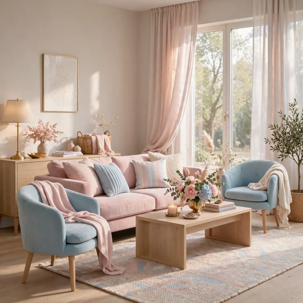
Baby blue paired with peach creates a gentle, warm-cool balance that suits a nursery or sunroom, since the peach’s warmth prevents the pairing from feeling overly cool despite blue being the more dominant tone. Use baby blue on walls and peach through textiles like curtains, a rug, or a throw blanket, keeping both tones at a similarly light, muted saturation so neither one visually recedes against the other.
4. Soft Yellow and Lilac
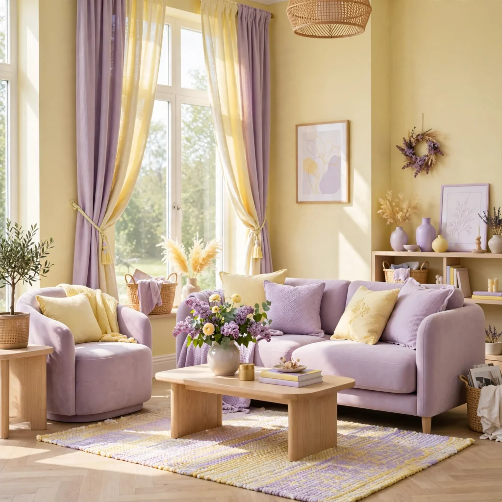
Soft yellow paired with lilac creates an unexpected but effective combination, since the yellow’s warmth and the lilac’s cool undertone balance each other in a way that keeps the palette feeling energetic without becoming overwhelming. Use yellow as an accent through furniture or art, and let lilac carry the primary wall color, since a full wall of soft yellow can read as more intense than most people expect once applied at scale.
| Color | Hex Code | Best Use |
| Soft yellow | #F5E6A8 | Accents, furniture |
| Lilac | #DCC6E8 | Walls |
5. Seafoam and Coral
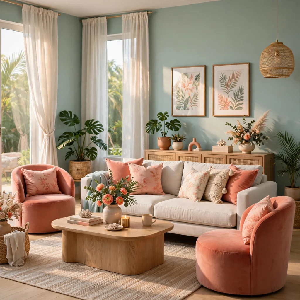
Seafoam, a muted blue-green, paired with coral creates a coastal-adjacent pastel combination that feels lively without the harsher contrast of a fully saturated blue and orange pairing. Use seafoam on walls or larger upholstered pieces, and bring in coral through smaller accents like pillows or ceramics, since coral tends to read as more intense than expected once introduced in larger quantities against a pastel background.
Find the perfect tones for your makeover with this stylish Living Room pink color palette.
6. Pastel Color Palette Moodboard
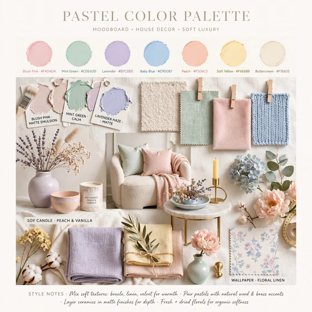
A moodboard acts as a rotating planning tool where you pin paint chips, fabric swatches, and reference photos while narrowing down a specific pastel color palette for a room. Build one from a cork panel wrapped in linen, framed with thin wood trim, and test paint swatches on it under the room’s actual lighting at different times of day, since pastels shift more noticeably under artificial light than more saturated colors do. Reviewing combinations here before committing avoids an expensive repaint.
7. Powder Pink and Sage
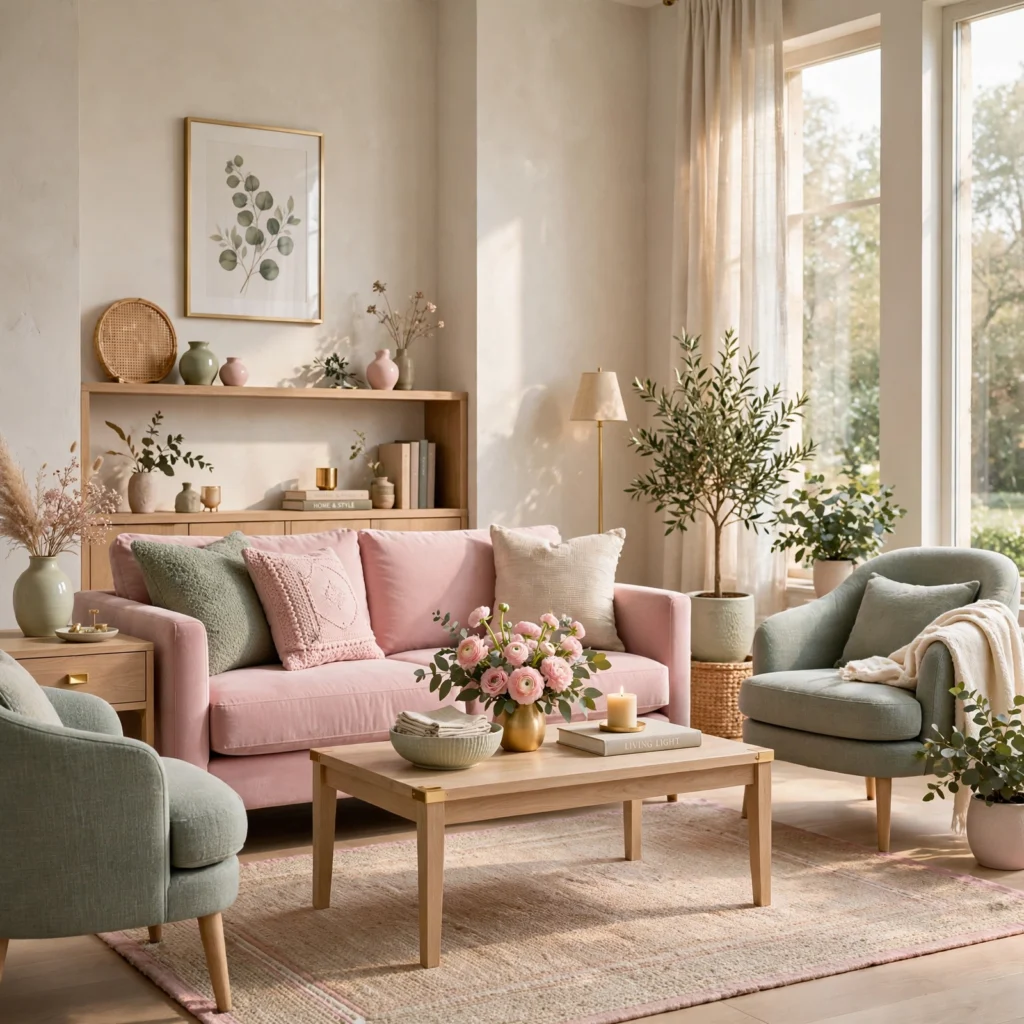
Powder pink paired with sage green creates a calm, nature-inspired palette that reads as more grown-up than a traditional pink and mint combination, since sage’s grayer, more muted undertone tempers the sweetness of the pink. Use sage as the dominant wall color and bring in powder pink through bedding, a headboard, or a single accent chair, keeping the overall palette weighted toward the more neutral sage tone.
| Color | Hex Code | Best Use |
| Powder pink | #F0D0D0 | Bedding, accent chair |
| Sage green | #B8C4A8 | Walls |
8. Periwinkle and Cream
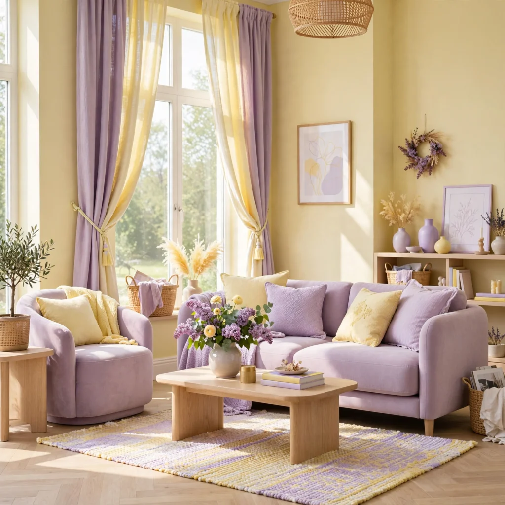
Periwinkle, sitting between blue and purple, paired with a warm cream creates a soft, cohesive palette that works particularly well in a bedroom where a restful, slightly cool-toned scheme is the goal. Use periwinkle on walls or bedding and let cream carry the trim and larger furniture, since the warmth in cream keeps this cooler-leaning pastel from feeling sterile, especially in a room with abundant natural light.
9. Pistachio and Apricot
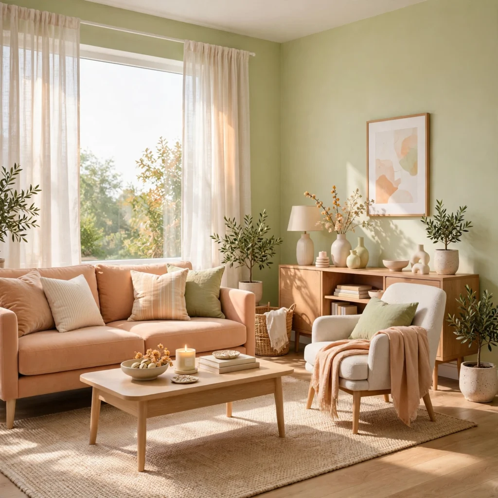
Pistachio, a soft, slightly yellow-leaning green, paired with apricot creates a warm, appetizing combination well suited to a kitchen or breakfast nook. Use pistachio on lower cabinetry or a full accent wall, and bring in apricot through smaller accessories like dishware or a runner rug, since this pairing works best when apricot stays in a supporting role rather than competing equally with the larger pistachio surfaces.
10. Sky Blue and Lavender
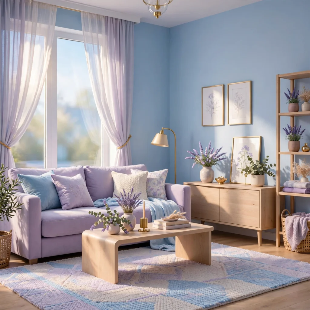
Sky blue paired with lavender creates a soft, cool-toned combination that works especially well in a bathroom, since both tones read as clean and calming without feeling clinical. Use sky blue on tile or walls, and bring in lavender through towels, a bath mat, or a small accent, keeping the saturation of both tones closely matched so one doesn’t read as noticeably more intense than the other.
| Color | Hex Code | Best Use |
| Sky blue | #C6E0EC | Tile, walls |
| Lavender | #D8C6E8 | Towels, accents |
11. Buttercup Yellow and Rose
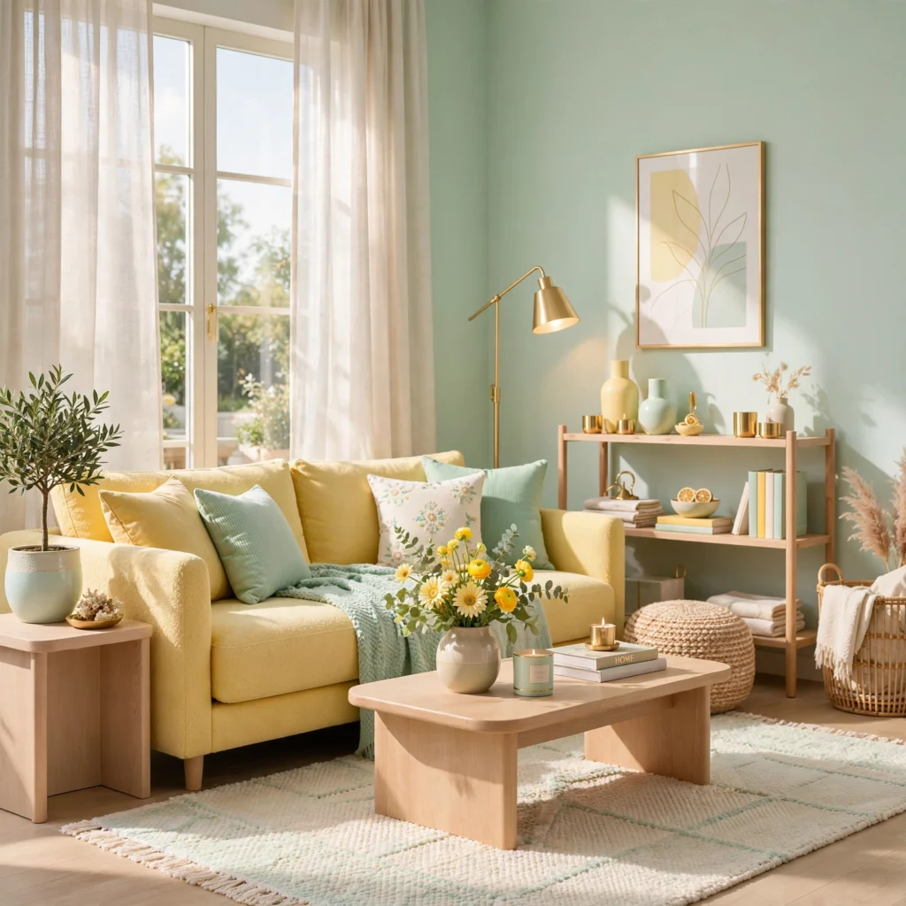
Buttercup yellow paired with a dusty rose creates a warm, cheerful combination without leaning into a strictly feminine palette, since the muted rose tempers the brightness of the yellow. Use buttercup as an accent through furniture or art, and let rose anchor a larger surface like an accent wall or a sofa, since keeping yellow in a smaller supporting role prevents this particular combination from feeling overly bright across a full room.
12. Lilac and Soft Gray
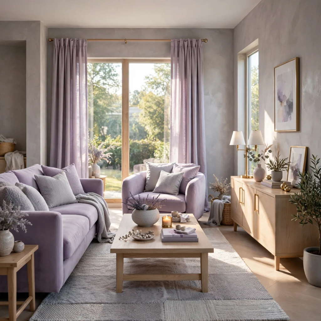
Lilac paired with a soft, warm-leaning gray creates a more restrained, sophisticated pastel palette suited to a home office or living room where a fully saturated pastel scheme might feel too playful. Use gray as the dominant wall and furniture color, and bring in lilac through a single accent wall, drapery, or artwork, since this pairing reads as considerably more neutral and versatile than most other pastel combinations on this list.
| Color | Hex Code | Best Use |
| Lilac | #DCC6E8 | Accent wall, drapery |
| Soft gray | #D8D4D0 | Walls, furniture |
13. Dusty Rose and Sage
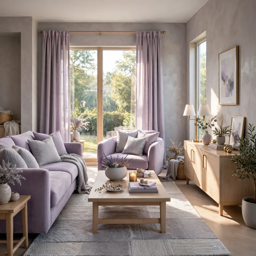
Dusty rose, a muted, slightly brown-leaning pink, paired with sage green creates one of the more versatile pastel combinations, since both tones sit at a similar, grayed-down saturation level that reads as calm rather than sweet. Use either color as the dominant wall tone and the other through bedding, upholstery, or drapery, since this pairing works well in nearly any ratio without one tone overwhelming the other.
14. Mint and Butter Yellow
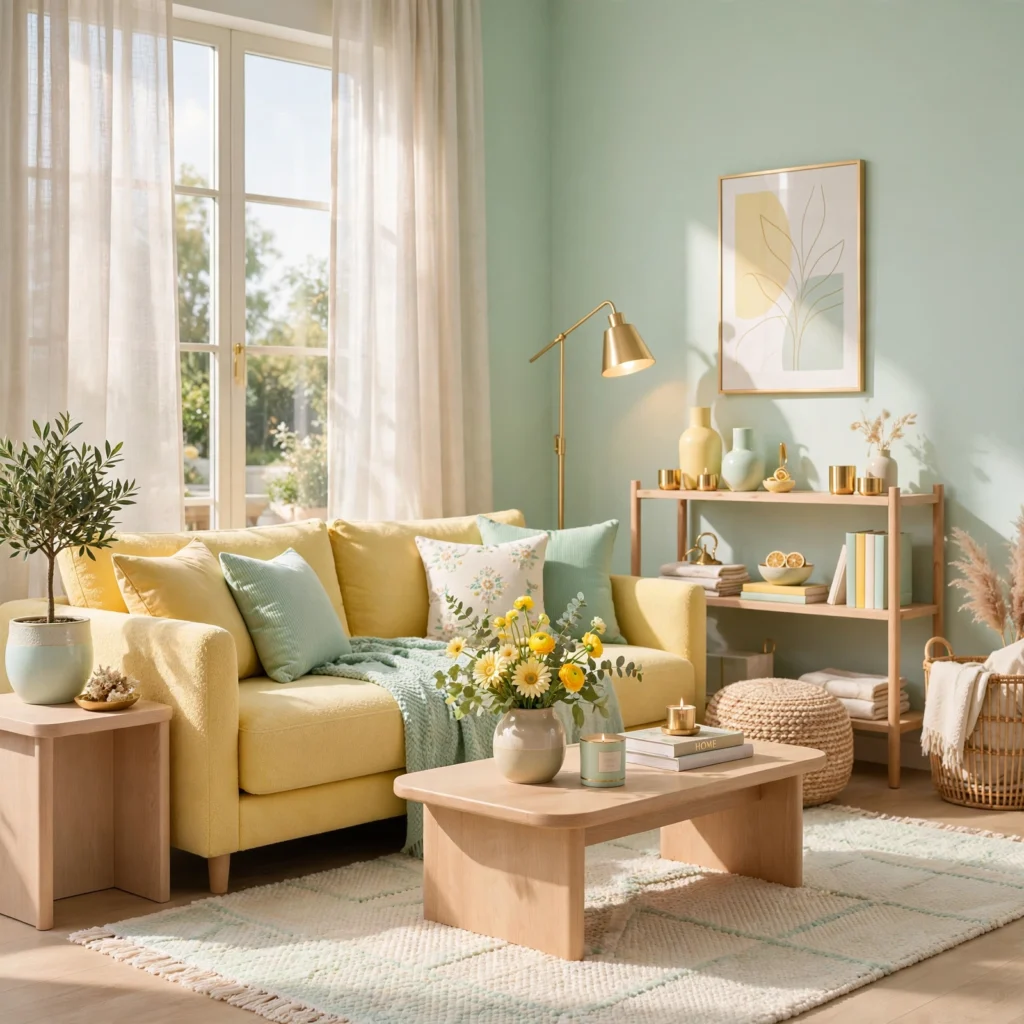
Mint paired with a soft butter yellow creates a fresh, slightly retro-inspired combination well suited to a kitchen or breakfast nook. Use mint on cabinetry or a full accent wall, and bring in butter yellow through smaller accessories like dishware, a runner rug, or curtains, since keeping yellow in a supporting role prevents the combination from tipping into an overly bright, candy-like palette.
15. Blush and Baby Blue
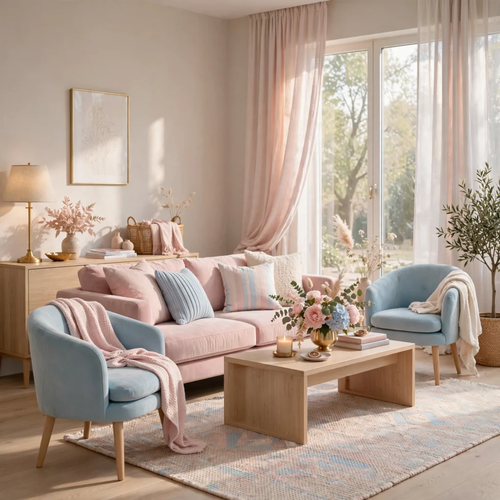
Blush paired with baby blue creates a soft, gender-neutral palette commonly used in nurseries, since both tones read as calm without leaning strongly masculine or feminine on their own. Use blush as the dominant wall color and bring in baby blue through bedding, a rug, or a mobile, keeping both tones at a similarly light saturation level so the combination feels cohesive rather than split between two competing themes.
16. Pastel Rainbow Gradient
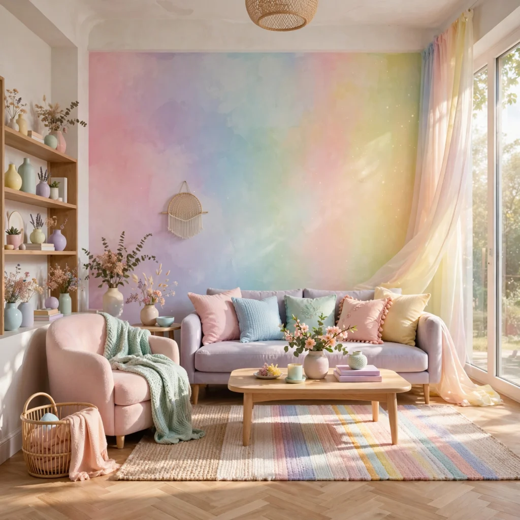
A gradient using four or five pastel tones across the color wheel, from pink through yellow, mint, and lavender, works well as a playful accent treatment rather than a full-room color scheme, commonly applied to a bookshelf, a gallery wall of frames, or a striped accent wall. Keep every tone at the same saturation and lightness level across the full gradient, since mismatched intensity between colors is what causes a rainbow palette to feel chaotic rather than cohesive.
17. Peach and Powder Blue
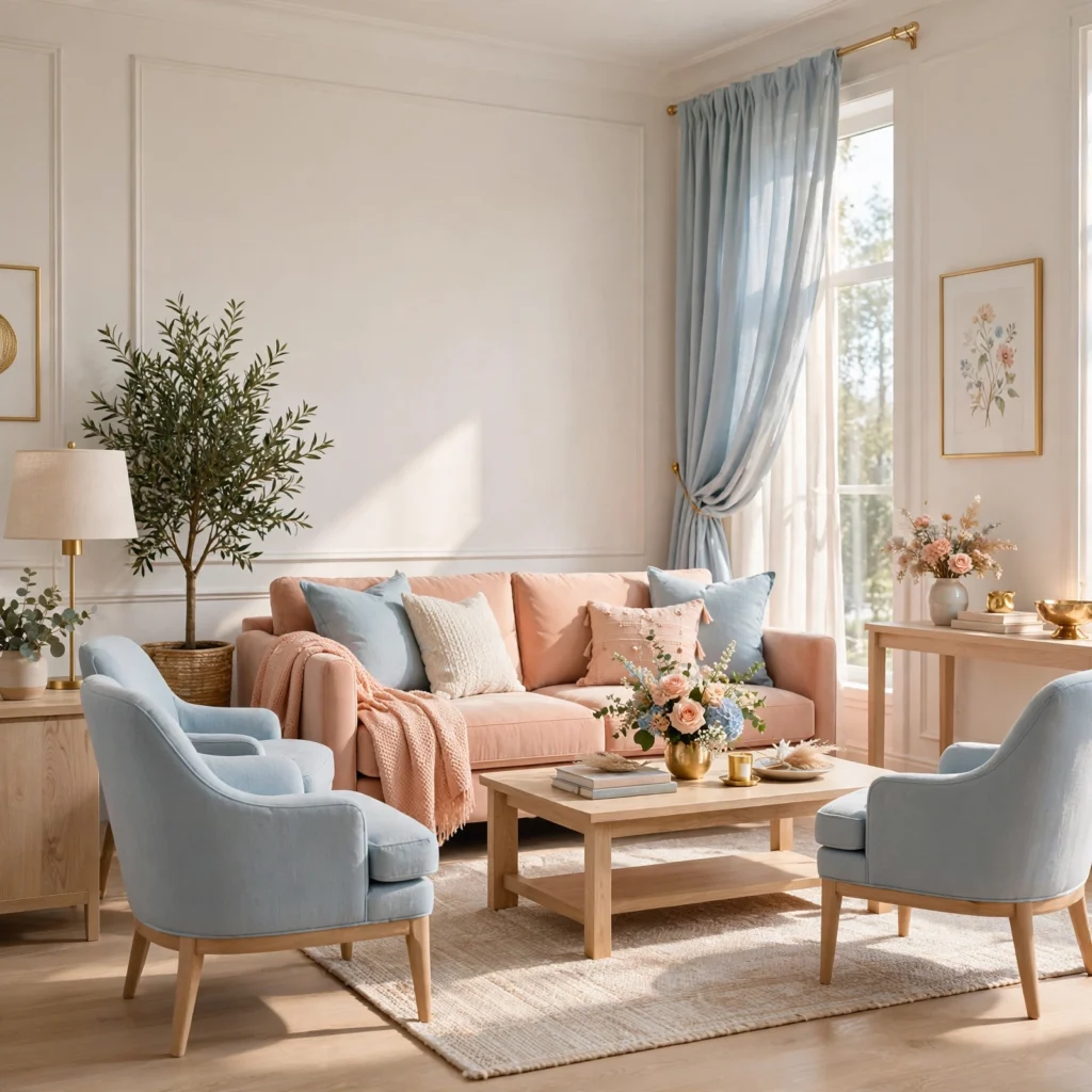
Peach paired with powder blue creates a warm-cool balance similar to the baby blue and peach combination but leans slightly warmer overall, since peach carries more orange undertone than a straightforward pastel pink. Use peach as the dominant color on walls or a sofa, and bring in powder blue through smaller accents like pillows or ceramics, since this combination works particularly well in a living room that gets a good amount of natural afternoon light.
| Color | Hex Code | Best Use |
| Peach | #F5D0B8 | Walls, sofa |
| Powder blue | #C6DCE8 | Pillows, accents |
Shop the Look
A few specific products make these palettes easier to execute well. Farrow & Ball’s “Nancy’s Blushes” and “Setting Plaster” work well as reference points for the powder pink and dusty rose palettes above. Sherwin-Williams’ “Comfort Gray” pairs reliably with the lilac and soft gray combination. For textiles, Serena & Lily and West Elm both carry pastel bedding and drapery lines with consistent, coordinated tones across their pink, blue, and lavender offerings. Rejuvenation’s brass hardware line pairs well as a warm accent against nearly any pastel wall color on this list.
Common Mistake to Avoid
The most common mistake with a pastel color palette is pairing tones at mismatched saturation levels, such as a very pale pastel pink against a noticeably more saturated mint, which reads as unbalanced even when both colors individually qualify as pastels. Before committing to a combination, hold physical paint chips or fabric swatches side by side and squint slightly, since this quick test reveals saturation mismatches more clearly than looking at each color individually on a screen or in a store display.
People Also Ask
What colors make a good pastel color palette?
A good pastel palette typically pairs two or three tones at a similar saturation and lightness level, often combining a warm pastel like peach or buttercream with a cooler one like mint or lavender to balance the overall temperature of the room. Sticking to tones that sit reasonably close together in saturation, rather than mixing a very pale pastel with a more vivid one, is generally what separates a cohesive pastel palette from one that feels mismatched.
Are pastel colors only suitable for nurseries?
No, pastel palettes work well in living rooms, kitchens, home offices, and bathrooms when paired thoughtfully, particularly when combined with more neutral tones like warm gray or cream to keep the overall scheme from reading as exclusively child-oriented. Muted, grayed-down pastels like sage, dusty rose, and slate blue in particular have become common choices in adult living spaces well beyond nursery design.
How do I keep a pastel room from looking washed out?
Introducing at least one deeper accent tone or a warm metal finish, like brass or matte black, alongside a pastel palette adds enough contrast to prevent the room from feeling flat or overly soft. Varying material texture, through elements like a woven rug, linen drapery, or a wood furniture piece, also adds visual depth that a purely flat, single-tone pastel room lacks, regardless of how many pastel colors are used.
What pastel color palette works best for a small room?
Lighter, cooler pastels like powder blue, mint, or soft lavender tend to make a small room feel more open, especially when the same tone is carried across walls and trim without a strong contrasting color breaking up the boundaries of the space. Warmer pastels like peach or buttercream can also work well in a small room with limited natural light, since the added warmth compensates for what a cooler tone might otherwise make feel slightly sterile.
Can pastel colors be used in a modern or minimalist home?
Yes, muted pastels like sage, dusty rose, and slate blue pair well with modern and minimalist design when used sparingly, typically as a single accent wall or through textiles rather than across every surface in a room. Keeping the surrounding palette limited to neutral tones like white, gray, or warm wood, and introducing only one pastel accent color at a time, maintains the restraint that minimalist design generally calls for.
Conclusion
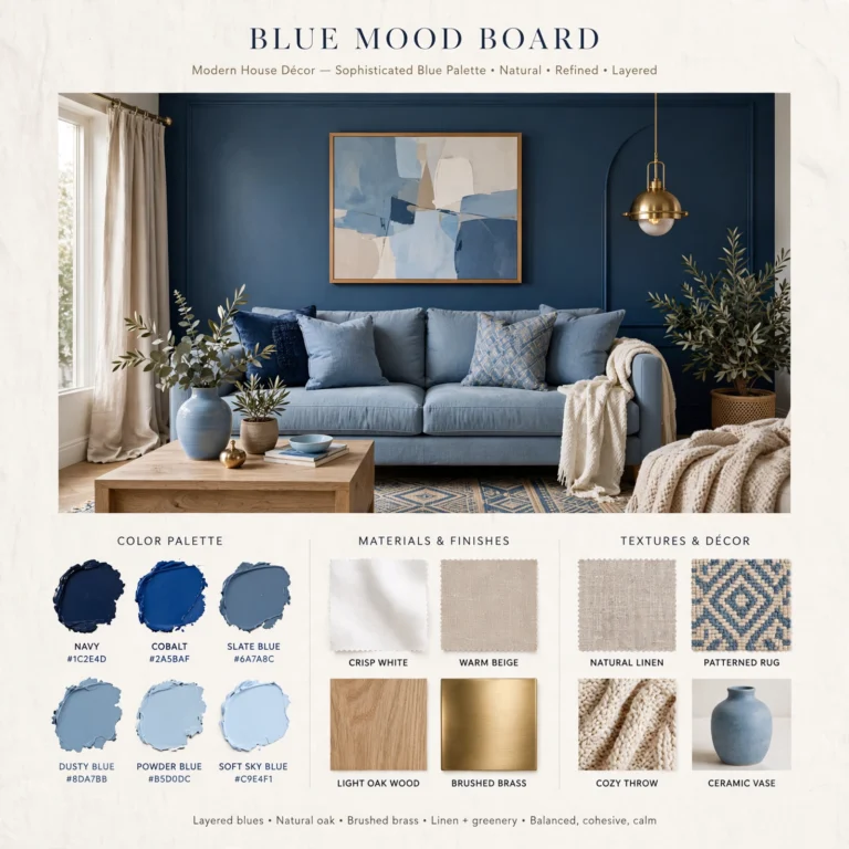
These seventeen pastel color palette combinations show that a soft, muted scheme reads as sophisticated rather than washed out when the paired tones share a similar saturation level and at least one warmer accent balances the overall temperature of the room. Start by testing physical swatches side by side in your room’s actual light, then build out from there with textiles and accents. If this guide helped, save it to Pinterest for your next paint project, or check out our related post on blue color palette ideas for more single-color combinations to explore.