13 Trending Fall Color Palette Combinations for a Warm Home
Fall color palettes tend to succeed or fail based on how well the deeper, more saturated tones are balanced against a lighter neutral, which is exactly where solid fall color palette ideas start. This guide walks through thirteen practical combinations, from rust and cream to harvest gold and deep teal, that you can apply to a single accent wall, textiles, or a full room refresh. You’ll learn which warm and cool pairings actually work together for a seasonal look, roughly where to use each palette, and how to avoid the common mistake of layering too many saturated fall tones without a neutral to anchor them. Each idea includes real hex codes and material pairings.
Trend & Background
Fall color palettes have moved beyond the classic orange-and-brown combination toward more layered, sophisticated pairings that mix a single deep seasonal tone with an unexpected complementary color, like teal or sage, rather than relying only on traditional autumnal hues. Muted, complex tones such as deep olive and burnt terracotta have grown in popularity because they solve a specific problem: a fall palette built entirely from bright orange and gold can feel more like a costume than year-round decor. This matters now because more paint and textile brands have released deeper, more nuanced fall-adjacent colors specifically designed to transition smoothly into winter rather than feeling seasonal for only a few weeks.
Key Takeaways
- Thirteen fall color palette pairings cover warm, rich combinations suited to living rooms, bedrooms, and entryways.
- Reference tables are included for hex codes, paint sheen, and best room applications so you can plan before you buy.
- Pairing a deep, saturated fall tone with a lighter neutral keeps a room from feeling too dark or heavy.
- Most palettes work as an accent wall or textile refresh rather than requiring a full repaint every season.
1. Rust and Cream
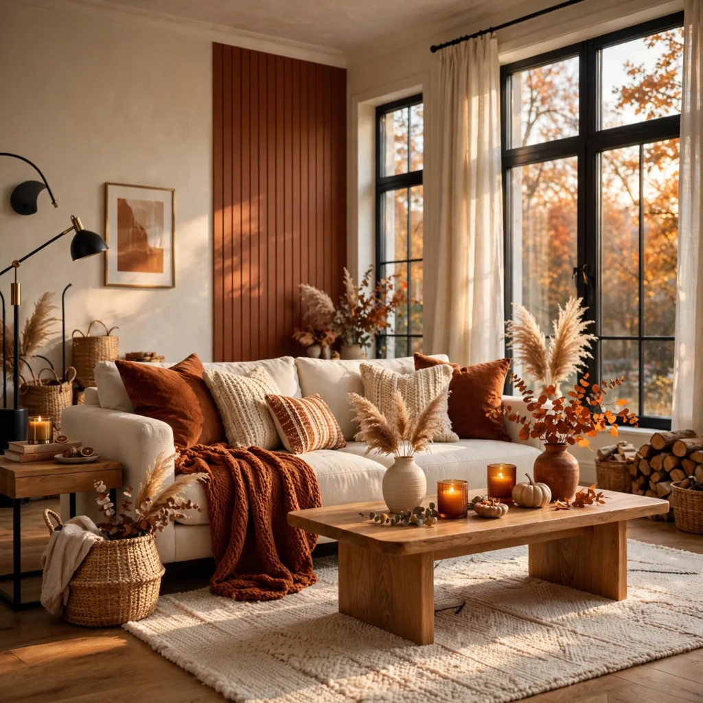
Rust paired with a warm cream, rather than a stark white, creates a classic fall combination that still feels balanced rather than overly saturated. Use rust as an accent through a sofa, an accent wall, or a rug, and let cream carry the dominant wall and trim color, since the lighter neutral prevents the deeper rust tone from making the room feel smaller or heavier than intended.
| Color | Hex Code | Best Use |
| Rust | #B5502F | Sofa, accent wall, rug |
| Warm cream | #F2E8D0 | Walls, trim |
2. Deep Olive and Burnt Orange
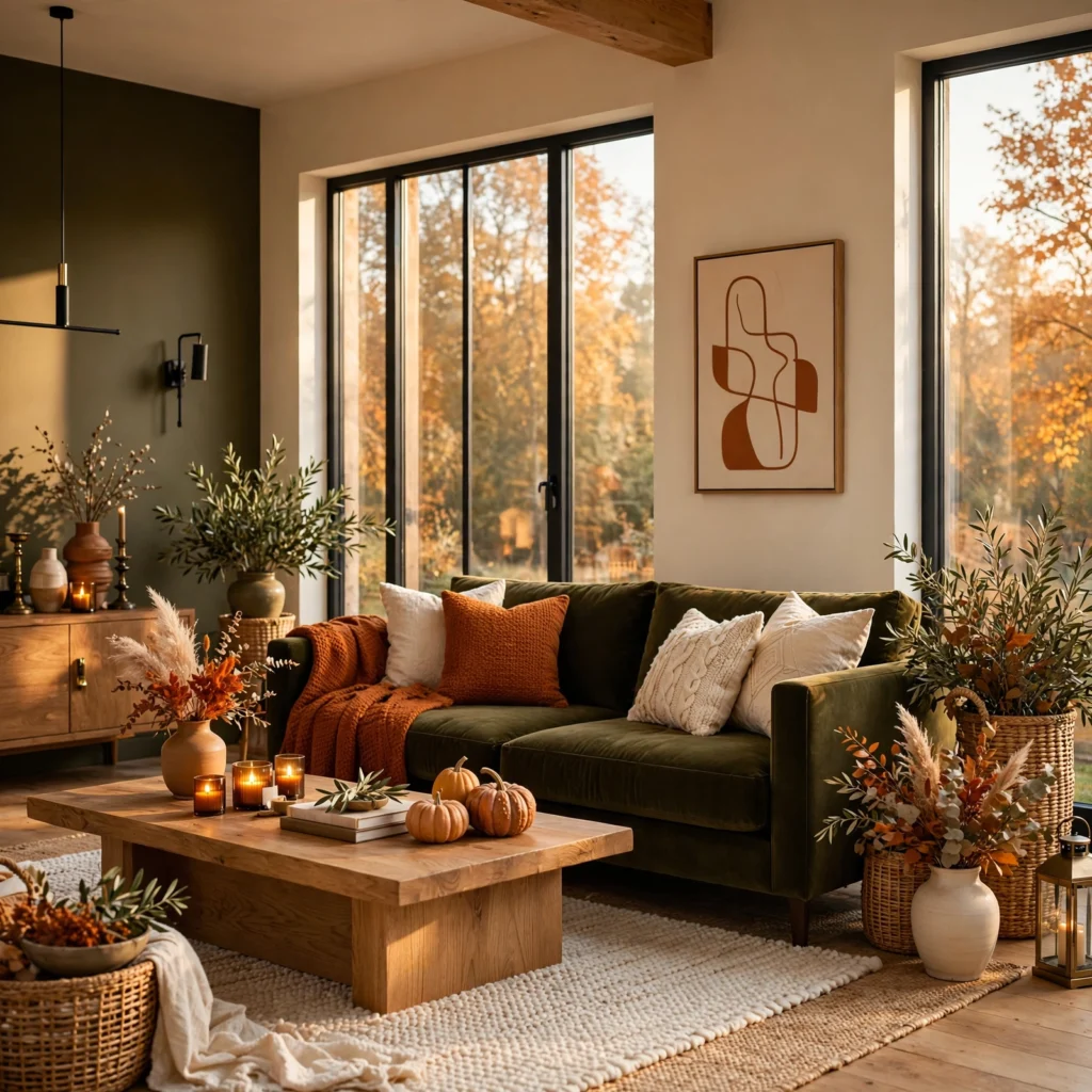
Deep olive paired with burnt orange creates a grounded, earthy fall scheme well suited to a den or home office. Use olive as the dominant wall color, since its muted, grayed-down green reads as more neutral than a brighter green would, and bring in burnt orange through smaller accents like pillows, art, or a throw blanket, keeping the ratio weighted toward olive so the orange stays a supporting accent rather than the dominant tone.
3. Burgundy and Mustard
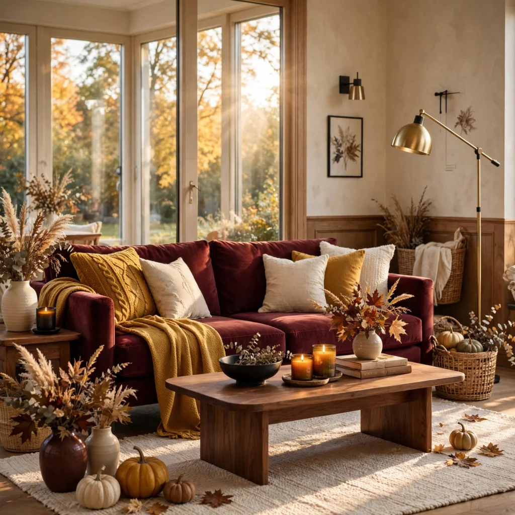
Burgundy paired with mustard creates a rich, high-contrast fall palette suited to a dining room or entryway where a bolder statement feels appropriate. Use burgundy on walls or a large upholstered piece, and bring in mustard through smaller accents like dining chairs, art, or ceramics, since both colors carry enough saturation that keeping one of them limited to accent-scale use prevents the pairing from feeling overly intense across a full room.
| Color | Hex Code | Best Use |
| Burgundy | #6B1F2A | Walls, upholstery |
| Mustard | #C9A227 | Accent chairs, art |
4. Chocolate Brown and Amber
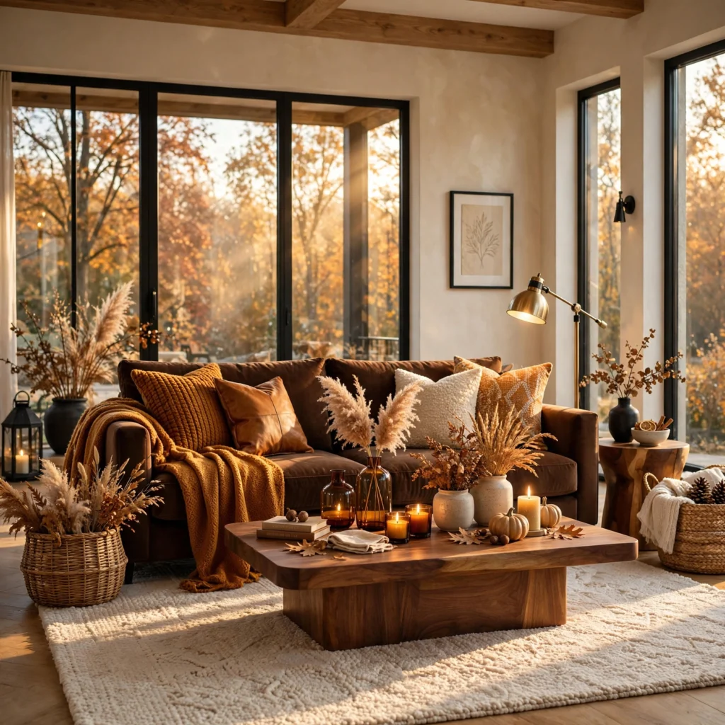
Chocolate brown paired with amber creates a warm, cozy combination that leans more sophisticated than a typical bright orange fall palette. Use chocolate brown on walls, cabinetry, or a large sofa, and bring in amber through glassware, lighting, or a lamp shade, since amber’s warm glow pairs particularly well with brown when introduced through actual light sources rather than only flat surface color.
From soft neutrals to bold statement shades, explore our winter color palette for fresh design inspiration.
5. Fall Color Palette Moodboard
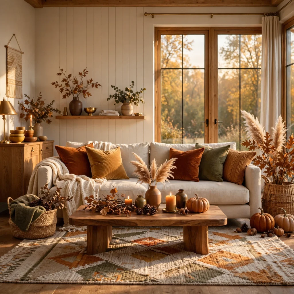
A moodboard acts as a rotating planning tool where you pin paint chips, fabric swatches, and reference photos while narrowing down a specific fall color palette for a room. Build one from a cork panel wrapped in linen, framed with thin wood trim, and test swatches on it under the room’s actual lighting at different times of day, since deeper fall tones can shift noticeably between warm afternoon light and cooler evening artificial light. Reviewing combinations here before committing avoids an expensive repaint.
6. Pumpkin and Charcoal
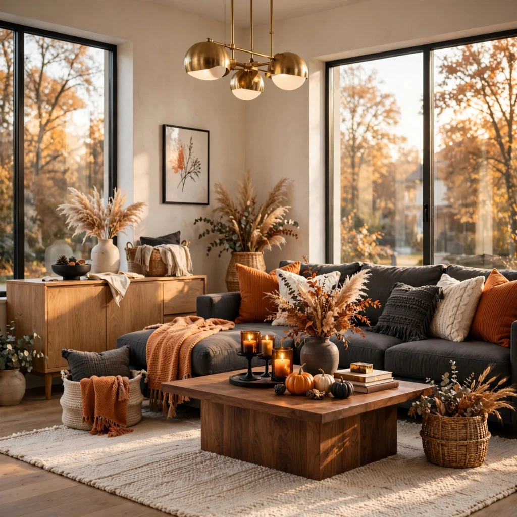
Pumpkin orange paired with charcoal creates a bold, modern take on a traditionally bright fall color, since the deep gray tempers the orange’s intensity and keeps the combination from reading as overly seasonal or costume-like. Use charcoal on trim, furniture, or a secondary wall, and let pumpkin carry a single accent wall or a smaller collection of accessories, keeping the pairing limited to these two tones without additional colors competing for attention.
| Color | Hex Code | Best Use |
| Pumpkin | #C9622F | Accent wall, accessories |
| Charcoal | #2B2B2B | Trim, furniture |
7. Cranberry and Sage
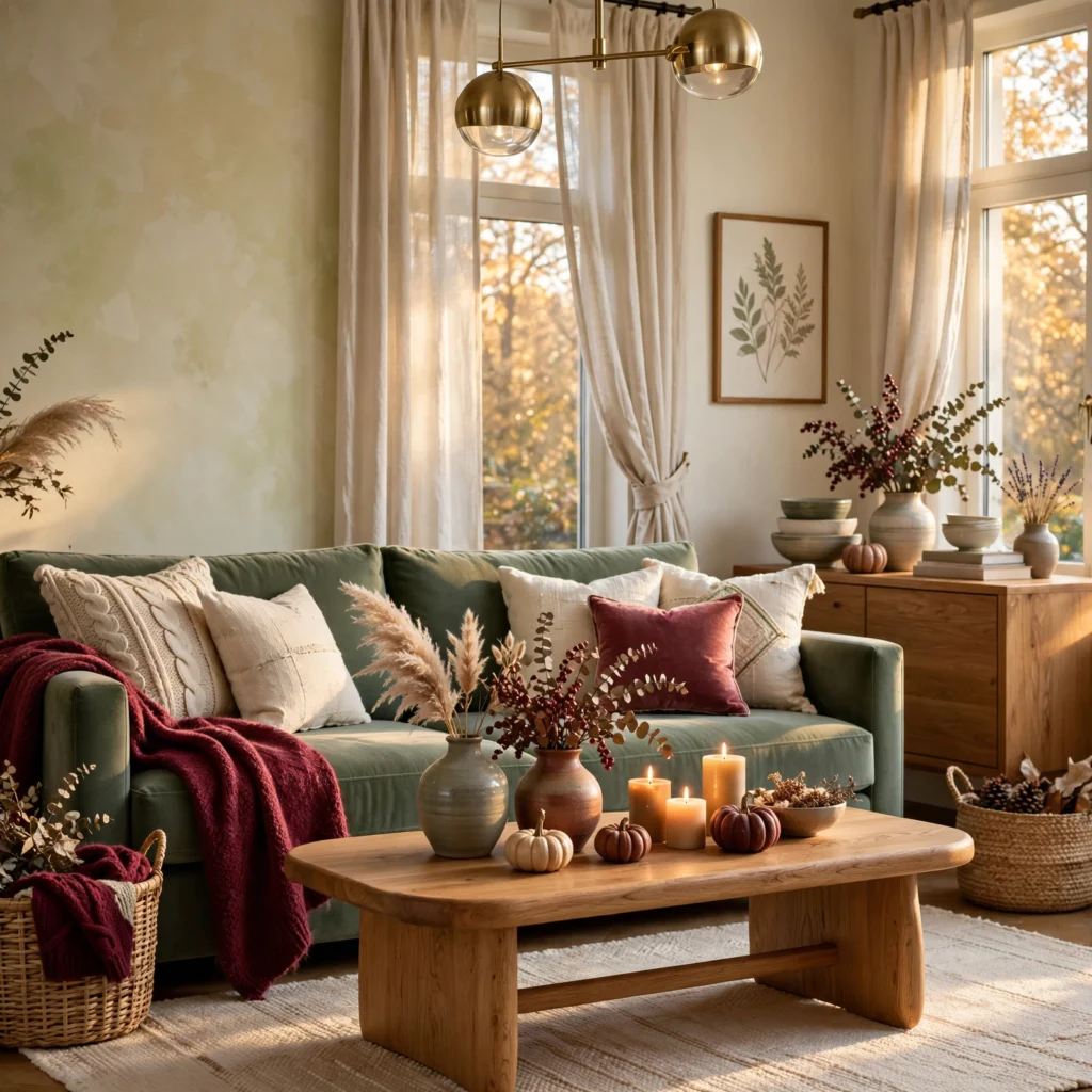
Cranberry paired with sage green creates an unexpected fall combination that feels fresher than a typical warm-only palette, since sage’s cool, muted undertone balances cranberry’s deep red warmth. Use sage as the dominant wall or bedding color, and bring in cranberry through smaller accents like pillows or a throw blanket, since this pairing works particularly well in a bedroom where a fully saturated cranberry room might otherwise feel too intense for a restful space.
8. Golden Wheat and Espresso
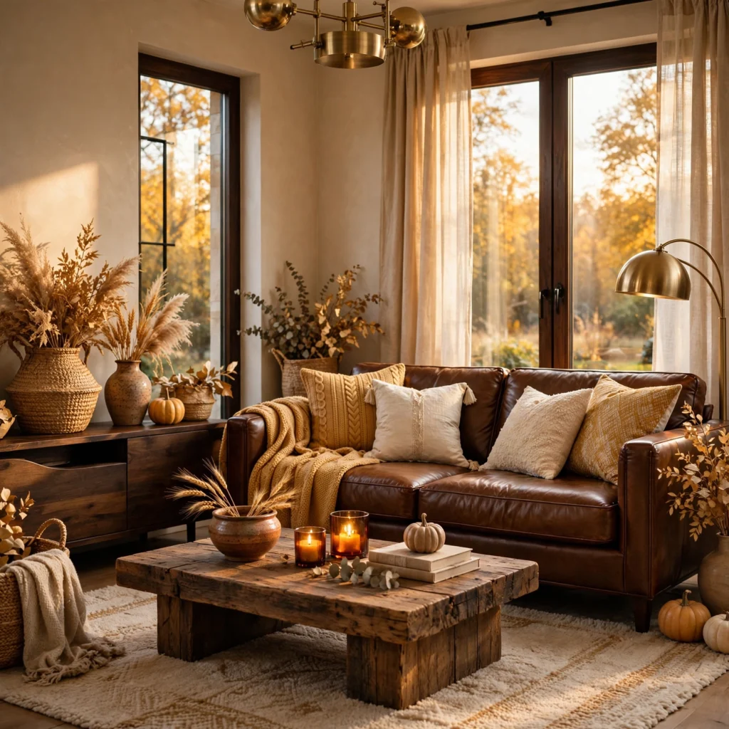
Golden wheat paired with espresso brown creates a warm, grounded palette well suited to a kitchen or breakfast nook. Use golden wheat on walls or a full accent wall, and bring in espresso through cabinetry, furniture, or countertops, since this combination reads as inviting without leaning into brighter, more overtly seasonal orange tones.
| Color | Hex Code | Best Use |
| Golden wheat | #D9B76A | Walls |
| Espresso brown | #3B2A1E | Cabinetry, furniture |
9. Terracotta and Navy
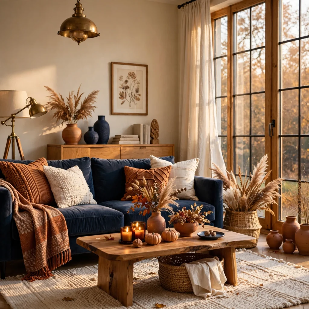
Terracotta paired with navy creates a striking warm-cool contrast that works well in a living room where a fall palette still needs to feel intentional rather than purely seasonal. Use navy as the dominant wall or sofa color, and bring in terracotta through smaller accents like pillows, art, or ceramics, since this pairing carries enough visual interest that keeping one tone dominant prevents the combination from feeling visually split down the middle.
10. Plum and Copper
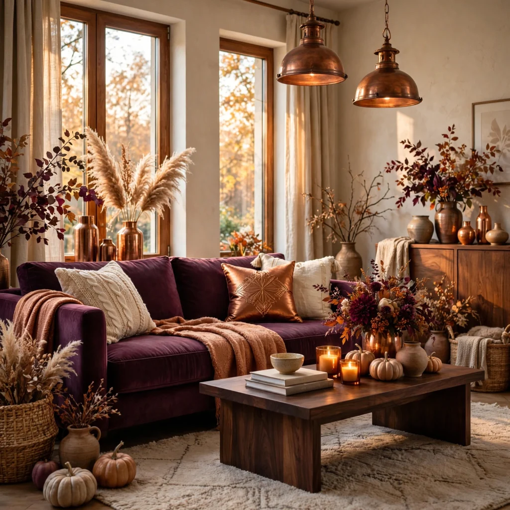
Plum, a deep purple-leaning tone, paired with copper accents creates a moody, elegant fall palette suited to a dining room or powder room. Use plum on walls in a smaller room where the depth won’t feel overwhelming, and bring in copper through light fixtures, hardware, or a mirror frame, since copper’s warm metallic tone catches light in a way that keeps a fully saturated plum room from feeling flat or one-dimensional.
| Color | Hex Code | Best Use |
| Plum | #4A2E4A | Walls |
| Copper | #B87333 | Lighting, hardware |
11. Forest Green and Rust
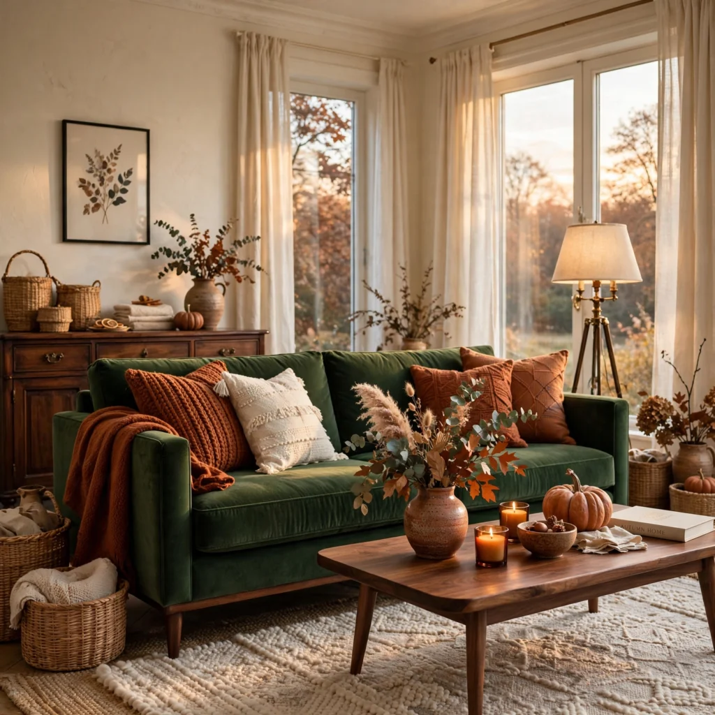
Forest green paired with rust creates a classic, nature-inspired fall combination that reads as timeless rather than trend-dependent. Use forest green as the dominant wall or upholstery color, and bring in rust through a rug, pillows, or ceramics, since this pairing works well across a range of room types, from a living room to a home office, without needing a third color to feel complete.
12. Camel and Burgundy
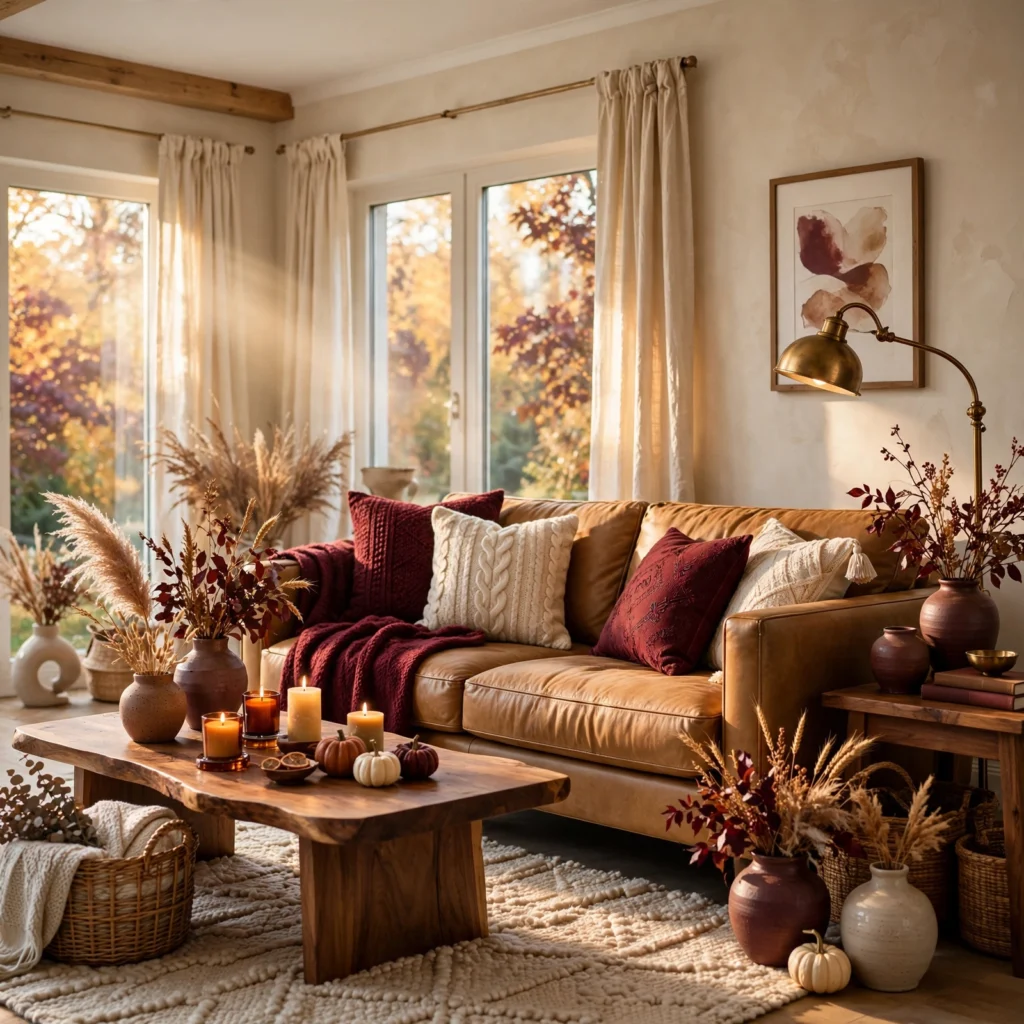
Camel, a warm tan, paired with burgundy creates a sophisticated, slightly muted fall palette that works well in a bedroom or study. Use camel as the dominant wall or bedding color, and bring in burgundy through a headboard, throw blanket, or a single accent chair, since camel’s neutral warmth allows burgundy to read as a deliberate, elegant accent rather than an overwhelming dominant color.
| Color | Hex Code | Best Use |
| Camel | #C4A06A | Walls, bedding |
| Burgundy | #6B1F2A | Headboard, accent chair |
13. Harvest Gold and Deep Teal
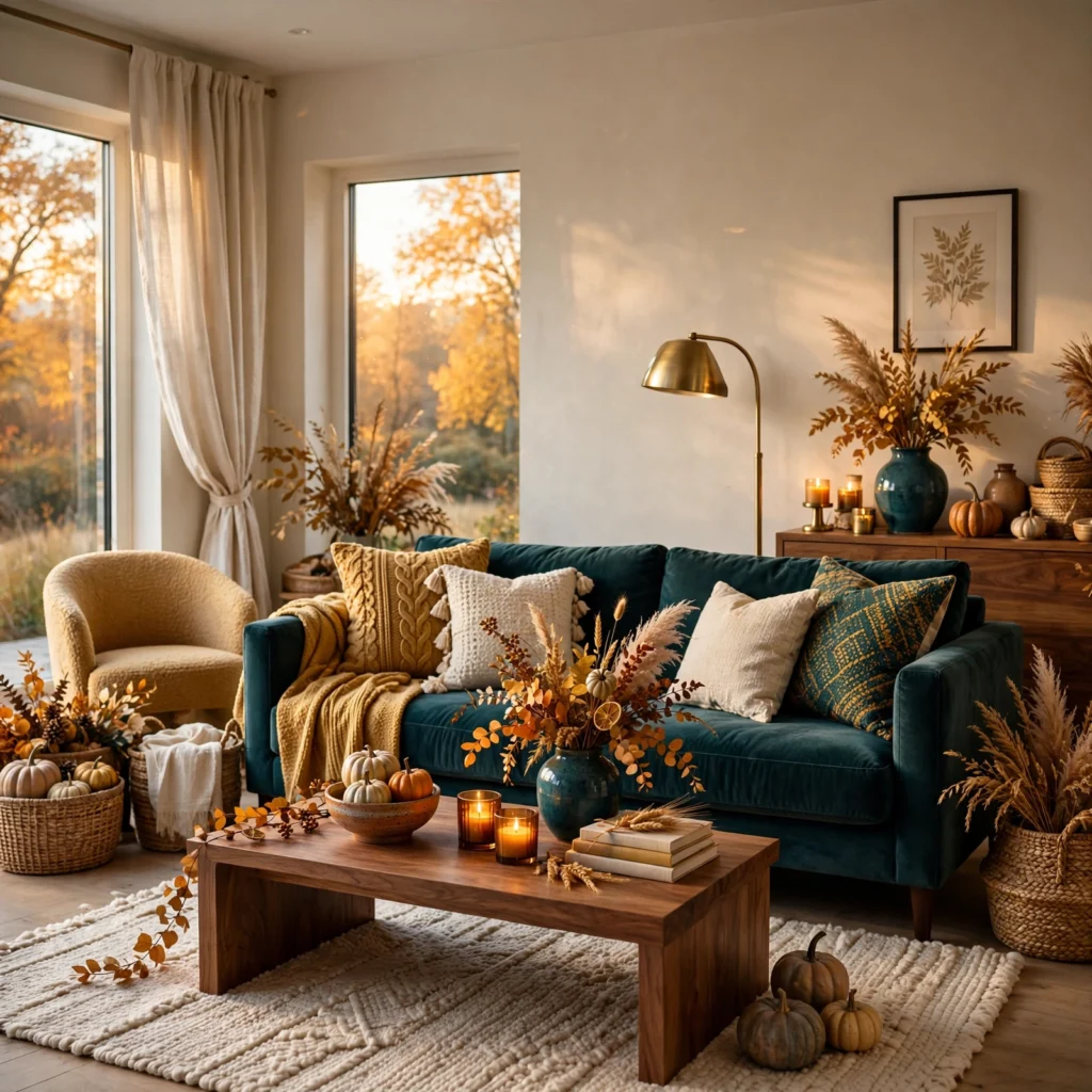
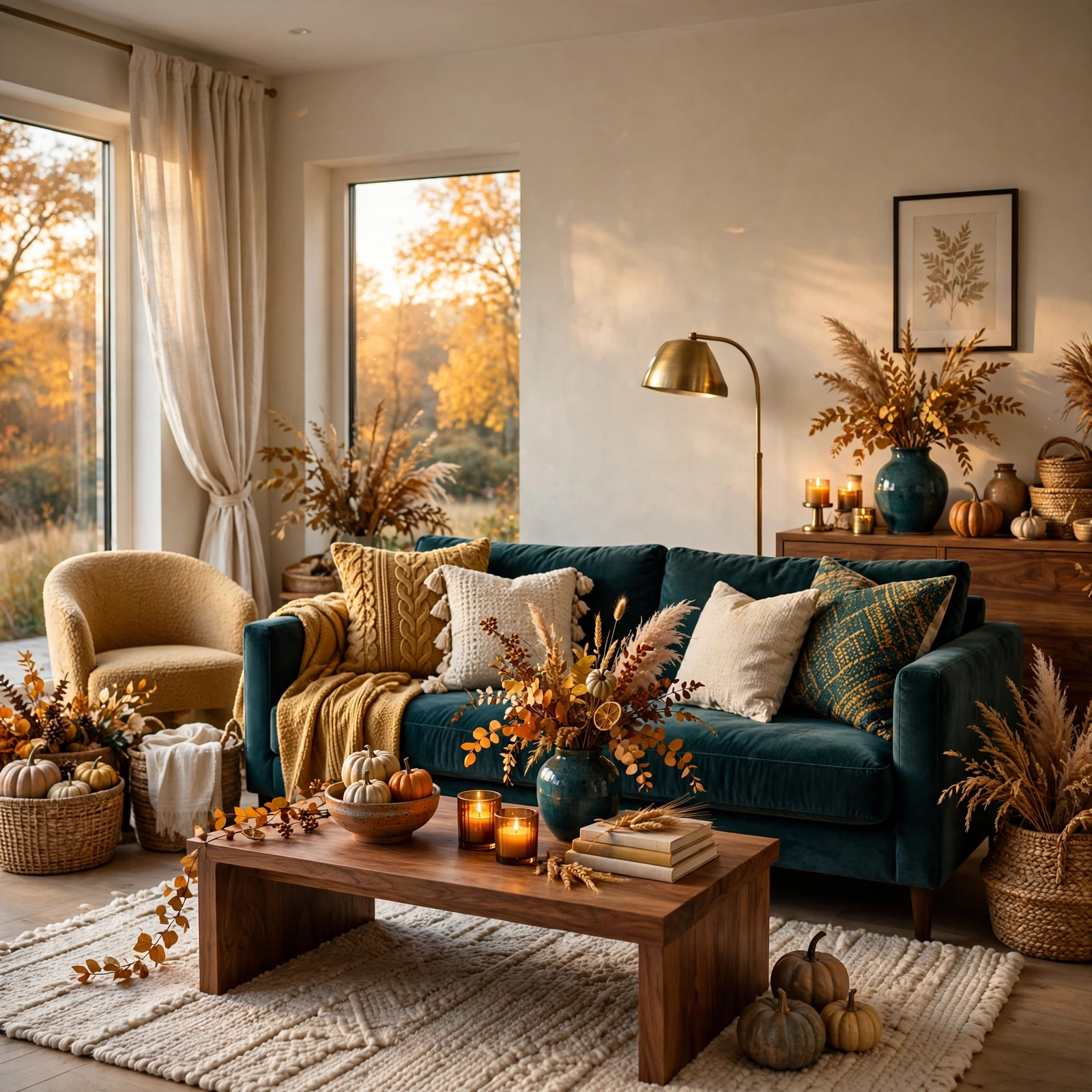
Harvest gold paired with deep teal creates a retro-inspired fall combination that offers strong contrast without relying on the more expected orange and brown pairing. Use teal as the dominant wall or sofa color, and bring in harvest gold through smaller accents like pillows, art, or a lamp shade, since this pairing works particularly well for anyone wanting a fall palette that still feels distinct from traditional autumnal color choices.
Shop the Look
A few specific products make these palettes easier to execute well. Farrow & Ball’s “Book Room Red” and “Bancha” work well as reference points for the burgundy and olive palettes above. Sherwin-Williams’ “Cavern Clay” is a reliable match for the terracotta and rust tones featured throughout this list. For metallic accents, Rejuvenation and Schoolhouse both offer copper and warm brass lighting that pairs well with the plum and copper or chocolate brown and amber combinations. Loloi’s wool rug collection carries several options in rust, olive, and burgundy tones suited to these palettes.
Common Mistake to Avoid
The most common mistake with a fall color palette is layering too many saturated seasonal tones into one room without a neutral base to anchor them, which can make a space feel heavy or overly themed rather than simply warm and inviting. Keeping one lighter neutral, like cream or camel, as the dominant surface color and reserving the deeper fall tones for accents and smaller furniture pieces prevents this, allowing the palette to feel intentional in every season rather than tied to a few autumn weeks.
People Also Ask
What colors are considered a fall color palette?
Fall color palettes typically draw from warm, earthy tones like rust, burnt orange, mustard, deep olive, and burgundy, often paired with a neutral like cream or camel to keep the overall scheme balanced. More modern fall palettes also incorporate unexpected contrasts, like deep teal or navy, alongside these traditional warm tones for a combination that feels less strictly seasonal and more versatile throughout the year.
How do I make a fall color palette feel less seasonal and more year-round?
Pairing a deep fall tone with a neutral base color, rather than combining several bright autumnal hues together, keeps the palette from reading as overtly seasonal decor. Choosing muted, complex versions of fall colors, like a grayed-down olive instead of a bright orange, and applying them through larger furniture pieces rather than temporary seasonal accessories also helps a fall-inspired palette hold up as a permanent room scheme.
What is the best accent color to pair with a fall color palette?
Cream, camel, and warm white all work reliably as neutral bases for a fall palette, since they balance the depth of tones like burgundy or forest green without competing for attention. For a bolder accent, copper and warm brass metals pair particularly well with fall colors, adding a reflective warmth that complements deep, saturated wall or furniture colors without introducing an additional distinct hue.
Should I paint my whole room in a fall color palette?
Painting an entire room in a deep fall tone like burgundy or forest green works well in smaller spaces, such as a dining room or powder room, where the depth reads as intentional rather than overwhelming. In larger, more frequently used rooms like a living room, applying the deeper fall tone to a single accent wall or through furniture and textiles, while keeping the remaining walls in a lighter neutral, generally produces a more livable, less visually heavy result.
How can I update my home for fall without repainting?
Swapping textiles like throw pillows, a rug, and a throw blanket into fall tones like rust, mustard, or olive is the fastest way to bring a seasonal palette into a room without committing to a full repaint. Adding warm metallic accents, like a copper vase or brass candle holders, and layering in a few ceramic pieces in deeper fall colors also shifts a room’s feel significantly with minimal cost or effort.
Conclusion
These thirteen fall color palette combinations show that a warm, seasonal scheme reads as sophisticated rather than overwhelming when a deep, saturated tone is balanced against a lighter neutral base. Start with one accent wall or a textile refresh in your chosen combination, then expand from there once you’ve confirmed the pairing works in your room’s actual light. If this guide helped, save it to Pinterest for your next paint project, or check out our related post on color palette design ideas for the methods behind building a balanced scheme like these.