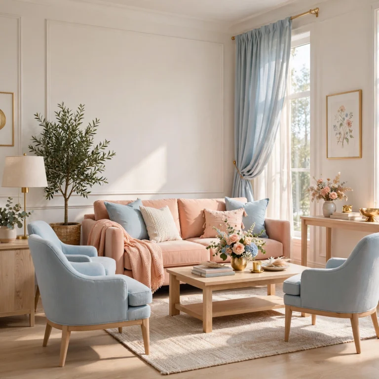
16 Beautiful Pink Color Palette Ideas for Every Room and Project
Picking the right pink color palette comes down to more than choosing a shade you like, since pink shifts dramatically depending on its undertone, the materials around it, and the light hitting it throughout the day. This guide breaks down sixteen distinct palettes, from dusty, muted neutrals to bold, saturated combinations, each with real hex codes and pairing notes so you can move straight from inspiration to an actual paint can, fabric swatch, or design file. Whether you’re working on a room, a brand, or a single accent wall, there’s a palette here built around a specific mood and use case.
Trend & Background
Pink has moved well beyond its association with a single soft, pastel shade, expanding into deeper terracotta-adjacent tones, near-neutral mauves, and high-saturation combinations paired with black or deep green. This shift mirrors a broader move in both interior design and branding toward warmer, more complex neutrals that read as sophisticated rather than juvenile. Understanding undertone, whether a pink leans warm and peachy or cool and mauve, matters more now than ever, since mixing warm and cool pinks in the same space is one of the fastest ways for a palette to feel accidentally off rather than intentional.
Key Takeaways
- Sixteen palettes ranging from soft, muted neutrals to bold, saturated combinations for interiors, branding, and design work
- Hex codes are included for every palette so you can pull exact colors into paint, print, or digital projects
- Reference tables cover undertone pairing and lighting considerations so a palette reads correctly in the final space
- Five FAQs cover which pinks work with which skin tones, metals, and lighting conditions
1. Dusty Rose Neutral Palette
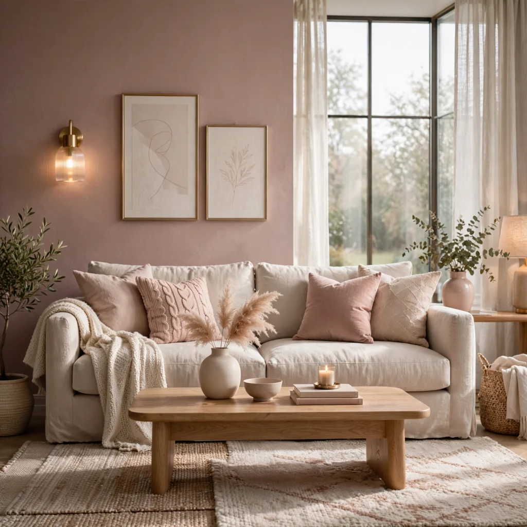
Dusty rose pairs a muted, slightly grayed pink with warm neutrals like sand and taupe, creating a palette soft enough to use as a wall color without feeling overly sweet. This combination works especially well in bedrooms and living rooms since the grayed-down pink reads closer to a neutral than a true color statement. Pair dusty rose with brushed brass or warm wood tones rather than cool metals like chrome, since the warmth in both elements reinforces rather than competes with each other.
| Color | Hex Code | Role |
| Dusty Rose | #C08497 | Primary |
| Warm Sand | #D9C7B8 | Secondary |
| Soft Taupe | #A89A8C | Accent |
| Warm White | #F5EFE9 | Base |
2. Millennial Pink Classic
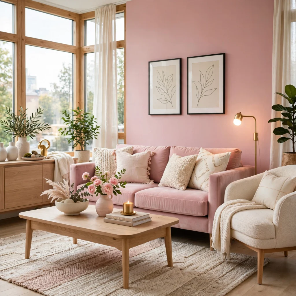
Millennial pink, a flat, slightly cool pastel pink, remains one of the most recognizable palettes of the last decade, and it still works well when paired with restraint rather than repeated across every surface. Combine it with a true white and a cool gray to keep the palette from feeling dated, and use the pink itself sparingly, on one wall, a single piece of furniture, or a logo mark, rather than throughout an entire space. This palette photographs particularly well in flat, even lighting, which is part of why it became so popular for branding and product photography.
3. Terracotta Blush Palette
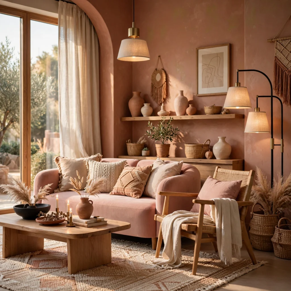
Terracotta blush blends a warm, clay-adjacent pink with true terracotta and a deep rust accent, producing a palette that reads as earthy and grounded rather than sweet. This combination suits kitchens, dining rooms, and exteriors where a softer pink alone might feel too delicate for the space. Pair terracotta blush with unlacquered brass, natural wood, and woven natural fiber textures, since the palette’s warmth is reinforced by materials with similar undertones rather than cooler stone or chrome finishes.
4. Mauve and Charcoal Contrast
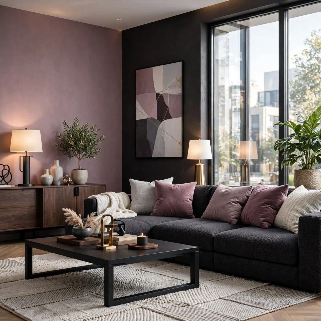
Pairing a deep, cool-toned mauve with charcoal or near-black creates a palette with far more visual weight than a typical soft pink combination, making it suitable for a bedroom or living room that wants a moodier, more grown-up feel. Use mauve as the dominant wall or upholstery color and reserve charcoal for trim, frames, or a single accent piece so the darker tone grounds the space without overwhelming it. Matte black hardware and fixtures complete this palette better than polished or warm metals.
5. Coral Pink Sunset Palette
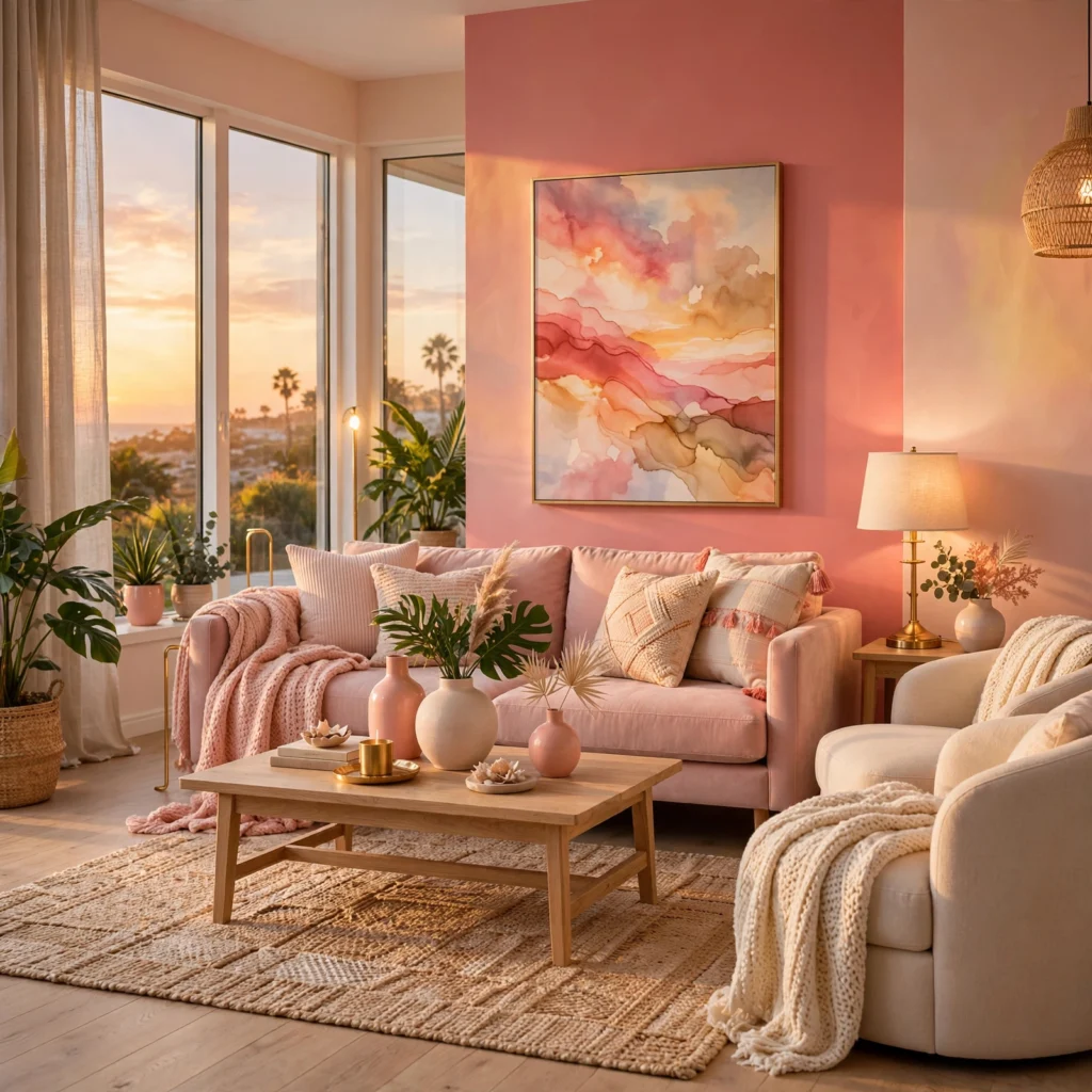
A coral pink sunset palette layers a warm, slightly orange-leaning pink with deeper coral and a soft golden yellow, producing a combination with real energy that works well in a dining room, kids’ space, or brand identity aimed at feeling approachable rather than formal. Keep the golden yellow as the smallest proportion of the palette, used in accents rather than large surfaces, since too much yellow next to coral can push the combination toward feeling more orange than pink overall.
6. Blush and Sage Pairing
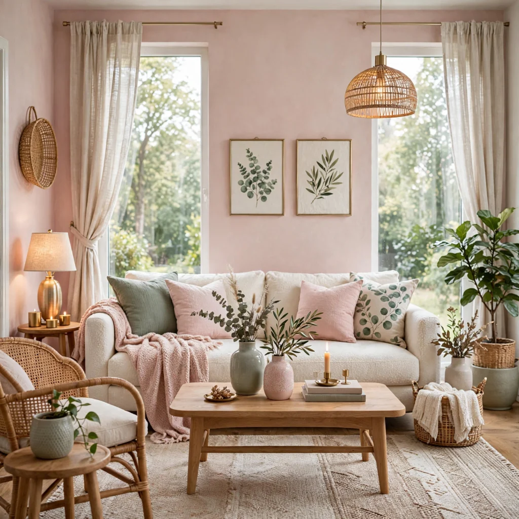
Blush pink paired with a muted sage green is one of the most reliable pink-and-green combinations, since both colors sit at a similarly soft, desaturated level rather than one overpowering the other. This palette works particularly well in a nursery, home office, or living room aiming for a calm, botanical feel rather than a bold style statement. Add a warm wood tone as a third element to keep the palette from feeling too cool overall, since blush and sage alone can read slightly clinical without it.
Looking for the right combination of shades? Discover a beautiful green color palette to transform your rooms.
7. Hot Pink and Black Palette
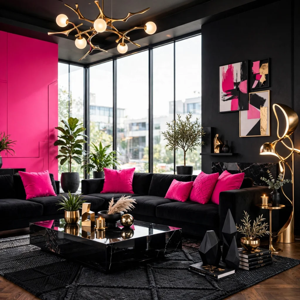
A hot pink and black combination delivers maximum visual impact and suits branding, statement decor pieces, or a single accent wall in a space that wants real energy rather than a calm, neutral backdrop. Keep the ratio heavily weighted toward black or white as a base, using hot pink in smaller, more concentrated doses, since covering large surfaces in saturated pink tends to feel overwhelming outside of a genuinely maximalist space. This combination photographs especially well under direct, bright lighting rather than warm, dim ambient light.
8. Pale Pink and Cream Palette
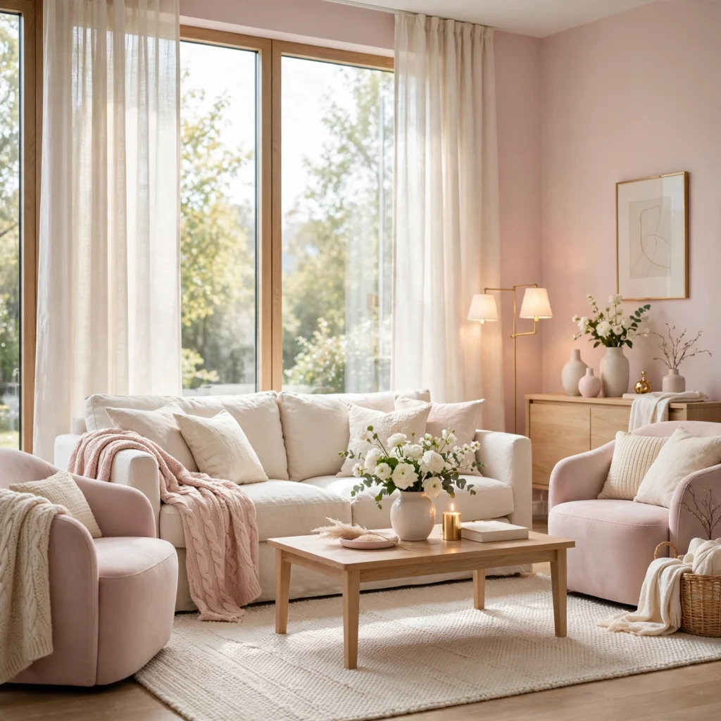
Pale pink paired with cream and a soft warm white creates one of the most subtle pink palettes available, close enough to neutral that it works in spaces wanting softness without an obvious color statement. This combination suits bedrooms, bathrooms, and nurseries where a barely-there wash of color feels more appropriate than a bold accent. Layer in varied textures, linen, boucle, and a matte ceramic finish, since a palette this close to neutral relies on texture rather than contrast to stay visually interesting.
9. Raspberry and Navy Palette
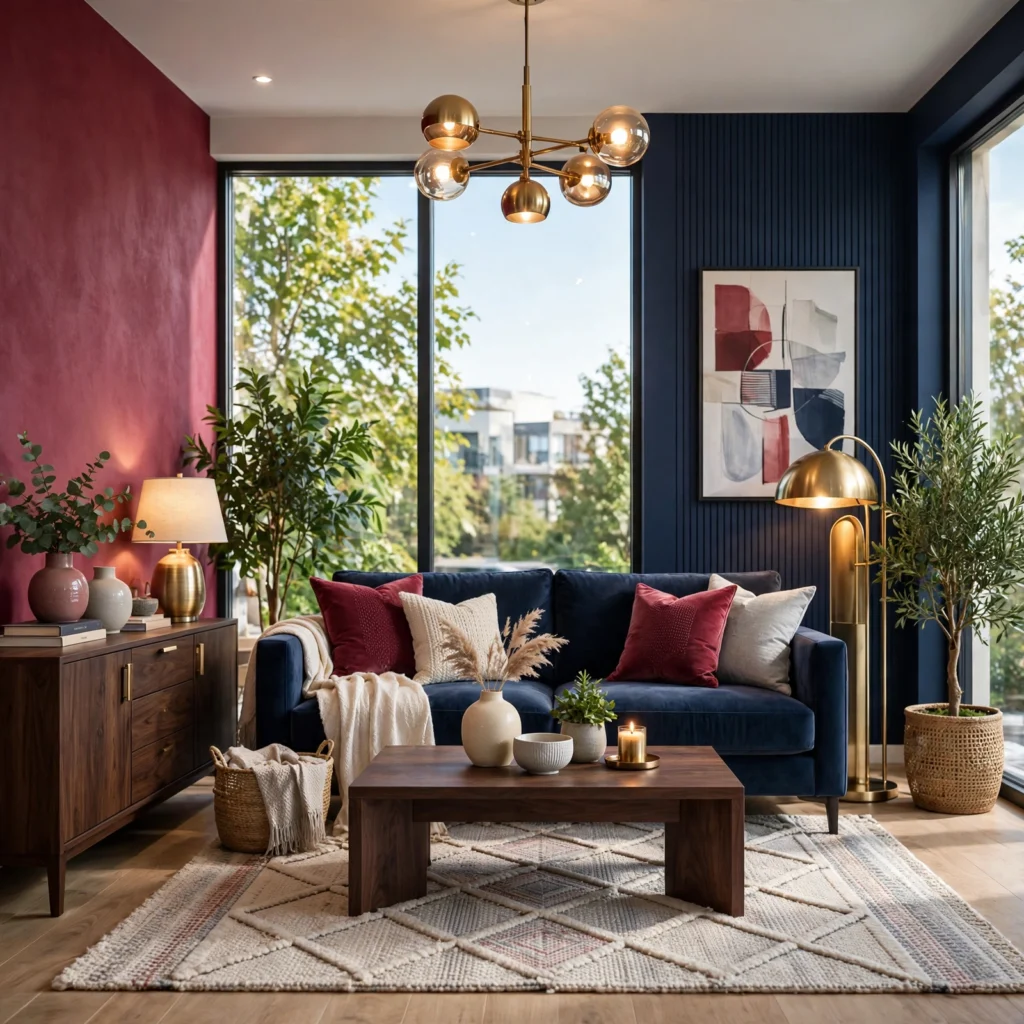
A deep raspberry pink paired with navy produces a rich, jewel-toned palette that reads as more sophisticated and less playful than lighter pink combinations. This pairing works especially well in a dining room, home office, or powder room, where a smaller, more contained space can handle the visual weight of two saturated colors without feeling overwhelming. Brass or gold hardware bridges the two colors effectively, since the warm metal picks up on raspberry’s warmth while still reading elegant against the cooler navy.
| Color | Hex Code | Role |
| Raspberry | #A83E5C | Primary |
| Deep Navy | #1B2A4A | Secondary |
| Warm Brass | #C9A66B | Accent |
| Soft White | #F7F4EF | Base |
10. Rose Gold Metallic Palette
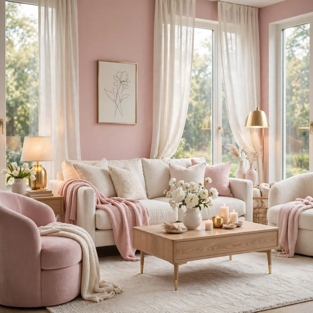
A rose gold metallic finish paired with a soft pink base color creates a palette built around shimmer and warmth rather than flat color contrast, making it especially suited to bathroom fixtures, jewelry-adjacent branding, or a glam-leaning bedroom. Keep the rose gold to hardware, light fixtures, and small decorative accents rather than large surfaces, since a metallic finish loses its impact when overused across an entire room. Pair with a warm white or soft gray rather than a stark white, since stark white tends to make rose gold read colder than intended.
11. Dusty Pink and Olive Palette
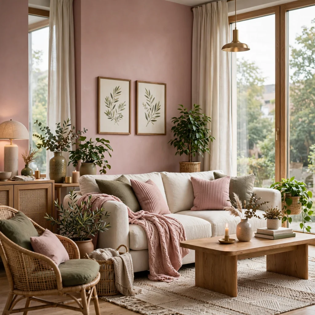
Dusty pink combined with olive green produces an earthy, muted palette that trades the sweetness of brighter pink-and-green combinations for something closer to a natural, worn-in feel. This pairing suits a living room or office aiming for warmth without leaning traditional or overly soft. Add a rust or warm brown accent as a third color to bridge the pink and olive together, since the two colors alone can occasionally feel slightly disconnected without a warmer transitional tone in between.
12. Pink and Gray Modern Palette
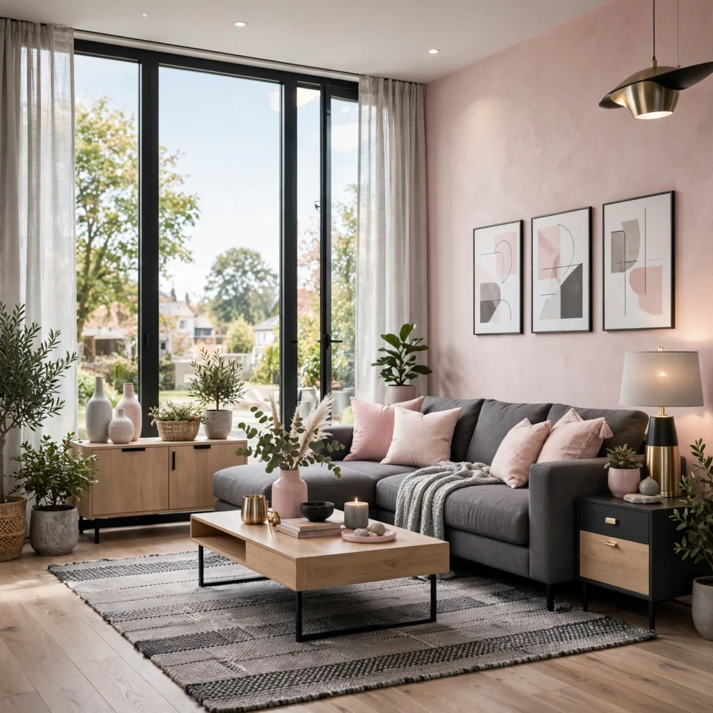
Pairing a clear, slightly cool pink with a range of grays, from light dove gray to a deeper charcoal, produces a palette that feels current and restrained rather than overtly sweet or feminine. This combination suits a modern living room, home office, or brand identity wanting a single color accent within an otherwise neutral, minimal palette. Keep the pink to under twenty percent of the overall color usage in a room, reserved for a single wall, chair, or accent piece, so the grays remain the dominant, grounding tone.
13. Peachy Pink Sunset Palette
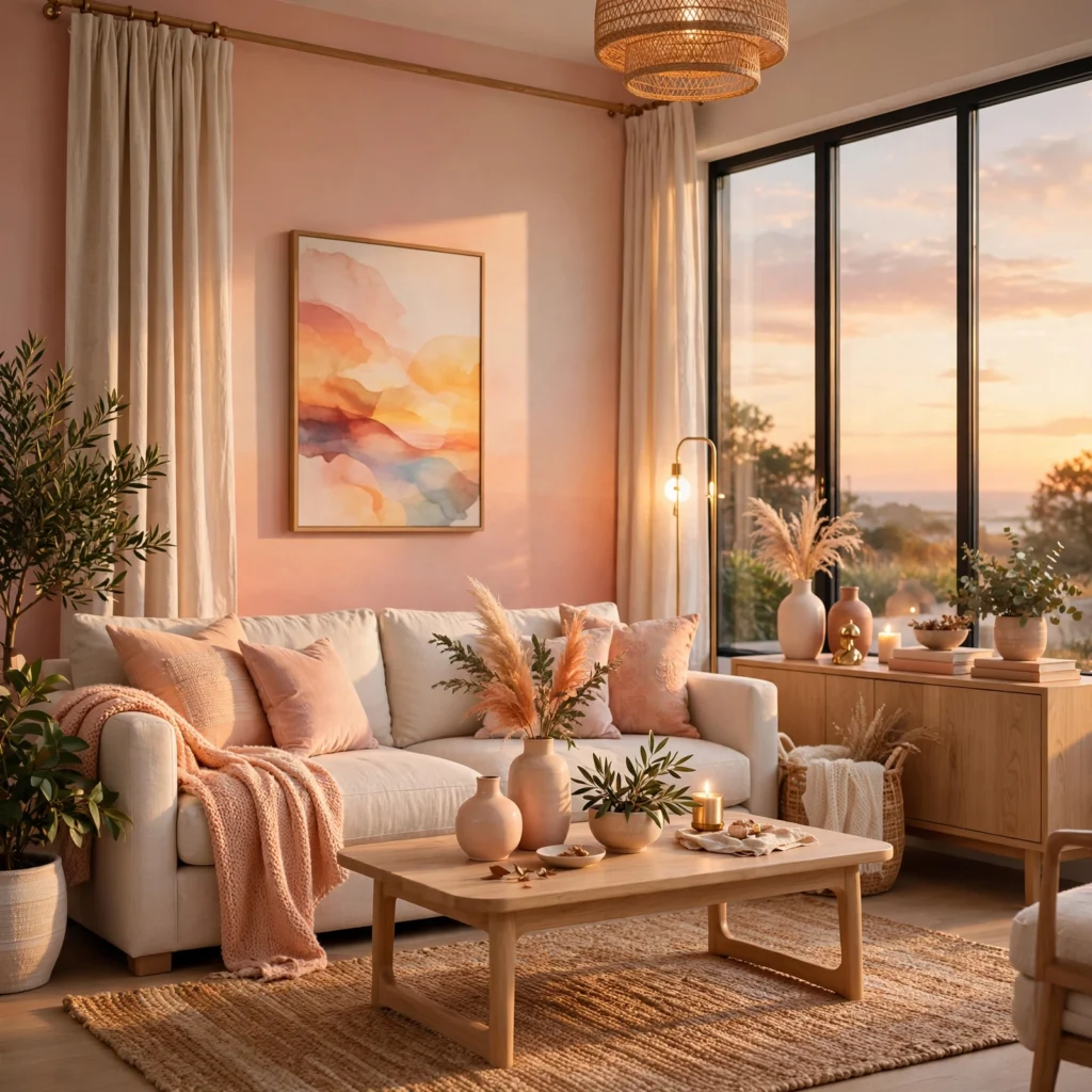
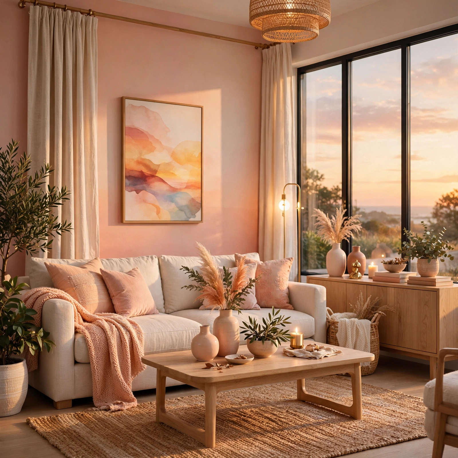
A peachy pink palette leans warmer and slightly more orange than a true pink, producing a softer, more approachable combination that suits kitchens, nurseries, and casual dining spaces. Pair peachy pink with cream and a muted coral accent to keep the overall palette cohesive without introducing a cooler tone that would clash with the warmth already present. This palette reads particularly well under warm incandescent or warm LED lighting, since cooler daylight bulbs can wash out the subtlety of the peach undertone.
14. Fuchsia and Emerald Palette
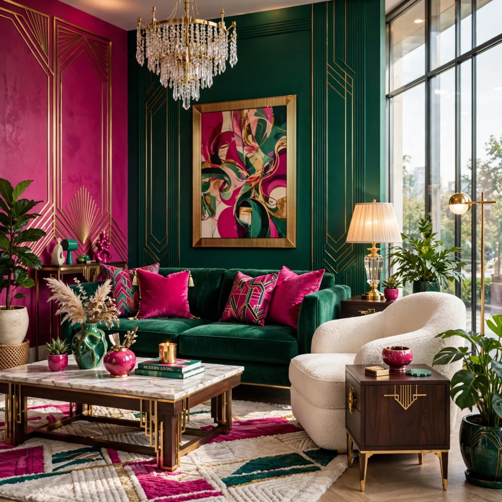
Fuchsia paired with emerald green creates a maximalist, jewel-toned palette suited to a powder room, a statement piece of furniture, or a brand wanting to stand out clearly from softer, more muted competitors. Both colors carry significant saturation, so keep the overall composition simple, one dominant color and one accent, rather than mixing in additional bold colors that would compete for attention. Gold or brass metal finishes complete this palette more effectively than silver or chrome, since warm metals sit naturally between the two saturated hues.
15. Ballet Pink and Ivory Palette
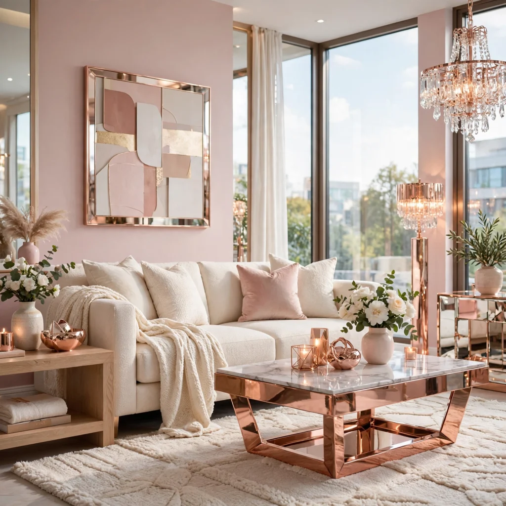
Ballet pink, a soft, slightly cool pastel, paired with ivory rather than stark white produces a romantic, quiet palette suited to a bedroom, nursery, or a wedding-adjacent brand identity. The ivory base keeps the palette from feeling as sharp or clinical as ballet pink paired with true white would, softening the overall contrast. Add a small amount of warm gold or champagne metallic detailing to keep the palette from feeling flat, since two very close pastel tones alone can read as slightly undefined without a third element for contrast.
16. Watermelon Pink Bold Palette
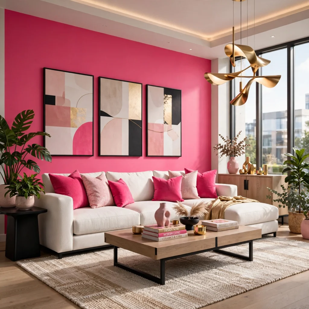
A watermelon-inspired palette pairs a bright, slightly cool pink with a deep green accent and small touches of black, referencing the fruit’s coloring without leaning literal or novelty. This combination suits a playful kitchen, a kids’ room, or a summer-focused brand or product line wanting energy without feeling juvenile. Keep the green to roughly a third of the palette’s overall usage and the black to small detail work only, letting the pink remain the clear dominant color throughout the space or design.
Shop the Look
For dusty rose paint, look at Benjamin Moore’s “Pink Damask” or Sherwin-Williams’ “Rosy Outlook.” Terracotta blush ceramics and textiles are easiest to source through Anthropologie or a local pottery studio. Rose gold hardware and fixtures from Delta or Kohler cover the metallic palette idea directly. For raspberry and navy textiles, look at velvet options from Loloi or Interior Define, and brass accents from Schoolhouse round out most of the warmer palettes above.
Common Mistake to Avoid
The most common mistake with any pink color palette is mixing warm and cool undertones without realizing it, pairing a peachy, warm pink with a cool, blue-based mauve in the same room, for example, which reads as slightly off even to someone who can’t identify exactly why. Hold physical paint or fabric swatches next to each other in the actual room’s lighting before committing, since undertone differences that are invisible on a screen or in a store’s fluorescent lighting often become obvious in daylight or warm evening light at home.
Frequently Asked Questions
What pink undertone works best with warm lighting?
Peachy, coral, and terracotta-leaning pinks with warm undertones generally read best under warm incandescent or warm LED lighting, since the light’s yellow-orange cast reinforces rather than fights the pink’s existing warmth. Cool-toned pinks, like a true millennial pink or a mauve, can shift toward looking slightly muddy or brown under very warm lighting, losing some of their crispness. If a room relies heavily on warm bulbs, testing the specific pink swatch under that exact lighting before painting a full wall avoids an unpleasant surprise once the room is finished.
Does pink work with black and dark colors?
Pink pairs well with black and other dark colors, and the contrast tends to make the pink itself look more saturated and intentional rather than soft or accidental. Hot pink and black, or raspberry and navy, both rely on this same principle, using a dark, grounding color to keep a bold pink from feeling too sweet on its own. The key is proportion, using the dark color as roughly half to two-thirds of the overall palette so pink reads as a deliberate accent rather than getting overwhelmed or looking like an afterthought.
What metal finish pairs best with a pink color palette?
Warm metals, brass, rose gold, and copper, generally pair more naturally with pink than cool metals like chrome or brushed nickel, since both the metal and the color share a similar warmth. Cooler, more muted pinks like a true mauve or a cool millennial pink can work with brushed nickel or even matte black for a more modern, less overtly warm combination. Testing a small metal sample against your specific pink swatch is worth doing before committing to fixtures, since the pairing can look noticeably different depending on the pink’s exact undertone.
Can pink work in a small room without making it feel smaller?
Lighter, more muted pinks like pale pink, dusty rose, or ballet pink generally work well in small rooms since their lower saturation keeps walls from visually advancing the way a highly saturated color can. Reserving a bolder, more saturated pink for a single accent wall, rather than all four walls, is the safer approach in a smaller space, since it adds color impact without the enclosing effect a fully saturated room can create. Pairing any pink with a lighter ceiling color also helps a small room continue to feel open rather than boxed in.
How do I choose a pink color palette that won’t feel too trendy in a few years?
Muted, complex pinks with some gray, brown, or clay mixed into their base, like dusty rose, terracotta blush, or mauve, tend to age more gracefully than flat, single-note pastels like a true millennial pink, since the added complexity reads less as a specific design moment and more as a genuine neutral. Building the palette around one of these more complex pinks as the dominant color, then using a brighter or trend-driven pink only in small, easily replaceable accents like pillows or accessories, keeps the overall space flexible as trends shift.
Conclusion
The sixteen palettes above cover soft neutrals, bold contrasts, and everything in between, giving you enough range to find a pink color palette suited to almost any room, brand, or project. Whether you start with a quiet dusty rose or commit to a bold fuchsia and emerald combination, the goal is a palette built around undertone and proportion rather than a single shade picked at random. Save this list to Pinterest for your next project, or check our related post on house interior design ideas for more room-specific color guidance.
I’ve spent the last six years consulting on color selection for residential interiors and small brand identities, which means I’ve watched which pink palettes actually hold up under real lighting and which ones only work in a single styled photo.