16 Amazing Purple Color Palette Ideas for Any Room or Project
Purple carries a reputation for being difficult to use well, but the right shade and pairing can make it one of the more distinctive and sophisticated color choices in a room. This post covers sixteen purple color palette ideas spanning soft lavender, deep plum, and bold violet tones, each with specific pairing guidance. You’ll get hex codes, material pairings, and room-specific recommendations so you can choose a purple combination that reads as intentional rather than overly sweet or dated.
Trend & Background
Purple has moved back into broader use in interior and design work over the past few years after spending time on the margins of most color trend reports, with deeper, more muted shades like plum, aubergine, and mauve replacing the brighter lavender tones that dominated purple’s last major moment in design. This shift reflects a broader trend toward richer, more saturated jewel tones across the board, with purple benefiting from the same appetite for color that’s driven renewed interest in deep greens and blues. This matters now because the current approach to purple, favoring muted and deep tones over bright or pastel versions, produces results that read as considerably more current and adult than purple’s earlier, more juvenile associations.
Key Takeaways
- A purple color palette can read as calming and soft or dramatic and luxurious depending entirely on the shade’s saturation and what it’s paired with.
- Pairing purple with warm metals like brass or gold consistently reads as more sophisticated than pairing it with cool silver tones alone.
- Lighter lavender and lilac tones suit bedrooms and nurseries, while deeper plum and eggplant tones work well in dining rooms and formal spaces.
- A hex code and pairing comparison table is included so you can match a specific purple tone to your project before ordering paint or fabric.
1. Lavender and White Duo
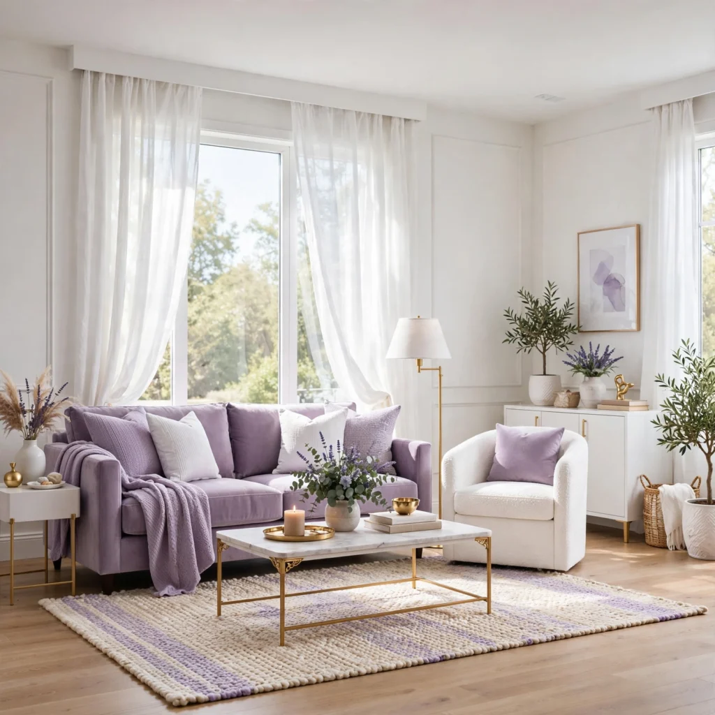
A lavender and white duo pairs a soft, light purple with crisp white, producing one of the gentlest and most broadly appealing purple combinations available. This pairing works particularly well in bedrooms and bathrooms where a calming, low-contrast palette is the goal. Keep lavender to about a third of the room’s surface area, using it on an accent wall, bedding, or curtains while white carries the remaining walls and trim.
2. Plum and Brass Combination
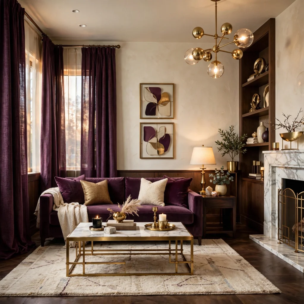
A plum and brass combination pairs a deep, wine-toned purple with warm brass hardware and fixtures, creating a rich, slightly formal palette well suited to dining rooms, powder rooms, or a home office. The warm undertone in brass keeps a deep plum from reading as cold, which can happen when the same shade is paired with cooler silver or chrome tones instead. Use plum on a smaller surface area than a lighter purple, such as a single accent wall or cabinetry, given its visual weight.
3. Violet and Charcoal Contrast
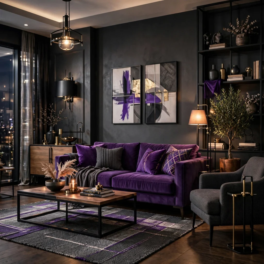
A violet and charcoal contrast pairs a bright, saturated violet with deep charcoal gray, producing a bold, contemporary palette that reads as confident rather than soft. This combination works well in smaller doses, like an accent wall or a single upholstered piece, since violet carries significant visual weight on its own. Balance the pairing with a neutral like white or warm gray elsewhere in the room so the contrast doesn’t overwhelm the overall space.
4. Purple Color Palette for Bedrooms
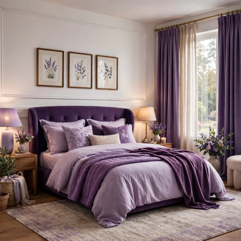
A purple color palette for bedrooms generally favors a muted, dusty tone like mauve or a soft lilac rather than a bright or saturated purple, since lower-saturation shades support the calmer, more restful atmosphere most bedrooms aim for. This approach has become one of the more common alternatives to the all-neutral bedroom palette that dominated for years prior. Pair with warm wood furniture and brushed brass hardware for a softer, more current result than the cooler metal pairings purple was more commonly styled with in the past.
| Purple Shade | Approximate Hex Code | Best Application |
| Lavender | #C8A2C8 | Bedrooms, bathrooms |
| Mauve | #915F6D | Bedrooms, living rooms |
| Plum | #8E4585 | Dining rooms, accent walls |
| Aubergine | #3B0910 | Libraries, statement pieces |
5. Lilac and Blush Pairing
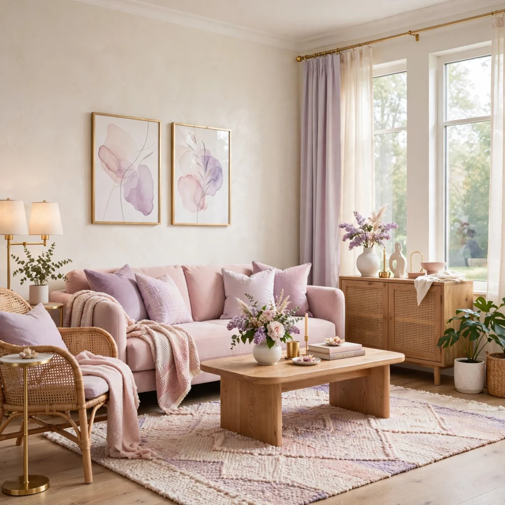
A lilac and blush pairing combines a light, cool-toned purple with a soft pink, producing a gentle, slightly romantic palette that works well in nurseries, bathrooms, or a bedroom aiming for a light, airy feel. This combination reads as considerably softer than most other purple pairings on this list, making it a better fit for spaces where that lighter tone is the actual goal rather than a more sophisticated or formal look. Keep both colors at a similar light value so neither one dominates the pairing.
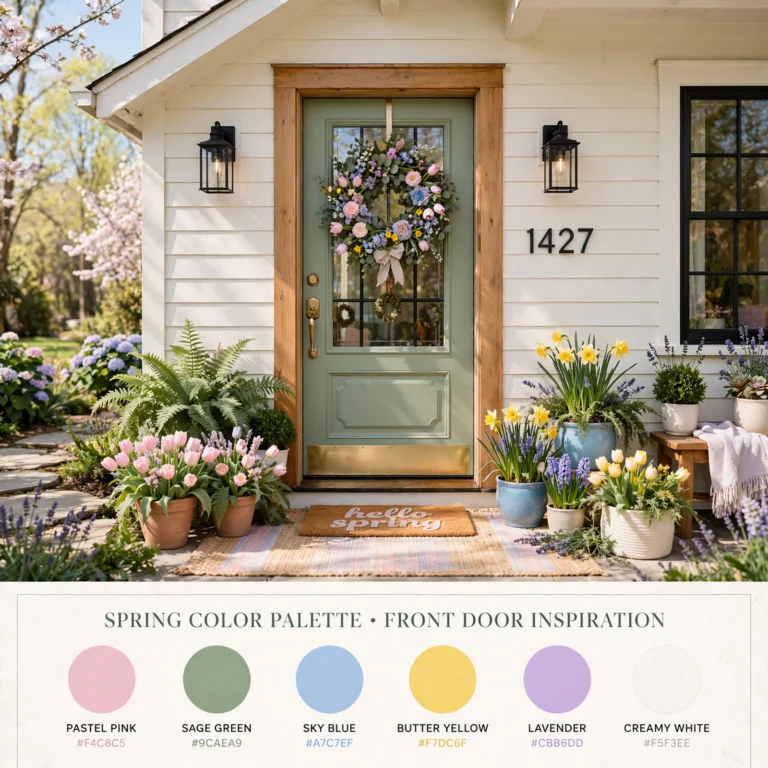
A well-planned pastel color palette can completely change the mood and atmosphere of your home.
6. Aubergine and Camel Leather
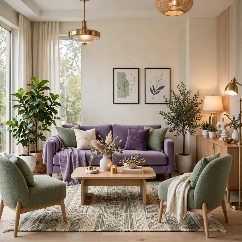
Aubergine and camel leather pairs a very deep, near-black purple with warm tan or camel-toned leather upholstery, creating a rich, moody palette well suited to a study, home office, or a living room built around a leather sofa or chair. This combination draws on the same warm-cool balance that makes hunter green and camel work well together, giving purple a similarly grounded, timeless quality. Add brass or aged wood accents to reinforce the warm undertone running through both primary colors.
7. Wisteria and Sage Combination
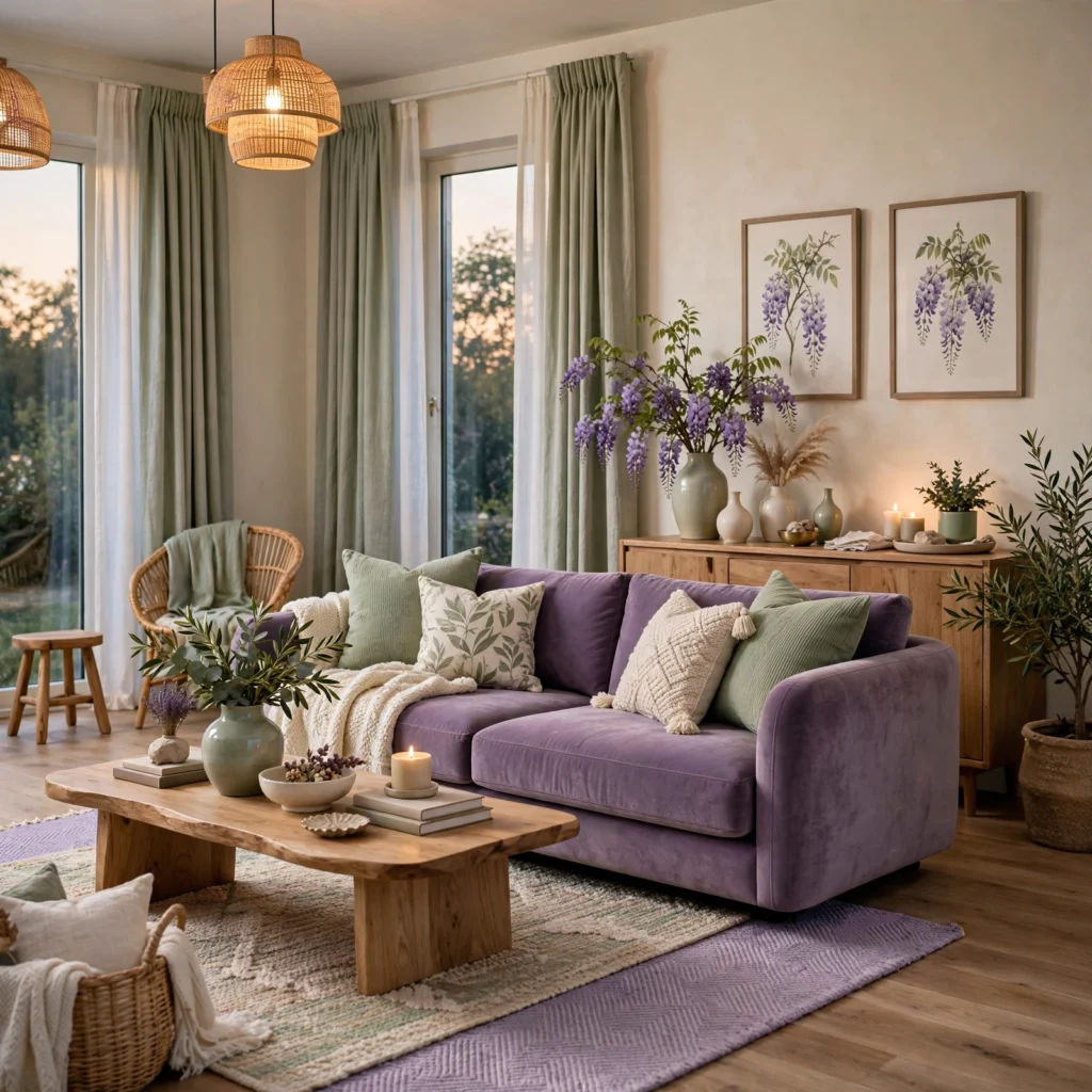
A wisteria and sage combination pairs a soft, blue-leaning purple with a muted green, producing a palette that reads as garden-inspired and slightly unexpected without feeling overly sweet. This combination works particularly well in a sunroom, breakfast nook, or a bedroom with a lot of natural light, since both colors have enough softness to feel cohesive without competing. Balance the ratio so one color remains dominant, typically wisteria on walls with sage in textiles or accessories.
8. Deep Violet and Gold Accent
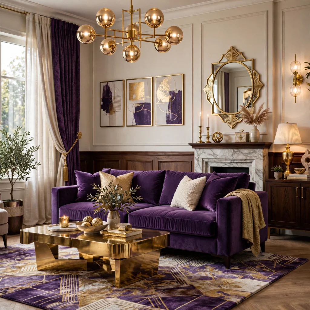
A deep violet and gold accent pairs a saturated, jewel-toned violet with warm metallic gold, creating a dramatic, luxurious palette well suited to a dining room, powder room, or a statement piece of furniture. This pairing carries significant visual weight, so it generally works best contained to a single room or feature rather than applied throughout an entire home. Use gold sparingly, in hardware, light fixtures, or picture frames, rather than as a large surface area, to keep the metallic from overwhelming the deep violet base.
9. Purple Color Palette for Bathrooms
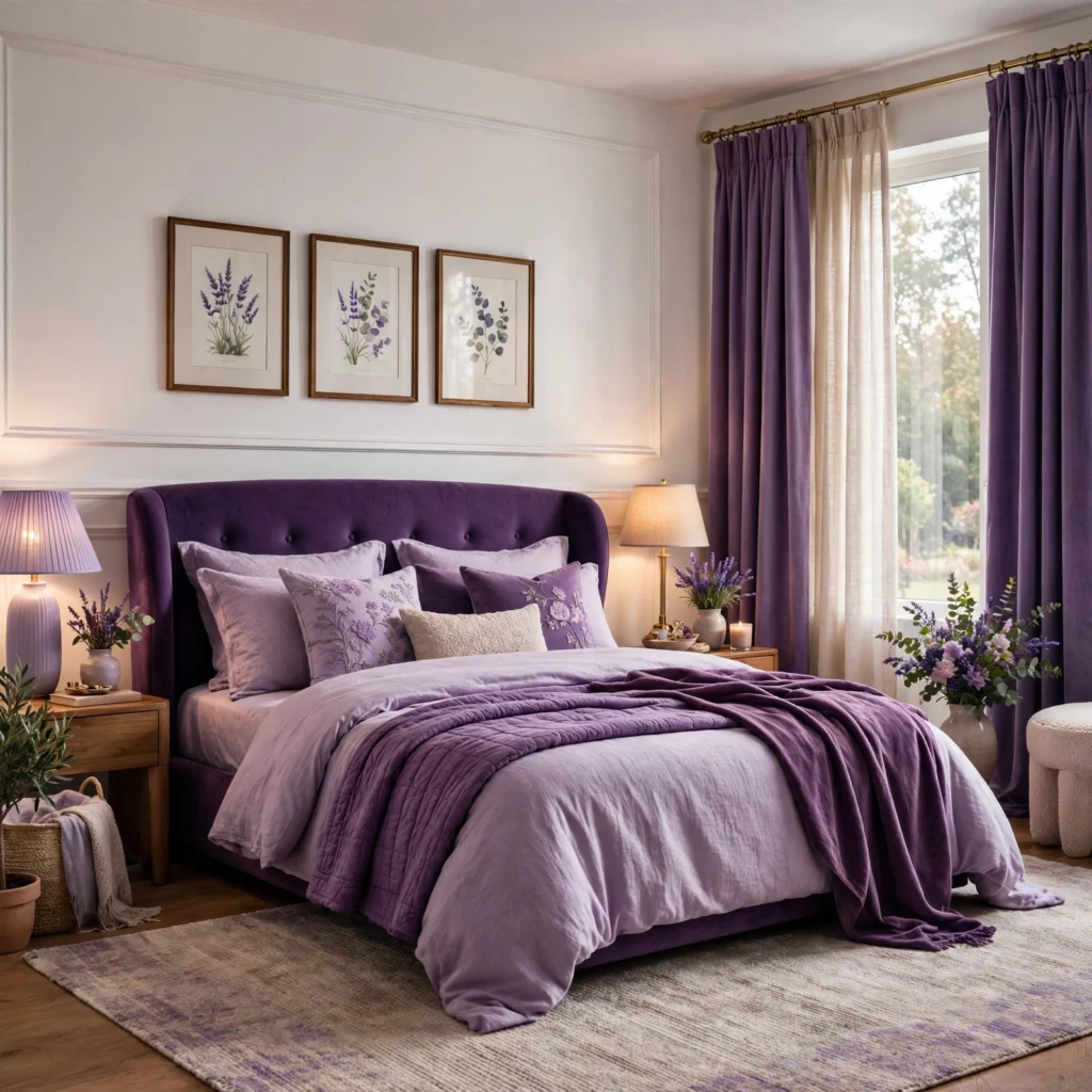
A purple color palette for bathrooms typically favors lighter, cooler-leaning tones like lavender or a pale lilac, paired with white fixtures and either brass or matte black hardware, since lighter purples hold up better in a smaller room without extensive natural light. Tile is a particularly effective way to introduce purple into a bathroom, since it withstands moisture better than paint over the long term in a shower or splash zone. Pair a purple tile with white grout for a cleaner, more current look than colored grout, which tends to date more visibly.
10. Mauve and Terracotta Duo
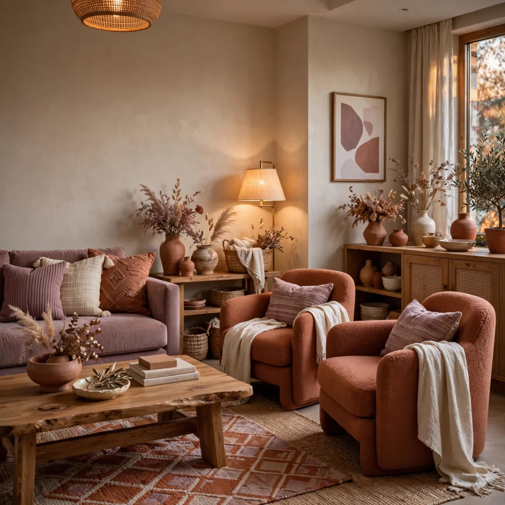
A mauve and terracotta duo pairs a dusty, brownish-purple with a warm, earthy terracotta, producing a grounded, muted palette well suited to a living room or bedroom aiming for a warm, understated feel rather than a bold or overtly purple statement. Both colors share enough warmth in their undertones to feel cohesive together despite occupying different areas of the color wheel. Add a cream or warm white as a third neutral to keep the pairing from feeling too heavy across a full room.
11. Periwinkle and Navy Combination
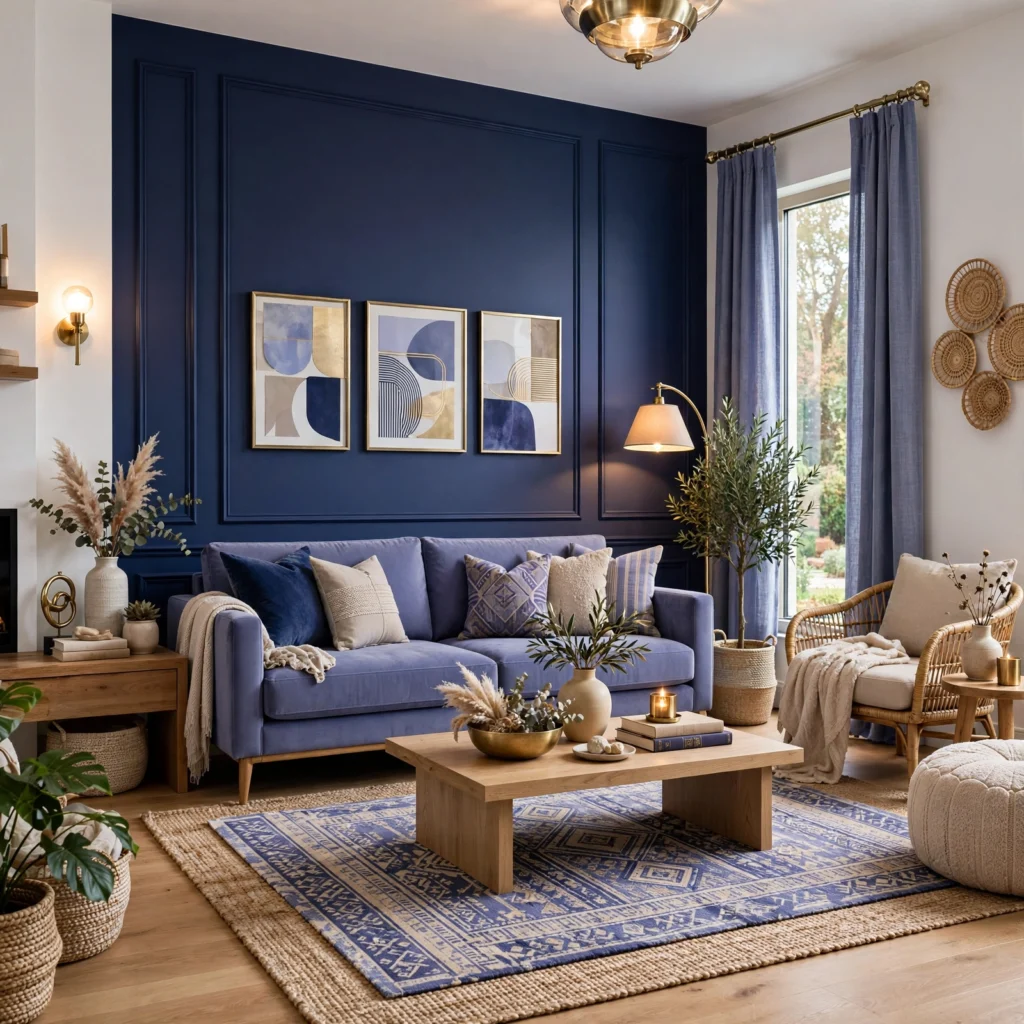
A periwinkle and navy combination pairs a soft, blue-leaning purple with a deep navy, producing a palette that reads as more nautical and cool-toned than most other purple pairings on this list. This works particularly well in a home office, bedroom, or study aiming for a calm but slightly more saturated feel than an all-neutral room. Keep navy as the dominant color on larger surfaces, using periwinkle in smaller doses like pillows, art, or a single accent chair.
12. Purple and Sage Modern Pairing
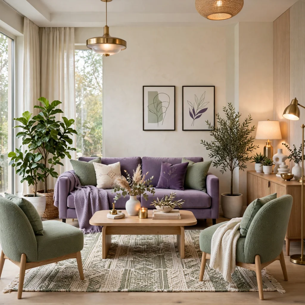
A purple and sage modern pairing combines a muted, grayed-down purple with an equally muted sage green, producing a soft, contemporary palette that leans into the current preference for low-saturation, tonal color combinations over high-contrast pairings. This works particularly well in a living room or bedroom aiming for a restrained, Scandinavian-influenced feel. Keep both colors at a similar value and saturation level so the pairing reads as intentional rather than accidental.
13. Orchid and Cream Combination
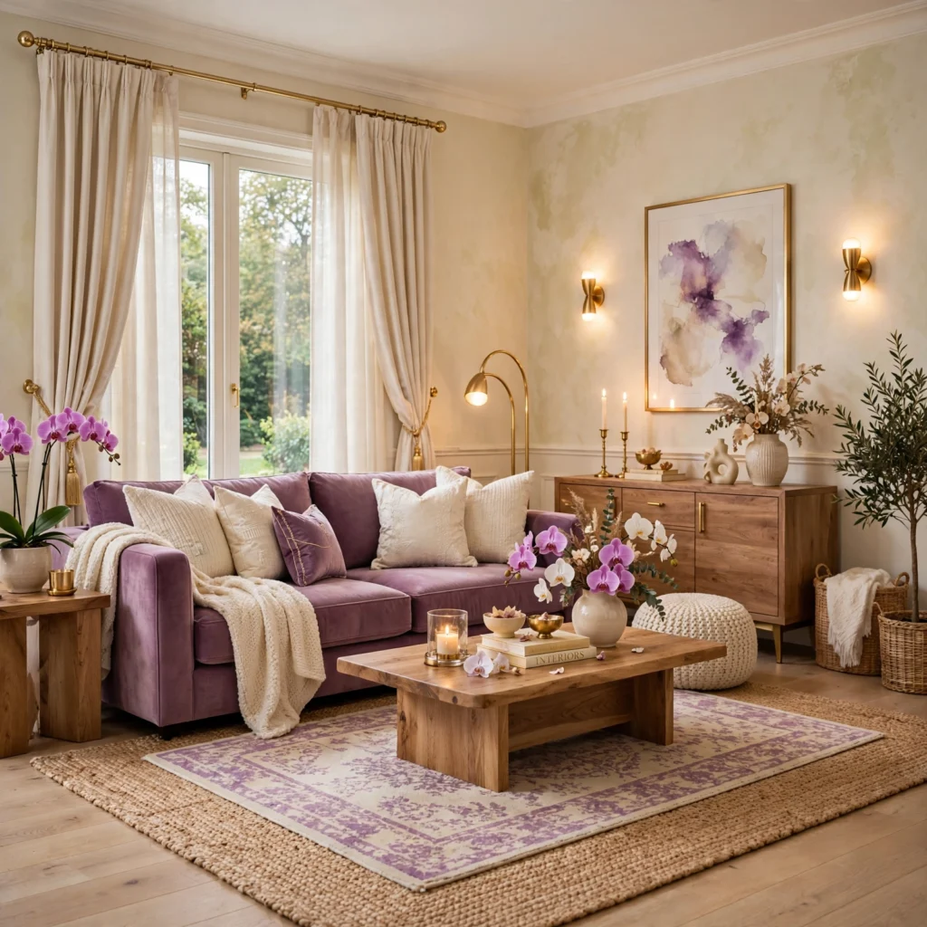
An orchid and cream combination pairs a bright, slightly pink-leaning purple with a warm cream, creating a livelier, more energetic palette than most other pairings on this list while still remaining soft enough for daily living spaces. This combination works well in a sunroom, kids’ room, or any space aiming for a cheerful, less restrained feel. Keep wall surfaces in the lighter cream tone, reserving orchid for furniture, textiles, and accessories.
14. Purple Color Palette for Exteriors
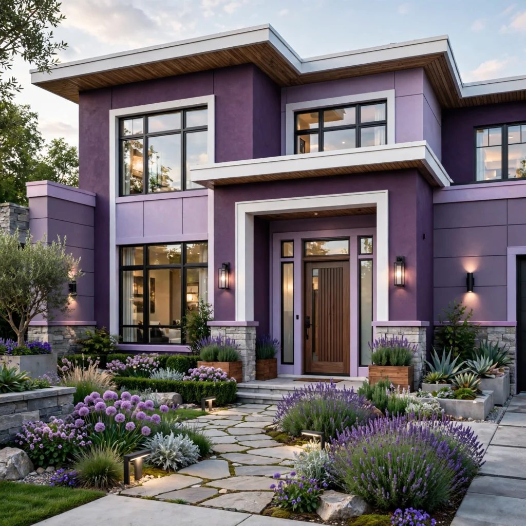
A purple color palette for exteriors is less commonly used than green, gray, or blue, but a deep, muted plum or a soft dove-purple can work well as a front door or accent color on an otherwise neutral facade. Pair with white or black trim for the strongest contrast, and reserve the purple for a single element, like a door or shutters, rather than the full siding, since purple as a dominant exterior color remains a considerably bolder choice than more common exterior colors. Test any exterior purple in full outdoor sunlight before committing, since undertones can shift noticeably outside.
15. Amethyst and Silver Combination
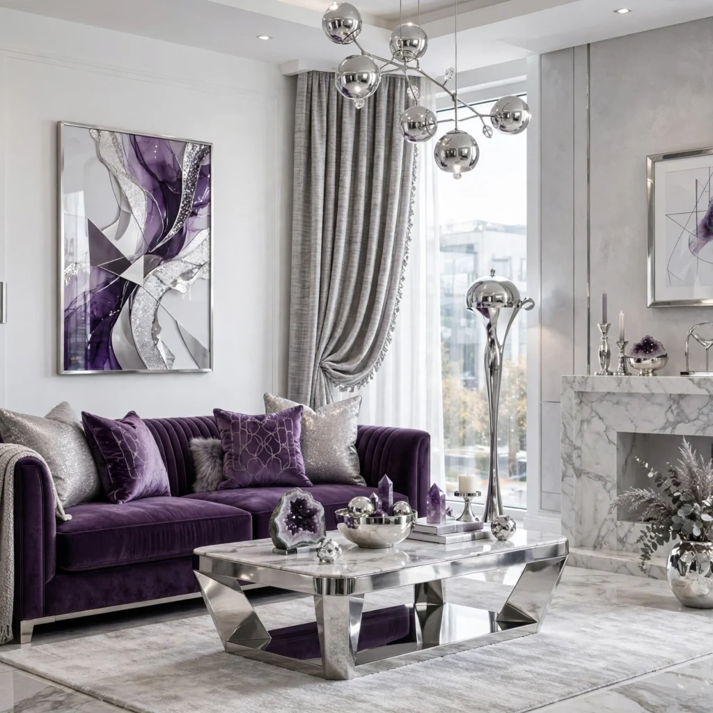
An amethyst and silver combination pairs a rich, saturated purple with cool metallic silver, producing a glamorous, slightly formal palette that departs from the warmer brass and gold pairings elsewhere on this list. This combination works well in a bedroom, powder room, or dressing area aiming for a more polished, dressed-up feel. Because both amethyst and silver read as fairly cool and reflective, balance the pairing with a soft textile like velvet to add warmth and texture back into the room.
16. Heather and Charcoal Palette
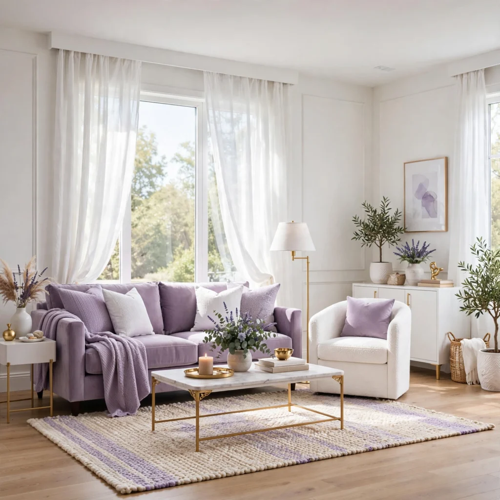
A heather and charcoal palette pairs a muted, grayish purple with deep charcoal, producing an understated, moody combination well suited to a home office, media room, or bedroom aiming for a darker, more enveloping feel. This pairing reads as more contemporary and less traditional than combinations involving brass or gold, making it a good fit for a minimal or modern-leaning space. Keep lighting warm even within this cooler-leaning palette, since flat charcoal and heather together can otherwise read as visually heavy.
Shop the Look
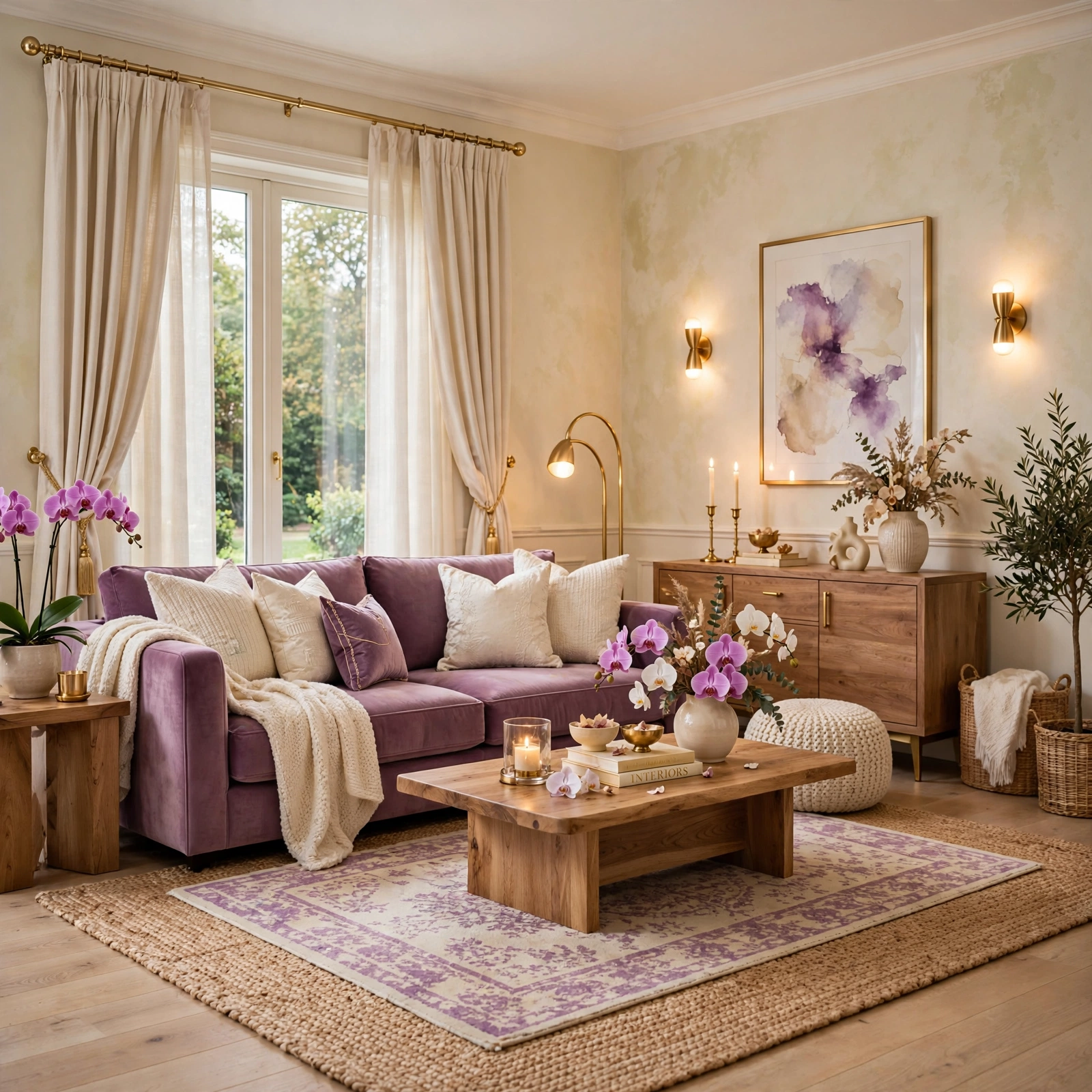
A mauve performance-fabric sofa pairs well with brass table lamps and a cream wool area rug for a soft, livable palette. For a bolder statement, a plum accent wall paired with matte black shelving and warm wood furniture covers several of the deeper combinations above. A set of lilac ceramic vases and an ivory linen throw round out a more understated, classic purple palette.
Common Mistake to Avoid
The most common mistake with a purple color palette is choosing a shade based on a small paint chip or a single online image without testing it under the room’s actual lighting conditions, since purple shifts noticeably in appearance between warm incandescent, cool LED, and natural daylight. A lavender that reads soft and neutral in a showroom can shift distinctly pink or blue once painted across a full wall in a different lighting environment. Always test a full sample swatch on the actual wall, viewed at different times of day, before committing to a full room.
FAQs
What colors go best with a purple color palette?
Warm metals like brass and gold, warm neutrals like cream and camel, and muted greens like sage all pair well with most shades of purple, since purple itself spans both warm and cool undertones depending on the specific shade. Charcoal and navy work particularly well with deeper, more saturated purples like plum or violet for a moody, contemporary look, while softer lavender and mauve tones pair more naturally with blush or terracotta. The right pairing ultimately depends on whether the specific purple leans warmer or cooler.
Is purple a good color for a small room?
Lighter, cooler-leaning purples like lavender, lilac, or periwinkle generally work better in a small room than deep, saturated tones like aubergine or plum, since lighter colors reflect more available light and don’t visually shrink the space the way a darker, more enclosing color can. If a deeper purple is preferred, using it on a single accent wall rather than the full room, combined with a lighter ceiling and trim color, helps maintain a sense of openness even in a smaller footprint.
How do I make a purple color palette feel less juvenile?
Choosing muted, grayed-down shades like mauve, plum, or aubergine rather than bright, saturated lavender or violet is the most effective way to keep a purple palette from reading as juvenile, since lower-saturation purples carry considerably more sophistication than their brighter counterparts. Pairing purple with warm metals like brass and rich materials like velvet or leather also reinforces a more adult, considered feel. Limiting purple to one or two elements rather than spreading it across every surface in a room further supports a more restrained, mature result.
What purple shade works best for a bedroom?
Muted, dusty tones like mauve or a soft lilac generally work best for a bedroom, since these lower-saturation shades support a calmer, more restful atmosphere than a bright or highly saturated purple would. A deeper plum can also work well in a bedroom used primarily in the evening, particularly on a single accent wall behind the bed rather than across all four walls. The right choice ultimately depends on how much natural light the room receives and how bold a statement feels appropriate for the space.
Does purple work in a modern minimalist space?
Yes, purple works well in a modern minimalist space, particularly muted, grayed-down tones like heather or a cool mauve, which read as sophisticated and restrained rather than bold or decorative. Limiting purple to one or two elements, like a single wall or a piece of furniture, rather than spreading it across many accessories, keeps the palette consistent with minimalist design’s broader preference for restraint. Pairing purple with charcoal, black, or a cool neutral rather than warm wood tones also reinforces a more contemporary, minimal feel.
Conclusion
A purple color palette offers more range than its reputation suggests, capable of reading as calm, dramatic, earthy, or formal depending entirely on the shade and pairing chosen. Save this list to Pinterest for your next design project, and check out our related posts on green color palette and elegant living room decor for more ways to build out a full color scheme.