15 Brilliant Wedding Color Palette Ideas for Every Season and Style
A wedding color palette shapes everything from floral orders to bridesmaid dresses, making it one of the earliest and most consequential planning decisions a couple makes. This guide walks through fifteen wedding color palette ideas covering pastel spring combinations, bold jewel tones, classic neutrals, and modern pairings that work across different seasons and venue styles. By the end, you’ll have specific color combinations, application guidance, and styling suggestions to choose a palette that feels intentional and photographs well from the ceremony through the reception.
Trend & Background
Wedding color palettes have moved away from strict seasonal formulas toward more personal, often unexpected combinations, with couples increasingly drawing inspiration from fashion, interior design, and personal favorite colors rather than defaulting to whatever’s traditionally associated with their wedding’s specific season. Muted, dusty tones have also gained ground over brighter, more saturated colors across most palette styles, reflecting a broader design trend toward softer, more sophisticated color choices. This matters now because wedding photography and video have become more central to how couples experience their event afterward, making a well-considered, photogenic palette worth real planning attention beyond just matching linens to flowers.
Key Takeaways
- Season and venue lighting should guide palette choice more than trend alone, since colors read differently indoors versus outdoors.
- Pastel, jewel-toned, and neutral palettes each suit distinct wedding styles rather than working interchangeably.
- A palette built around two dominant colors plus one metallic accent tends to photograph more cohesively than three or more competing hues.
- Testing fabric swatches and floral samples under the venue’s actual lighting prevents mismatches that photos alone can’t predict.
1. Blush and Sage Green
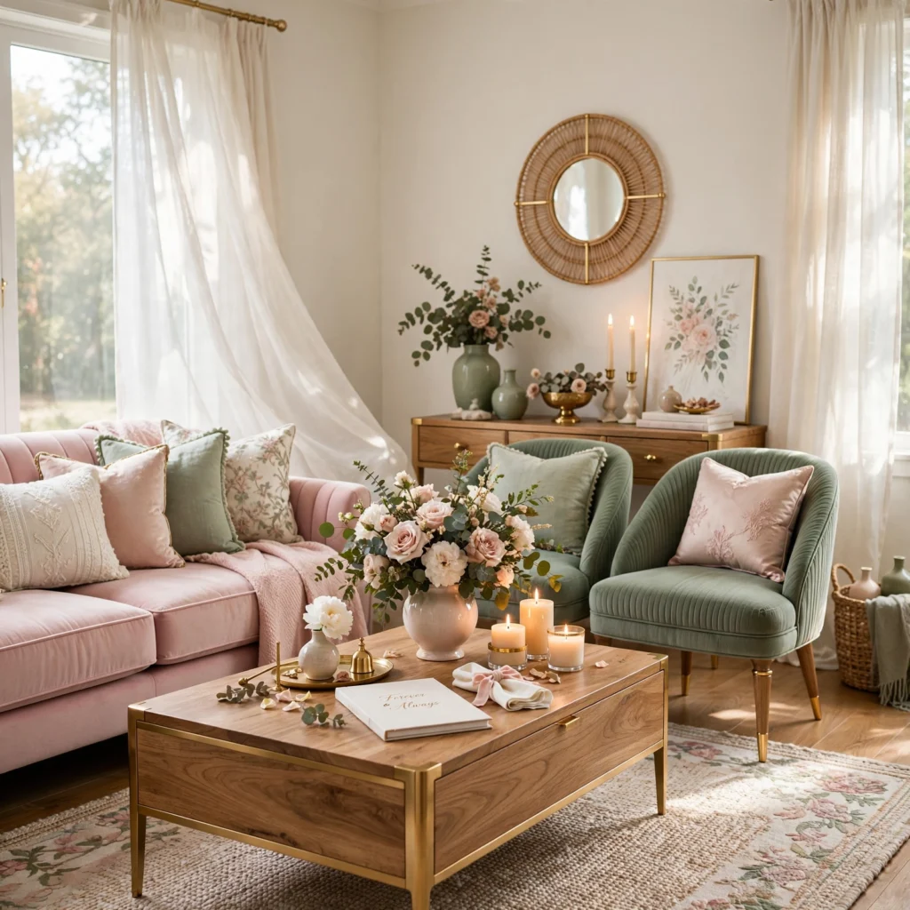
A blush and sage green palette pairs a soft, muted pink with a dusty, grayed green, creating a gentle, romantic combination that suits a spring or early summer garden wedding particularly well. This pairing has remained consistently popular because both colors read as soft without feeling overly sweet, especially when balanced with warm wood tones in the venue’s furniture or decor. Using blush for florals and bridesmaid dresses, with sage reserved for linens and ribbon, keeps the palette feeling light and airy throughout.
2. Navy and Ivory Classic
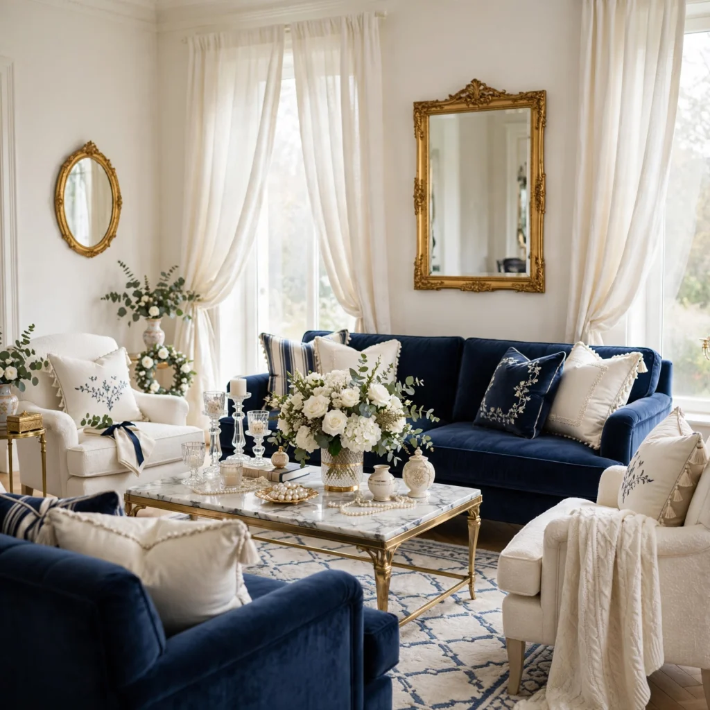
A navy and ivory classic combination pairs a deep, rich navy with a soft, warm ivory, creating a timeless palette that works across nearly any season or venue style. This pairing suits a more formal or traditional wedding particularly well, since the strong contrast between the two colors reads as elegant without requiring any trend-dependent color choices. Using navy for groomsmen suits and table linens, with ivory carrying bridesmaid dresses and stationery, produces a classic, balanced look that photographs well in both natural and indoor lighting.
| Element | Navy Application | Ivory Application |
| Attire | Groomsmen suits | Bridesmaid dresses |
| Linens | Table runners | Tablecloths |
| Stationery | Accent ink or envelope | Base card color |
3. Dusty Lavender and Silver
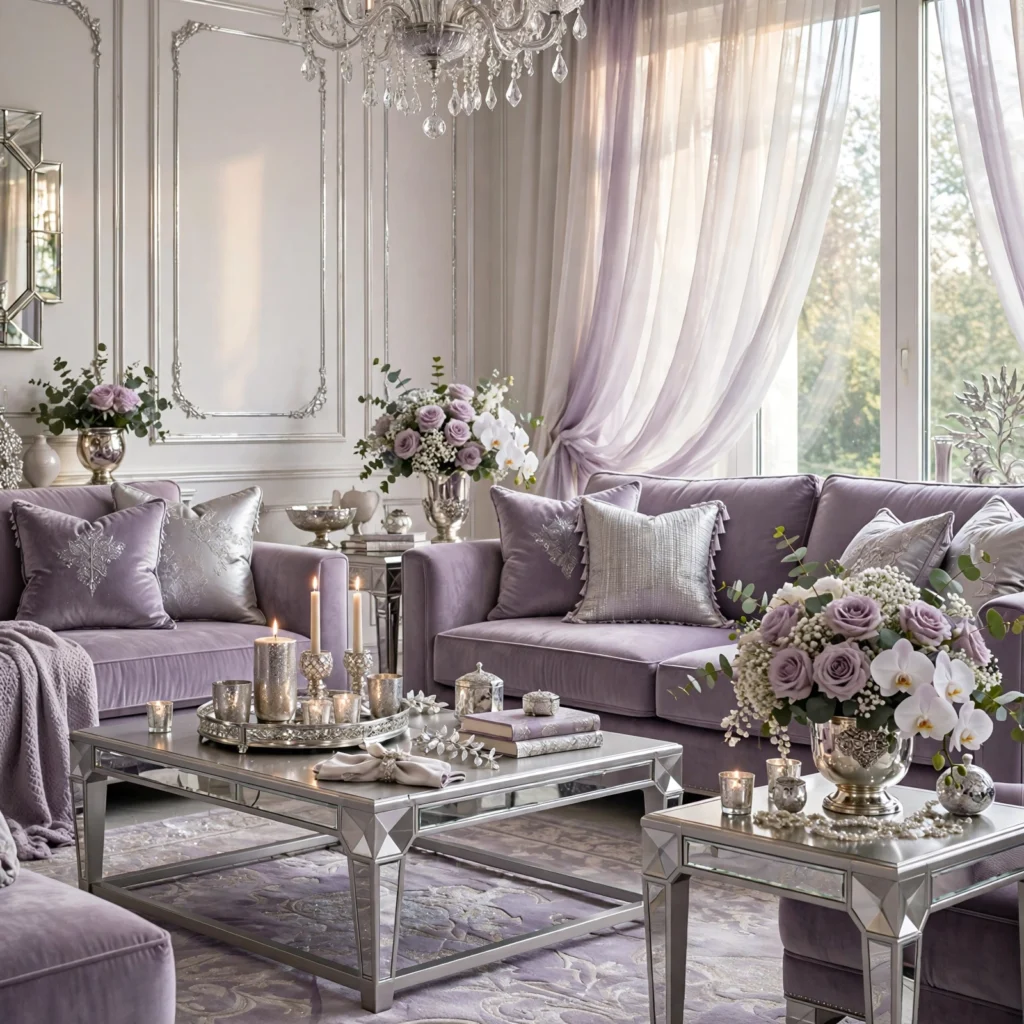
A dusty lavender and silver combination pairs a muted, grayed purple with cool silver metallic accents, creating a soft yet elegant palette suited to a formal evening reception. This pairing works particularly well under chandelier or candlelight, since silver’s cooler reflective quality complements lavender’s own gentle, slightly cool undertone. Choosing dusty lavender over a brighter, more saturated purple keeps this combination feeling sophisticated rather than overly playful.
4. Wedding Color Palette Coral and Turquoise
A coral and turquoise combination pairs a warm, vibrant pink-orange with a cool, saturated blue-green, creating a bold, energetic palette suited to a beach or tropical destination wedding. This wedding color palette works particularly well against a natural backdrop of ocean water and warm sand, where both colors already exist in the surrounding landscape. Balancing the two colors roughly equally throughout florals and decor, rather than letting one dominate, keeps this vibrant combination feeling intentional rather than clashing.
5. Champagne and Warm Taupe
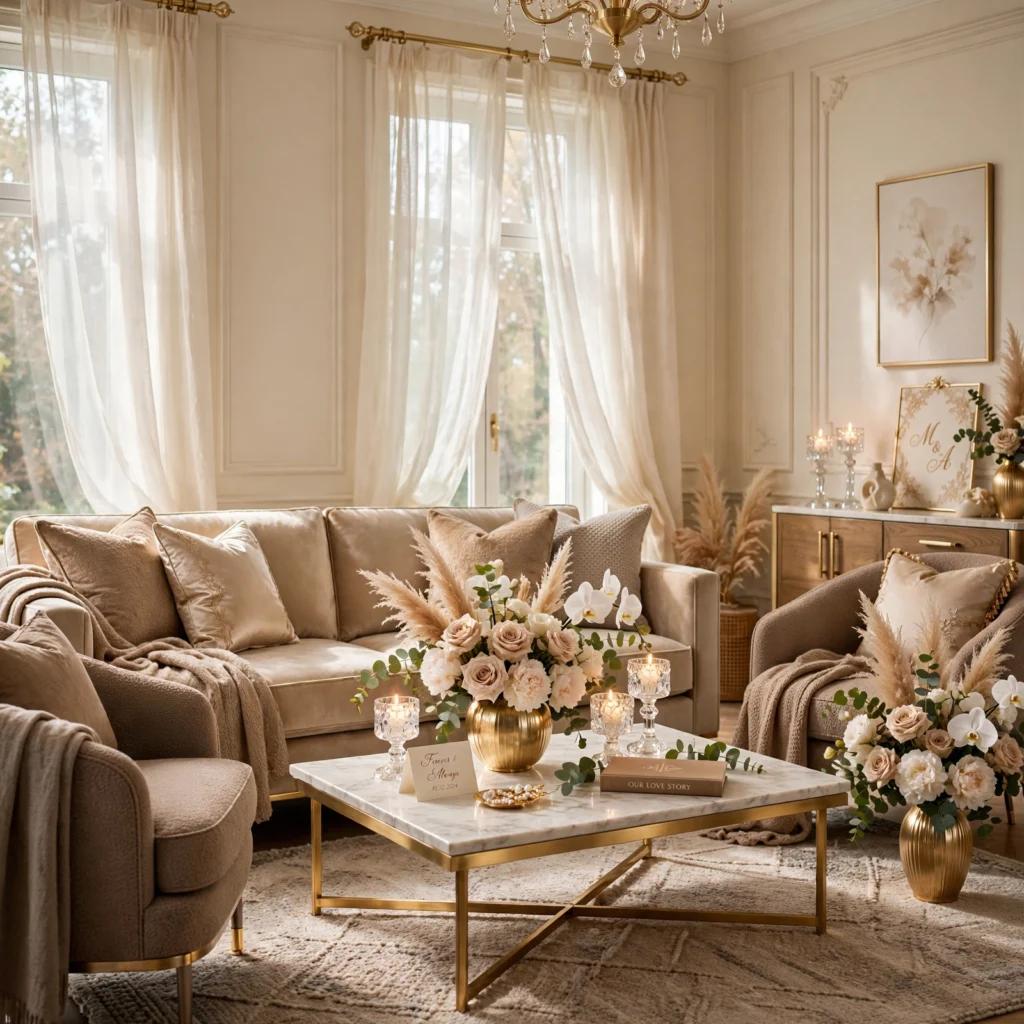
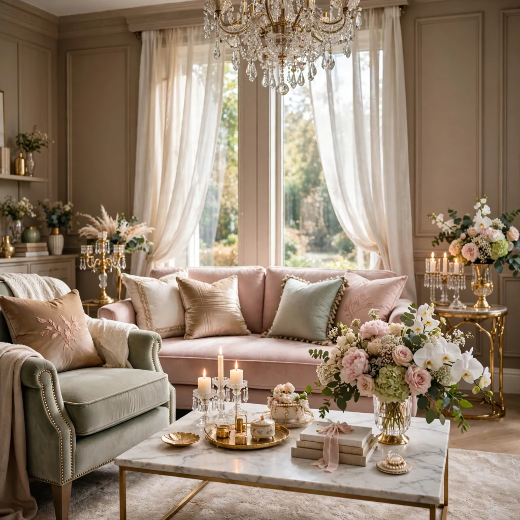
A champagne and warm taupe combination pairs two closely related warm neutrals, creating an understated, elegant palette that lets venue architecture and floral texture carry more of the visual interest than bold color contrast would. This pairing suits a couple wanting a sophisticated, timeless look that won’t feel dated in photos years later. Introducing texture through varied fabric weights, like a matte linen against a subtle silk shimmer, keeps this closely toned palette from feeling flat despite its narrow color range.
From soft neutrals to bold statement shades, explore our spring color palette for fresh design inspiration.
6. Deep Emerald and Gold
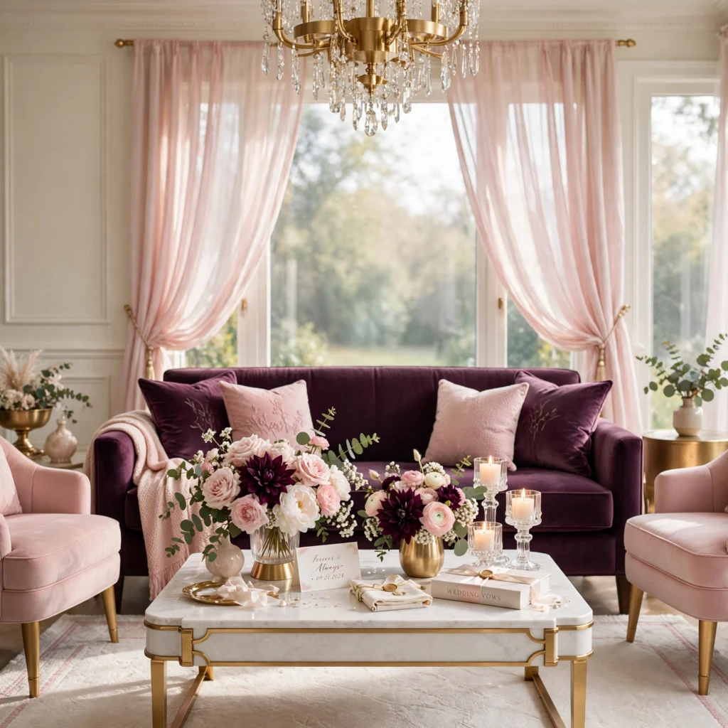
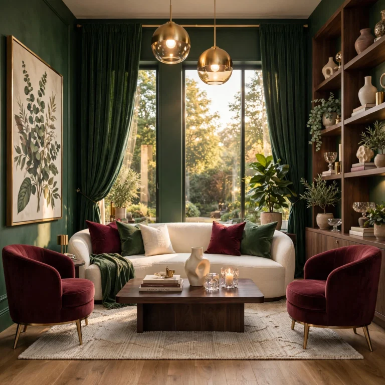
A deep emerald and gold combination pairs a rich, saturated jewel-toned green with warm metallic gold accents, creating a luxurious, dramatic palette suited to a formal indoor venue or an evening celebration. This pairing photographs particularly well against dark wood paneling or under warm ambient lighting, where gold’s reflective quality catches available light most effectively. Using emerald for bridesmaid dresses and larger floral arrangements, with gold reserved for stationery, chair details, and lighting accents, balances the palette’s overall richness.
7. Soft Yellow and White
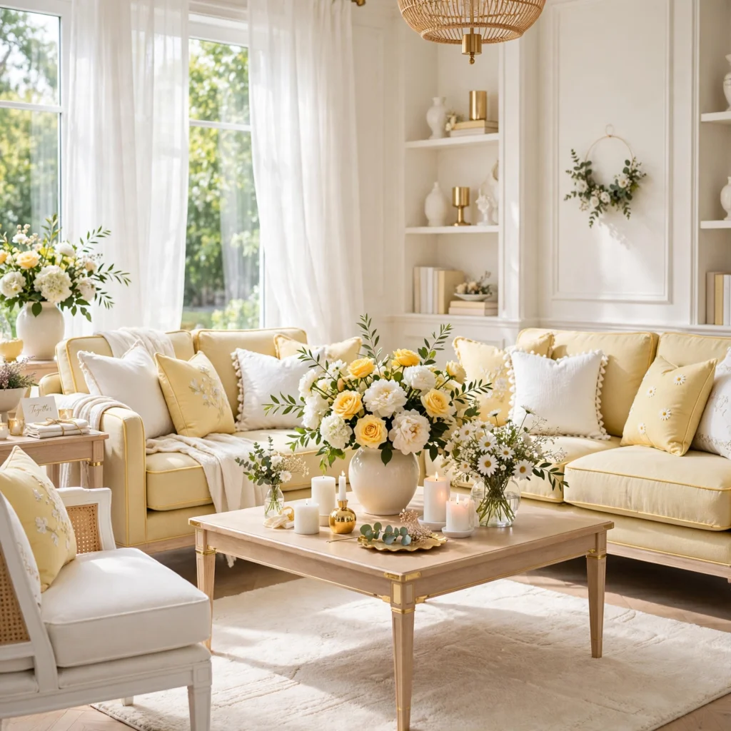
A soft yellow and white combination pairs a pale, buttery yellow with crisp white, creating a bright, cheerful palette suited to a spring or summer daytime celebration. This pairing photographs beautifully in natural sunlight, since both colors reflect rather than absorb available light. Choosing a true pale yellow, rather than a more saturated or greenish-yellow tone, keeps this combination feeling fresh and universally flattering across different skin tones in bridal party attire.
8. Dusty Rose and Burgundy
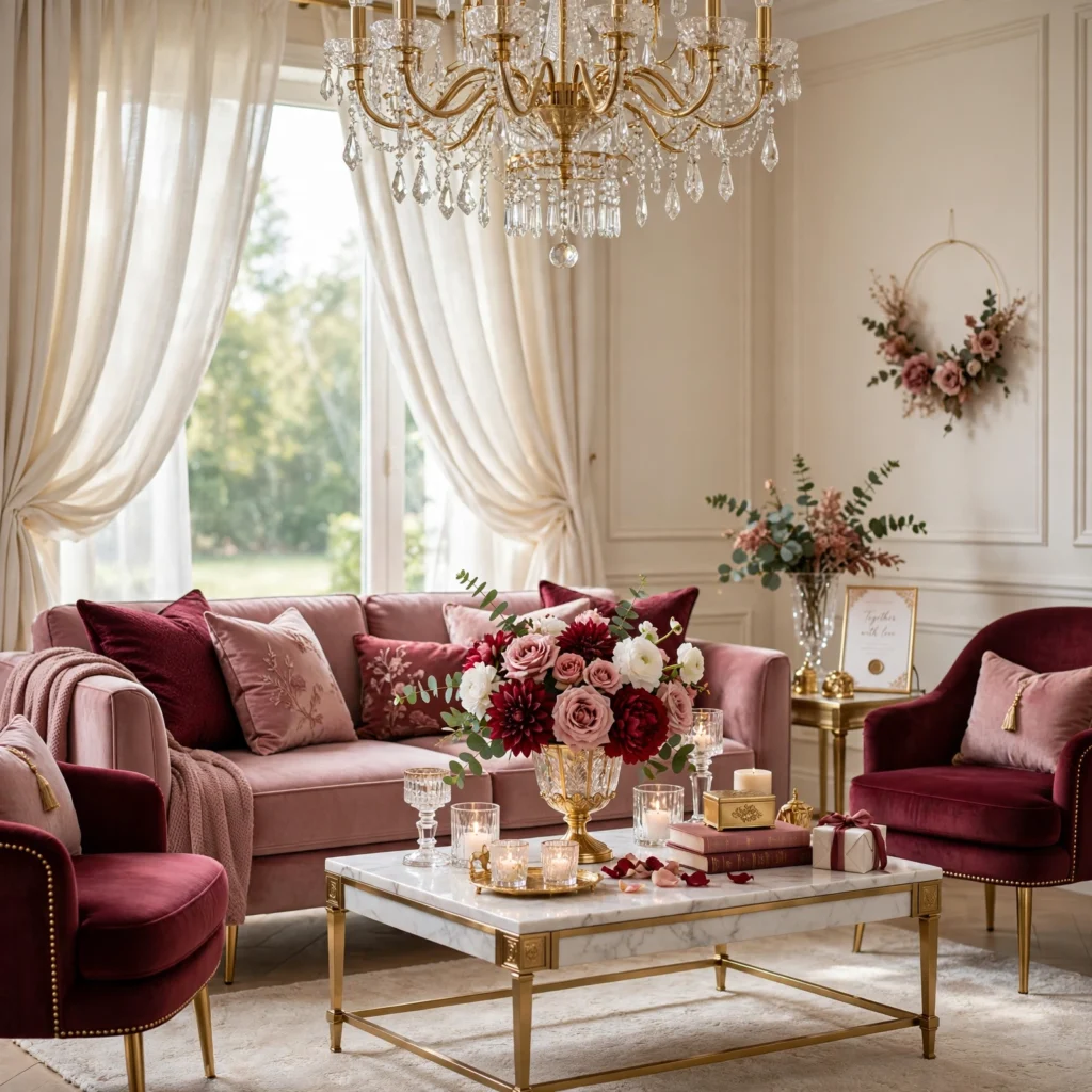
A dusty rose and burgundy combination pairs a soft, muted pink with a deep, rich wine tone, creating a romantic palette with enough contrast and depth to suit both daytime and evening celebrations. This pairing works well across multiple seasons, reading as appropriate for a late spring wedding just as easily as an early fall one. Using dusty rose for bridesmaid dresses and lighter florals, with burgundy concentrated in deeper floral accents and groomsmen details, produces a balanced result.
| Element | Dusty Rose Application | Burgundy Application |
| Florals | Garden roses, ranunculus | Deep dahlias, accent greenery |
| Attire | Bridesmaid dresses | Groomsmen ties or vests |
| Decor | Table runners | Candle accents |
9. Sky Blue and White
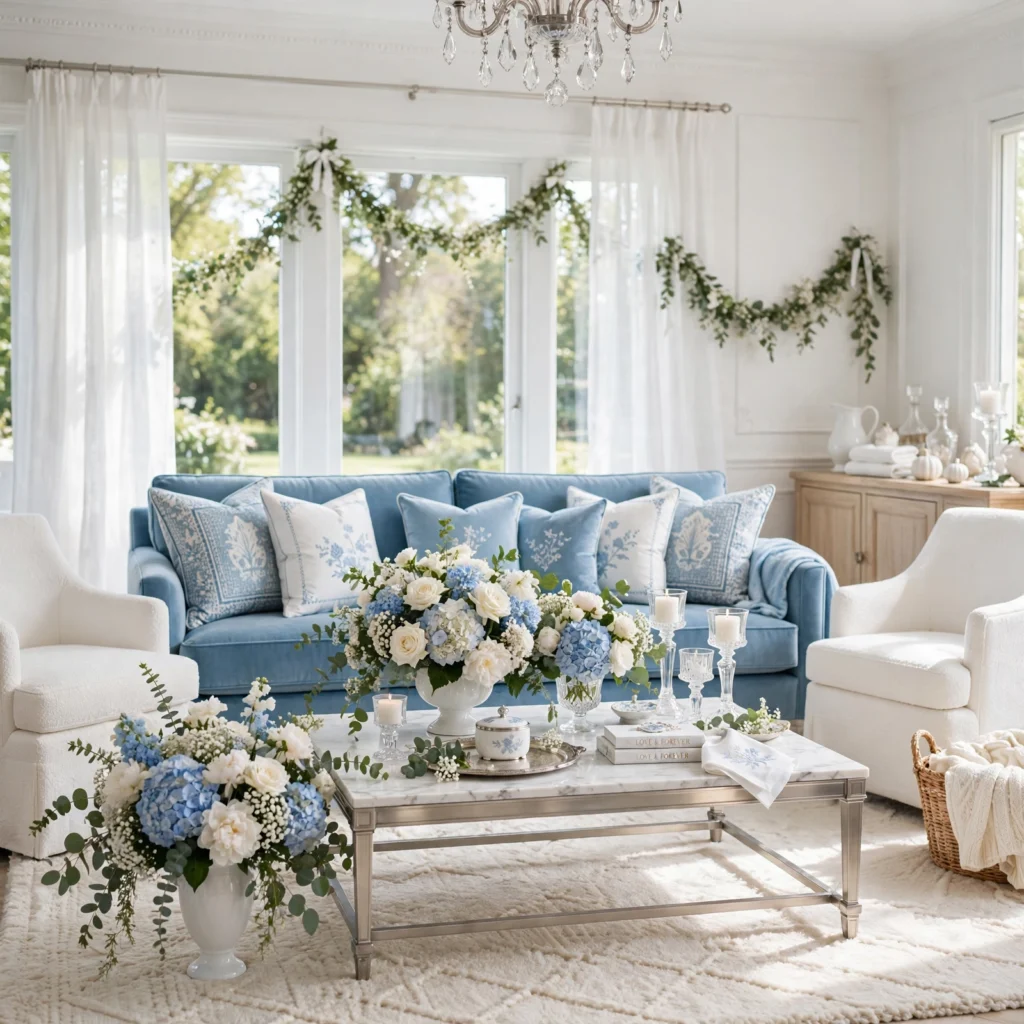
A sky blue and white combination pairs a soft, clear light blue with crisp white, creating a fresh, airy palette suited to a summer wedding, particularly one held near water or in a bright, open venue. This pairing has remained a consistently popular classic choice, since the combination reads as clean and universally appealing without leaning into any specific passing trend. Using sky blue for groomsmen ties or accent linens, with white carrying the majority of the wedding’s overall attire and decor, keeps this pairing feeling light rather than overly saturated.
10. Charcoal and Blush
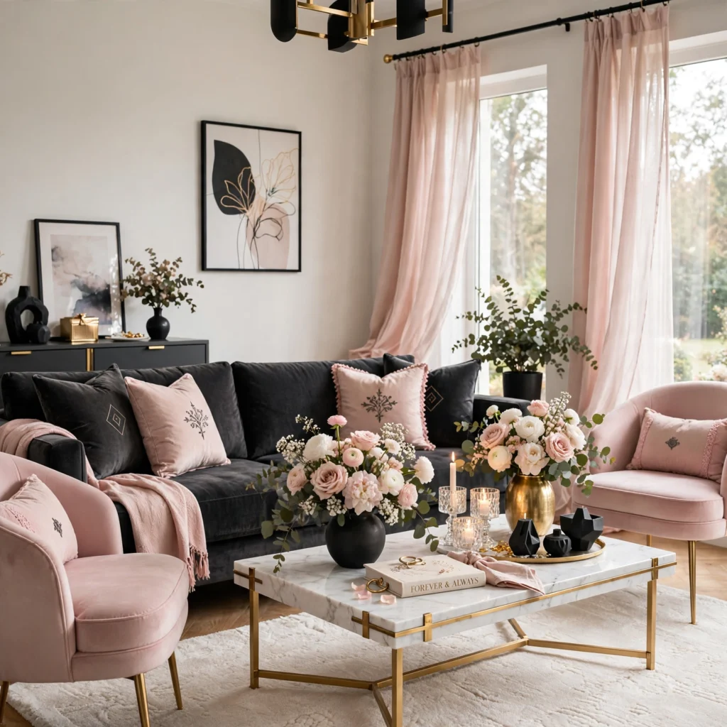
A charcoal and blush combination pairs a deep, cool gray with a soft, warm pink, creating a modern, slightly edgy palette that balances softness with a more contemporary edge. This pairing suits a couple wanting a romantic color story without leaning into an overly traditional or sweet overall aesthetic. Using charcoal for groomsmen suits and select linens, with blush carrying bridesmaid dresses and florals, produces a balanced contrast between the palette’s darker and softer elements.
11. Terracotta and Cream
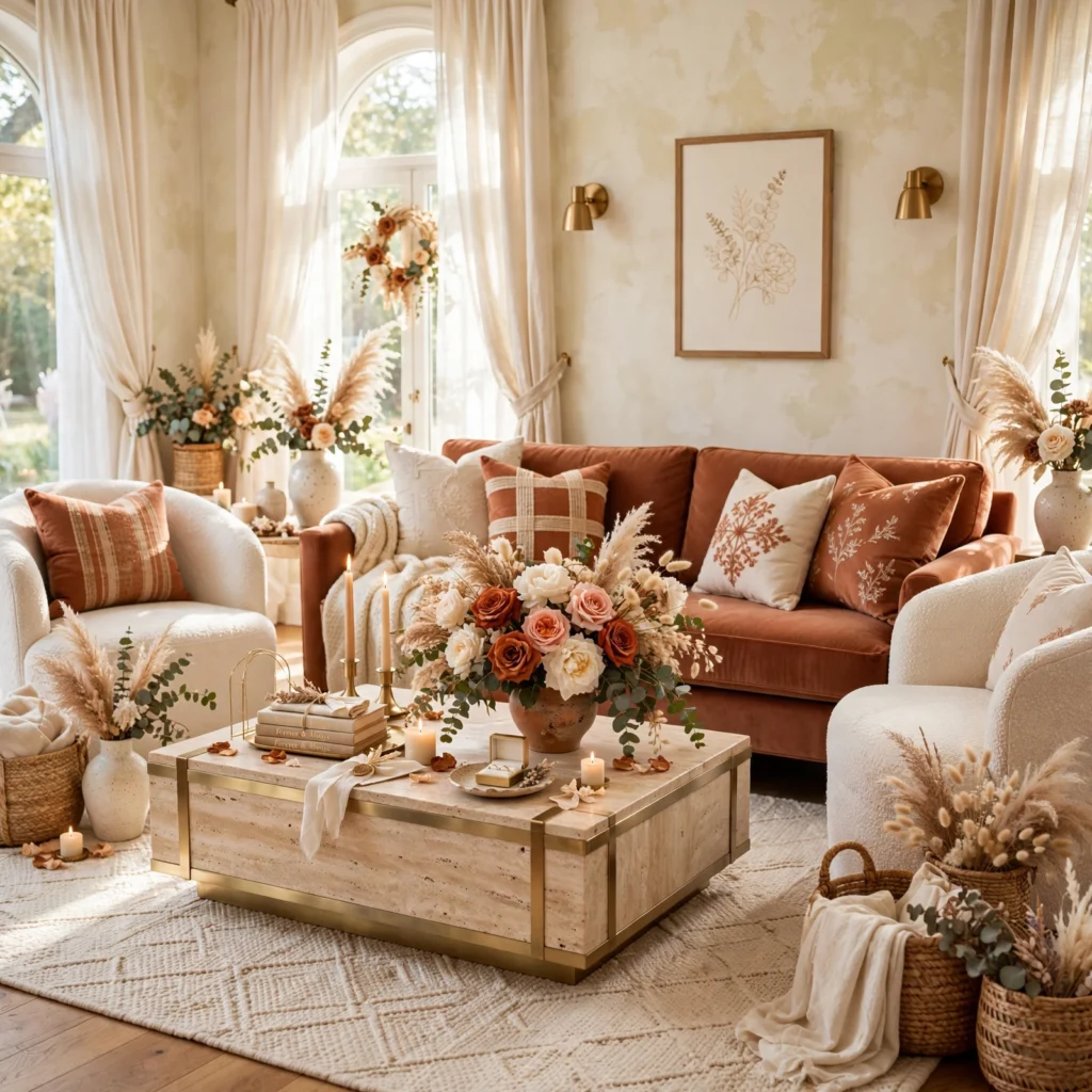
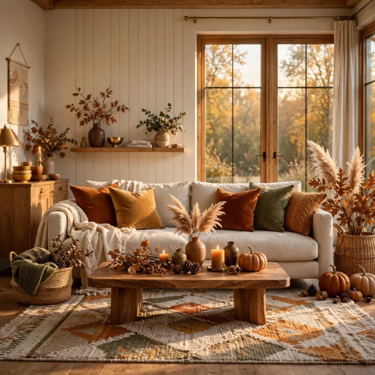
A terracotta and cream combination pairs a warm, earthy orange-red with a soft, warm neutral, creating a combination that works particularly well for a late summer or early fall wedding without leaning into the more literal deep autumn tones. This pairing suits an outdoor or vineyard venue especially well, where terracotta ties naturally into surrounding warm-toned landscape elements. Using terracotta for florals and accent details, with cream carrying linens and stationery, keeps the overall palette feeling warm but not overly heavy.
12. Burgundy and Gold
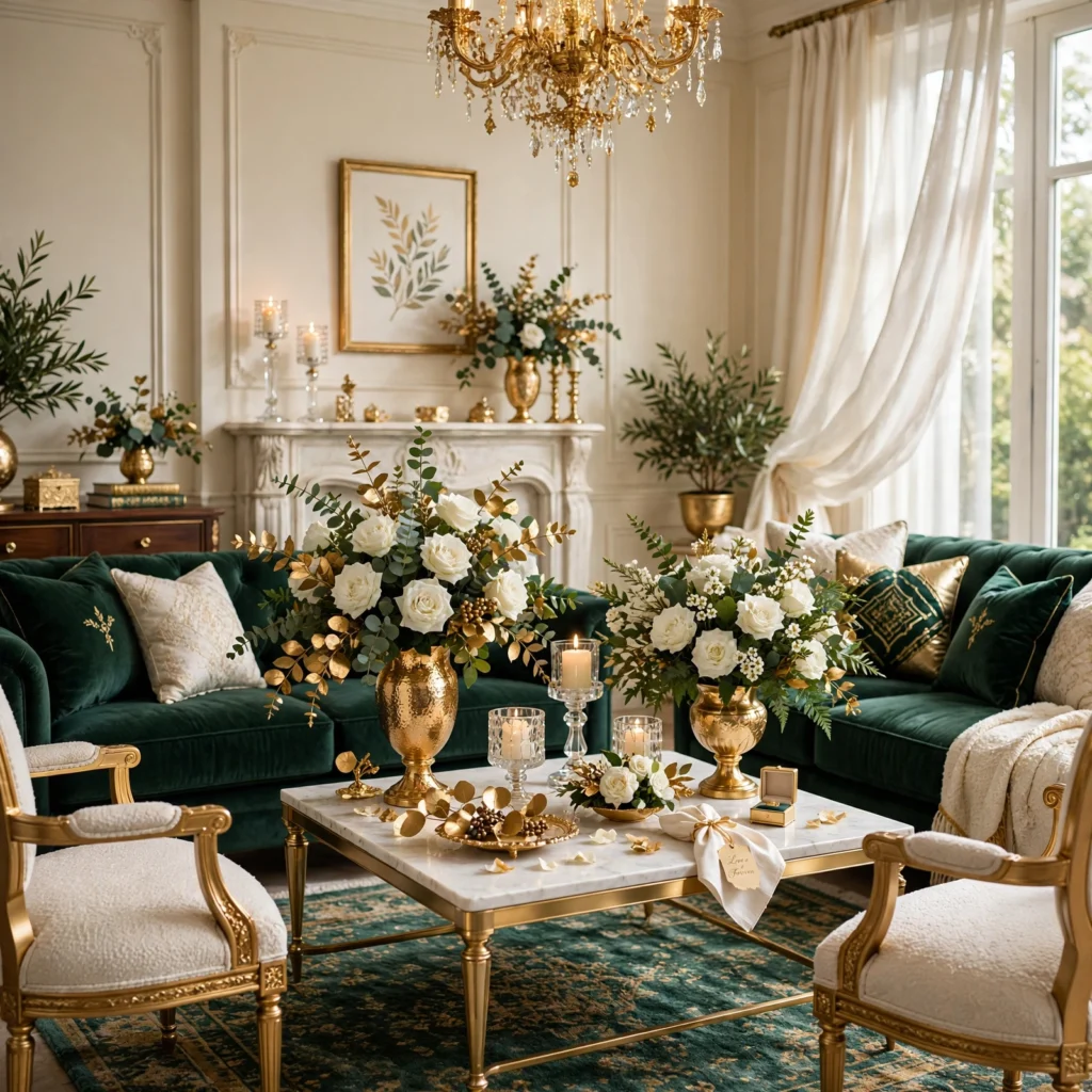
A burgundy and gold combination pairs a deep, wine-toned red with warm metallic gold accents, creating a rich, formal palette that suits both fall weddings and winter celebrations equally well. This pairing photographs beautifully under warm string lights or candlelight, since gold’s reflective quality complements burgundy’s own deep, saturated intensity. Using burgundy for bridesmaid dresses and table linens, with gold reserved for stationery, chair sashes, and candle details, keeps this rich combination feeling balanced rather than overwhelming throughout the venue.
13. Mint Green and White
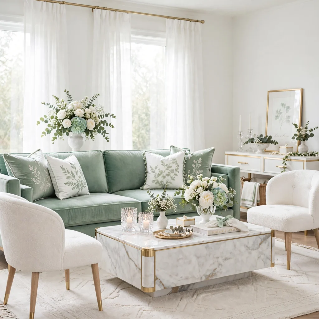
A mint green and white combination pairs a pale, cool-toned green with crisp white, creating a fresh, clean palette particularly suited to a spring or early summer wedding. This pairing works well for a couple wanting a soft color statement without the warmth that a blush or peach-based palette would introduce instead. Choosing mint with a true cool undertone, rather than one leaning yellow or gray, keeps this combination reading as crisp and fresh rather than muddy.
14. Deep Plum and Blush
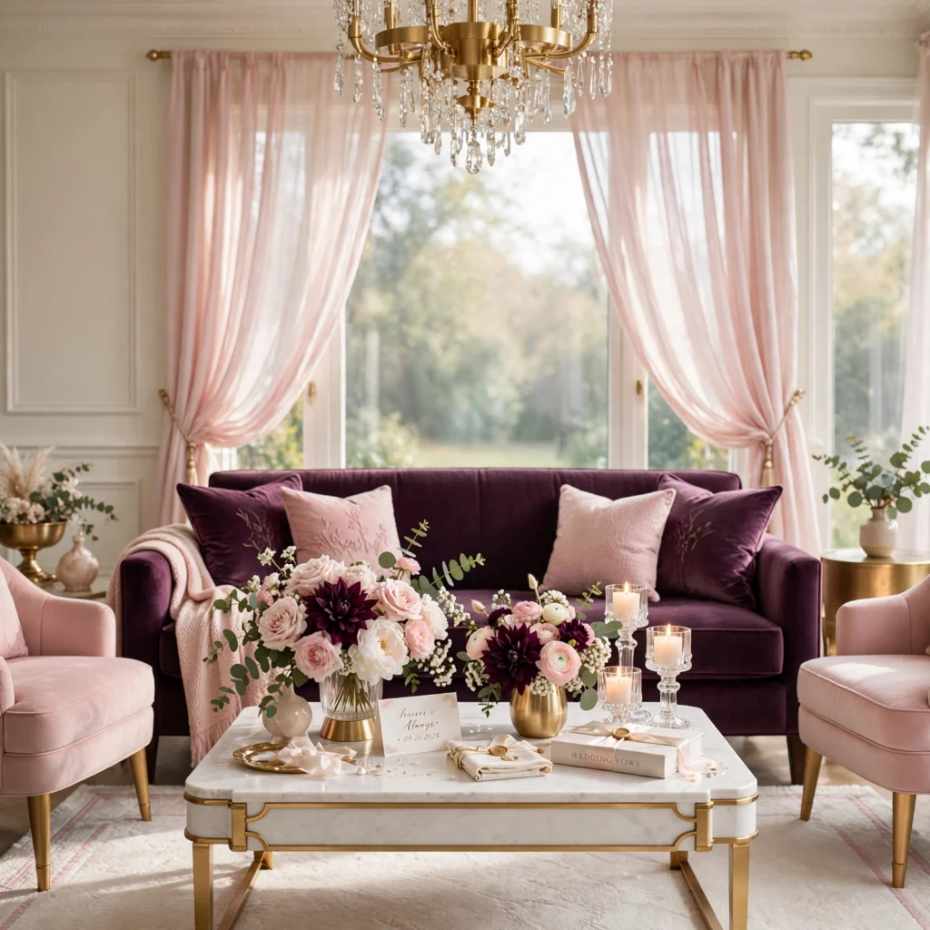
A deep plum and blush combination pairs a rich, dark purple with a soft, muted pink, creating a romantic yet dramatic palette suited to an evening celebration during nearly any season. This pairing offers more depth and contrast than blush paired with a lighter color alone, while still maintaining an overall romantic tone throughout the wedding’s styling. Using plum for bridesmaid dresses or deeper floral accents, with blush carrying lighter florals and stationery, balances the palette’s overall visual weight.
15. Black and White Modern Classic
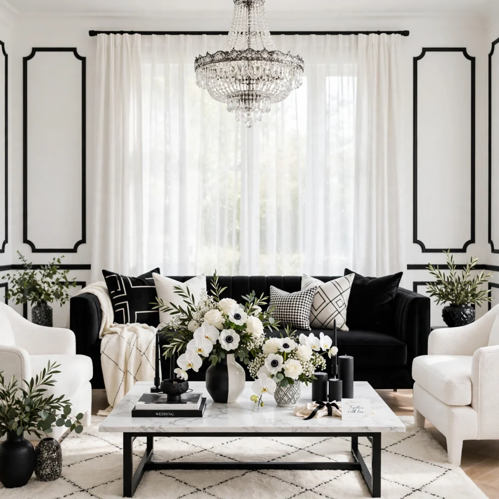
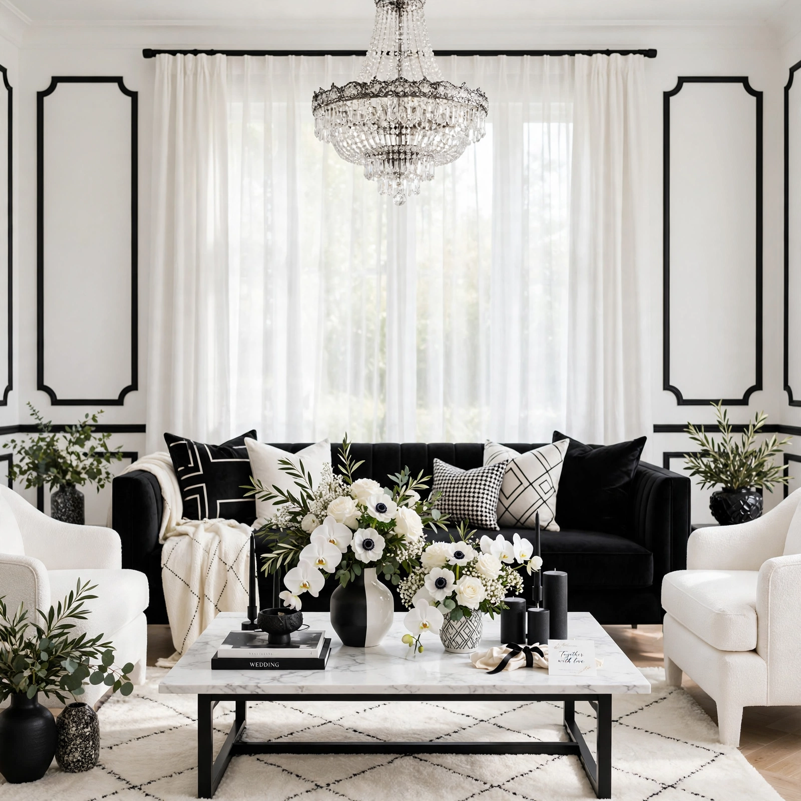
A black and white modern classic combination relies entirely on the strongest possible contrast, creating a bold, graphic palette suited to a couple wanting a sleek, contemporary aesthetic over a softer, more traditional color story. This pairing works particularly well for a modern venue with clean architectural lines, where the stark contrast complements rather than competes with the surrounding space. Introducing a single accent color, like a deep red or gold, in smaller doses keeps this otherwise monochromatic palette from feeling overly stark throughout an entire event.
Shop the Look
For this palette, look for dusty rose and sage silk ribbon for stationery accents, warm gold or cool silver candle holders depending on your chosen metallic, a set of ivory or champagne linen table runners, terracotta or burgundy floral samples for testing against your venue, and ribbon or sash swatches in your two dominant colors. These pieces work together across several of the ideas above without requiring a single unified vendor for the whole palette.
Common Mistake to Avoid
The most common mistake when choosing a wedding color palette is finalizing colors based on inspiration photos alone, without testing actual fabric swatches and floral samples in the specific venue where the wedding will take place. A palette that looks stunning in an outdoor, sunlit reference photo can read completely differently under a venue’s indoor lighting or against its existing wall colors and architectural finishes. Requesting physical swatches from florists and linen rental companies, then viewing them on-site if possible, prevents this frustrating and difficult-to-correct mismatch on the actual wedding day.
FAQs
What wedding color palette ideas work best for a spring wedding?
Blush and sage green, soft yellow and white, and mint green and white all work particularly well for a spring wedding, since these lighter, fresher combinations complement the season’s natural blooming landscape and softer overall light quality. Avoiding overly deep, heavy jewel tones tends to suit spring better than the richer palettes more commonly associated with fall or winter celebrations. Testing these lighter palettes against your specific venue’s natural surroundings helps confirm the combination will photograph well in genuine spring light.
How do I choose a wedding color palette that matches my venue?
Choosing a palette that matches your venue generally starts with identifying the space’s existing dominant colors, like wall paint, exposed brick, or surrounding landscape, then selecting wedding colors that either complement or intentionally contrast with those existing tones rather than clashing unintentionally. Visiting the venue at the same time of day as your actual wedding, ideally with fabric swatches in hand, provides the most reliable way to confirm how your chosen palette will actually appear in that specific lighting. This on-site testing step matters more than relying on inspiration photos taken in an entirely different location.
Should bridesmaid dresses all match the same exact color?
Bridesmaid dresses don’t need to match the same exact color, and many current wedding color palettes intentionally use varying shades within the same color family, like different tones of sage green or dusty rose, rather than requiring an identical dress color across the whole bridal party. This mismatched-but-coordinated approach has grown in popularity partly because it flatters a wider range of skin tones and body types than a single uniform shade might. The final decision generally comes down to the couple’s personal preference and how formal or uniform they want the bridal party’s overall look to read.
How many colors should a wedding palette include?
Most well-balanced wedding palettes work best with two to four total colors, typically one or two dominant tones plus a metallic accent like gold or silver for smaller details throughout stationery and table settings. Fewer than two colors can feel underdeveloped for a full wedding’s decor needs, while significantly more than four tends to create visual competition across florals, linens, and attire. This range provides enough variety for a cohesive, layered look without overwhelming any single element of the day’s overall styling.
Do wedding colors need to match the time of year?
Wedding colors don’t strictly need to match the traditional season they’re associated with, and many couples successfully choose palettes based purely on personal preference rather than seasonal convention, like a jewel-toned palette for a summer wedding or pastels for an early fall celebration. That said, considering how a chosen palette will interact with the season’s natural light and any existing outdoor greenery or landscape still matters for how the final photos and decor will actually look. The decision ultimately comes down to balancing personal color preference against the practical realities of the specific venue and time of year.
Conclusion
These wedding color palette ideas cover everything from soft spring pastels to bold modern contrasts, giving you options regardless of your wedding’s season, venue style, or how bold you want the overall color statement to feel. Start by testing your top one or two color combinations against your actual venue’s lighting and existing tones, then build out florals, linens, and attire from that confirmed direction. Save this guide to Pinterest for later, and check out our related post on fall wedding color palette ideas for more season-specific inspiration.