Aesthetic Room Decor 14 Ideas for a Calm And Curated Bedroom
Walking into a room that feels intentional rather than accidental is the goal of most aesthetic room decor projects, and it starts with a handful of decisions made early: what light does to a wall, how fabric softens a corner, where a shelf should stop and a plant should start. This guide breaks down fourteen practical, buildable ideas for anyone updating a bedroom, reading nook, or studio space, along with the mistakes that quietly undo good design and answers to the questions people search for most before they start shopping.
Trend & Background
Interior design searches have shifted noticeably toward warmth and texture over the sterile, all-white minimalism that dominated the last decade. Terracotta plaster, boucle upholstery, and reclaimed wood are replacing glossy surfaces, while curated lighting layers are replacing single overhead fixtures. This matters now because more people are spending time working, resting, and hosting from home, which puts pressure on rooms to function well and look considered at once. Aesthetic room decor has become less about following one trend and more about building a space that photographs well and still feels comfortable to live in daily.
Key Takeaways
- Aesthetic room decor works best when lighting, texture, and color palette are planned together rather than added piece by piece.
- Budget-friendly swaps like textiles, shelving, and wall treatments can shift a room’s entire mood without a full renovation.
- Cohesive design comes from repeating two or three materials throughout the space instead of mixing too many finishes.
- Small details hardware, plant choices, scent are what separate a styled room from a lived-in one.
1. Terracotta Plaster Walls
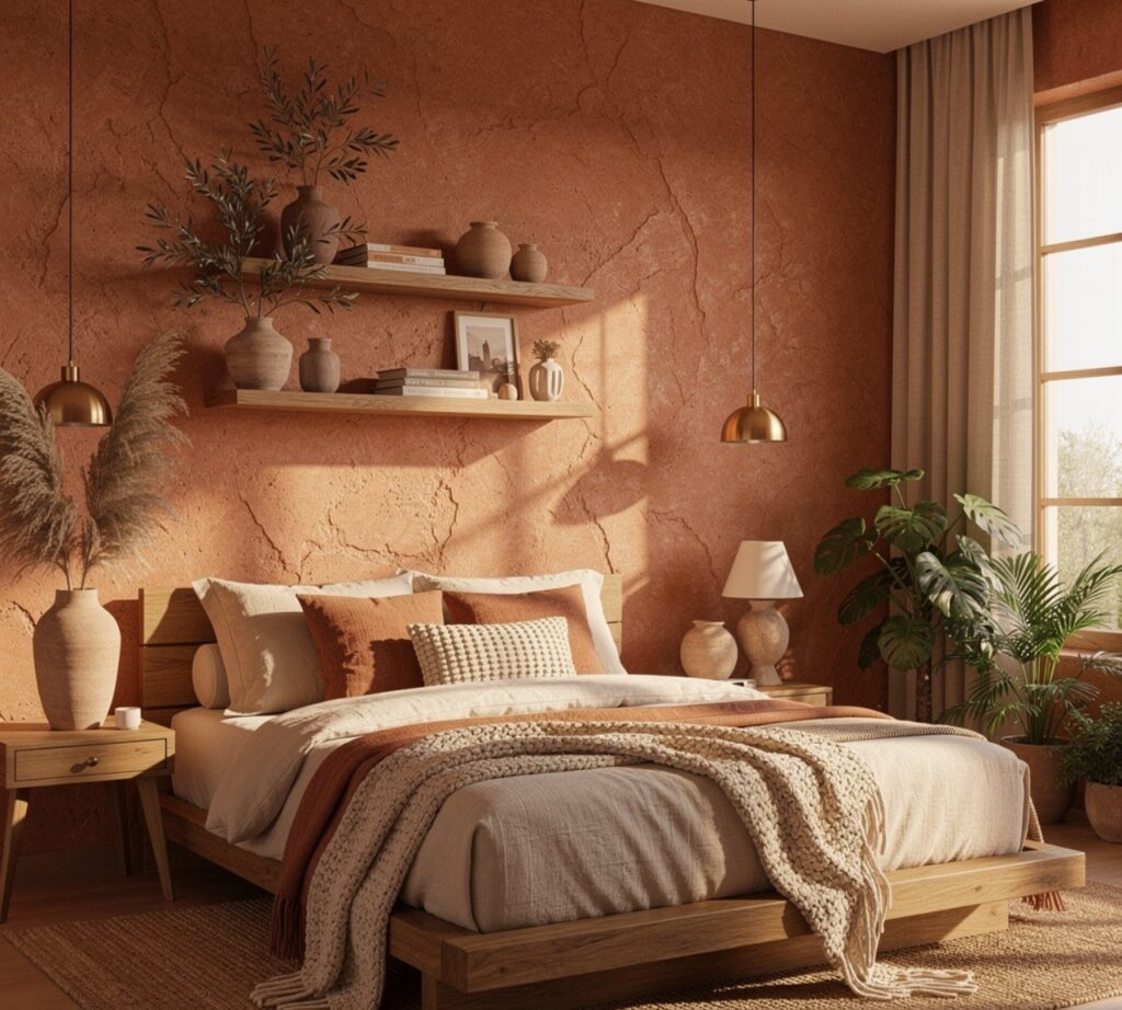
Limewash or microcement in a terracotta tone gives a bedroom wall depth that flat paint cannot replicate, especially under warm bulb lighting. The finish is applied in thin, uneven layers, which is what creates the subtle color variation people notice in high-end interiors. It works particularly well as a single accent wall behind a headboard, paired with linen bedding and brass fixtures, and it holds up better over time than trend-driven wallpaper since the color reads as timeless rather than seasonal.
2. Canopy Bed Frame
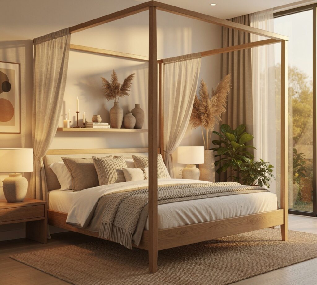
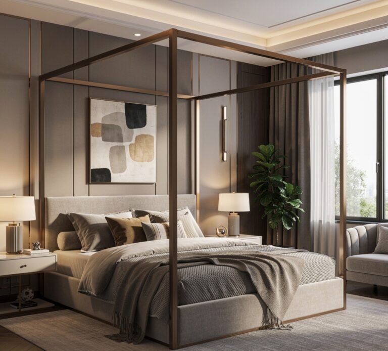
A canopy frame in blackened steel or natural rattan adds architectural height to a room without requiring taller ceilings, since the eye is drawn upward along the posts rather than across the walls. Draping a single lightweight linen panel over one side, rather than fully enclosing the bed, keeps the look airy instead of heavy. This works especially well in rooms with plain, builder-grade ceilings, where the frame itself becomes the visual focal point that replaces the need for elaborate lighting.
3. Floating Wall Shelves
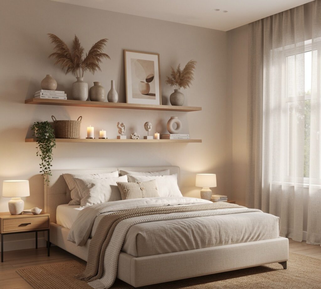
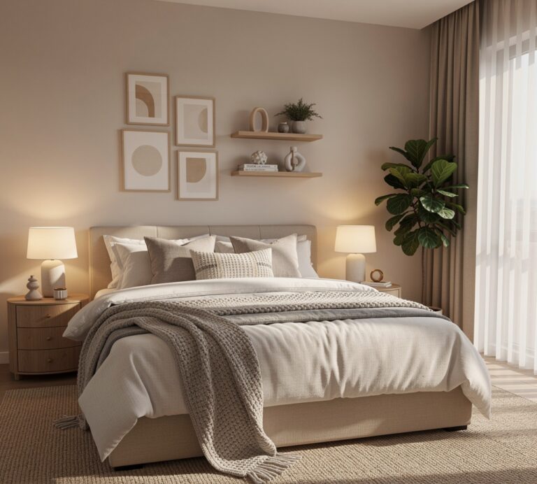
Open oak or walnut shelves mounted in an asymmetrical cluster break up a blank wall while doubling as display space for books, ceramics, and small plants. Keeping the shelf depth shallow, around six to eight inches, prevents the arrangement from feeling bulky in smaller rooms. Styling them with varied heights and negative space between objects is what gives the wall a gallery feel rather than a cluttered one, and the natural wood tone grounds the room against lighter wall colors.
To see more options for room decor CLICK HERE
4. Layered Area Rugs
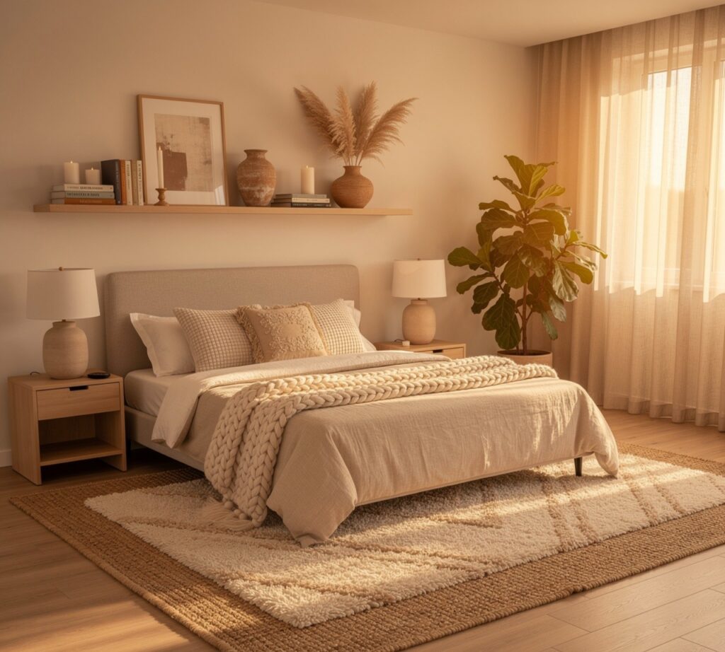
Placing a smaller patterned rug, such as a vintage-style Turkish weave, on top of a larger jute or wool base rug adds texture underfoot and visually anchors a seating or reading corner. This layering technique also solves the problem of an oddly sized room where no single rug fits the space cleanly. The contrast between a flat woven base and a plush topper reads as intentional and collected, especially when both rugs share at least one color in common with the room’s palette.
5. Rattan Pendant Light
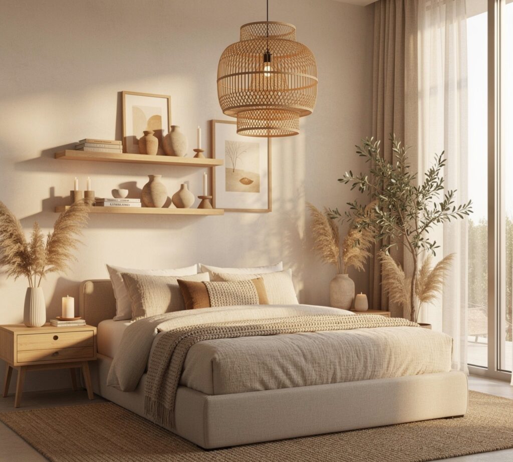
Swapping a builder-grade flush mount for a woven rattan or seagrass pendant softens overhead lighting and adds a handmade texture that pairs naturally with linen, wood, and clay tones. The open weave casts dappled shadow patterns on the ceiling at night, which adds ambiance without needing a dimmer switch. This fixture works especially well in bedrooms and reading nooks where the goal is warmth over brightness, and it’s one of the lowest-cost swaps on this list relative to its visual impact.
6. Gallery Wall Arrangement
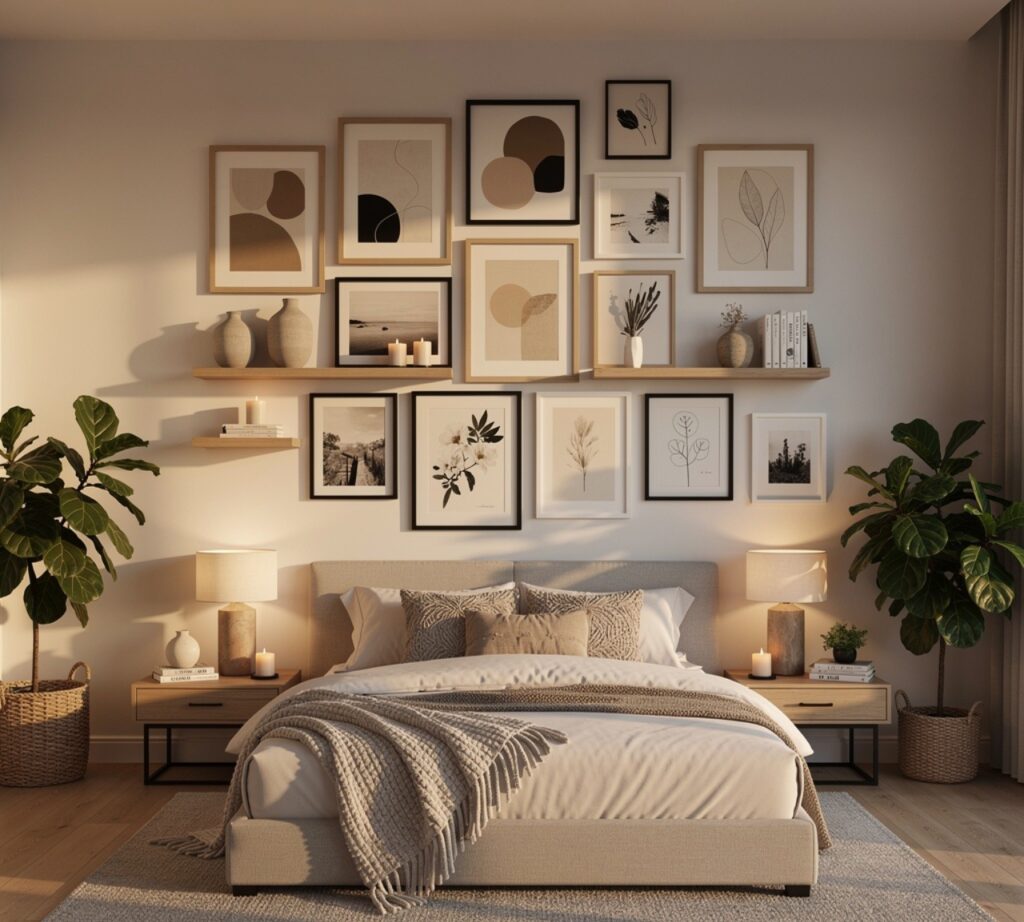
A curated gallery wall using mismatched frame styles in a consistent finish, like black metal or natural wood, creates a focal point that feels personal rather than store-bought. Mixing framed prints, mirrors, and one small shelf breaks up the grid pattern that makes gallery walls look generic. Planning the layout on the floor first, then transferring it to the wall with painter’s tape outlines, prevents the trial-and-error hole-patching that usually discourages people from attempting this look.
7. Linen Bedding Set
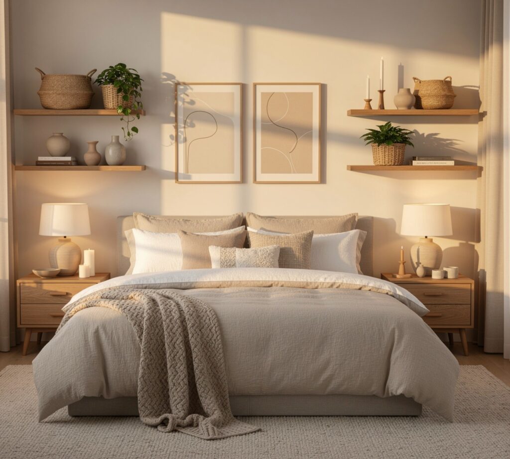
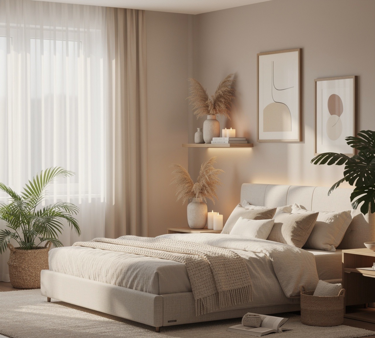
Stonewashed linen in a neutral tone like oatmeal, sage, or clay softens a bed visually and physically, since the fabric wrinkles naturally in a way that reads as relaxed rather than unmade. Layering a waffle-weave throw at the foot of the bed adds texture without introducing a new color. Linen also regulates temperature better than cotton blends, which makes it a practical upgrade as much as an aesthetic one, especially in rooms that get direct afternoon sun.
8. Built-In Nightstands
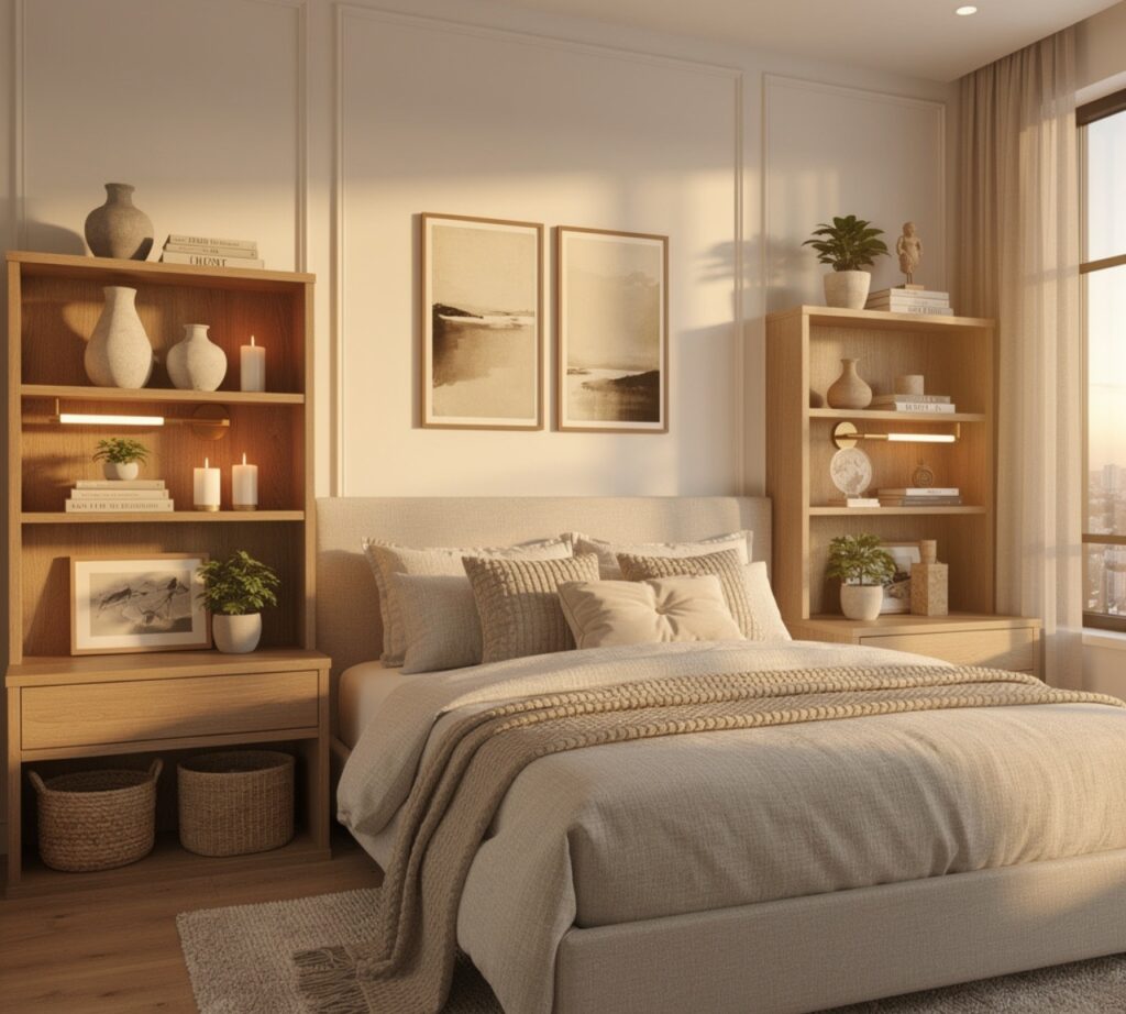
Custom or modular built-in nightstands, often constructed from the same material as a headboard wall, remove visual clutter by concealing cords and storage behind flush cabinet doors. This works especially well in narrow bedrooms where freestanding furniture eats into walking space. Matching the nightstand finish to the flooring or bed frame, rather than the walls, keeps the furniture grounded and prevents the built-in from visually floating against the room’s backdrop.
9. Boucle Accent Chair
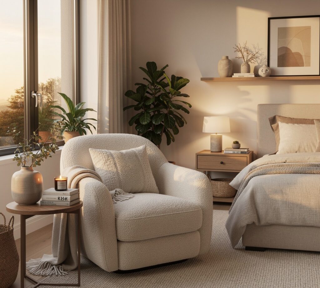
A single boucle-upholstered chair in cream or oatmeal introduces texture contrast against smoother surfaces like linen curtains or a wood floor. Placed near a window rather than centered in the room, it creates a secondary zone for reading that doesn’t compete with the bed as the main focal point. Boucle also photographs well under natural light, which is part of why the material has stayed popular in curated interiors longer than most upholstery trends typically last.
10. Botanical Plant Styling
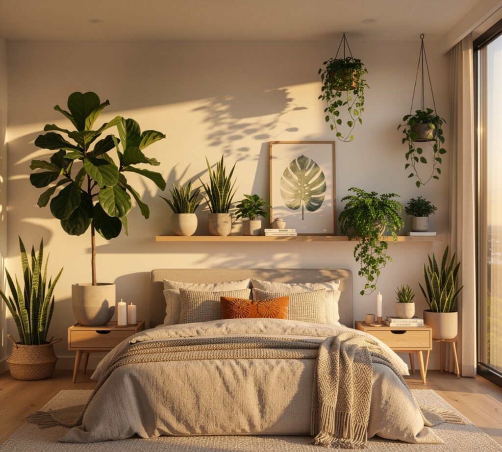
Grouping plants by height rather than scattering single pots around a room creates a more deliberate, layered look, especially when a tall fiddle-leaf fig or olive tree anchors a corner with smaller trailing pothos on a shelf nearby. Terracotta or stone-toned pots keep the grouping cohesive even when plant species vary. This idea also improves air quality and adds a living texture that changes subtly with the seasons, which static decor elements can’t replicate.
11. Woven Window Treatments
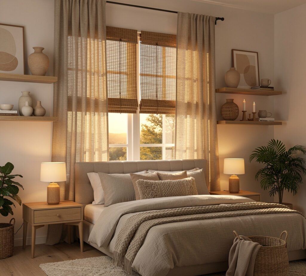
Bamboo or rattan roman shades replace heavy blackout curtains with a texture that filters light instead of blocking it entirely, which suits rooms where the goal is softness rather than total darkness. Pairing a woven shade with a single linen curtain panel on either side adds height and frames the window without overwhelming it. This combination also tends to cost less than full drapery panels while still finishing the window in a considered way.
12. Reclaimed Wood Headboard
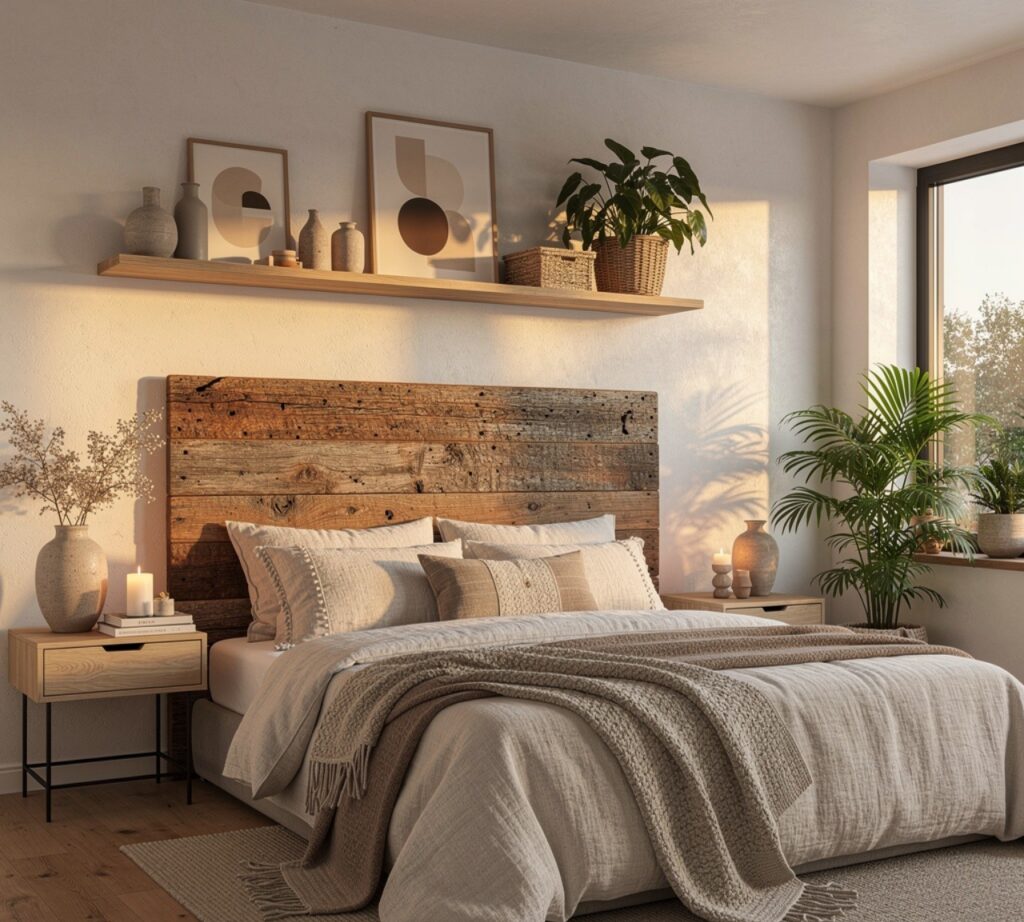
A headboard built from reclaimed barn wood or salvaged oak planks brings warmth and history into a room that all-new furniture can’t replicate, since the grain and weathering vary naturally across each board. Mounting it directly to the wall, rather than attaching it to the bed frame, allows for a taller silhouette that draws the eye upward. This pairs particularly well with the terracotta plaster wall idea above when the two share similar warm undertones.
13. Ceramic Table Lamps
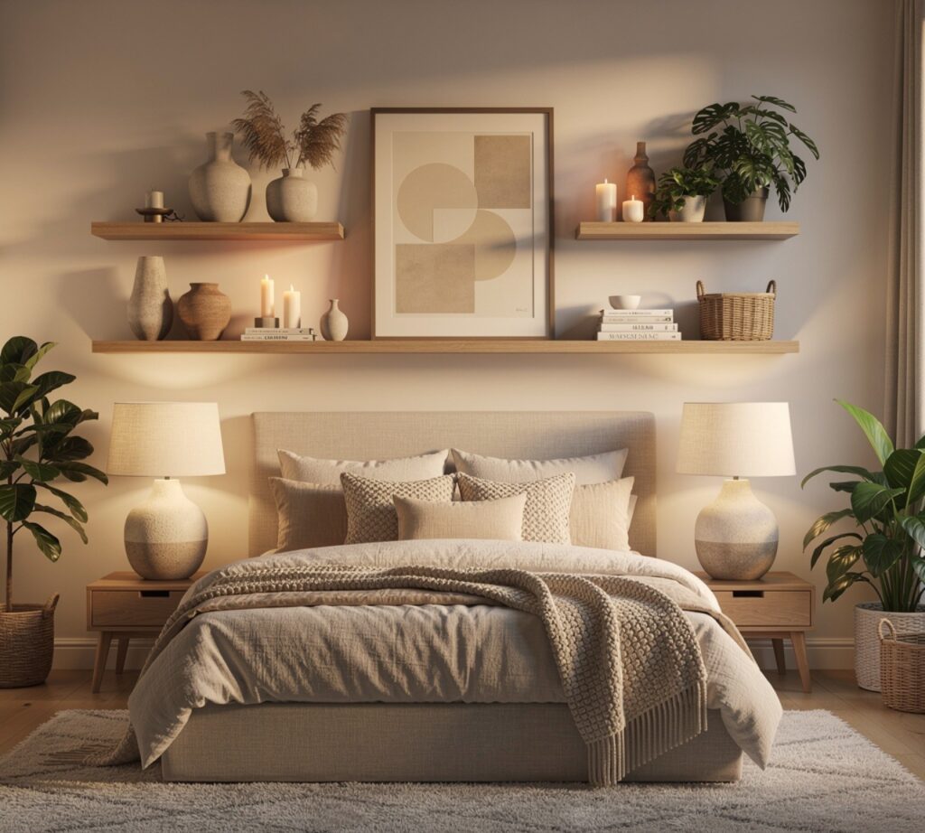
Hand-thrown ceramic lamps in a matte glaze add sculptural interest to a nightstand or dresser while providing warmer, more diffused light than most overhead fixtures. Choosing a pair in a slightly imperfect, artisan-style finish rather than a mass-produced glossy shape reinforces the handmade quality running through the rest of the room. Placing lamps at slightly different heights on either side of a bed also breaks the symmetry that can otherwise make a room feel like a hotel rather than a home.
14. Aesthetic Room Decor Color Palette
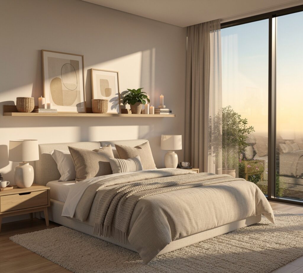
Choosing a restrained palette of three tones typically a neutral base, a warm mid-tone like terracotta or rust, and a deep accent like charcoal or forest green keeps an entire room cohesive even as individual pieces are added over time. This idea ties every other item on this list together, since furniture, textiles, and wall treatments all read as intentional when they pull from the same limited color story rather than competing for attention.
| Palette Element | Example Tone | Where to Use |
| Base Neutral | Oatmeal, warm white | Walls, bedding, large rugs |
| Mid-Tone | Terracotta, rust, clay | Accent wall, lamps, pottery |
| Deep Accent | Charcoal, forest green | Frames, hardware, small textiles |
Shop the Look
For this look, search for stonewashed linen duvet sets in oatmeal or clay, a rattan pendant light with a UL-listed cord kit, a boucle swivel chair in cream bouclé fabric, matte ceramic table lamps sold in pairs, and a reclaimed wood headboard sized to a queen or king frame. Most of these are available through furniture marketplaces, independent ceramic studios, and lighting retailers that specialize in natural materials.
Common Mistake to Avoid
The most common mistake is buying every piece in the same finish at once, which flattens a room instead of giving it depth. A space with only matte black hardware, only light oak furniture, and only one shade of beige textile ends up looking like a showroom display rather than a home. Real depth comes from mixing two or three finishes intentionally, letting one material lead while the others support it, and adding pieces gradually so the room can be adjusted as it comes together.
FAQs
What makes a room look aesthetically pleasing?
A room reads as aesthetically pleasing when its color palette, lighting, and textures are limited and repeated rather than random. Most well-designed rooms use no more than three main tones and two or three key materials, like wood, linen, and ceramic, across furniture and accessories. Consistent lighting temperature also plays a bigger role than people expect, since mismatched warm and cool bulbs in the same room can undercut even well-chosen furniture and decor.
How do you make a small bedroom look aesthetic?
Small bedrooms benefit most from vertical elements like a canopy frame or floating shelves, which draw the eye upward and make the ceiling feel higher. Keeping furniture pieces low-profile and choosing a light, layered color palette also prevents the room from feeling boxed in. Built-in nightstands or wall-mounted lighting free up floor space, which matters more in a small room than any single decorative object placed inside it.
What colors are trending for aesthetic room decor?
Warm neutrals paired with earthy mid-tones are currently the most searched combination, replacing the cooler grays and stark whites that were popular previously. Terracotta, clay, sage green, and warm oatmeal show up consistently across current bedroom and living space designs. These tones pair well with natural materials like rattan, linen, and unfinished wood, which is part of why the palette has stayed popular across multiple seasons rather than fading quickly.
Is it expensive to redecorate a room aesthetically?
Not necessarily, since textiles, lighting swaps, and wall treatments like limewash typically cost far less than replacing furniture. A new pendant light, a linen bedding set, and a gallery wall arrangement can meaningfully change a room for a few hundred dollars total. Spending gradually on a few well-chosen pieces, rather than replacing everything at once, tends to produce a more cohesive result and is easier on a typical decorating budget.
How many colors should a bedroom have?
Most designers recommend limiting a bedroom to three core tones: one neutral base, one warm or cool mid-tone, and one deeper accent color used sparingly in frames, hardware, or small textiles. Going beyond three tones tends to make a room feel busy rather than curated, even when each individual color choice is reasonable. Repeating the same three tones across walls, textiles, and furniture is what makes a room feel finished rather than still in progress.
Conclusion
Building a room around aesthetic room decor principles doesn’t require a full renovation it requires choosing a limited palette, repeating key materials, and adding texture gradually through lighting, textiles, and a few considered furniture pieces. Save this guide to Pinterest for reference while you shop, and check out our related post on small-space furniture layouts for more room-specific ideas.