16 Trending Blue Kitchen Cabinets Ideas for Every Kitchen Style, From Classic to Modern
Blue kitchen cabinets have moved from a bold, occasional choice to one of the most common alternatives to plain white or gray, but choosing the right shade still depends heavily on your kitchen’s lighting, existing finishes, and overall style. This guide breaks down sixteen distinct blue kitchen cabinet ideas, from soft, muted dusty blue to a deep, dramatic navy, each with real paint names, hex codes, and pairing notes so you can move from inspiration to an actual sample on your own cabinets. Whether you’re repainting existing cabinetry or ordering new, there’s a specific shade and styling direction here for nearly any kitchen.
Trend & Background
Blue kitchen cabinets gained significant momentum as homeowners looked for an alternative to the all-white kitchen that dominated for over a decade, offering color without the higher-commitment risk of a bolder hue like red or yellow. Two-tone kitchens, blue lower cabinets paired with white or wood upper cabinets, have also grown especially popular, since the combination adds color without covering every surface in a single saturated tone. Understanding a blue’s undertone, whether it leans gray, green, or true navy, matters more in a kitchen than almost any other room, since cabinet color needs to coordinate with countertops, backsplash, and flooring all at once rather than a single wall in isolation.
Key Takeaways
- Sixteen shades and styling approaches ranging from soft dusty blue to bold navy, each suited to a different kitchen style
- Hex codes and popular paint names are included so you can bring an exact color to a paint store or cabinet maker
- A reference table covers hardware and countertop pairing so the finished kitchen reads as cohesive
- Five FAQs cover resale value, upkeep, and how to keep a bold blue from feeling overwhelming
1. Dusty Blue Shaker Cabinets
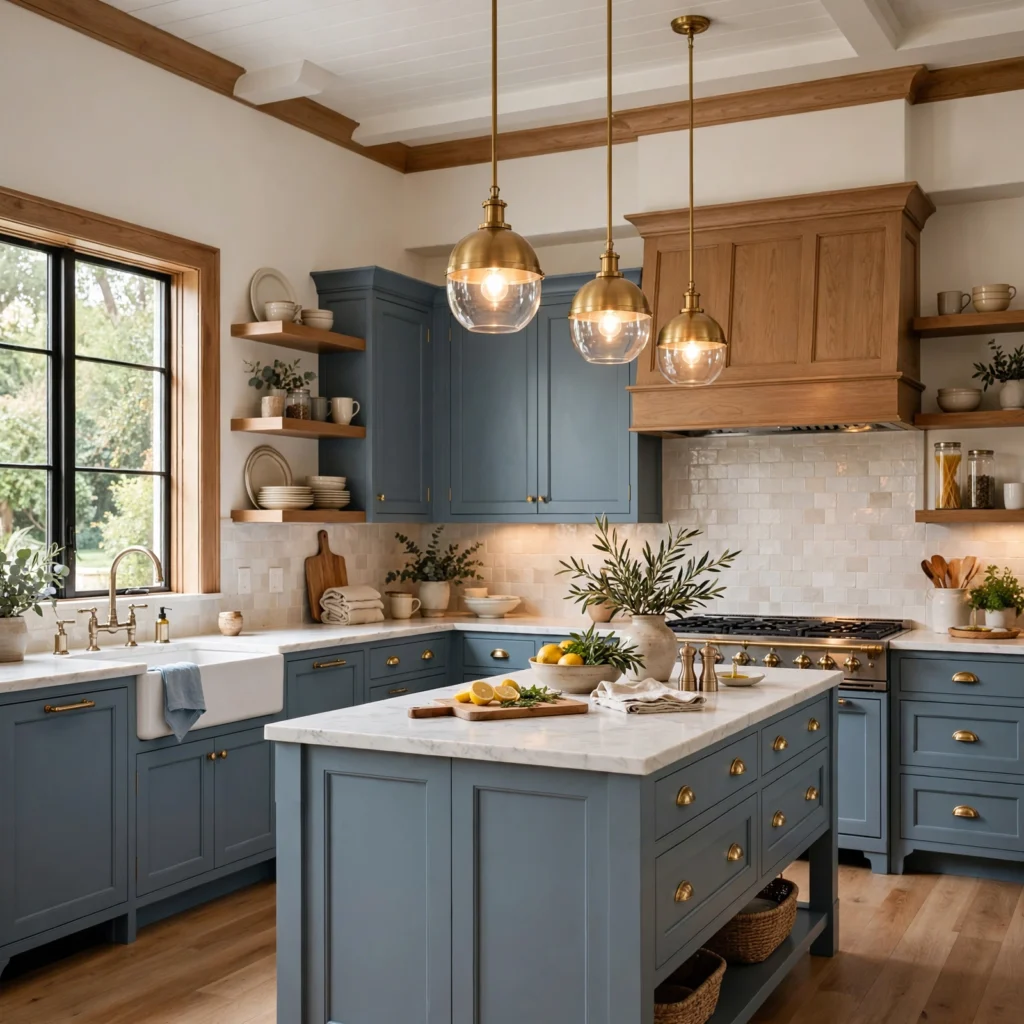
Dusty blue, a muted, slightly grayed shade, works especially well on shaker-style cabinets, since the simple, recessed panel profile lets the color’s softness read clearly without competing with ornate detailing. This shade pairs naturally with warm white countertops and brushed brass hardware, since the warmth in both elements balances the blue’s inherent coolness. Benjamin Moore’s “Wolf Gray” or Sherwin-Williams’ “Bracing Blue” both fall into this dusty blue family and photograph particularly well under warm kitchen lighting.
| Cabinet Shade | Paint Name Example | Hex Code |
| Dusty Blue | Benjamin Moore Wolf Gray | #8CA0AF |
| Navy | Sherwin-Williams Naval | #2B3A4A |
| Sage-Blue | Farrow & Ball Oval Room Blue | #A3B7B0 |
2. Classic Navy Lower Cabinets
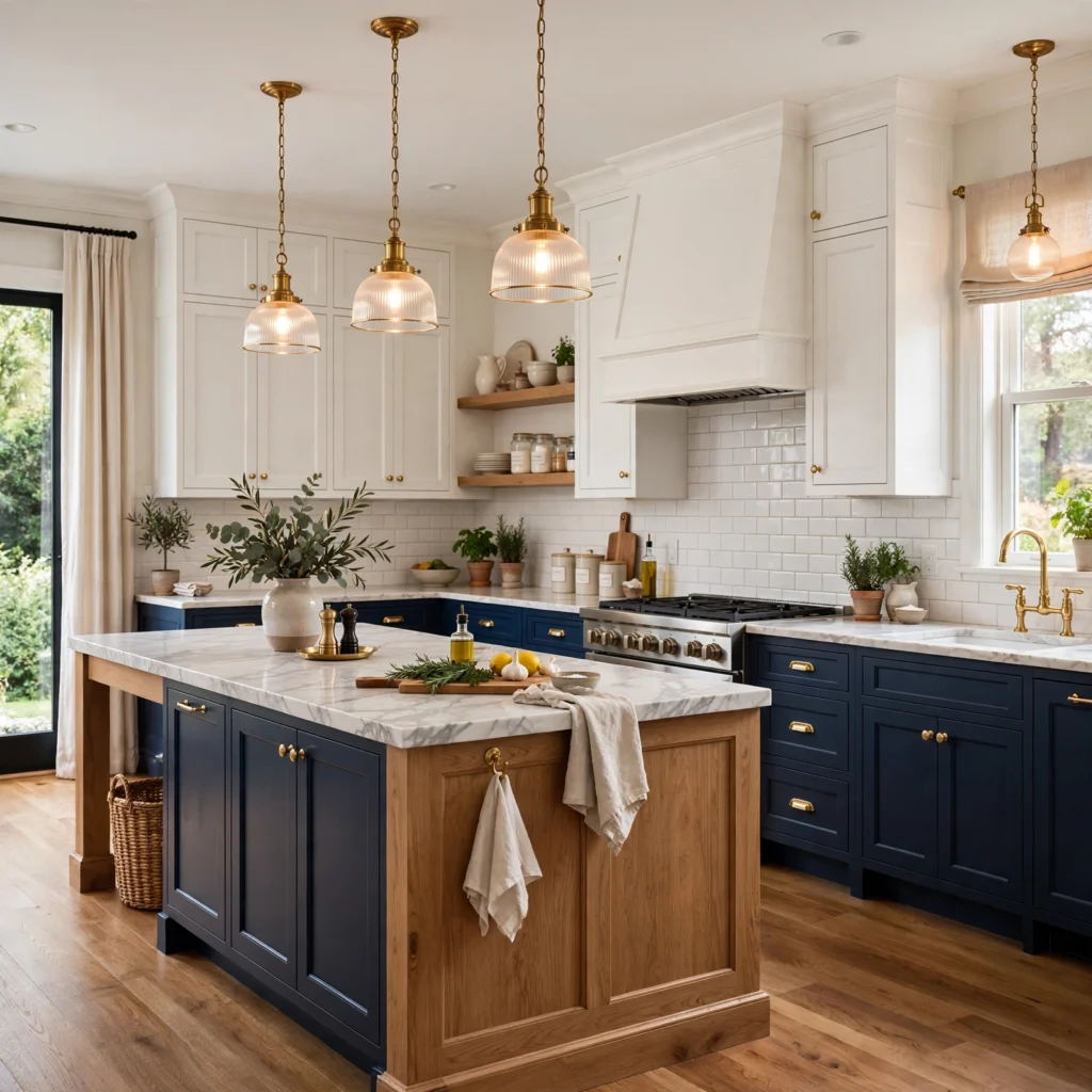
A classic navy paired with white upper cabinets remains one of the most enduring two-tone blue kitchen combinations, since the deep, near-black navy grounds the kitchen without covering the whole room in dark color. Sherwin-Williams’ “Naval” is one of the most widely used shades for this application, reading as rich and true blue rather than shifting toward purple or teal under most lighting conditions. Pair with brushed nickel or matte black hardware rather than warmer brass, since navy’s coolness pairs more naturally with cool metal finishes.
3. Powder Blue Vintage Kitchen
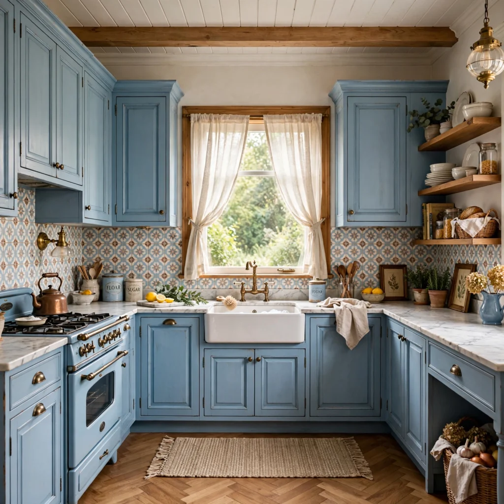
A soft powder blue, closer to pastel than a true saturated blue, suits a vintage or cottage-style kitchen aiming for a light, cheerful feel rather than a bold color statement. This shade works especially well with white subway tile, brass or nickel cup pulls, and open shelving displaying colorful vintage dishware. Farrow & Ball’s “Borrowed Light” or Benjamin Moore’s “Woodlawn Blue” both fall into this softer, more pastel-leaning family of powder blue.
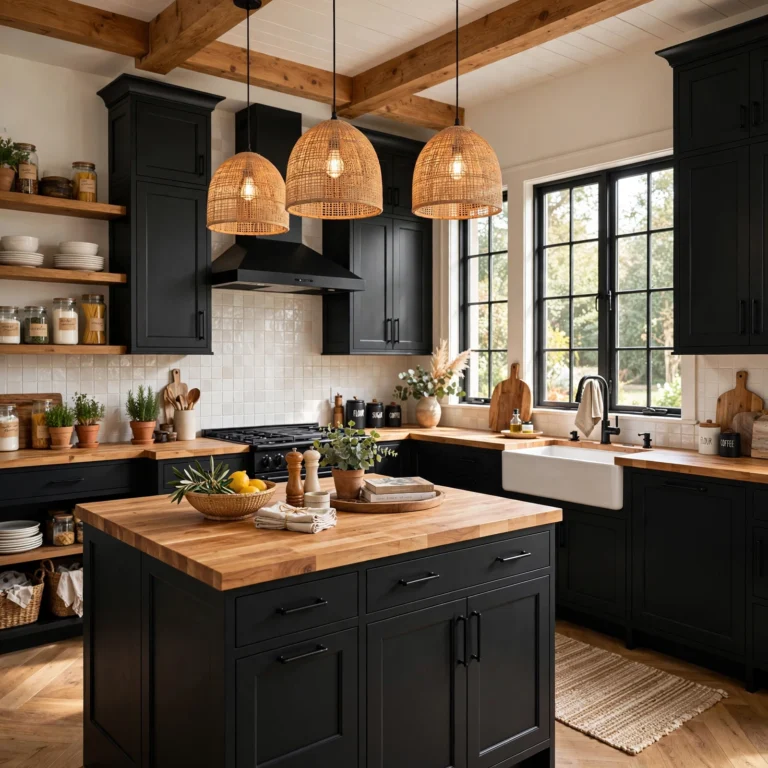
To see more black kitchen cabinets
4. Deep Teal-Blue Modern Kitchen
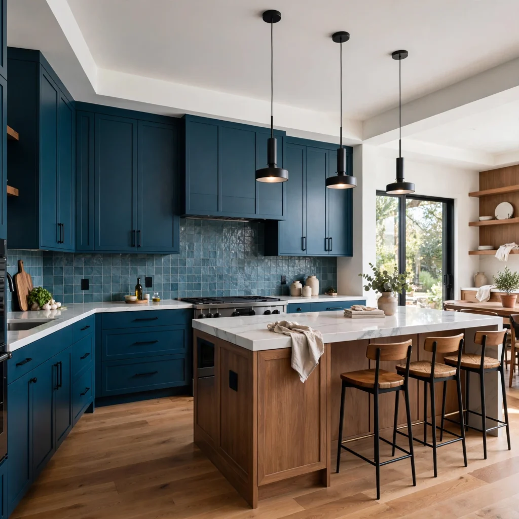
A deep teal-leaning blue, with just enough green undertone to distinguish it from a true navy, suits a modern kitchen wanting a bold, current color statement paired with flat-panel cabinet doors and integrated handleless hardware. This shade reads as sophisticated rather than playful, especially against a waterfall quartz island and matte black fixtures. Sherwin-Williams’ “Rock Bottom” or Behr’s “Sea Cave” both work well in this deep teal-blue family for a modern application.
5. Two-Tone Blue and White Kitchen
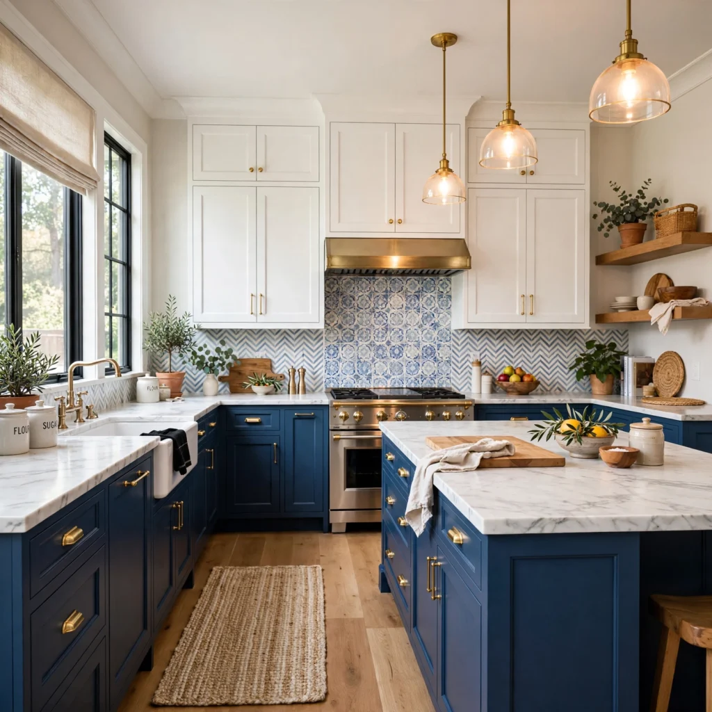
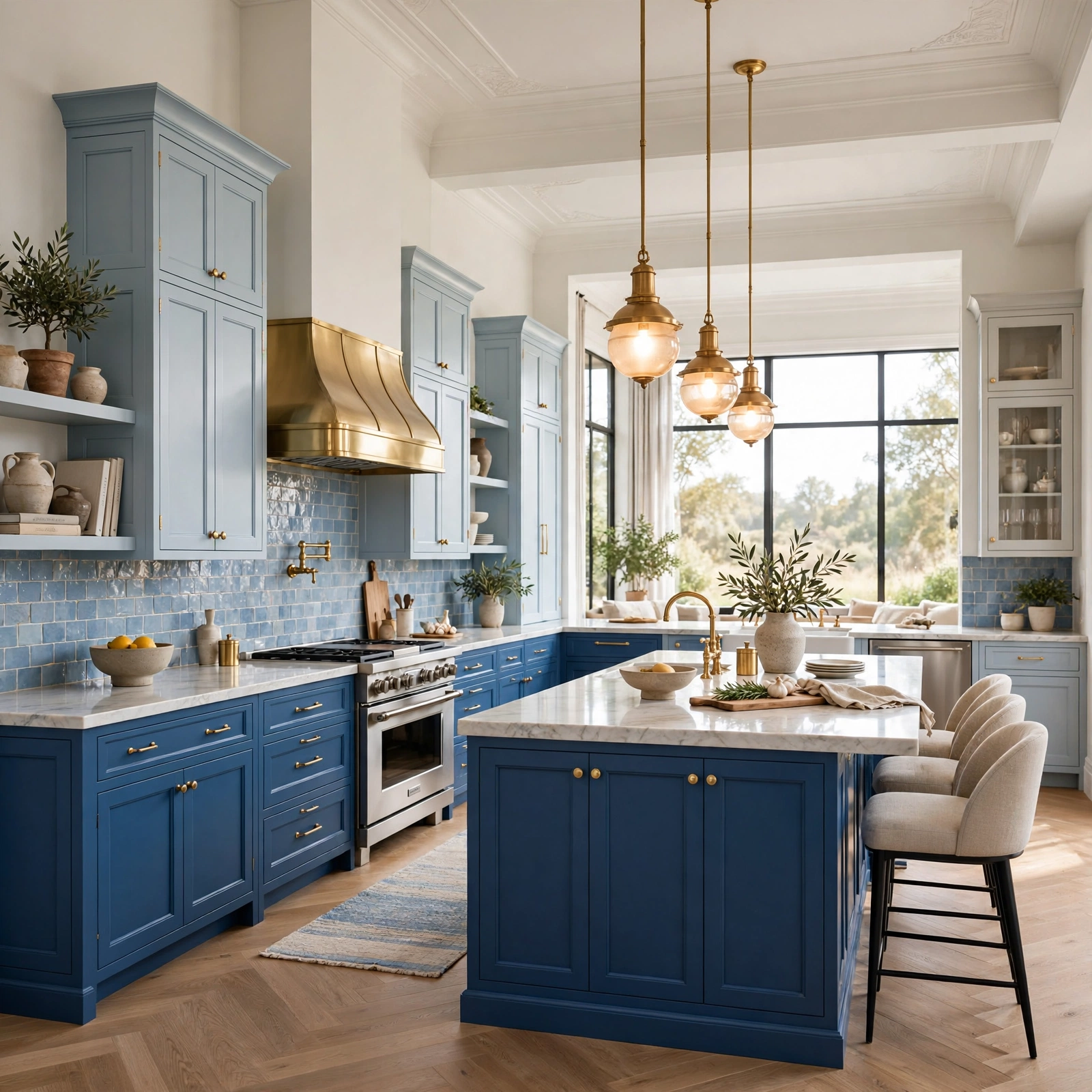
Painting only the lower cabinets a saturated blue while keeping upper cabinets or open shelving white creates visual lightness at eye level while still delivering real color impact throughout the kitchen. This approach works particularly well in a smaller kitchen, since an all-blue kitchen can start to feel closed in without the visual break a lighter upper cabinet color provides. Keep the same white used on the upper cabinets consistent with the ceiling and trim color, since mismatched whites are one of the most common mistakes in a two-tone kitchen.
6. Slate Blue Farmhouse Kitchen
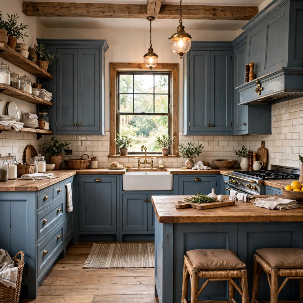
Slate blue, a muted, slightly gray-leaning shade, suits a farmhouse kitchen paired with an apron-front sink, open shelving, and warm wood countertops or a butcher block island. This shade avoids reading as either too playful or too formal, sitting comfortably between the softer pastel blues and the more dramatic true navy options on this list. Behr’s “Blueprint” or Benjamin Moore’s “Stratton Blue” both work well in this slate blue family for a farmhouse-leaning kitchen.
7. Cobalt Blue Statement Island
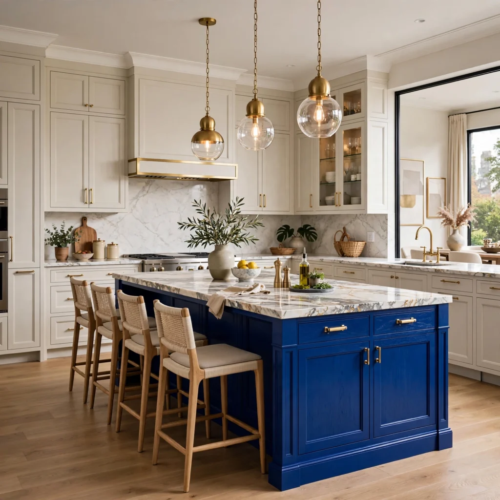
Painting only the kitchen island a bold, saturated cobalt blue while keeping the surrounding perimeter cabinets white or a light wood tone concentrates color into a single, high-impact focal point rather than spreading it across the whole room. This approach works especially well in an open-concept kitchen visible from a living or dining area, since the island reads clearly as a deliberate design choice from across the room. Pair a cobalt island with brass hardware and a contrasting wood or stone countertop to keep the bold color from feeling like the only decision made in the space.
8. Muted Sage-Blue Coastal Kitchen
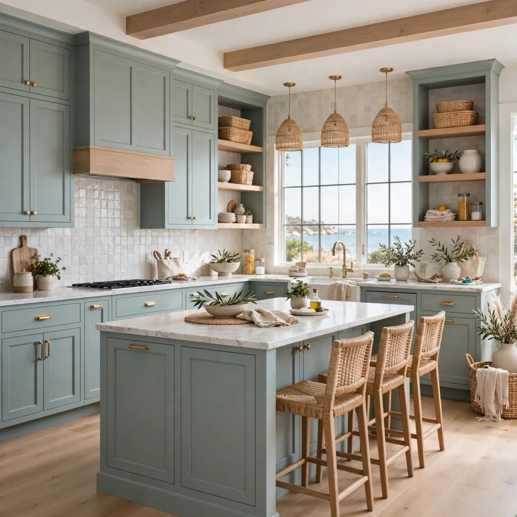
A muted, slightly green-leaning sage-blue suits a coastal or beach house kitchen wanting a relaxed, natural feel rather than a crisp, saturated color. This shade pairs naturally with white oak open shelving, woven pendant lighting, and a light stone or quartz countertop with subtle veining. Farrow & Ball’s “Oval Room Blue” or Sherwin-Williams’ “Comfort Gray” both work well in this soft sage-blue direction for a coastal-leaning kitchen.
9. High-Gloss Blue Contemporary Kitchen
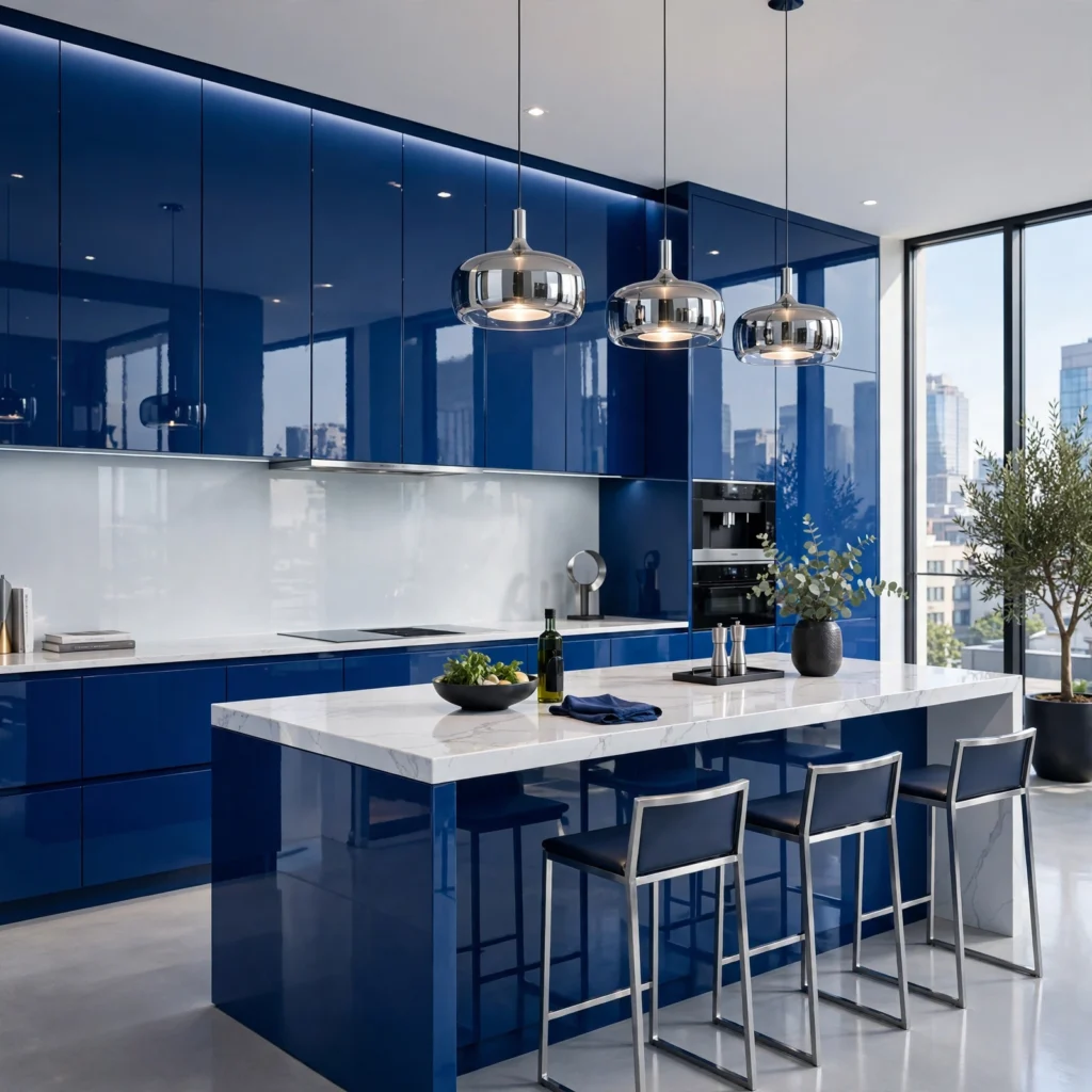
A high-gloss lacquer finish in a true saturated blue gives a contemporary kitchen a sleek, reflective quality that a standard matte or satin paint finish can’t replicate. This finish requires a specialized cabinet maker or refinishing shop, since achieving an even, streak-free high-gloss finish is considerably more technically demanding than a standard painted cabinet. Pair with minimal, integrated hardware and a polished stone or glossy quartz countertop to reinforce the reflective, modern quality throughout the rest of the kitchen.
10. Denim Blue Transitional Kitchen
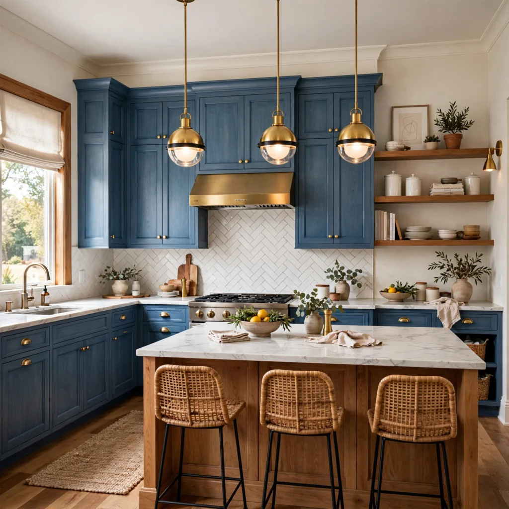
Denim blue, a mid-tone, slightly worn-looking shade, suits a transitional kitchen that sits between fully traditional and fully modern, pairing well with both shaker-style cabinet doors and simpler flat-panel alternatives. This shade tends to photograph consistently across different lighting conditions better than either very pale or very saturated blues, making it a lower-risk choice for a kitchen with mixed natural and artificial lighting throughout the day. Behr’s “Blueberry Twist” or Sherwin-Williams’ “Denim” both fall into this mid-tone denim blue family.
11. Periwinkle Blue Eclectic Kitchen
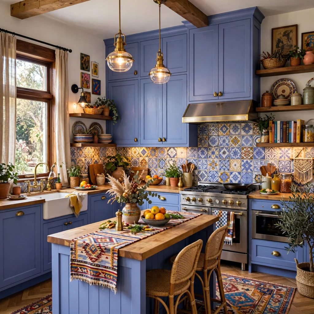
Periwinkle, a blue with a distinct violet undertone, suits an eclectic or maximalist kitchen already incorporating pattern through tile or wallpaper, since the slight purple lean gives the cabinets more personality than a straightforward true blue. This shade pairs particularly well with patterned cement or encaustic tile backsplashes and brass hardware with an aged or antique finish. Because periwinkle carries a distinct undertone, testing large samples against your specific tile and countertop choices before committing is especially important with this shade.
12. Steel Blue Industrial Kitchen
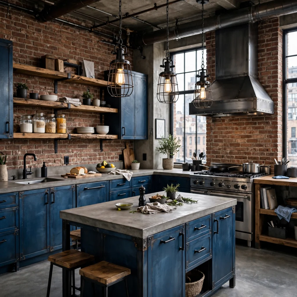
Steel blue, a cooler, grayer shade, suits an industrial-leaning kitchen paired with black steel open shelving, exposed brick, and concrete or butcher block countertops. This shade avoids reading as soft or cottage-like, instead leaning into a more utilitarian, grounded feel that complements raw, unfinished materials elsewhere in the space. Matte black hardware and fixtures reinforce this industrial direction more effectively than warmer brass or polished nickel would in this particular application.
13. Robin’s Egg Blue Retro Kitchen
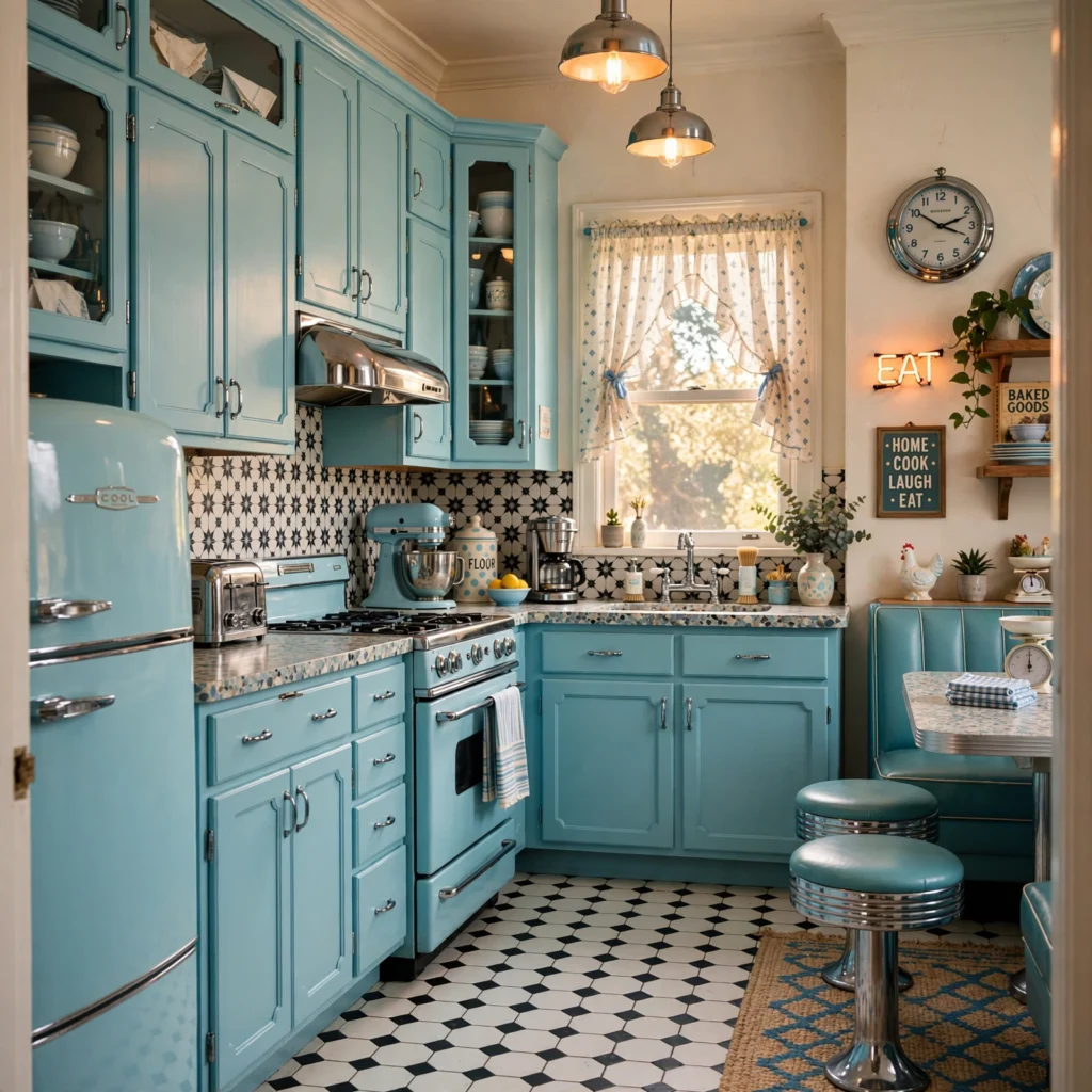
Robin’s egg blue, a bright, slightly green-leaning pastel, works well in a retro or 1950s-inspired kitchen paired with chrome hardware, black and white checkerboard flooring, and rounded cabinet door profiles reminiscent of the era. This shade reads as playful and nostalgic rather than sophisticated, making it a distinct departure from most of the more muted or formal blues elsewhere on this list. Vintage-style appliances in a matching or complementary color help complete this specific retro aesthetic more convincingly than modern stainless steel appliances would alongside it.
14. Charcoal-Blue Moody Kitchen
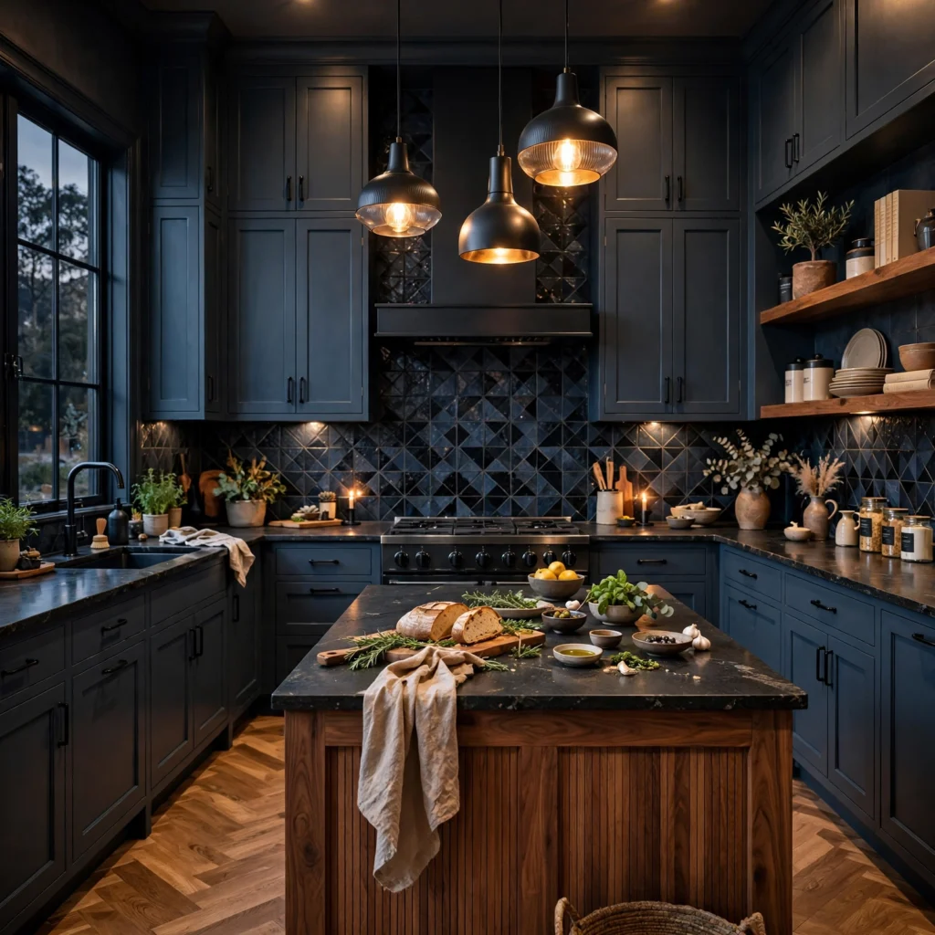
A charcoal-blue, dark enough to read as nearly black in low light but clearly blue-toned in brighter conditions, suits a kitchen wanting a dramatic, moody feel throughout every surface rather than a lighter, more airy approach. This shade works especially well in a kitchen with abundant natural light or strong under-cabinet lighting, since the depth of color needs adequate illumination to avoid feeling like a dark, closed-off space rather than a deliberately dramatic one. Brass or aged bronze hardware adds warmth against the cooler charcoal-blue base, keeping the kitchen from feeling entirely cold.
15. Two-Tone Blue Island with Wood Perimeter
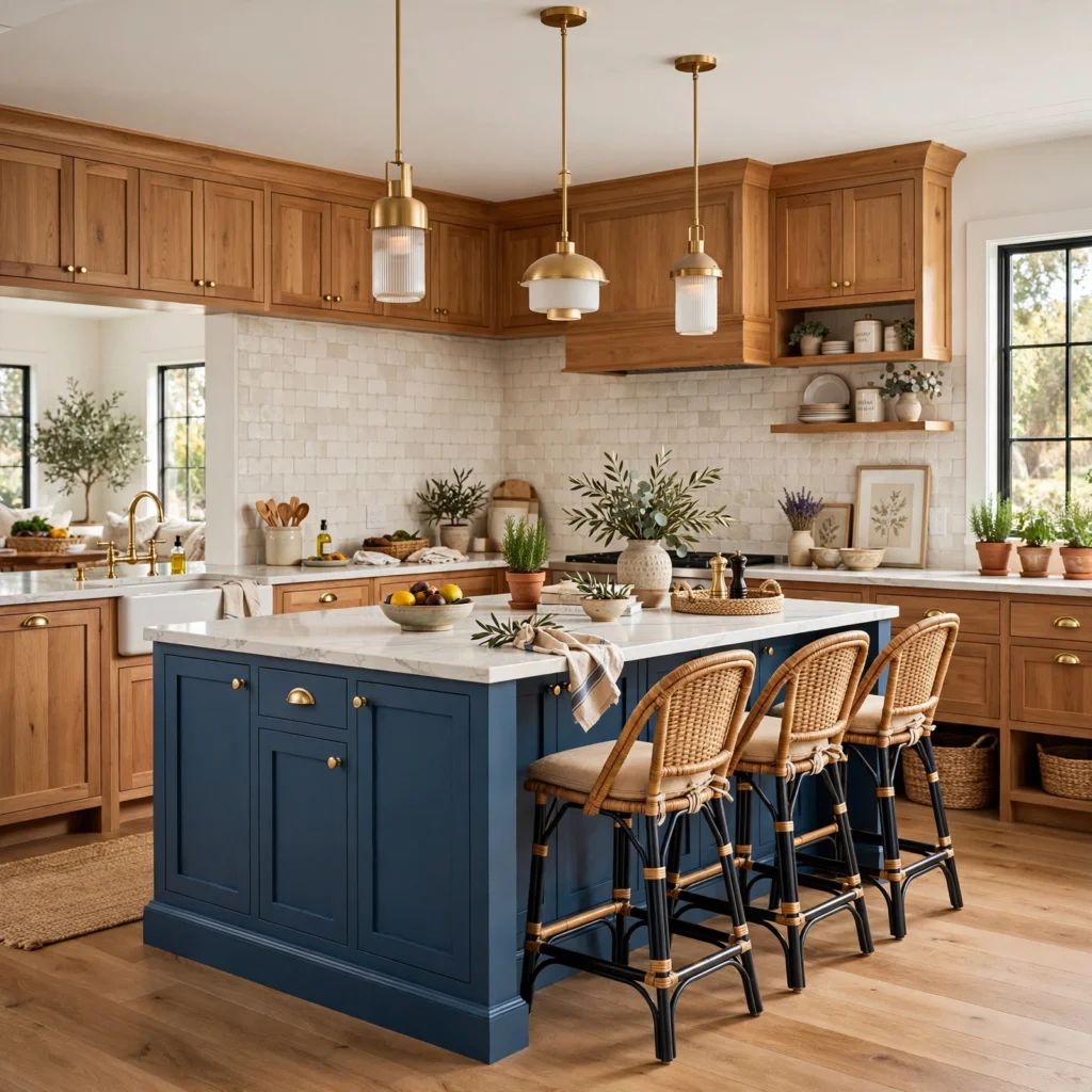
Pairing a saturated blue island with natural wood tone perimeter cabinets, rather than white, creates a warmer two-tone combination than the more common blue-and-white pairing found elsewhere on this list. White oak or a lighter ash wood tone works particularly well against most blues, since the wood’s warmth balances blue’s coolness more effectively than a stark white perimeter would. This combination suits a kitchen already incorporating natural wood elements elsewhere, like open shelving or a wood range hood, since the island then reads as coordinated rather than an isolated color choice.
| Countertop Material | Best Suited Blue Shade | Notes |
| White or cream quartz | Navy, cobalt, dusty blue | High contrast, classic |
| Warm wood butcher block | Slate blue, denim, sage-blue | Warmer overall pairing |
| Dark stone or soapstone | Charcoal-blue, steel blue | Moody, cohesive look |
16. Matte Blue Scandinavian Kitchen
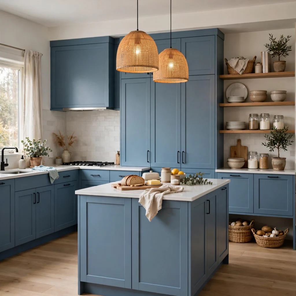
A muted, matte-finish mid-tone blue suits a Scandinavian-influenced kitchen paired with simple flat-panel cabinet doors, light wood flooring, and minimal, unobtrusive hardware or fully integrated pulls. This approach favors a quiet, restrained application of color, using the blue as the room’s primary decorative statement rather than layering in additional pattern or ornamentation elsewhere. Farrow & Ball’s “Stiffkey Blue” or Sherwin-Williams’ “Distance” both work well in this muted, matte-appropriate blue family for a Scandinavian-style kitchen.
Shop the Look
For navy and dusty blue cabinet paint, Sherwin-Williams’ “Naval” and Benjamin Moore’s “Wolf Gray” remain two of the most reliable, widely available options. Brass and unlacquered brass hardware from Rejuvenation or Schoolhouse pairs well with most warmer blue shades on this list. Matte black hardware from Emtek covers the cooler steel blue and charcoal-blue applications directly. For a professional cabinet refinishing job, look for a local shop specializing in cabinet spray finishing rather than a general painting contractor, since cabinets require a different application process than walls.
Common Mistake to Avoid
The most common mistake with blue kitchen cabinets is choosing a shade based on a small paint chip or an online photo without testing a large sample directly in the kitchen’s actual lighting, since blue shifts dramatically between natural daylight, warm incandescent light, and cooler LED under-cabinet lighting. Paint a large sample board, at least two feet square, and view it in the kitchen at different times of day before committing to a full cabinet repaint or a custom cabinet order. This single step prevents the most common and most expensive blue kitchen cabinet regret, discovering the chosen shade reads far more green, gray, or purple than expected once fully installed.
Do blue kitchen cabinets hurt resale value?
Blue kitchen cabinets, particularly in more muted or classic shades like navy or dusty blue, generally have a neutral to positive effect on resale value according to most recent real estate market data, since blue has become common enough that it no longer reads as an unusual or risky color choice to most buyers. Very bold or unusual shades, like a bright cobalt or a periwinkle, may appeal to a narrower pool of buyers than a more universally appealing navy or dusty blue, though this varies by local market and the overall quality of the kitchen’s finishes and layout.
How do I maintain painted blue kitchen cabinets?
A durable cabinet-grade paint, ideally applied by a professional using a spray finish rather than a brush, holds up considerably better to daily kitchen use than a standard wall paint applied with a roller. Wiping cabinets down regularly with a mild soap and water solution, rather than harsh chemical cleaners, helps preserve the finish over time. Touch-up paint kept on hand for the specific shade used allows for quick repairs to small chips or scratches before they become more noticeable or require a full repaint.
What countertop color works best with blue kitchen cabinets?
White or cream quartz countertops provide the highest, most classic contrast against nearly any blue cabinet shade, working particularly well with navy, cobalt, or dusty blue. Warmer wood countertops like butcher block pair especially well with softer, more muted blues like slate blue or sage-blue, since the wood’s warmth balances the blue’s coolness. Darker stone countertops, like soapstone or a dark granite, pair most successfully with equally deep blue shades like charcoal-blue or steel blue, since a dark countertop against a lighter blue can create more contrast than intended.
Are blue kitchen cabinets a passing trend?
Blue kitchen cabinets have remained consistently popular for close to a decade at this point, suggesting the color itself has moved beyond a short-lived trend into a genuinely established alternative to white or gray cabinetry. More muted, classic shades like navy and dusty blue in particular show no clear signs of declining in popularity, while brighter or more unusual shades like cobalt or periwinkle carry somewhat more trend risk given their bolder, more specific aesthetic. Choosing a more muted blue as the primary cabinet color, then introducing bolder blue accents through smaller, easily changeable elements like a runner rug or bar stools, hedges against this risk either way.
How do I keep a bold blue kitchen from feeling overwhelming?
Using blue on only a portion of the kitchen’s cabinetry, an island alone or lower cabinets only, rather than covering every cabinet surface in the same saturated color, is the most reliable way to introduce bold blue without it dominating the entire room. Balancing a bold blue with a generous amount of white, cream, or natural wood elsewhere in the kitchen, on countertops, walls, or upper cabinetry, also keeps the color from feeling like the only decision made in the space. Warm metal hardware and lighting further soften an otherwise cool, saturated blue throughout the room.
Conclusion
The sixteen ideas above cover soft pastels, deep navy, and everything in between, giving you enough range to find a blue kitchen cabinet shade suited to almost any kitchen style. Whether you start with a subtle dusty blue island or commit to a full high-gloss cobalt kitchen, the goal is a color choice built around your kitchen’s specific lighting and existing finishes rather than a shade picked from a photo alone. Save this list to Pinterest for your next kitchen project, or check our related post on blue color palette ideas for more general blue pairing guidance beyond the kitchen.
I’ve spent the last six years sourcing materials and consulting on kitchen renovations for residential clients, which means I’ve watched which blue cabinet shades actually hold up under real kitchen lighting and daily use, and which ones only look good in a single styled photo.