15 Trending Two Tone Kitchen Cabinets Ideas That Feel Custom
Two tone kitchen cabinets have moved from a niche designer trick to one of the most searched kitchen looks, replacing the all-one-color kitchens that dominated for years. This post breaks down fifteen specific, real color and layout combinations, covering exact pairings, hardware, and countertop choices so you can plan a kitchen that looks intentional rather than mismatched. Whether you’re painting existing cabinets or planning new ones, you’ll leave with concrete direction instead of a vague mood board.
Trend & Background
Two tone kitchens have grown in popularity as homeowners move away from resale-driven, all-white kitchens toward layouts that feel more personal and custom-built. Cabinet manufacturers and painters have both responded, now offering more pre-set two-color packages and matching hardware finishes than in previous years. This shift matters now because kitchens are increasingly designed as showpiece rooms rather than purely functional spaces, and a two-tone layout gives homeowners a way to introduce color and contrast without committing to a single bold shade across every cabinet in the room.
Key Takeaways
- Two tone kitchen cabinets typically pair a darker lower cabinet color with a lighter upper, though the reverse and other splits work just as well depending on ceiling height and layout.
- The island is the easiest, lowest-commitment place to introduce a second color if you’re not ready to repaint the whole kitchen.
- Contrast level, not just color choice, is what determines whether the look feels bold and modern or soft and traditional.
- Hardware and countertop choices need to bridge both cabinet colors so the kitchen reads as one cohesive design rather than two separate ones.
1. Navy Lower, White Upper Cabinets
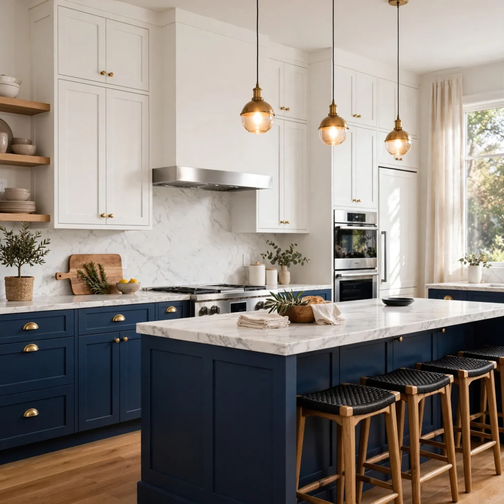
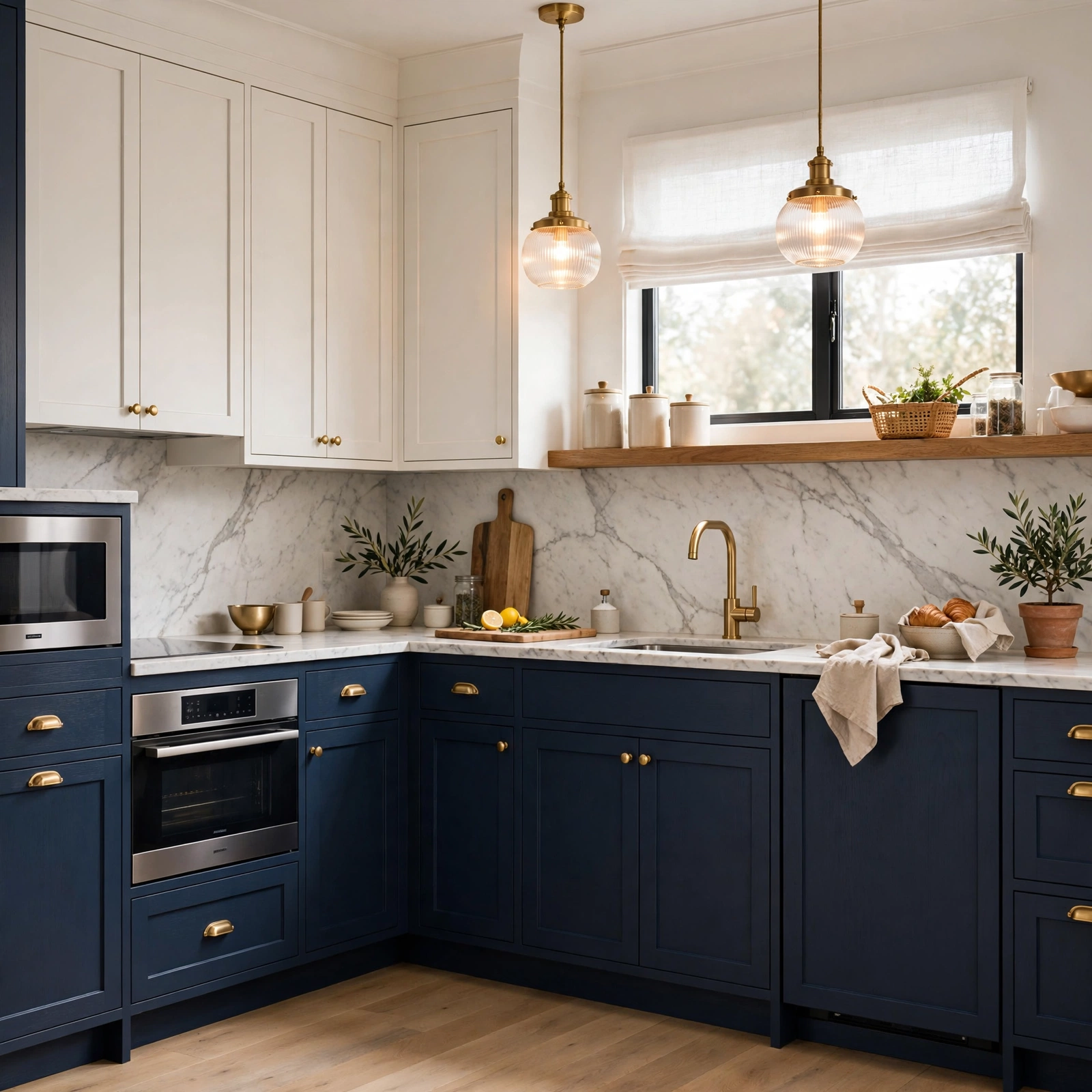
Navy lower cabinets paired with white upper cabinets is the most common two tone kitchen cabinets combination, grounding the room with a deep, classic color while keeping the upper half of the kitchen bright and open. The navy hides scuffs and fingerprints near handles better than white would, which matters most on lower cabinets that see the most daily contact. This pairing works in both traditional and modern kitchens depending on whether the doors are shaker-style or flat-panel.
2. Painted Island Contrast
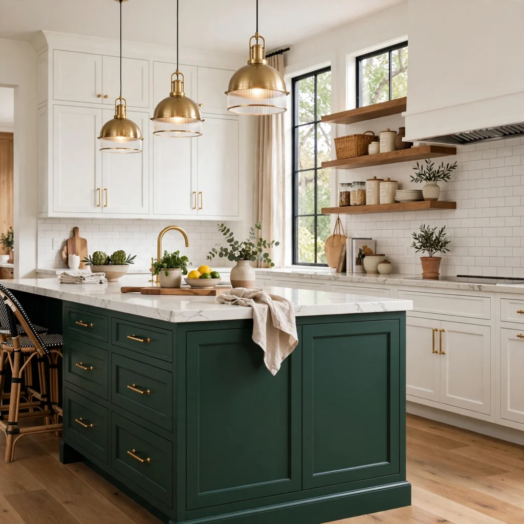
A painted island, left as the single bold color against otherwise neutral perimeter cabinets, is the lowest-commitment way to try a two-tone layout, since it typically involves less paint and labor than repainting every cabinet. This approach also naturally separates the cooking and prep zone from the rest of an open-concept kitchen. Choosing a saturated color like forest green, terracotta, or navy for the island keeps it functioning as a clear focal point rather than blending into the surrounding cabinetry.
| Kitchen Layout | Island Color Approach | Perimeter Color |
| Open-concept | Bold, saturated | White or cream |
| Galley | Medium-tone | Light wood or white |
| U-shaped | Bold or wood-tone | Neutral or white |
3. Wood and White Combination
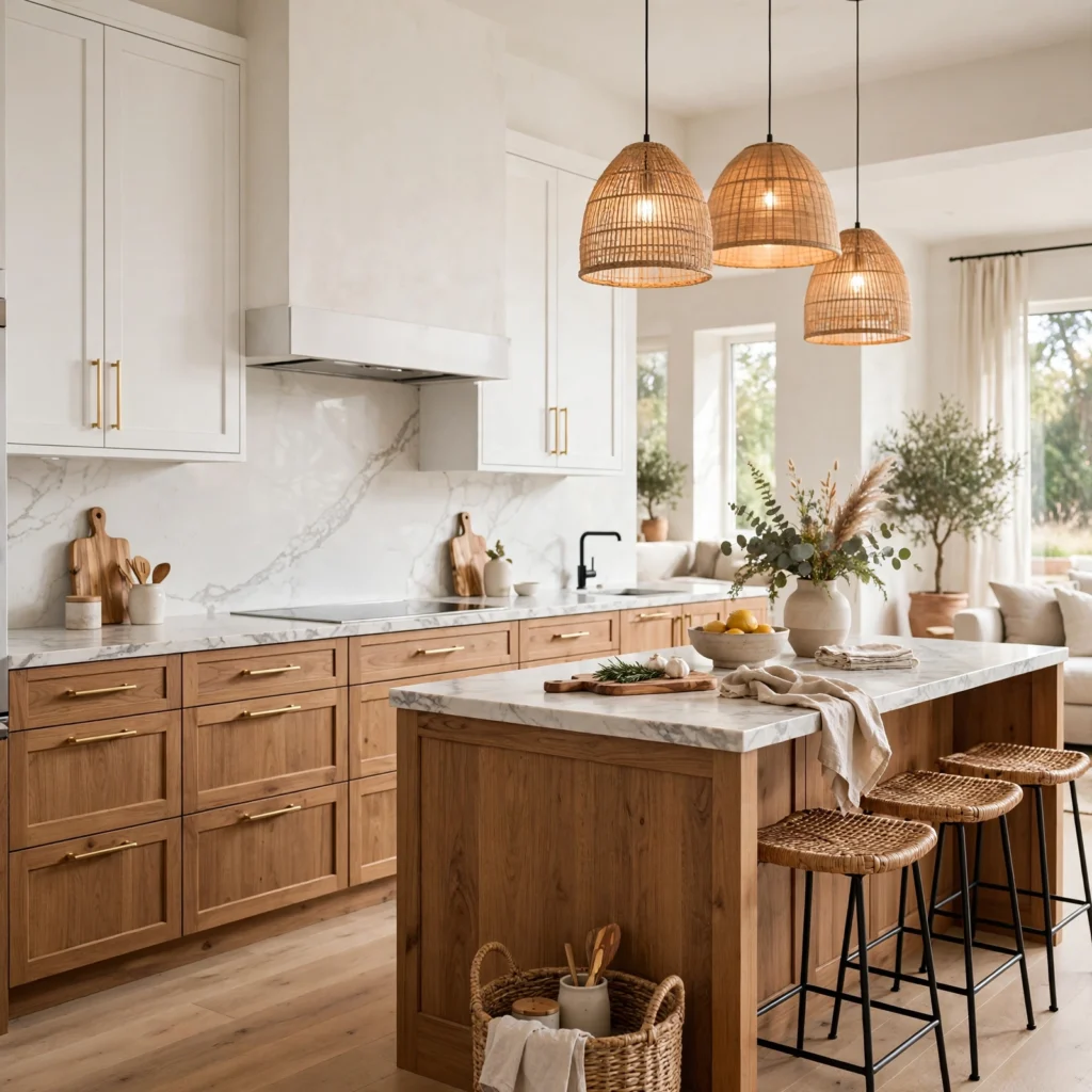
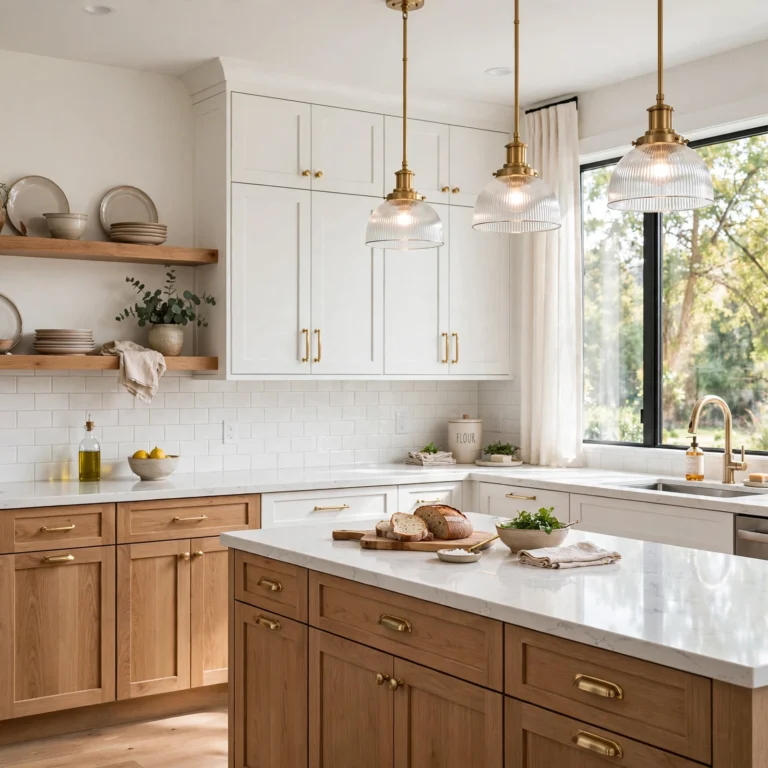
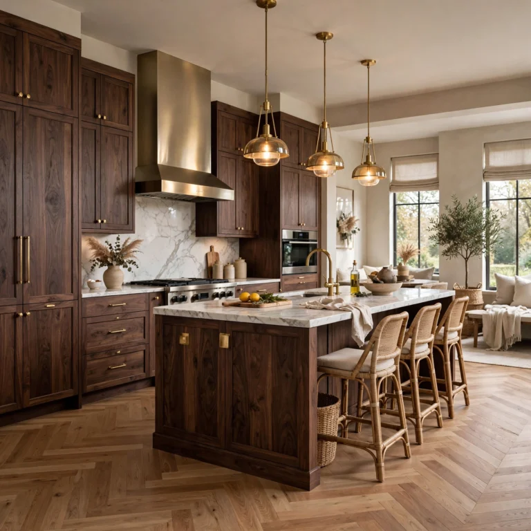
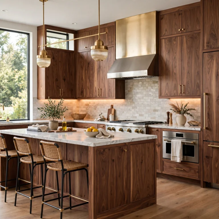
Pairing natural wood-tone cabinets with white painted cabinets keeps a kitchen feeling warm rather than stark, and it’s one of the more forgiving two-tone pairings since wood grain naturally varies in tone anyway. This combination often shows up as wood on the island or lower run with white uppers, or as wood open shelving mixed with white closed cabinetry. Choosing a wood tone with warm undertones, like white oak or walnut, keeps the pairing from feeling like two unrelated finishes stuck together.
In order to see more options for blue kitchen cabinets CLICK HERE
4. Black and Wood Two-Tone Kitchen
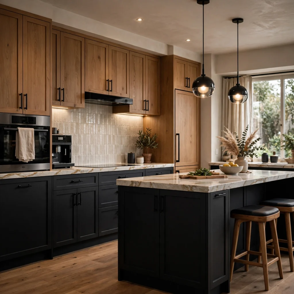
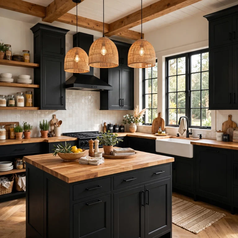
A black and wood two-tone kitchen pairs matte black lower cabinets or an island with warm wood upper cabinets or open shelving, creating a moody, high-contrast look that reads as modern and intentional. The wood tones soften the starkness of the black, keeping the kitchen from feeling cold or overly dramatic. This combination pairs especially well with brass or unlacquered gold hardware, which bridges the warmth of the wood and the depth of the black in a single finish.
5. Sage Green and Cream Cabinets
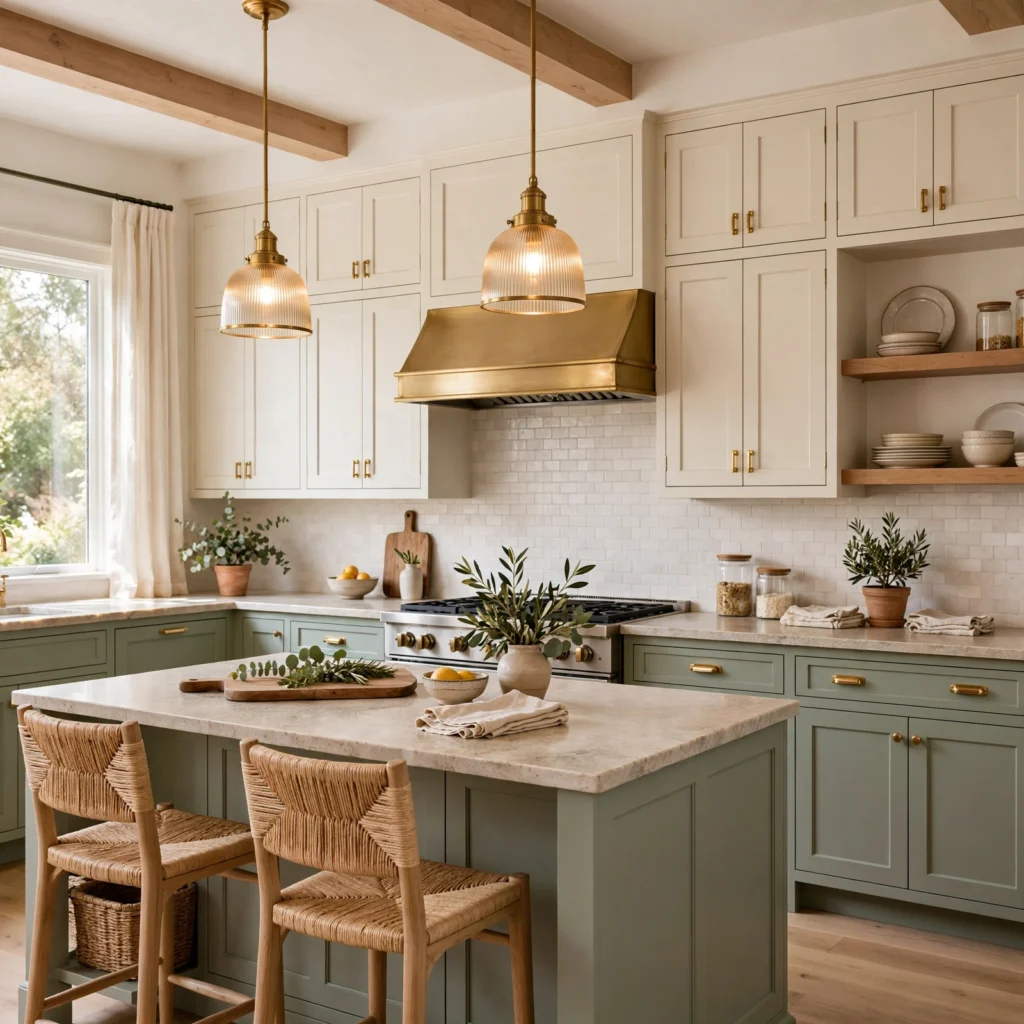
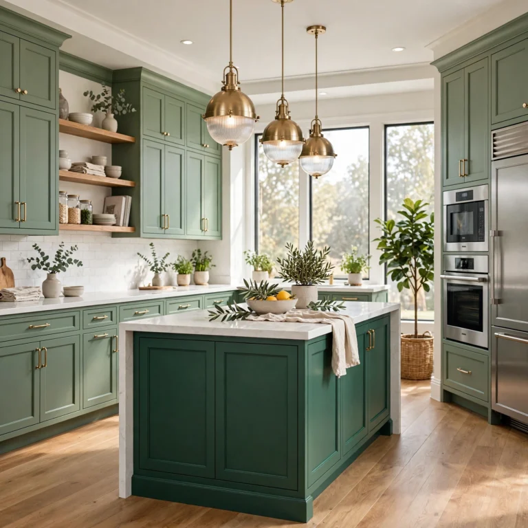
Sage green lower cabinets with cream or soft white upper cabinets create a muted, earthy two-tone look that feels calm rather than bold, making it a good option for homeowners who want color without high contrast. The grayed-down green tone keeps the pairing from reading as seasonal or trend-driven. This combination is particularly popular in farmhouse and cottage-style kitchens, where it pairs naturally with brass hardware, woven light fixtures, and natural stone countertops.
6. Two-Toned Cabinets With a Color-Matched Hood
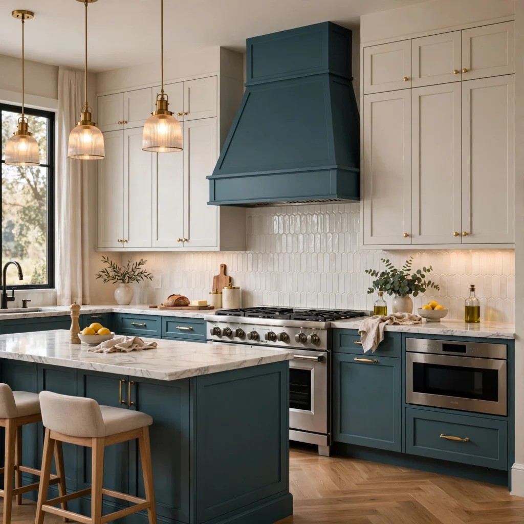
A range hood painted or clad to match one of the two cabinet colors, rather than left plain white or stainless, ties the whole kitchen together and gives the eye a clear anchor point above the range. This works especially well when the hood matches the darker of the two cabinet colors, since it grounds the upper portion of the room the same way the darker lower cabinets ground the base. Flanking the hood with matching floating shelves extends the effect further.
7. High-Contrast Black and White Kitchen
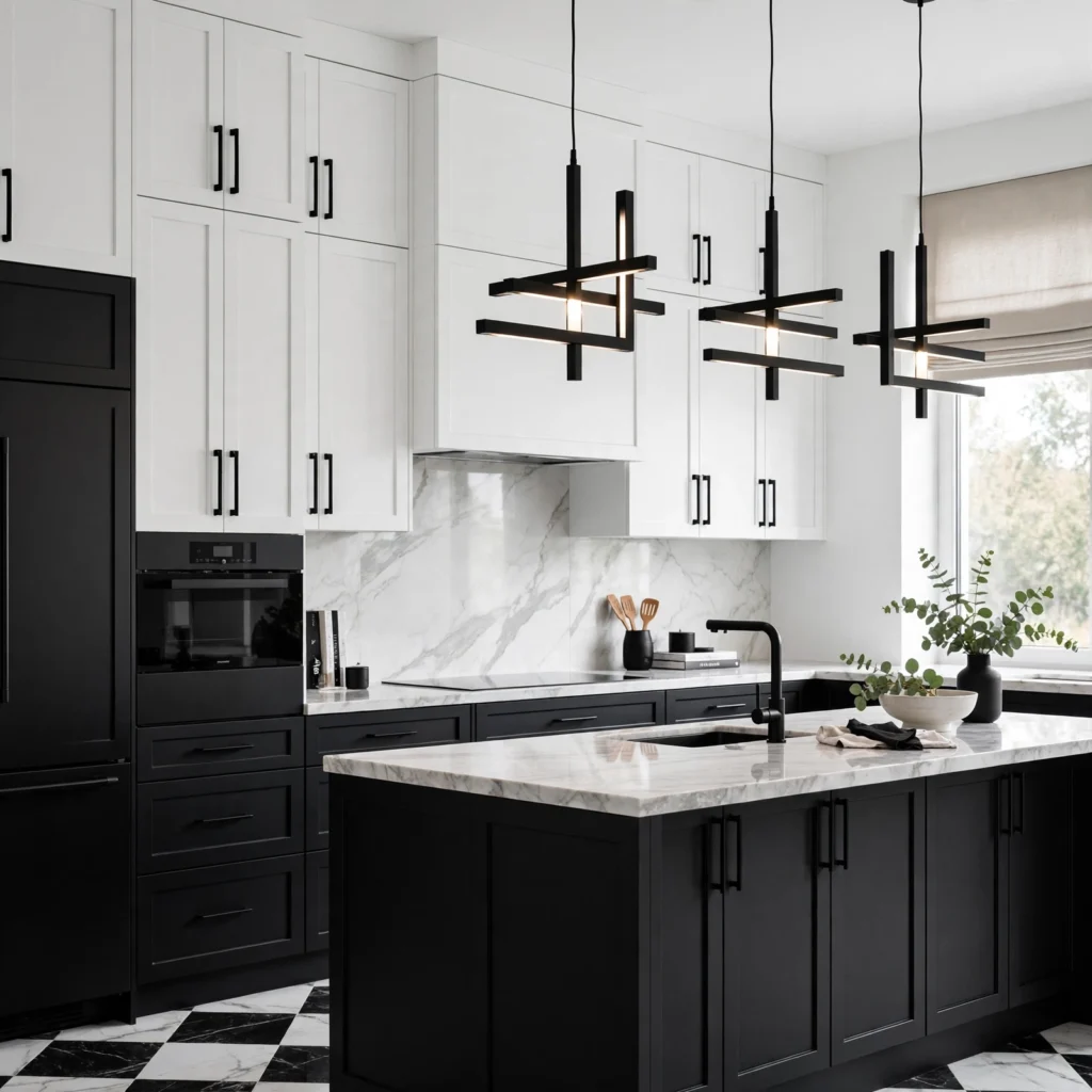
A high-contrast black and white kitchen, with true black lower cabinets against crisp white uppers, is the boldest version of the two-tone trend and reads as distinctly modern rather than traditional. Because the contrast is so strong, keeping countertops and backsplash tile simple, such as white marble or plain quartz, prevents the kitchen from feeling visually overwhelming. Brass or matte black hardware both work here, with the choice largely coming down to whether the kitchen leans warmer or cooler overall.
| Contrast Level | Example Pairing | Best Kitchen Style |
| Low | Cream + light wood | Farmhouse, cottage |
| Medium | Sage + white | Transitional |
| High | Black + white | Modern, contemporary |
8. Brass Hardware Across Both Tones
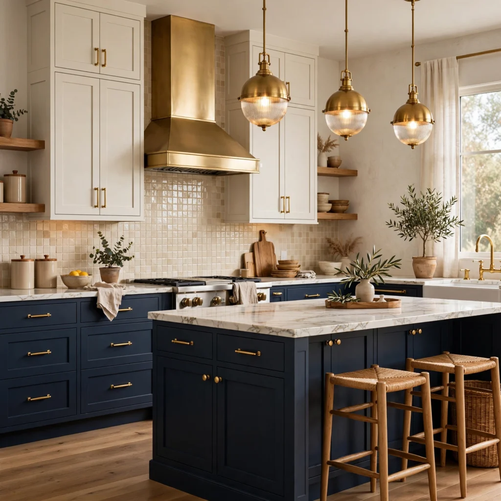
Using the same brass or gold hardware finish across both cabinet colors, rather than switching finishes between the two tones, is what keeps a two-tone kitchen feeling like one cohesive design instead of two separate cabinet runs. Unlacquered brass in particular works across nearly every color pairing, from navy and white to black and wood, because its warm tone reads as a neutral connector rather than competing with either cabinet color.
9. Terracotta and White Kitchen
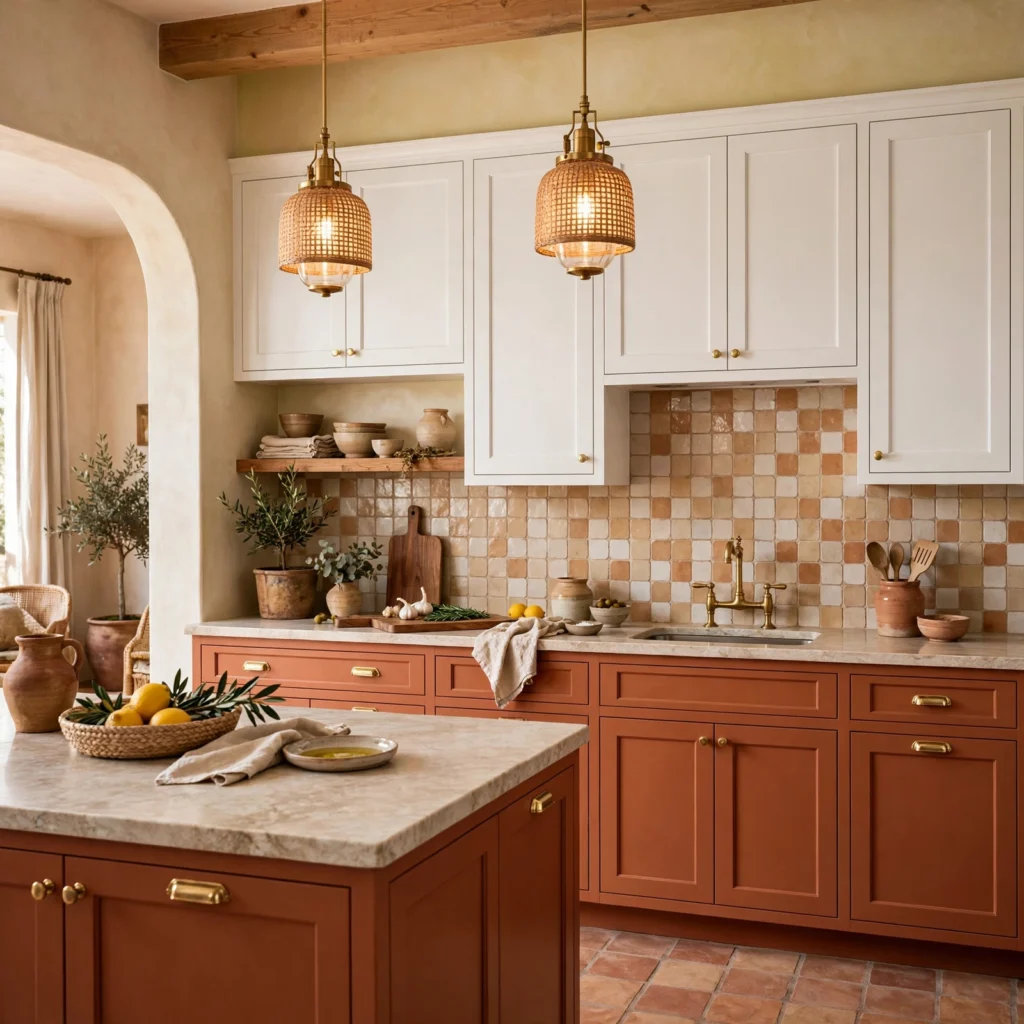
Terracotta or clay-toned lower cabinets paired with white upper cabinets bring an earthy, Mediterranean-leaning warmth that feels different from the more common navy or black pairings. This combination works particularly well in kitchens with natural stone or tile flooring, since the terracotta echoes those warm, organic tones rather than contrasting against them. Brass or aged bronze hardware suits this pairing better than chrome, which can feel too cold against the warmth of the terracotta.
10. Two-Tone Cabinets With Open Shelving
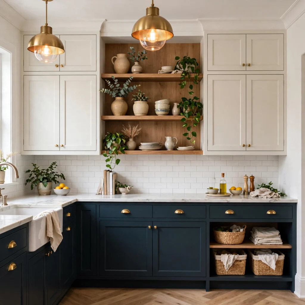
Replacing a portion of the upper cabinets with open shelving in a contrasting wood tone breaks up a wall of closed doors and introduces a natural third material without adding a third paint color. This works particularly well flanking a range hood or window, where the open shelving balances the visual weight of the lower cabinet color. Keeping the shelving styled with a limited number of items keeps the look intentional rather than cluttered.
11. Charcoal Gray and White Cabinets
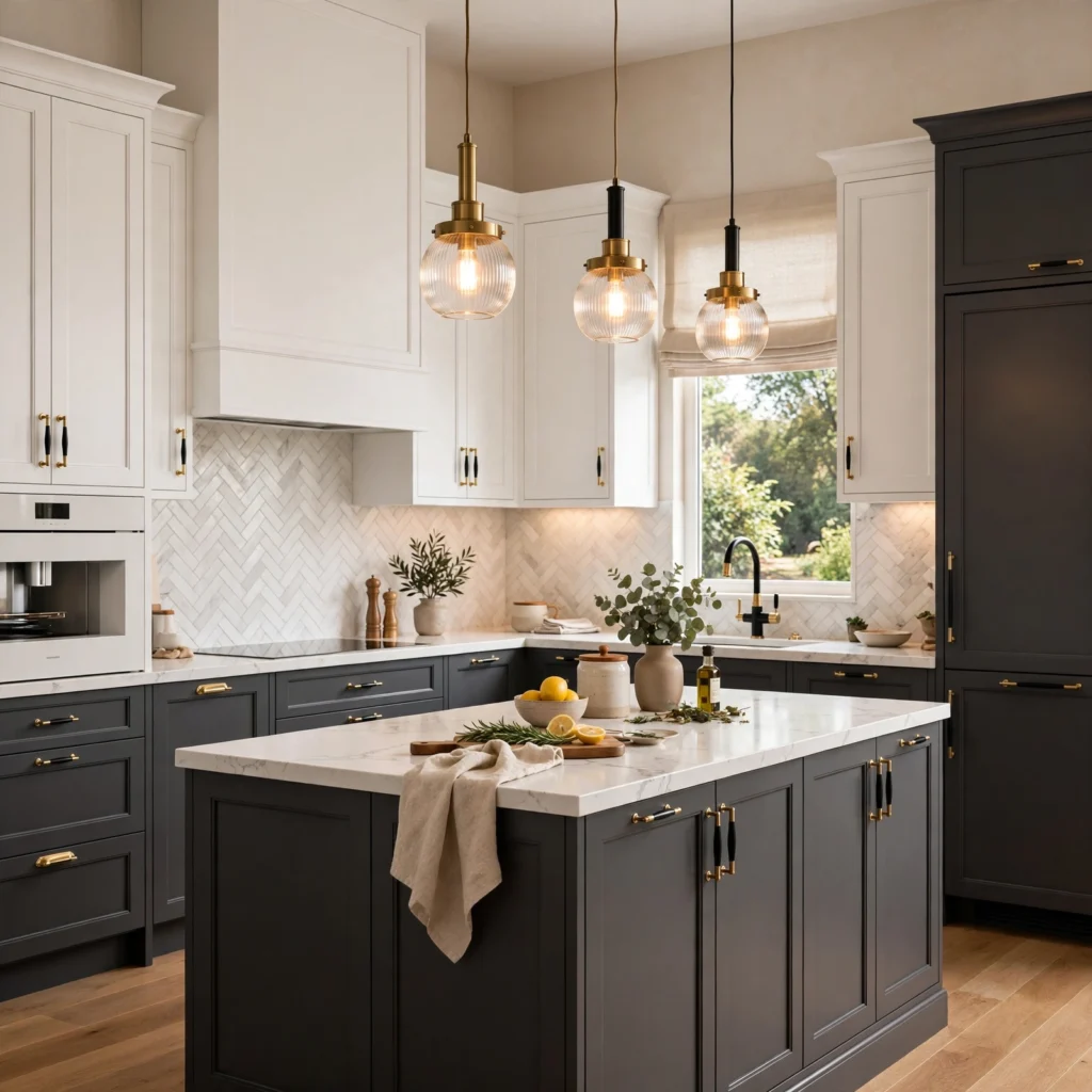
Charcoal gray lower cabinets with white upper cabinets offer a softer alternative to full black-and-white contrast while still reading as modern and clean. The gray hides daily wear near handles and the dishwasher better than pure white would, without introducing the visual weight of true black. This pairing works well with either chrome or matte black hardware, giving homeowners more flexibility than some of the warmer two-tone combinations.
12. Two-Tone Peninsula Kitchen
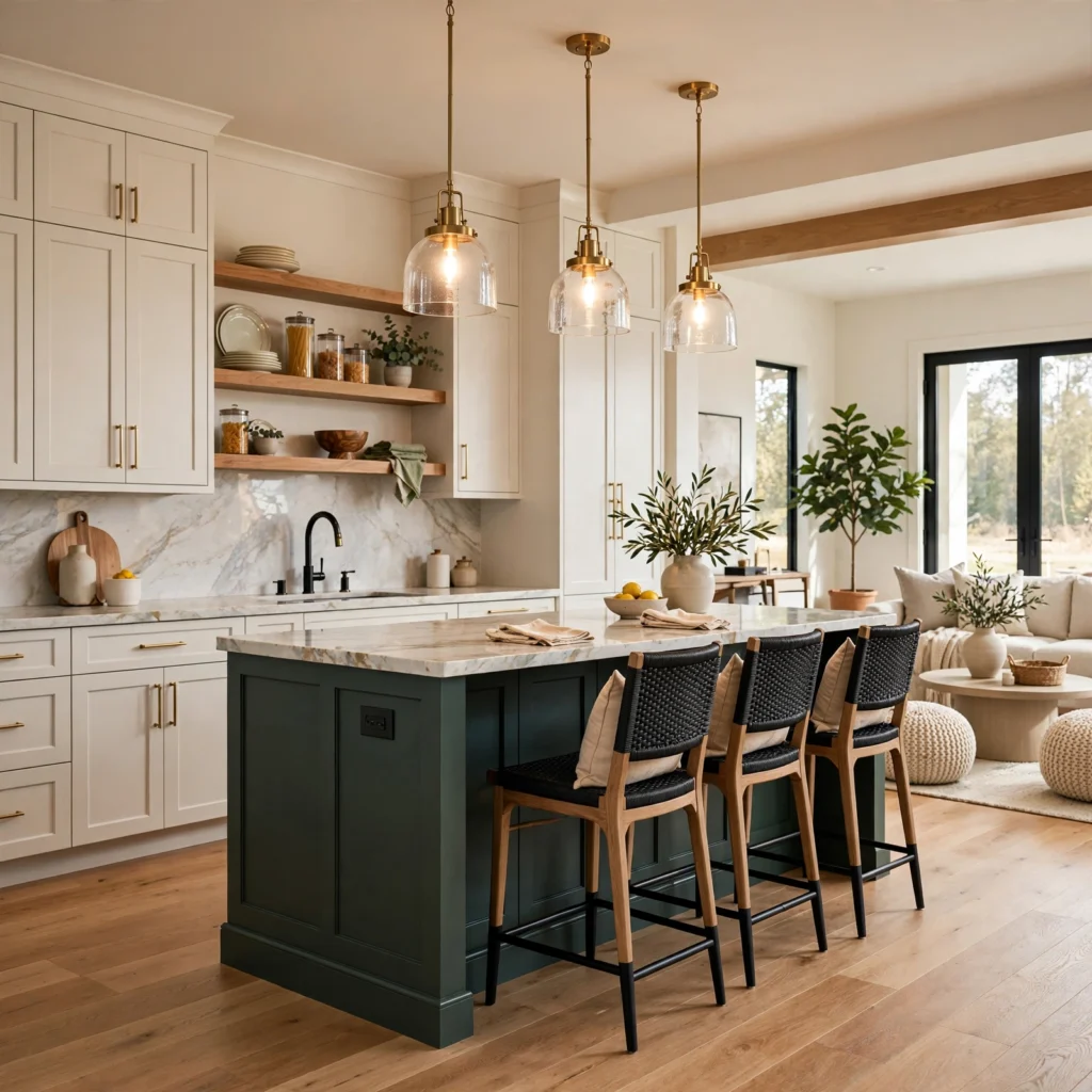
In kitchens with a peninsula rather than a full island, painting the peninsula’s cabinet faces a contrasting color creates a similar focal-point effect to a two-tone island, even in a smaller footprint. Because a peninsula is visible from more angles at once, including from an adjoining living or dining space, this approach tends to have an outsized visual impact relative to how much cabinetry is actually repainted.
13. Olive and White Two-Tone Kitchen
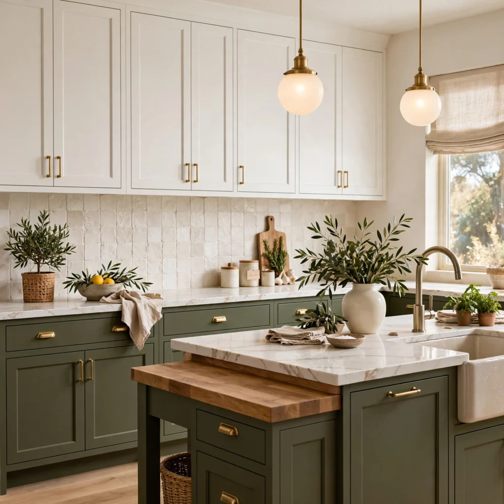
Olive lower cabinets with white upper cabinets bring a more muted, brownish-green alternative to sage, giving the kitchen an earthy, vintage-adjacent feel rather than a fresh, cottage one. This pairing works especially well with warm wood flooring and brass hardware, since the olive’s warm undertone bridges the two naturally. Because olive reads as more of a neutral than brighter greens, this combination tends to age well without needing to be repainted as trends shift.
14. Two-Tone Cabinets With a Wood Countertop Bridge
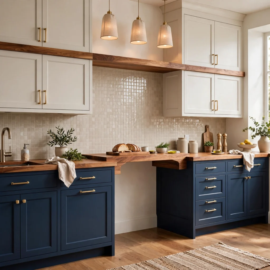
Using a butcher-block or solid wood countertop specifically on the section of cabinetry where the two colors meet, such as the island or a peninsula, gives the eye a natural transition point between the two cabinet colors instead of a hard, abrupt line. This works particularly well when the two cabinet colors are otherwise high-contrast, since the wood softens the transition without requiring a third paint color anywhere else in the kitchen.
Shop the Look
Start with a quart of navy or charcoal cabinet-grade paint for the lower cabinets, a quart of soft white or cream for the uppers, a set of unlacquered brass bin pulls and knobs, a white marble or quartz countertop slab, and a butcher-block insert for the island. These five elements cover both cabinet colors, hardware, and surfaces without requiring a full kitchen renovation.
Common Mistake to Avoid
The most common mistake is choosing two colors that sit too close together in tone or saturation, which reads as an accidental mismatch rather than an intentional two-tone design instead of a clear, deliberate contrast. A useful rule is to keep at least a few shades of difference in lightness between the two colors, even if they’re otherwise similar hues. Another frequent error is switching hardware finishes between the two cabinet colors without a clear reason, which fragments the kitchen visually instead of tying it together.
People Also Ask
Which cabinets should be darker in a two-tone kitchen?
Lower cabinets are almost always the darker of the two, since a darker base visually grounds the kitchen and hides everyday scuffs, spills, and fingerprints better than a light color would in that high-contact zone. White or cream upper cabinets keep the ceiling area feeling bright and prevent the room from feeling closed in. Reversing this, with dark uppers and light lowers, is less common but can work in kitchens with especially high ceilings.
Do two-tone kitchen cabinets look dated?
Two tone kitchen cabinets have stayed popular for several years now because the approach is flexible enough to update through color choice rather than layout, unlike more literal trends. Choosing muted, tonal color pairings such as sage and cream tends to age better than very high-contrast or trend-driven color combinations. Limiting the second color to the island, rather than half the kitchen, also makes it easier to update later if preferences change.
What is the best color combination for two-tone kitchen cabinets?
Navy and white remains the most requested combination because it works across traditional and modern kitchens alike and pairs easily with brass, chrome, or black hardware. Sage green and cream is the most popular softer alternative, while black and wood-tone is the preferred choice for a more dramatic, modern kitchen. The best combination ultimately depends on the kitchen’s existing flooring, countertop, and overall style rather than color trends alone.
Should the island match the upper or lower cabinets?
The island typically matches the lower cabinet color, since both sit at the same visual level and both see heavy daily use, but a growing number of kitchens now treat the island as its own third color entirely. When the island introduces a third color, it’s usually the boldest of the palette, functioning as a clear focal point rather than blending into either the upper or lower cabinet color.
What countertop works best with two-tone cabinets?
A single countertop material, most often white or light gray marble or quartz, used consistently across both cabinet colors keeps a two-tone kitchen feeling cohesive rather than visually split into two separate zones. Butcher block is a common exception, frequently used specifically on the island to bridge higher-contrast color pairings. Matching countertop material to only one of the two cabinet colors tends to make that section feel disconnected from the rest of the kitchen.
Conclusion
These fifteen approaches to two tone kitchen cabinets show how much range the trend actually has, from a single painted island to a full navy-and-white remodel with brass hardware throughout. Start small if you’re unsure, a contrasting island or peninsula is a low-risk way to test the look before committing to a full repaint. Save this guide to Pinterest for your next kitchen update, and check out our related post on the best cabinet hardware finishes for 2026.
Author Expertise Note
Written by a design writer who has covered kitchen and cabinetry trends for home publications for several years, working closely with cabinet painters and kitchen designers to track which color pairings actually hold up over time.