16 Inspiring Summer Color Palette Ideas for Any Project
Choosing the right summer color palette means thinking beyond a single bright shade, since summer colors read very differently depending on how much light they’re exposed to and what materials sit around them. This guide breaks down sixteen distinct palettes, from muted coastal neutrals to bold tropical combinations, each with real hex codes and pairing notes so you can move straight from inspiration to an actual paint can, fabric swatch, or design file. Whether you’re refreshing a room, a brand, or a single outdoor space, there’s a palette here built around a specific mood and setting.
Trend & Background
Summer palettes have shifted away from the flat, primary-leaning brights that once defined the season toward deeper, more saturated versions of the same hues, paired with warm neutrals rather than stark white. This mirrors a broader move across interior design and branding toward richer color that still reads as light and warm-weather appropriate without looking washed out or overly pastel. Outdoor and high-UV settings also demand more attention to fade resistance now than in past years, since a beautiful saturated color chosen without that in mind can look noticeably different within a single season outdoors.
Key Takeaways
- Sixteen palettes ranging from soft coastal neutrals to bold tropical combinations for interiors, branding, and design work
- Hex codes are included for every palette so you can pull exact colors into paint, print, or digital projects
- Reference tables cover undertone pairing and lighting considerations so a palette reads correctly in the final space
- Five FAQs cover which summer tones fade well, work outdoors, and photograph best in bright light
1. Coastal Blue and Sand Palette
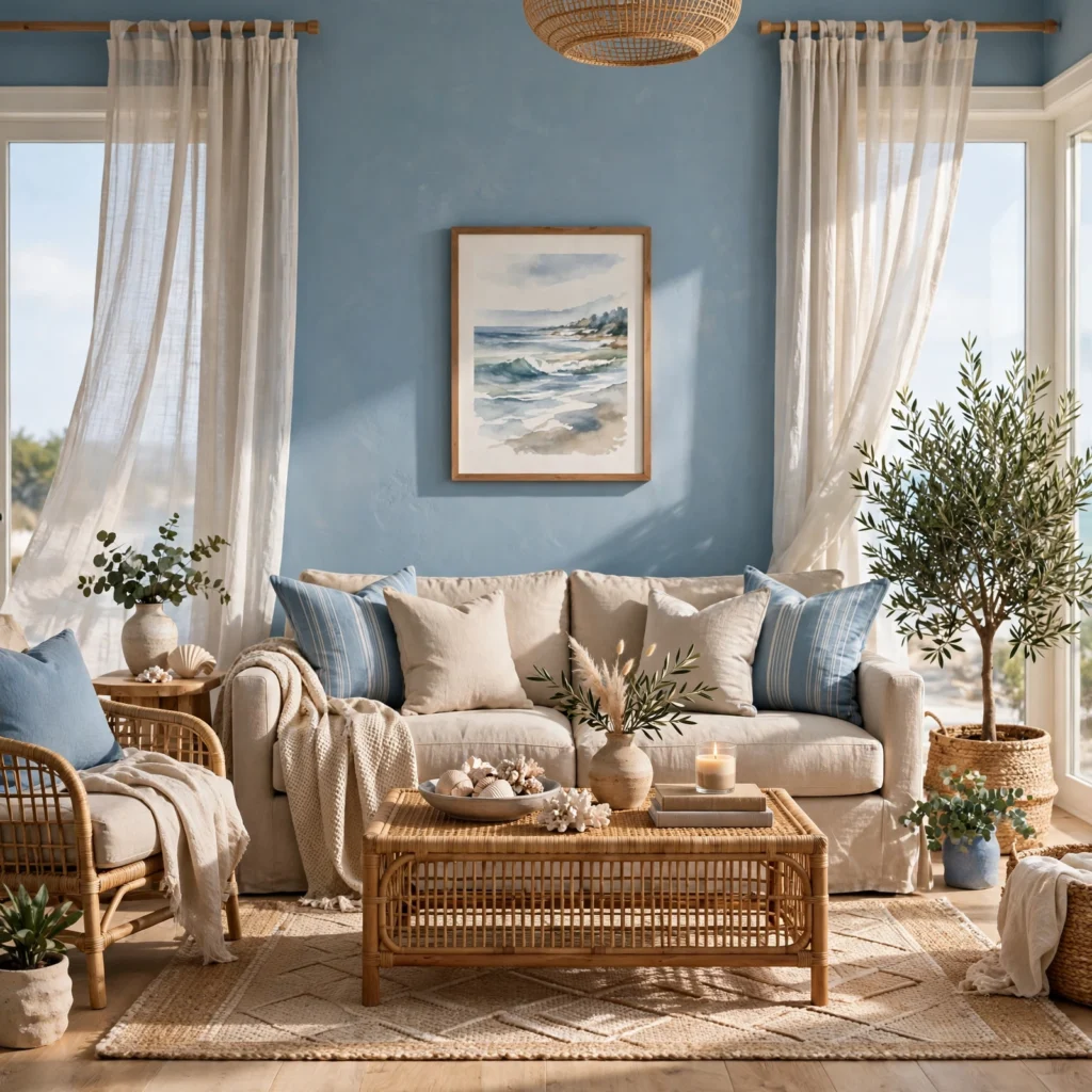
Coastal blue paired with warm sand and a soft white produces one of the most enduring summer palettes, since it draws directly from ocean and beach tones without leaning into anything trend-driven. This combination works well for a living room, exterior trim, or a brand wanting a relaxed, breezy feel rather than a bold statement. Pair coastal blue with natural wood tones and woven textures like rattan or jute, since the palette’s calm relies on texture as much as color to avoid feeling flat.
| Color | Hex Code | Role |
| Coastal Blue | #4A7C9E | Primary |
| Warm Sand | #E3D3B8 | Secondary |
| Soft White | #F7F3EC | Base |
| Driftwood Gray | #A99B8B | Accent |
2. Citrus Orange and Yellow Palette
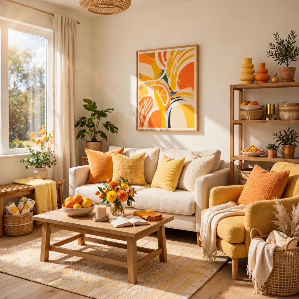
A citrus-inspired palette combining a warm orange with a brighter, slightly muted yellow captures summer energy without tipping into the overly saturated territory that can feel more like a children’s product than a considered design choice. This combination suits a kitchen, dining space, or a food and beverage brand wanting real warmth and appetite appeal. Keep yellow as the smaller proportion of the palette, since too much bright yellow next to orange can push the combination toward feeling more neon than genuinely citrus-inspired.
3. Tropical Green and Coral Palette
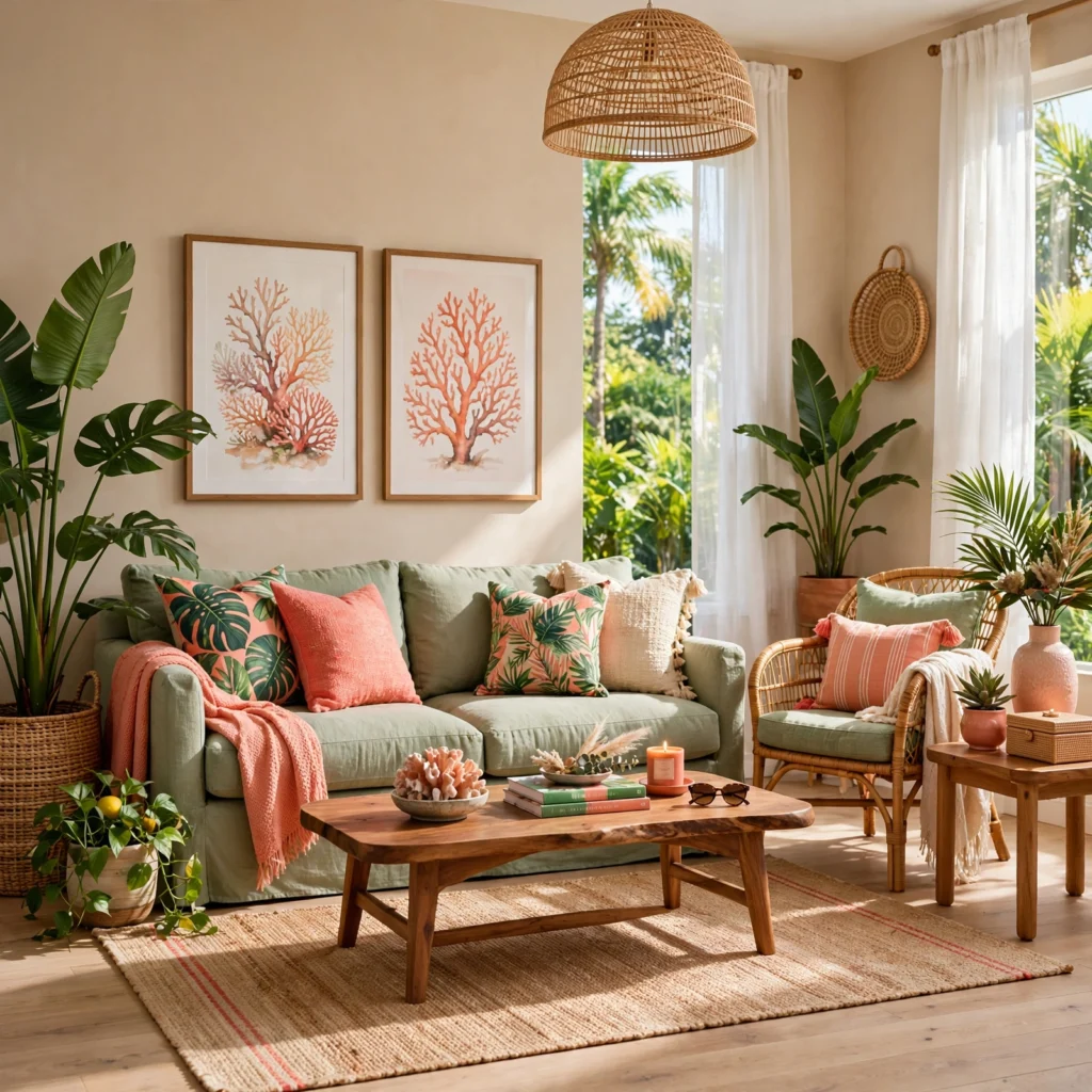
Pairing a saturated tropical green with a warm coral creates a palette with real vibrancy, drawing on the same contrast found in nature between foliage and flowering plants. This combination works especially well in a sunroom, patio space, or a resort-adjacent brand identity wanting to feel lively rather than restrained. Balance the ratio toward green as the dominant color, using coral in smaller accents like pillows or signage details, since two equally saturated colors at full strength can compete rather than complement each other.
Looking for the right combination of shades? Discover beautiful purple color palette Ideas to transform your rooms.
4. Watermelon Pink and Green Palette
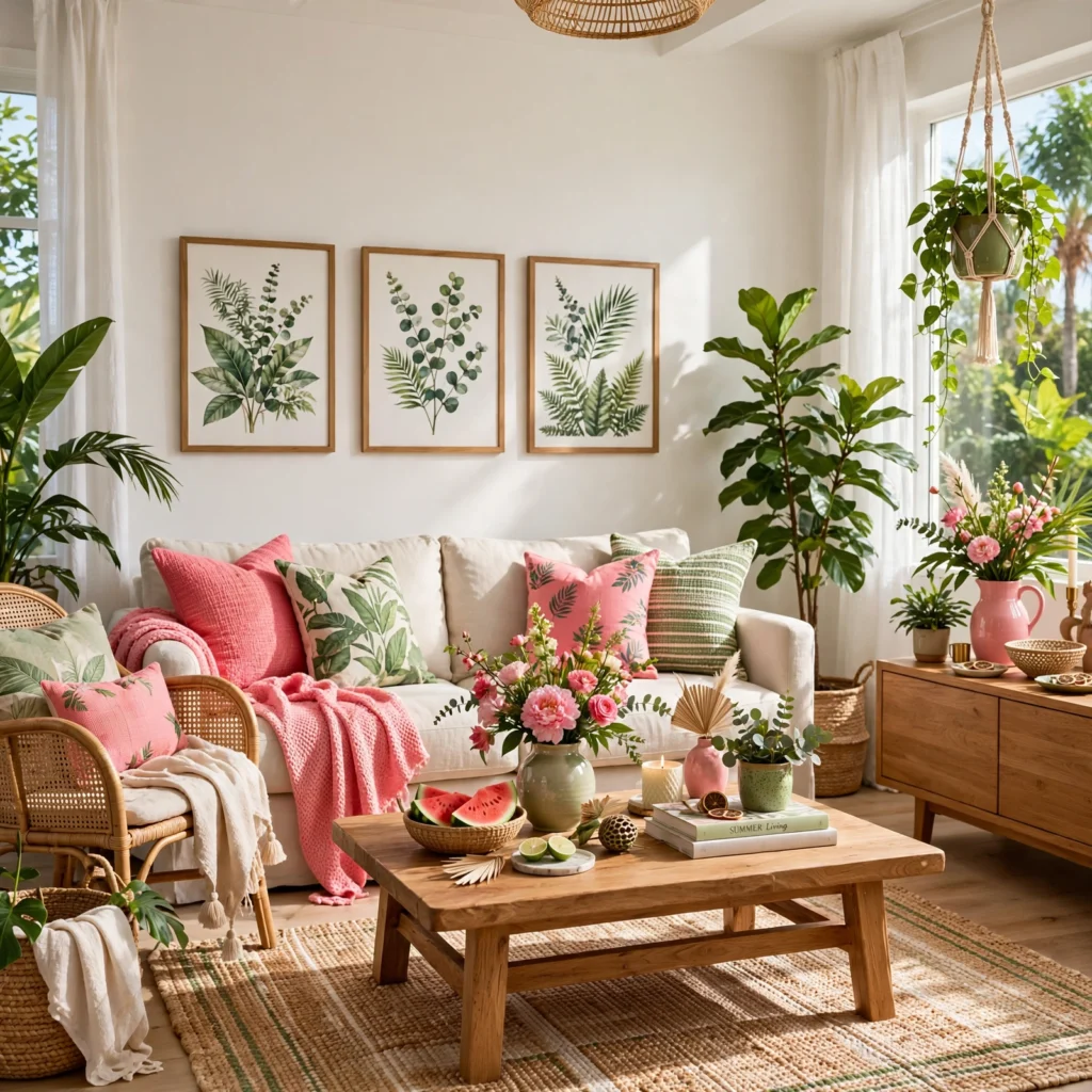
A watermelon-inspired combination pairs a bright, slightly cool pink with a deep green rind color and small touches of black seed detailing, referencing the fruit directly without feeling like a literal costume choice. This palette suits a playful kitchen, a kids’ space, or a summer product line wanting energy without leaning juvenile. Keep the green to roughly a third of the overall palette and reserve black for small detail work only, letting pink remain the clear dominant color throughout the room or design.
5. Sunset Coral and Peach Palette
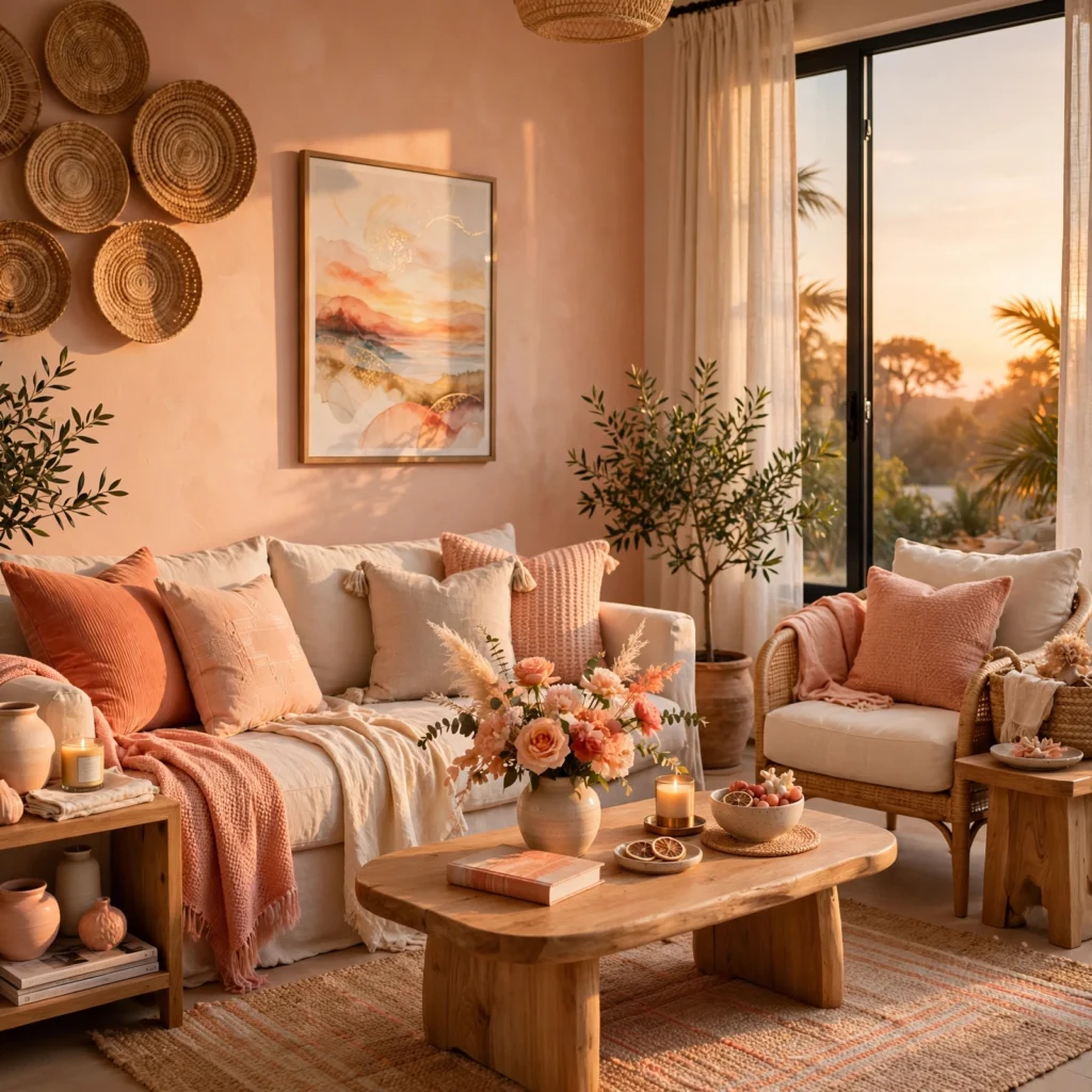
A sunset-inspired palette layers coral, peach, and a soft golden yellow to recreate the warm gradient of a summer evening sky. This combination works well for a bedroom, a wellness brand, or any project wanting a warm, romantic feel rather than a bold, high-energy statement. Blend the colors gradually rather than blocking them in hard-edged sections, since sunset palettes read most convincingly when the transition between shades feels soft, similar to how the actual colors shift across the sky at dusk.
6. Turquoise and White Palette
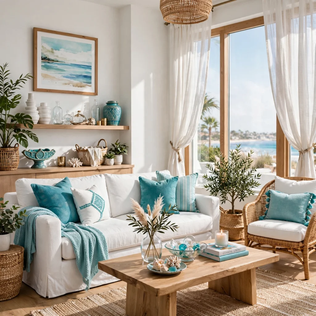
Turquoise paired with a crisp, true white produces a clean, high-contrast palette that reads as fresh and pool-adjacent rather than muted or coastal-soft. This combination suits a bathroom, an outdoor living space, or a brand wanting a modern, energetic take on summer rather than a relaxed one. Keep white as the dominant base, using turquoise in roughly a quarter to a third of the overall composition, since too much saturated turquoise across large surfaces can start to feel closer to a swimming pool than a livable interior.
7. Lavender and Lemon Palette
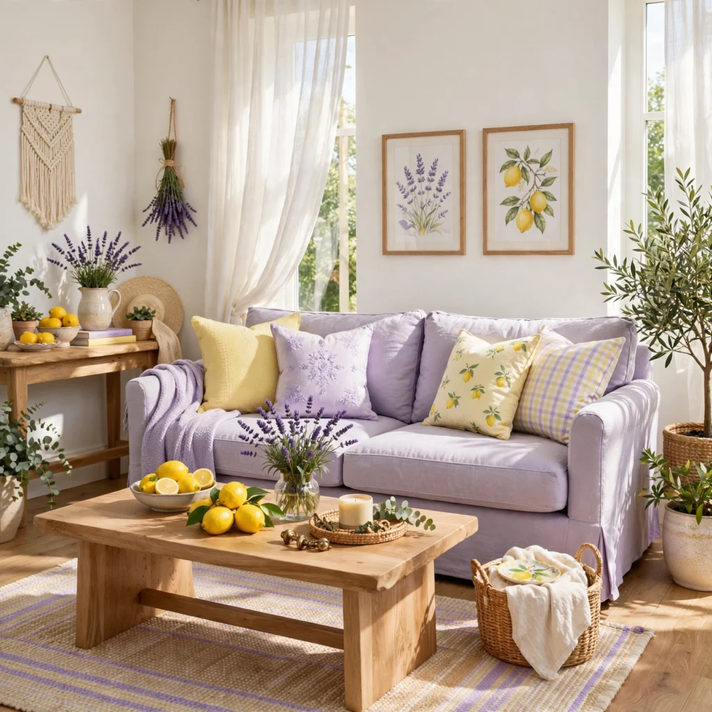
Pairing a soft lavender with a bright lemon yellow creates an unexpected, garden-inspired combination that feels distinctly summer without relying on the more common blue or coral pairings. This palette works especially well for a home office, a craft or hobby brand, or any space wanting a slightly whimsical, cheerful feel. Keep lavender as the larger, calmer base color and use lemon yellow in smaller accents, since the yellow carries enough visual weight on its own to dominate the palette if used in equal proportion.
| Color | Hex Code | Role |
| Soft Lavender | #B8A9C9 | Primary |
| Lemon Yellow | #F2D544 | Accent |
| Warm White | #FBF8F1 | Base |
| Sage Green | #9CAF88 | Secondary |
8. Terracotta and Olive Palette
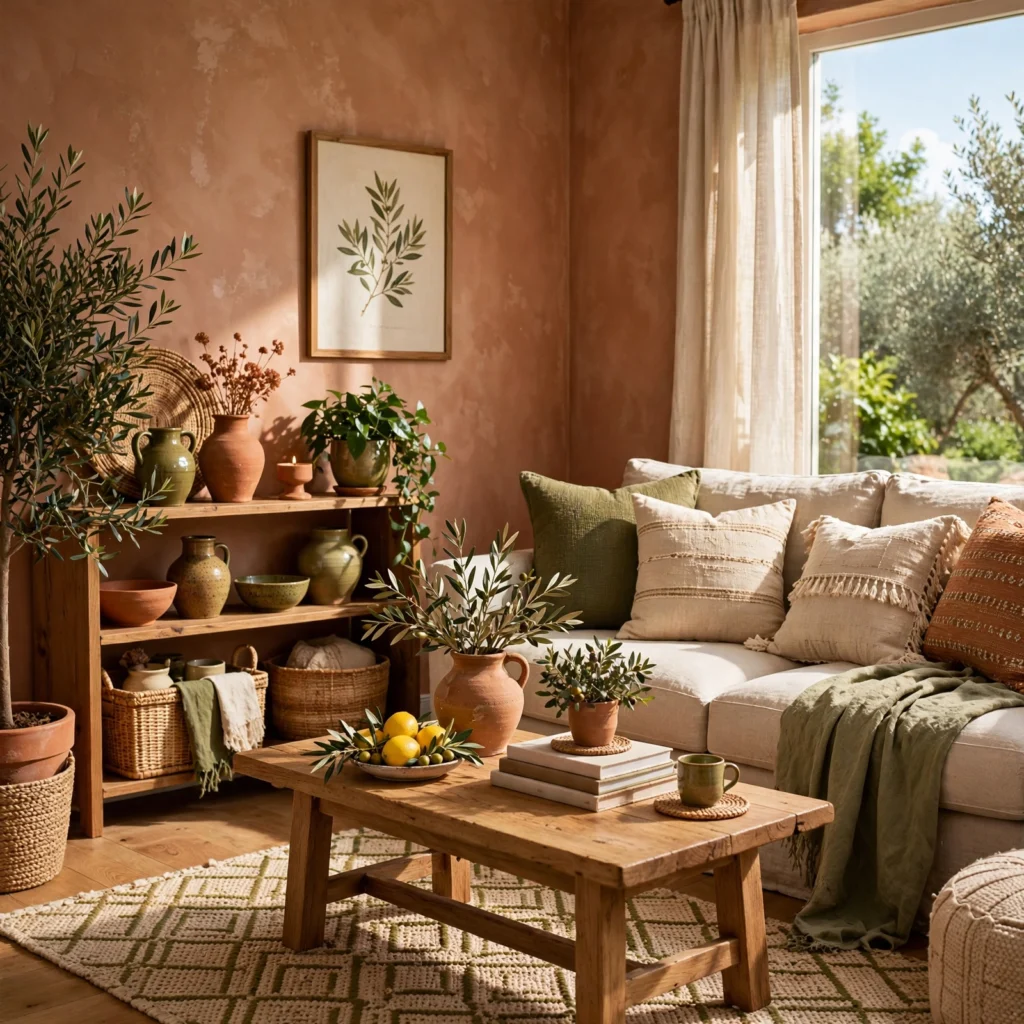
Terracotta paired with olive green produces a warmer, earthier summer palette that trades bright coastal or tropical energy for something closer to a Mediterranean patio or garden. This combination suits an outdoor living space, a ceramics or home goods brand, or a kitchen wanting warmth without leaning into brighter citrus tones. Pair with natural materials like unglazed terracotta pottery and woven textiles, since the palette’s strength comes from its connection to actual sun-baked, earthy surfaces rather than flat painted color alone.
9. Hot Pink and Turquoise Palette
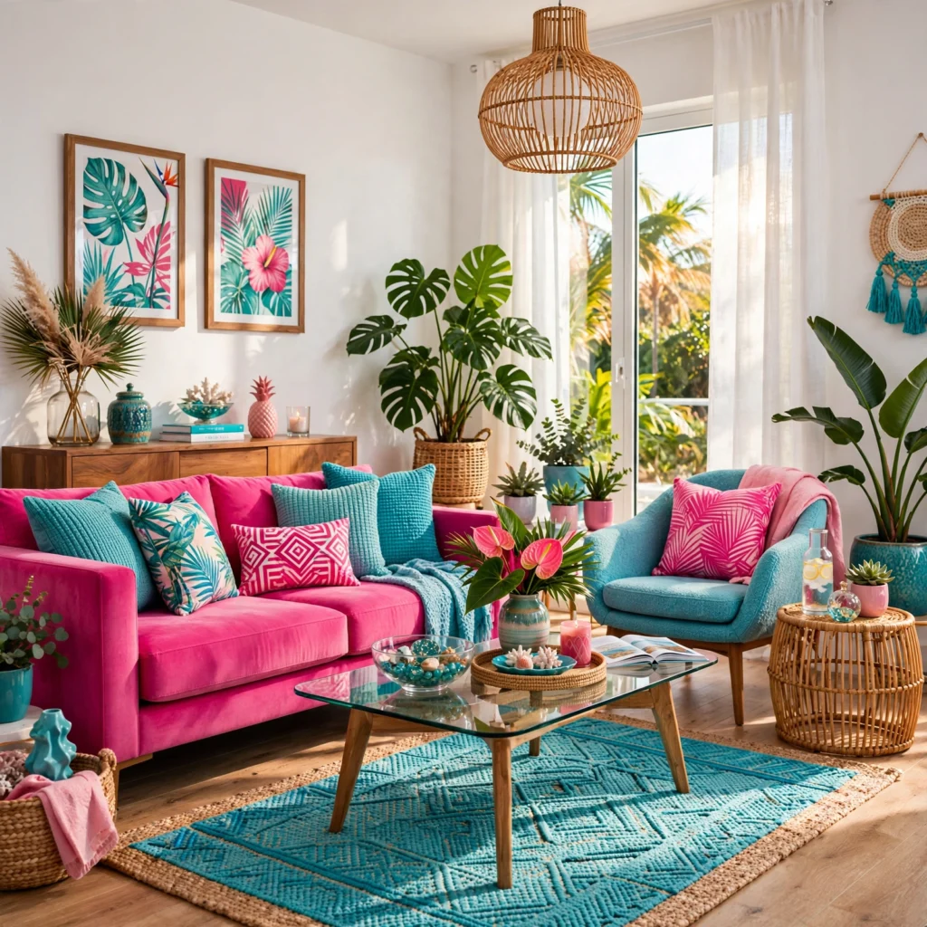
A hot pink and turquoise combination delivers maximum summer energy and suits branding, poolside decor, or a statement piece in a space that wants real vibrancy rather than a muted backdrop. Keep the ratio weighted toward one color as dominant, typically turquoise as a larger base with hot pink in smaller, more concentrated accents, since two equally saturated colors at full strength tend to visually compete rather than balance each other. This palette photographs especially well under bright, direct sunlight rather than warm, dim indoor lighting.
10. Seafoam and Cream Palette
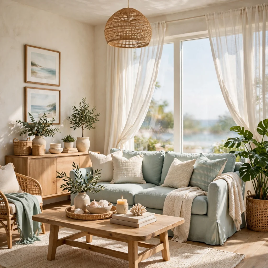
Seafoam green paired with cream and a light driftwood tone produces one of the softest, most muted summer palettes available, close enough to neutral that it works in spaces wanting a summer feel without an obvious color statement. This combination suits a bedroom, nursery, or coastal-adjacent bathroom where a barely-there wash of color feels more appropriate than a bold accent. Layer in varied textures, linen, rattan, and a matte ceramic finish, since a palette this muted relies on texture rather than contrast to stay visually interesting.
11. Mango and Deep Teal Palette
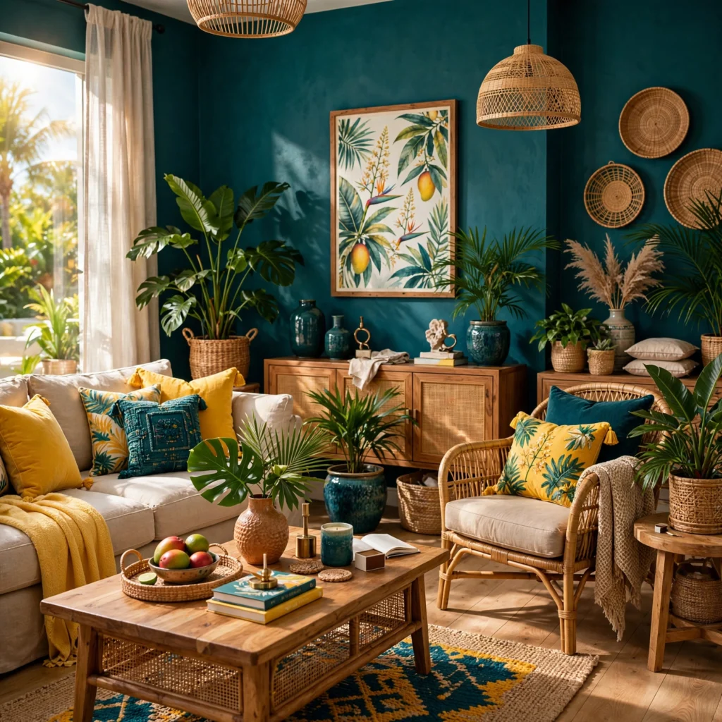
Pairing a rich mango orange with a deep teal creates a jewel-toned summer palette that reads as more sophisticated and less playful than lighter tropical combinations. This pairing works especially well in a dining room, home bar, or hospitality-adjacent brand identity, where a smaller, more contained space can handle the visual weight of two saturated colors without feeling overwhelming. Brass or gold hardware bridges the two colors effectively, since the warm metal picks up mango’s warmth while still reading elegant against the cooler teal.
12. Sky Blue and White Palette
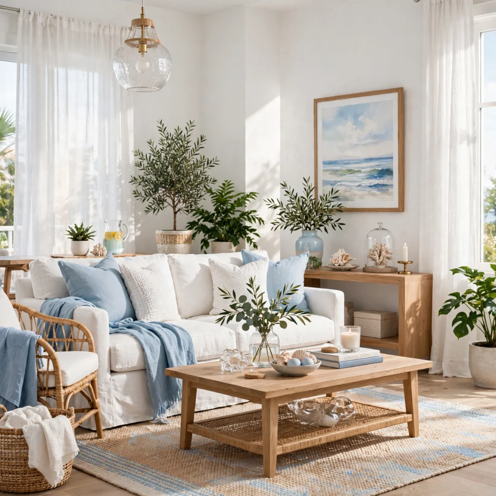
A soft sky blue paired with white creates one of the most classic, universally approachable summer palettes, suited to exterior trim, a nursery, or a brand wanting a light, airy feel without much risk. Keep the blue slightly muted rather than a pure saturated hue, since a softer sky blue reads as more current and less like a generic weather-app color scheme. This palette pairs naturally with warm wood tones as a third element, keeping the combination from feeling too cool or clinical on its own.
13. Papaya and Blush Palette
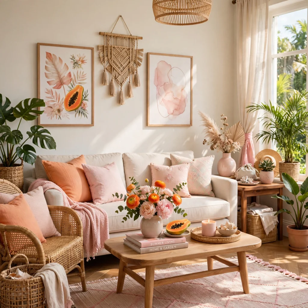
Papaya, a warm, slightly muted orange, paired with a soft blush pink creates a gentler tropical palette that reads as warm and inviting rather than bold or high-energy. This combination suits a bedroom, a beauty or wellness brand, or a nursery wanting summer warmth without a strong color statement. Add a small amount of warm cream or ivory as a base to keep the two warmer tones from feeling too saturated together, since papaya and blush share enough undertone similarity to need a lighter, neutral anchor.
14. Deep Ocean and Gold Palette
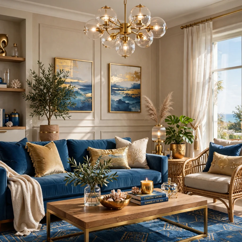
Combining a deep, near-navy ocean blue with warm gold accents produces a more elevated, evening-appropriate take on a summer palette, suited to a formal dining space, a hospitality brand, or a statement piece of furniture. Keep gold to metallic accents, hardware, and small detail work rather than large painted surfaces, since a metallic finish loses its impact when overused. This palette works especially well under warm evening lighting, where the gold picks up additional warmth and the deep blue reads as rich rather than simply dark.
15. Pastel Rainbow Sherbet Palette
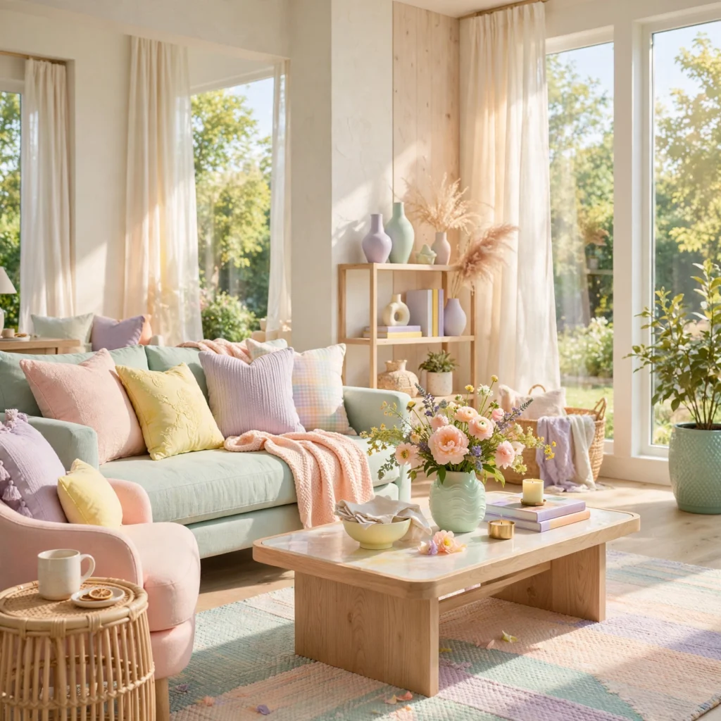
A sherbet-inspired palette blends soft pastel pink, orange, and mint together, evoking a classic summer dessert without leaning into anything overly literal or novelty. This combination suits a kids’ room, an ice cream or dessert-adjacent brand, or any space wanting a playful, nostalgic summer feel. Keep the three pastels close in saturation and value so none of them dominates the composition, and use a warm white base to keep the overall effect soft rather than visually busy.
| Color | Hex Code | Role |
| Pastel Pink | #F5C4C0 | Accent |
| Pastel Orange | #F7D0A8 | Accent |
| Pastel Mint | #B8E0D2 | Accent |
| Warm White | #FBF7F1 | Base |
16. Marigold and Rust Palette
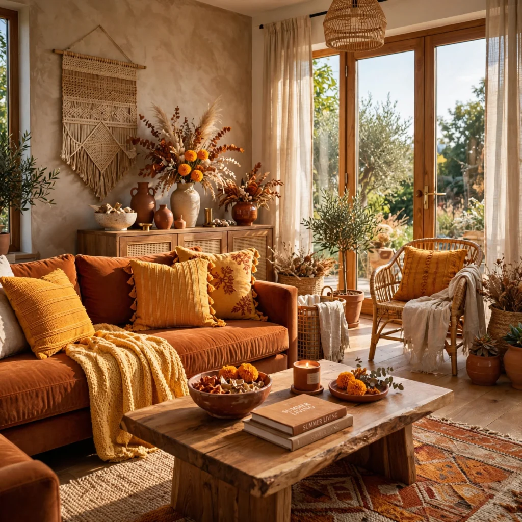
Marigold paired with a deeper rust produces a warmer, more saturated summer palette suited to a late-summer or early-fall transitional space, a dining room, or a brand wanting richness rather than a lighter, breezier feel. This combination works especially well in rooms with strong natural light, since the warmth in both colors intensifies under direct sun rather than fading into something duller. Pair with dark wood tones and matte black metal accents to keep the palette grounded rather than tipping toward feeling overly bright or costume-like.
Shop the Look
For coastal blue paint, look at Benjamin Moore’s “Van Deusen Blue” or Sherwin-Williams’ “Rain.” Woven rattan and jute textiles for the coastal and seafoam palettes are easiest to source through Serena & Lily or a local import shop. Terracotta and olive ceramics from Anthropologie or a local pottery studio cover the earthy palette ideas directly. For turquoise and coral outdoor textiles, look at performance fabric options from Sunbrella, and brass or gold accents from Schoolhouse round out most of the warmer, richer palettes above.
Common Mistake to Avoid
The most common mistake with any summer color palette is choosing colors purely from a screen or a paint chip without testing them under the actual light the project will live in, since summer colors shift dramatically between bright direct sun, shaded outdoor light, and warm indoor lighting. A turquoise that looks perfect on a laptop screen can read noticeably duller under indoor incandescent bulbs, while a coral chosen indoors can look almost neon once exposed to full outdoor sunlight. Always test large swatches in the actual setting and lighting condition before committing to paint, fabric, or print.
FAQs
Which summer colors fade the least outdoors?
Deeper, more saturated pigments with strong UV resistance, particularly darker blues, greens, and blacks, generally fade more slowly outdoors than brighter, lighter pigments like coral, hot pink, or bright yellow. Performance fabrics specifically engineered for outdoor use, like Sunbrella, hold color significantly longer than standard indoor fabric even in the same shade, since the fibers themselves are treated for UV resistance. For painted surfaces, choosing a paint line rated for exterior use with UV-resistant pigments matters more than the specific color chosen, since even a fade-resistant hue can perform poorly in a lower-quality exterior paint.
What summer palette works best for small spaces?
Lighter, more muted summer palettes like seafoam and cream, sky blue and white, or coastal blue and sand generally work best in small spaces, since their lower saturation keeps walls from visually advancing the way a highly saturated tropical palette can. Reserving a bolder combination, like hot pink and turquoise or watermelon pink and green, for a single accent wall or a smaller feature like a door or piece of furniture, rather than an entire small room, adds summer energy without the enclosing effect a fully saturated space can create.
Do summer color palettes work in interior design or just outdoor spaces?
Summer color palettes work well in both interior and outdoor design, though the specific shades and finishes often need adjusting between the two settings. Interior applications generally benefit from slightly more muted or complex versions of a summer hue, since flat, highly saturated color can feel overwhelming in an enclosed room lit primarily by artificial light. Outdoor applications can typically support more saturated, vibrant versions of the same palette, since natural light and open space absorb intensity that would feel like too much indoors.
How do I choose a summer color palette that photographs well?
Colors with a slightly warmer undertone and moderate rather than maximum saturation tend to photograph most reliably across different lighting conditions, since extremely saturated colors, particularly bright pinks and certain greens, can shift unpredictably or lose detail under a camera’s automatic white balance. Testing a palette under both bright midday light and warmer late-afternoon light before finalizing it for a branding or product photography project helps confirm the colors will read consistently rather than shifting dramatically between different shoot times.
Can a summer color palette work year-round, or should it change with the seasons?
Muted, complex versions of summer colors, like terracotta and olive, coastal blue and sand, or marigold and rust, tend to work reasonably well year-round since their added complexity reads less as season-specific and more as a genuine, flexible neutral-adjacent palette. Brighter, more saturated combinations like hot pink and turquoise or watermelon pink and green read more distinctly as summer-specific and are usually better suited to easily changeable elements, like pillows, table linens, or seasonal signage, rather than a permanent wall color or core brand palette.
Conclusion
The sixteen palettes above cover soft coastal neutrals, bold tropical combinations, and everything in between, giving you enough range to find a summer color palette suited to almost any room, brand, or project. Whether you start with a quiet coastal blue and sand combination or commit to a bold hot pink and turquoise pairing, the goal is a palette built around undertone, proportion, and real lighting conditions rather than a single shade picked at random. Save this list to Pinterest for your next project, or check our related post on pink color palette ideas for more color-specific pairing guidance.
I’ve spent the last six years consulting on color selection for residential interiors and small brand identities, which means I’ve watched which summer palettes actually hold up under real outdoor light and which ones only work in a single styled photo.