15 Genius Winter Color Palette Ideas for a Cozy, Layered Home
A winter color palette has the chance to lean into the season’s natural coziness, using deeper tones and warmer accents to make a home feel more sheltering during the darker, colder months. This guide walks through fifteen winter color palette ideas covering deep jewel tones, warm neutrals, and moody combinations that work across living rooms, bedrooms, and entryways alike. By the end, you’ll have specific color pairings, material suggestions, and application guidance to bring real seasonal warmth into a home without needing to repaint every wall.
Trend & Background
Winter color palettes have moved toward deeper, more saturated tones paired with warm metallics, replacing the cooler, icier blues and silvers that once dominated winter-specific color trends. This reflects a broader shift toward treating winter decor as an extension of a home’s year-round warm, natural material palette rather than a separate, more literal seasonal theme built around snow and ice imagery. This matters now because more people are spending significant indoor time during the winter months, making a genuinely cozy, well-considered palette worth real attention rather than a purely decorative afterthought.
Key Takeaways
- Deep, muted tones read as warmer and cozier through winter’s shorter days than the brighter colors suited to spring or summer.
- Pairing one dark anchor color with a warm neutral prevents a winter palette from feeling heavy or closed-in.
- Metallic accents in warm gold or brass add a subtle glow that complements winter’s lower natural light levels.
- Testing a winter palette under actual evening lighting matters more this season, given how much time gets spent indoors after dark.
1. Deep Forest Green and Cream
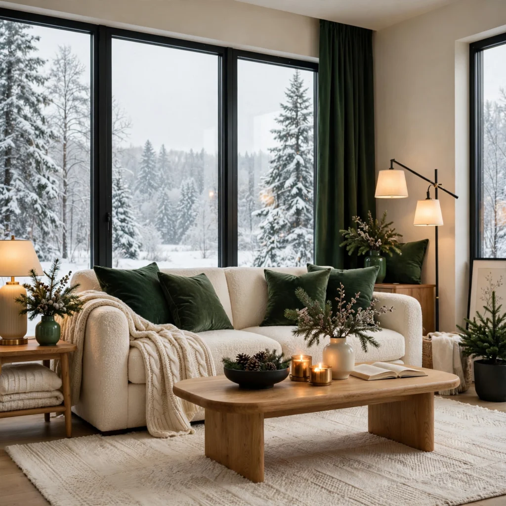
A deep forest green and cream combination pairs a rich, dark green with a soft, warm cream, creating a grounded palette that feels both sophisticated and inherently tied to winter’s natural evergreen imagery without leaning into overly literal holiday decor. This pairing works particularly well in a living room or a study, where the deeper green can anchor a smaller accent wall or a set of upholstered furniture. Choosing cream over a starker white keeps the overall combination feeling warm rather than stark against the deeper green.
2. Burgundy and Warm Camel
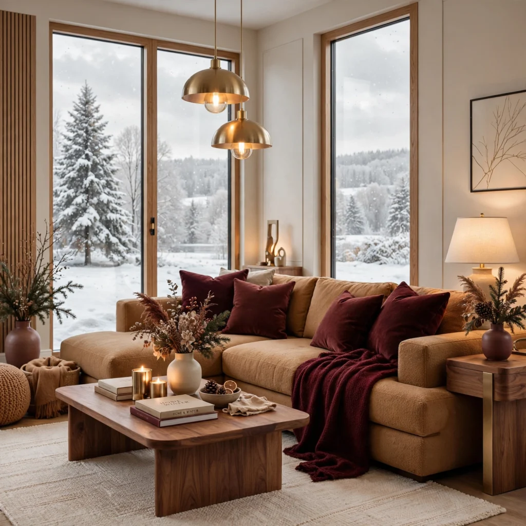
A burgundy and warm camel combination pairs a deep wine-red with a warm, honeyed tan, creating a rich, layered palette suited to a bedroom or a reading nook. This pairing photographs particularly well against natural wood furniture, since camel’s warmth bridges the gap between burgundy’s intensity and any surrounding wood tones in the room. Using burgundy for a single accent wall or upholstered piece, with camel carrying larger textiles like curtains or a rug, keeps the palette balanced.
| Element | Burgundy Application | Camel Application |
| Walls | Single accent wall | Remaining walls |
| Textiles | Throw pillows, small rug | Curtains, larger blanket |
| Furniture | Accent chair upholstery | Wood furniture tones |
3. Charcoal and Warm Gold
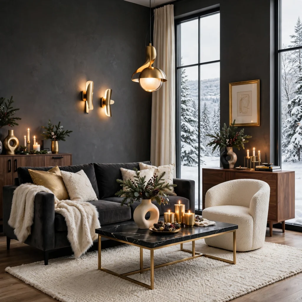
A charcoal and warm gold combination pairs a deep, cool-toned gray with warm metallic gold accents, creating a moody yet elegant palette suited to a dining room or an entryway during the darker winter months. This pairing photographs beautifully under candlelight or warm string lighting, since gold’s reflective quality catches available light more dynamically than a cooler silver would. Using charcoal for walls or larger furniture, with gold reserved for smaller decorative accents like frames or candle holders, keeps this combination from feeling overly dark throughout the room.
4. Winter Color Palette Navy and Rust
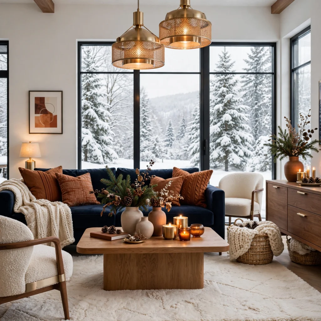
A navy and rust combination pairs a deep, saturated blue with a warm, earthy orange-red, creating an unexpected but striking pairing that carries genuine warmth despite navy’s typically cooler undertone. This winter color palette works particularly well in a living room, where rust-toned throw pillows and a navy sofa or accent wall create real visual depth against the season’s shorter daylight hours. Balancing the two colors so navy dominates while rust appears only in smaller accents keeps this combination from feeling visually competing.
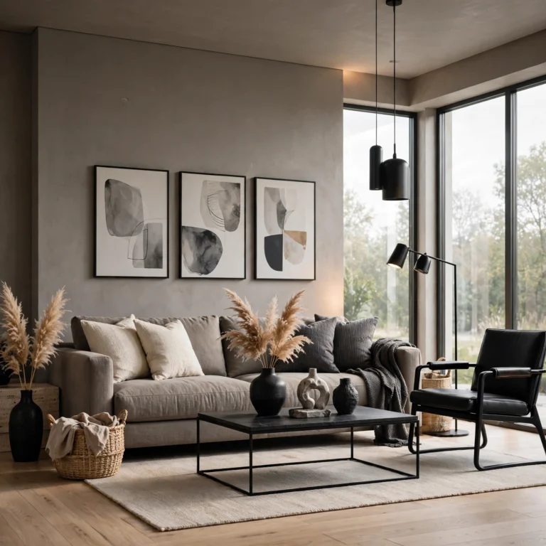
5. Warm Taupe and Black
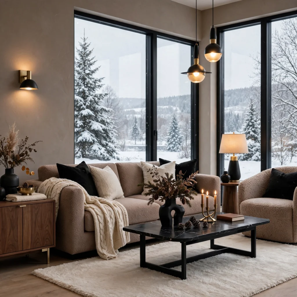
A warm taupe and black combination pairs a soft, warm neutral with sharp black accents, creating a grounded, sophisticated palette that works well throughout an entire home rather than being confined to a single room. This pairing suits a winter color scheme particularly well since taupe photographs warmly even under the cooler, dimmer natural light common during the season. Using black for hardware, window frames, or smaller furniture pieces, with taupe carrying the majority of walls and larger furniture, keeps the combination feeling balanced rather than overly stark.
Find the perfect tones for your makeover with these stylish Living Room Color Palette Ideas.
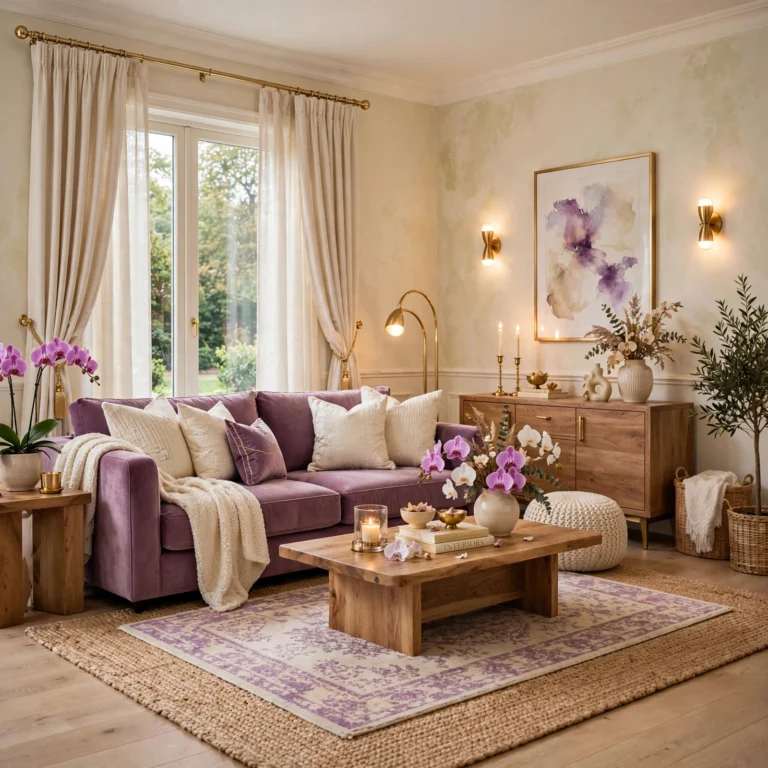
6. Plum and Warm Ivory
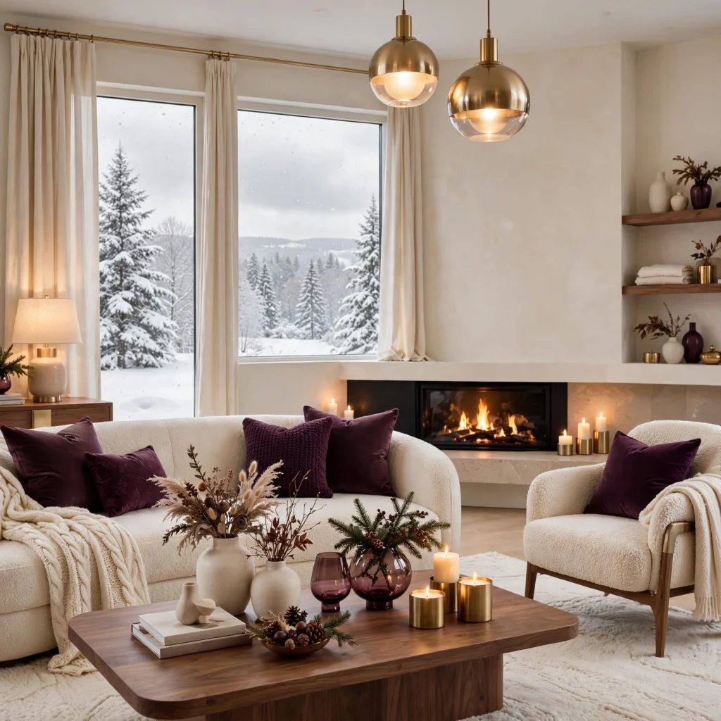
A plum and warm ivory combination pairs a deep, slightly cool purple-red with a soft, warm off-white, creating a romantic yet grounded palette suited to a bedroom during the winter months. This pairing photographs well under both natural winter light and warmer evening lamp lighting, since ivory’s warmth balances plum’s cooler undertone. Using plum for bedding or a single accent wall, with ivory carrying the remaining walls and larger furniture, produces a cozy but not overly dark bedroom palette.
7. Espresso Brown and Soft Sage
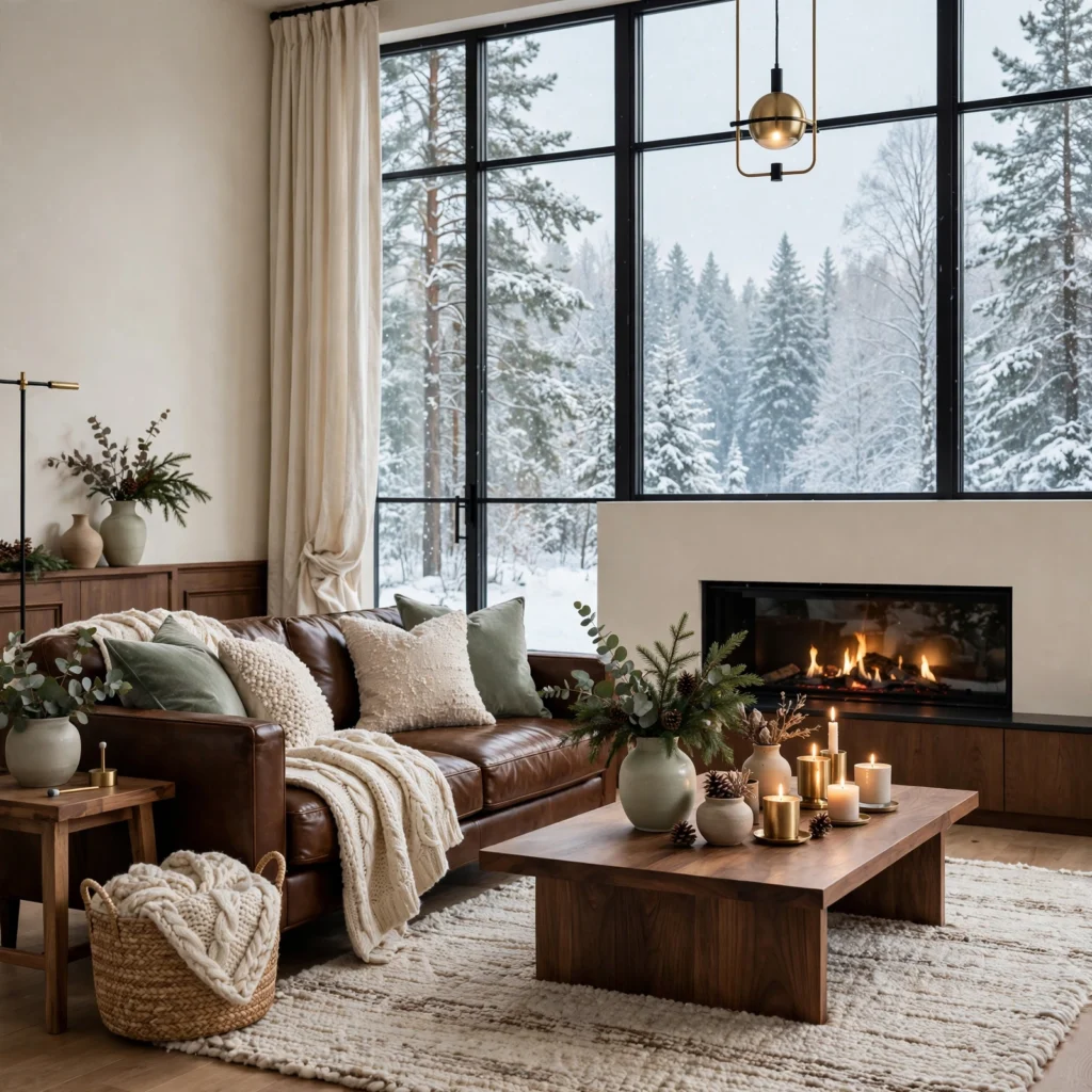
An espresso brown and soft sage combination pairs a deep, almost black-brown with a muted, dusty green, creating an earthy, grounded palette that feels connected to nature even during winter’s barer outdoor landscape. This pairing works particularly well in a home office or a den, where the deeper brown tones suit a room meant for focus and quiet activity. Choosing sage for smaller textile accents, with espresso carrying larger furniture and flooring tones, keeps this combination feeling balanced rather than overly heavy.
8. Wine Red and Warm Brass
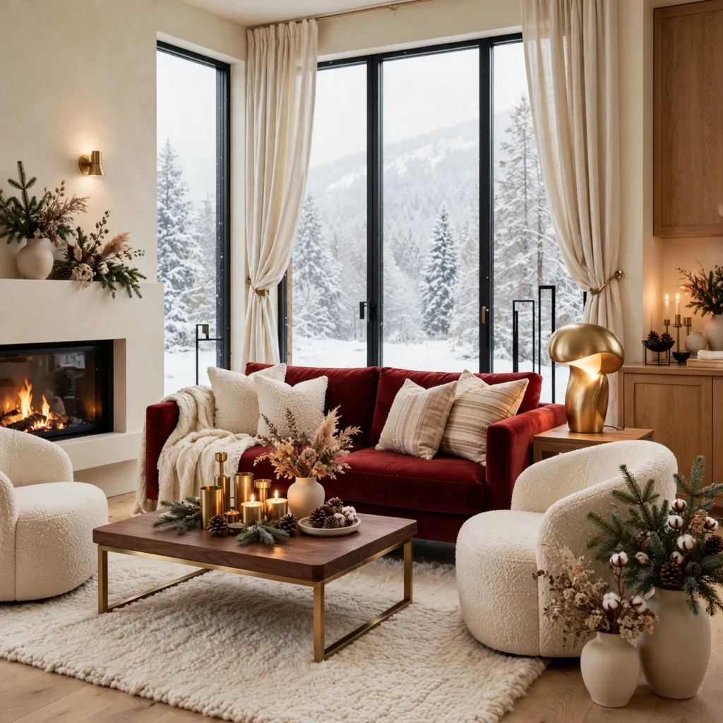
A wine red and warm brass combination pairs a deep, saturated red with warm brass metallic accents, creating a rich, formal palette suited to a dining room during winter entertaining season. This pairing photographs beautifully under warm pendant or chandelier lighting, since brass catches and reflects ambient light particularly well in a room used mostly during evening hours. Using wine red for dining chairs or a single accent wall, with brass reserved for lighting fixtures and smaller decorative details, balances this rich combination.
| Element | Wine Red Application | Warm Brass Application |
| Furniture | Dining chair upholstery | Chair legs, hardware |
| Lighting | N/A | Pendant or chandelier finish |
| Decor | Table linens | Candle holders, small trays |
9. Slate Blue and Warm White
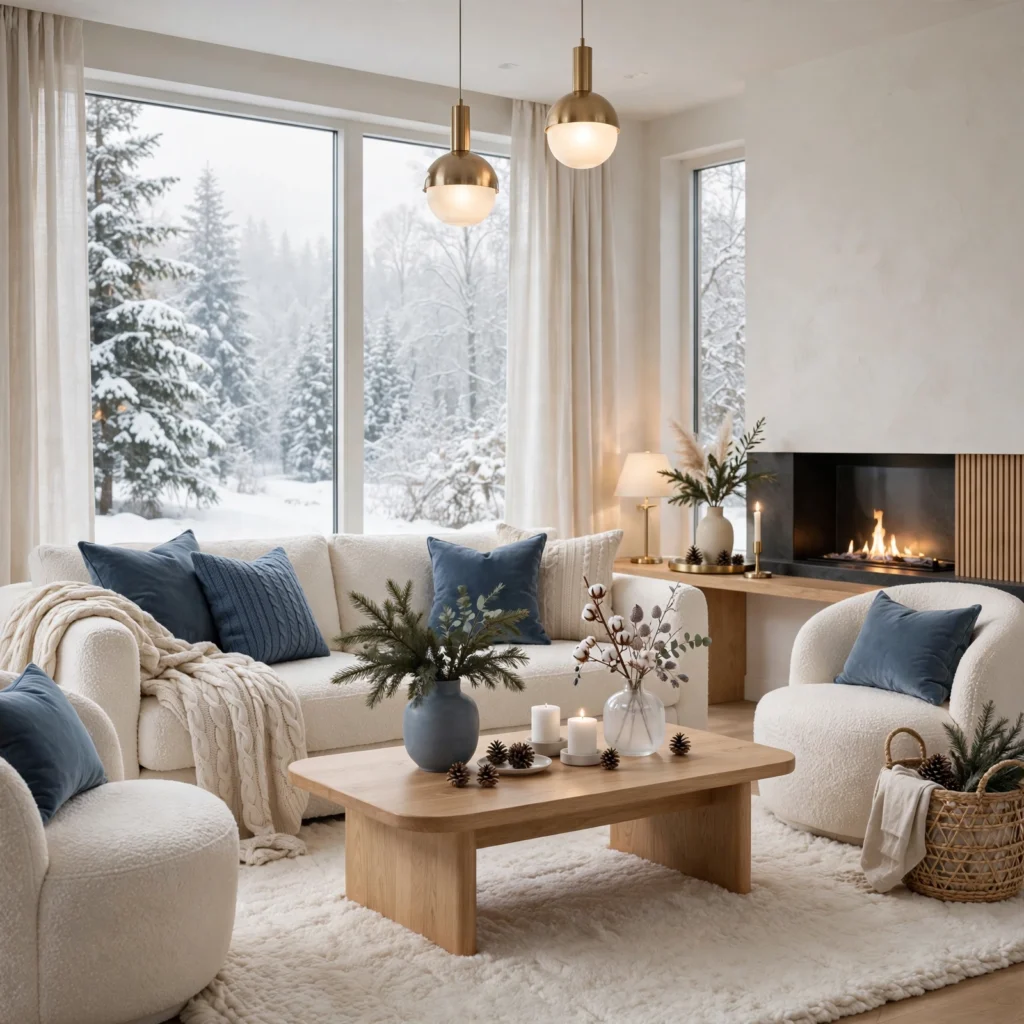
A slate blue and warm white combination pairs a muted, grayed blue with a soft, warm off-white, creating a calmer, more restrained winter palette suited to a bedroom or a bathroom. This pairing avoids the heavier, darker tones of other winter combinations while still feeling seasonally appropriate through its cooler, more subdued blue undertone. Choosing slate blue with enough gray mixed in prevents the color from reading as overly bright or summery against the warmer white base.
10. Deep Olive and Warm Cognac
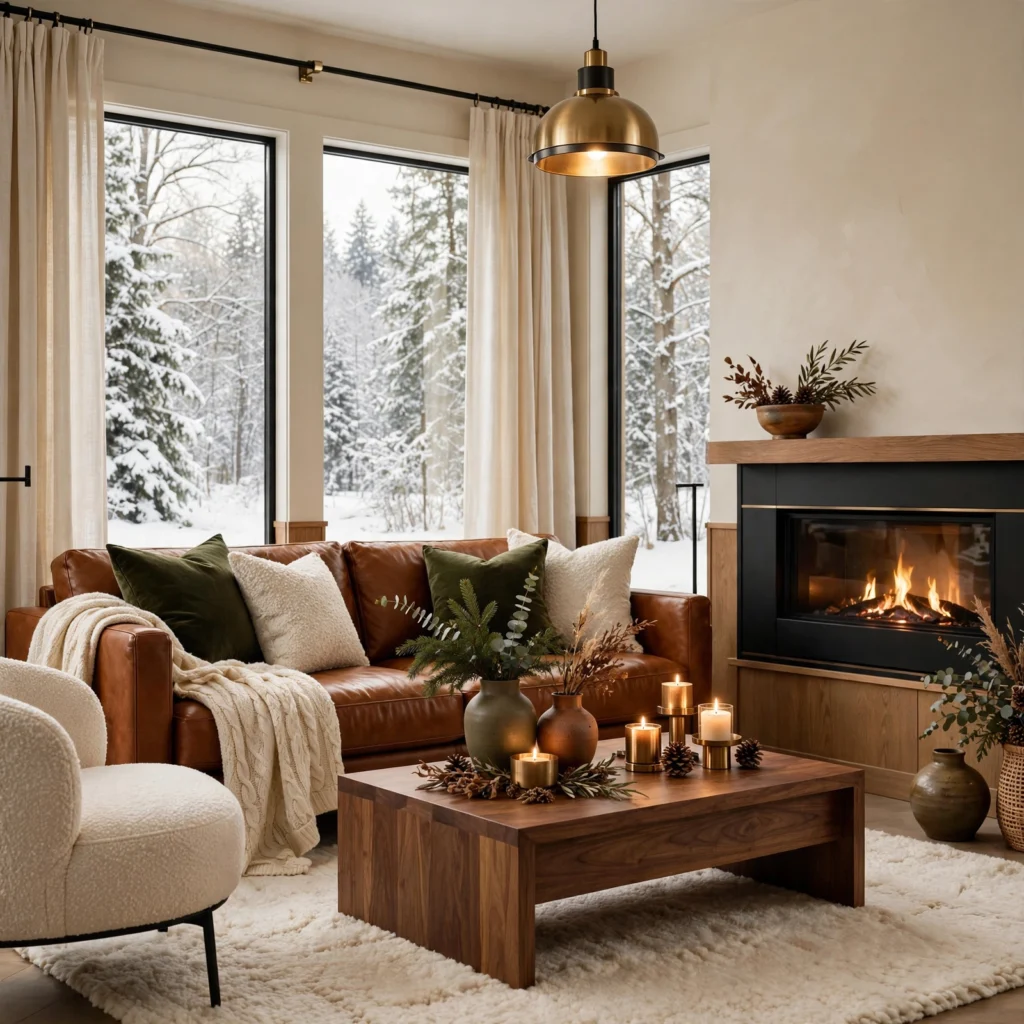
A deep olive and warm cognac combination pairs a muted, earthy green with a rich, warm leather-toned brown, creating a masculine, grounded palette suited to a home office or a den. This pairing works particularly well with leather furniture already common in these room types, since cognac naturally complements that material’s existing warm tone. Using olive for walls or larger upholstered pieces, with cognac carrying leather furniture and smaller accents, produces a cohesive, warm result.
11. Merlot and Warm Gray
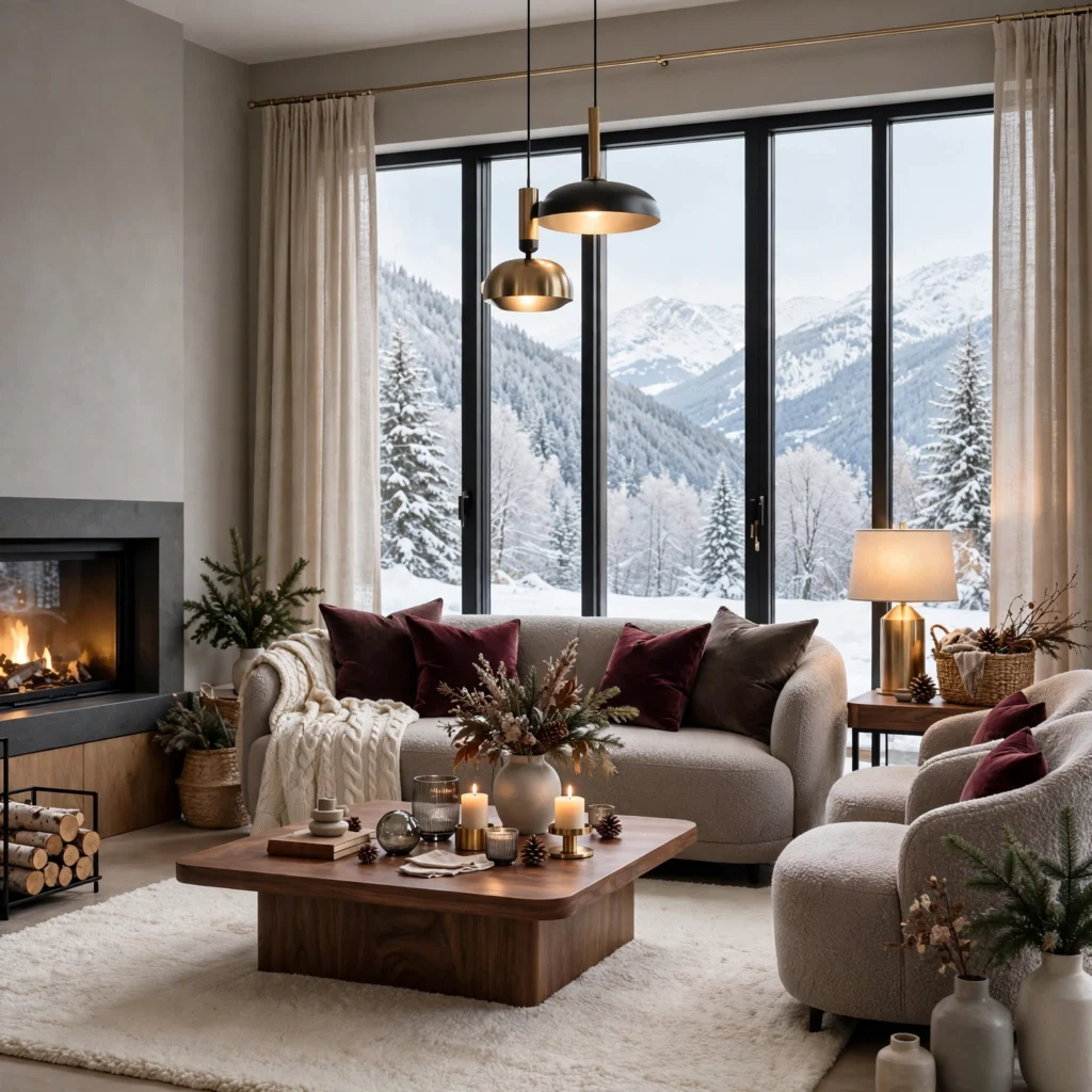
A merlot and warm gray combination pairs a deep, almost black-red wine tone with a soft, warm-toned gray, creating a sophisticated palette that works well in a primary bedroom during the winter months. This pairing balances merlot’s intensity with gray’s calming neutrality, preventing the combination from feeling overly dramatic for a room meant primarily for rest. Using merlot for bedding or a single accent wall, with warm gray carrying the remaining walls and furniture, keeps this palette feeling restful rather than overwhelming.
12. Hunter Green and Warm Copper
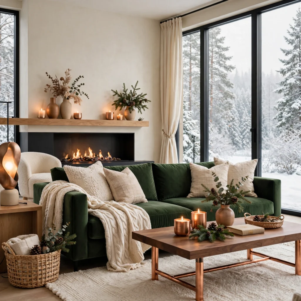
A hunter green and warm copper combination pairs a deep, rich green with warm copper metallic accents, creating a striking, nature-inspired palette suited to a living room or a kitchen during winter. This pairing photographs particularly well against natural wood tones, since both hunter green and copper share an earthy, grounded quality that complements wood furniture and flooring. Using hunter green for a single accent wall or larger upholstered piece, with copper reserved for lighting and smaller hardware details, balances this rich combination.
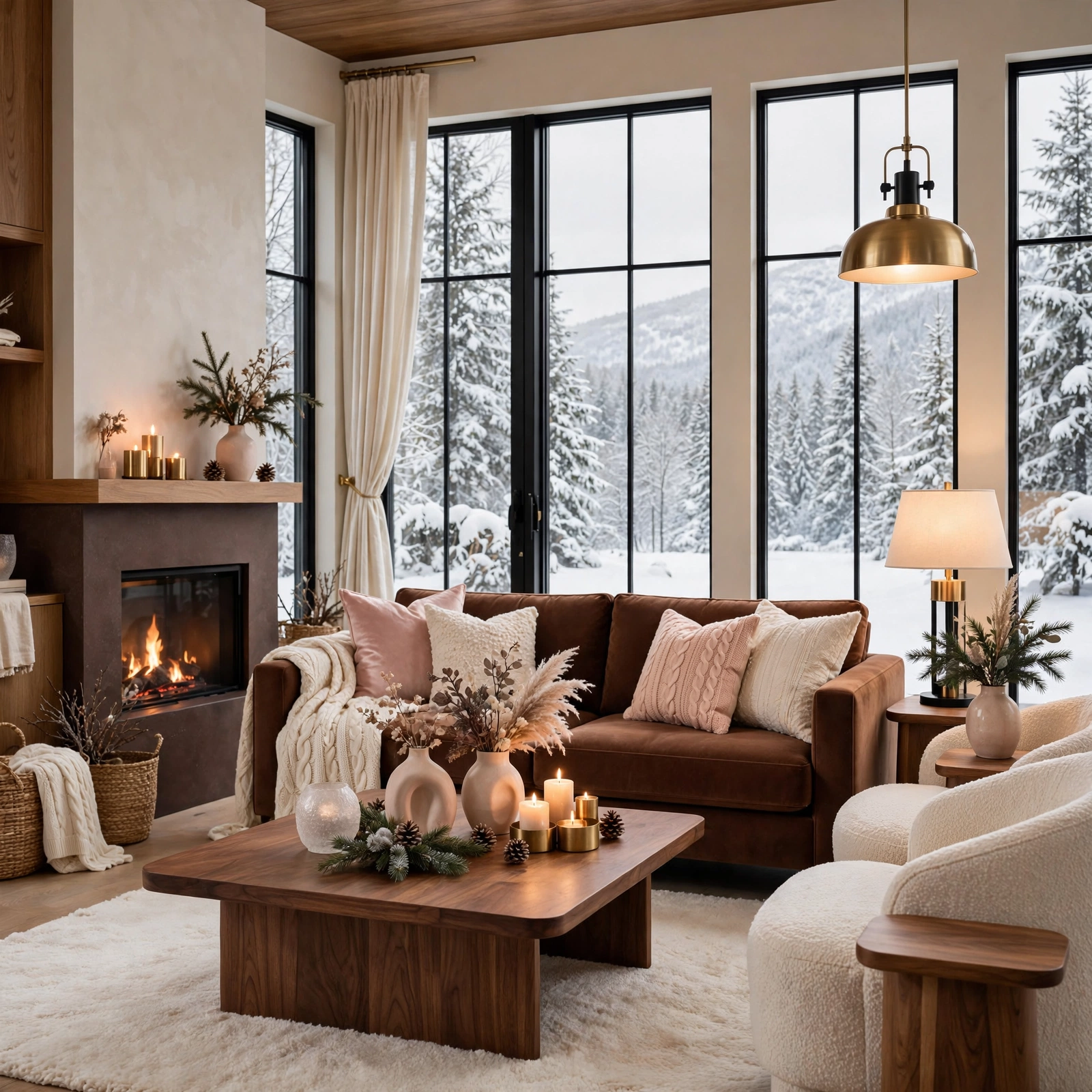
13. Warm Chocolate and Blush
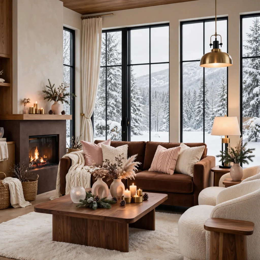
A warm chocolate and blush combination pairs a deep, rich brown with a soft, muted pink, creating an unexpectedly romantic winter palette that avoids the season’s more common darker, cooler-toned combinations. This pairing works particularly well in a bedroom, where the softer blush tone keeps the overall feel gentle despite chocolate’s depth. Using chocolate for larger furniture and flooring, with blush reserved for bedding and smaller textile accents, produces a warm, cozy result distinct from more traditional winter palettes.
14. Deep Teal and Warm Gold
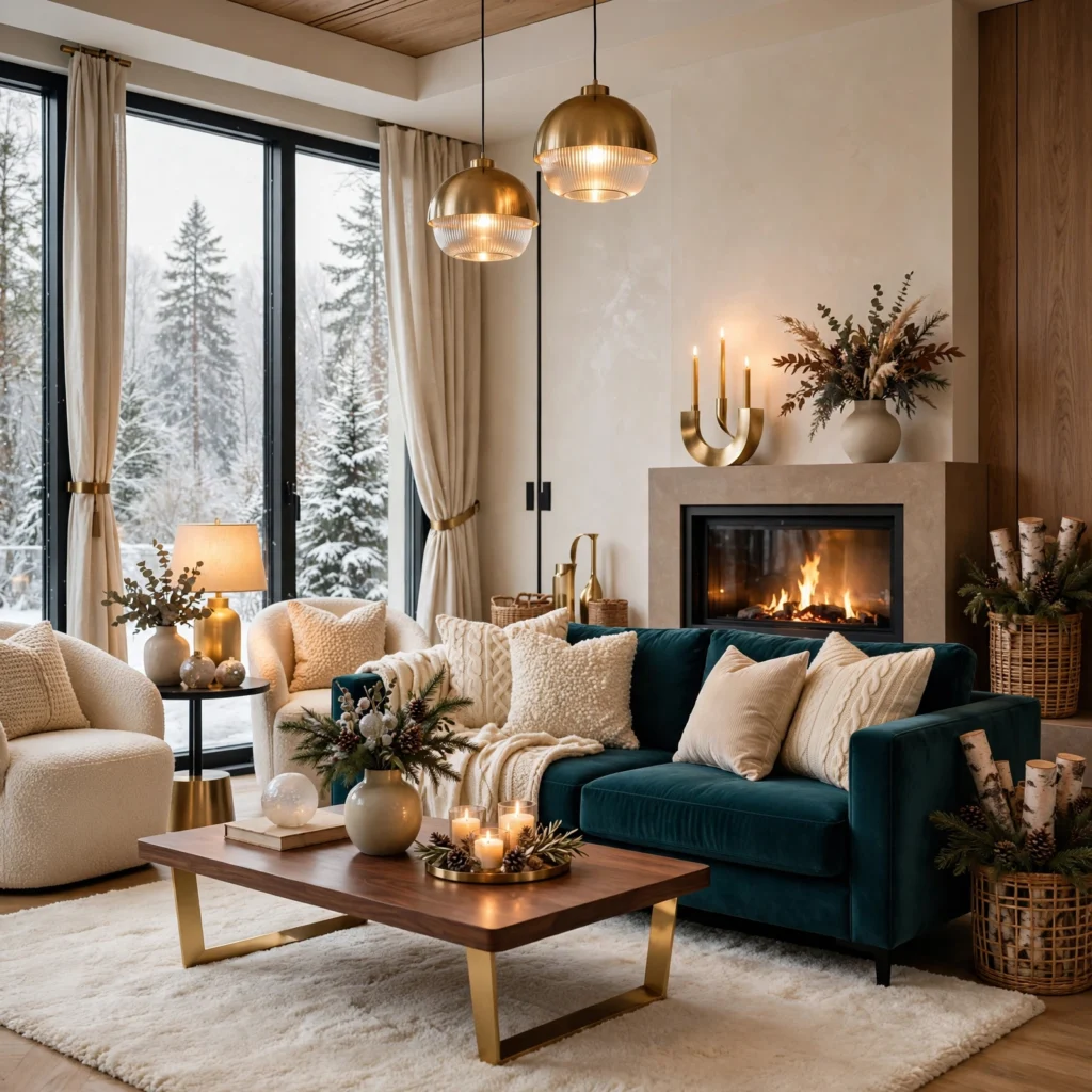
A deep teal and warm gold combination pairs a rich, dark blue-green with warm metallic gold accents, creating a luxurious, jewel-toned palette suited to a dining room or an entryway during winter entertaining season. This pairing photographs beautifully under warm ambient lighting, since gold’s reflective warmth balances teal’s cooler undertone particularly well in a room lit mostly by lamps or candlelight during darker winter evenings. Using teal for a single wall or upholstered piece, with gold reserved for smaller decorative accents, keeps this rich combination feeling intentional.
15. Warm Charcoal and Terracotta
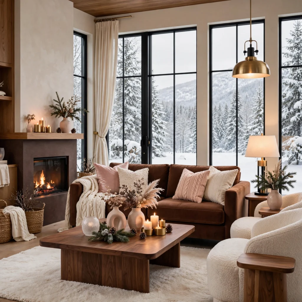
A warm charcoal and terracotta combination pairs a soft, warm-toned dark gray with a warm, earthy orange-red, creating a grounded, current palette that carries genuine warmth despite charcoal’s typically cooler association. This pairing works particularly well in a living room or an entryway, where terracotta accents through pottery or textiles add color against the deeper charcoal base. Using charcoal for larger furniture and walls, with terracotta reserved for smaller decorative accents and textiles, keeps this combination feeling balanced and warm throughout the room.
Shop the Look
For this palette, look for a deep forest green or burgundy throw pillow set, warm brass or gold candle holders, a set of cream or warm ivory linen curtains, a rust or terracotta ceramic vase, and a charcoal or espresso brown wool throw blanket. These pieces work together across several of the ideas above without requiring a full room repaint to test the direction.
Common Mistake to Avoid
The most common mistake when choosing a winter color palette is leaning too heavily into cooler, icier tones like pale blue and silver simply because they feel literally associated with the season, resulting in a room that reads as cold rather than cozy during the year’s darkest, chilliest months. A palette built entirely around cool colors, without any warm anchor like camel, brass, or a deep warm-toned red, often works against the sense of shelter and warmth most people actually want from their home during winter. Balancing at least one warm element into any winter palette, even a cooler-leaning one, produces a more genuinely comfortable result.
FAQs
What winter color palette ideas work best for a small room?
Warm taupe and black, slate blue and warm white, and warm chocolate and blush all work particularly well in a small room, since these combinations keep one tone relatively light and dominant while using a bolder color only for smaller accents. Avoiding two equally dark, saturated colors throughout a small winter palette helps prevent the room from feeling closed-in during a season when natural light is already more limited. Choosing a warm neutral as the dominant base, with a deeper accent color reserved for textiles or one wall, works best in this room type.
How much does it cost to update a room for a winter color palette?
A budget refresh using throw pillows, a throw blanket, and a few candle holders in a chosen winter palette can run under $150 total, while adding curtains or a small accent rug typically pushes the range to $250–$500. A full accent wall repaint with new furniture upholstery in a deeper winter tone costs more, often landing between $500 and $2,000 depending on the room size and whether new furniture pieces are involved. Textile-based updates remain the most budget-friendly way to shift a room’s palette seasonally without a full repaint.
Should a winter palette include metallic accents?
A winter palette doesn’t require metallic accents, but warm gold, brass, or copper tends to add a meaningful glow that complements the season’s lower natural light levels particularly well, especially in rooms used mostly during evening hours. A palette built entirely from fabric and paint colors without any metallic accent can still feel complete, particularly in a more understated or minimalist room. The decision generally comes down to how much warmth and reflective light the room specifically needs during winter’s darker months.
How do I transition my home’s color palette from fall to winter?
Transitioning from a fall to a winter color palette generally works best by keeping a consistent warm neutral base throughout connected living spaces, then swapping smaller textile accents, like throw pillows and a blanket, from fall’s typical rust and terracotta tones toward winter’s deeper burgundy, forest green, or navy options. This approach avoids the cost and effort of repainting walls between each season, relying instead on affordable, easily swapped textile updates. Keeping the underlying wall color neutral enough to support both seasonal directions makes this transition considerably easier to manage.
Are dark colors too heavy for a winter room?
Dark colors aren’t inherently too heavy for a winter room, provided they’re balanced with a warm neutral or metallic accent and applied thoughtfully, like a single accent wall rather than covering an entire room in the darkest available tone. Winter’s naturally cozier mood actually supports deeper, richer colors better than a brighter season might, since the goal during winter decorating often leans toward warmth and shelter rather than openness and light. The key factor is balance, pairing any dark color with enough warmth and lighter contrast to prevent the room from feeling closed-in rather than cozy.
Conclusion
These winter color palette ideas cover everything from deep jewel tones to warmer, softer neutral combinations, giving you options regardless of which room you’re updating or how bold you want the seasonal shift to feel. Start with textile-based updates in your chosen colors before committing to any wall repaint, then layer in warm metallic accents to complete the cozy, seasonal feel. Save this guide to Pinterest for later, and check out our related post on color palette ideas for more year-round color guidance.