12 Trending Kitchen Cabinet Color Ideas Beyond Plain White
Sorting through kitchen cabinet color ideas can be harder than it sounds, since undertone, lighting, and sheen all interact to change how the same paint color reads from one kitchen to the next. This post covers twelve specific cabinet color directions, each with real color families and pairing guidance so you can compare options directly rather than guessing from a single photo. Whether you’re repainting existing cabinets or specifying new ones, you’ll find undertone and maintenance notes to help you choose a color that still looks intentional years down the line.
Key Takeaways
- These kitchen cabinet color ideas range from muted greens and warm neutrals to bolder navy and terracotta tones.
- Two-tone combinations and warm wood stains are replacing the all-white cabinet trend that dominated past years.
- Several ideas include comparisons on undertone, lighting, and maintenance to help you choose a color that holds up long-term.
- Small details like sheen level and hardware finish can shift how a cabinet color reads just as much as the color itself.
Trend & Background
Cabinet color has moved noticeably away from the all-white kitchens that dominated the last decade, toward warmer neutrals, muted greens, and natural wood stains that add more depth to a room. Two-tone kitchens, where the island or lower cabinets differ from the uppers, have also become a common way to introduce color without committing to a single bold shade throughout. This matters now because repainting or replacing cabinets is expensive and disruptive, so choosing a color direction with staying power helps avoid a costly redo once a trend fades.
1. Sage Green
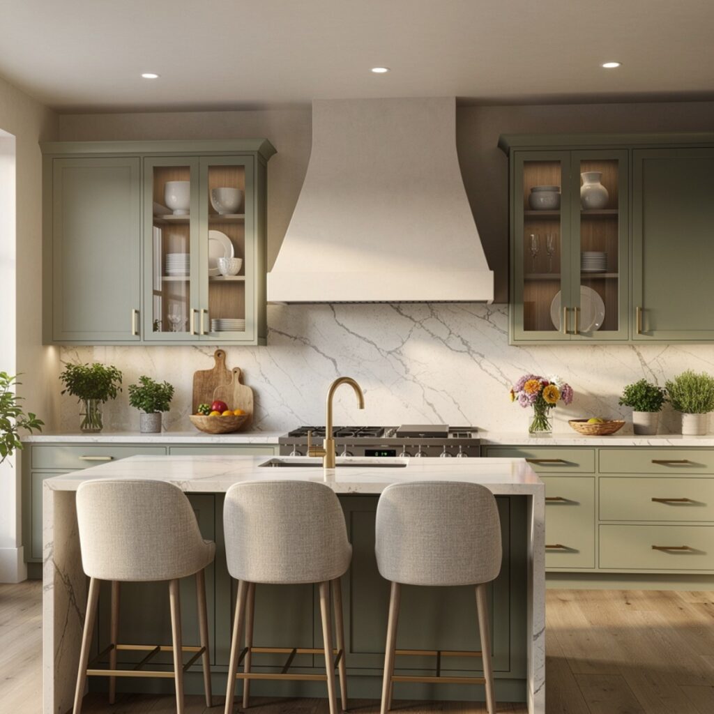
Sage green has become one of the more requested cabinet colors recently, offering a muted, earthy tone that reads as calming rather than bold. It pairs well with brass or matte black hardware and works particularly well against white oak open shelving or a warm-toned countertop. Because sage sits between green and gray, it tends to shift slightly depending on lighting, so testing a sample in the actual kitchen at different times of day matters more than with a true neutral. This color suits kitchens aiming for a soft, nature-inspired palette.
2. Deep Navy
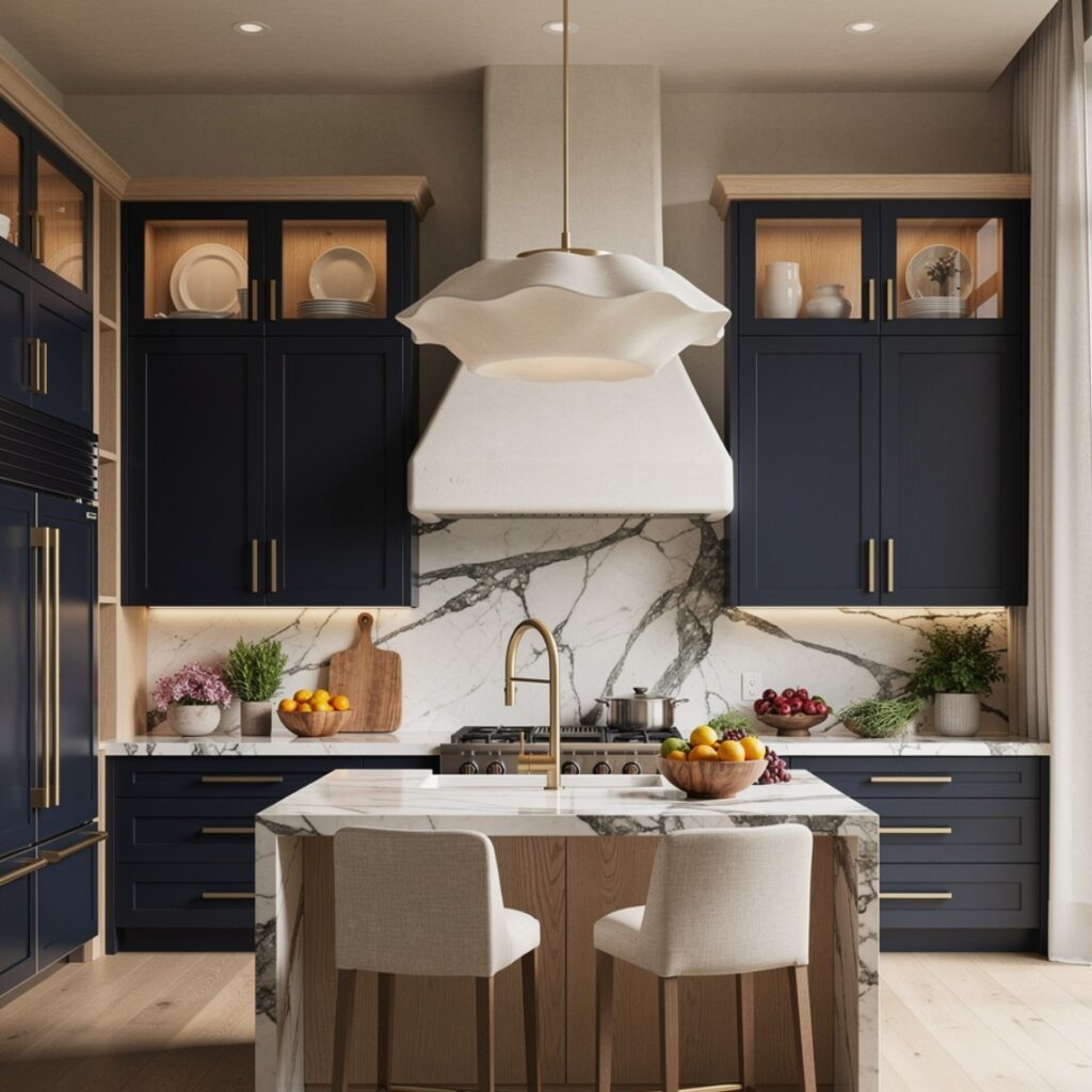
Deep navy cabinets, often used on a lower cabinet run or an island while uppers stay lighter, add contrast and depth without feeling as stark as black. This color pairs well with brass hardware and white or light stone counters, since the contrast keeps the kitchen from feeling too dark overall. Navy also tends to hide daily fingerprints and smudges better than lighter colors, making it a practical choice for high-traffic lower cabinets. This idea works in both traditional and contemporary kitchens depending on the surrounding hardware and trim details.
3. Warm White
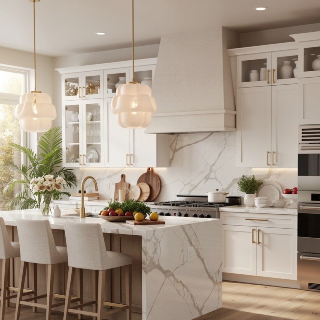
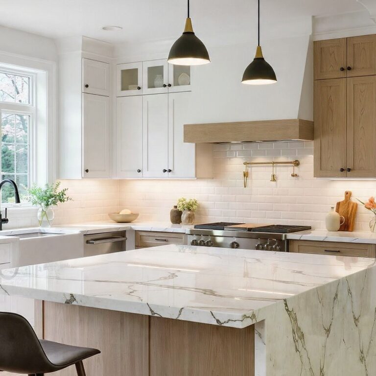
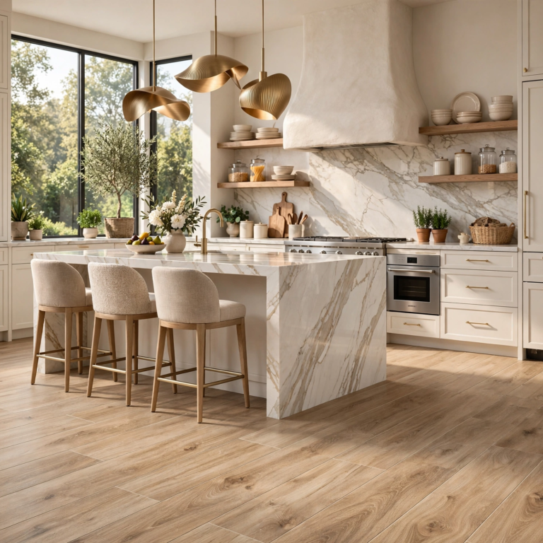
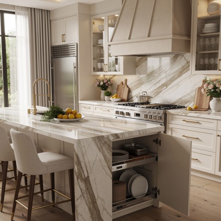
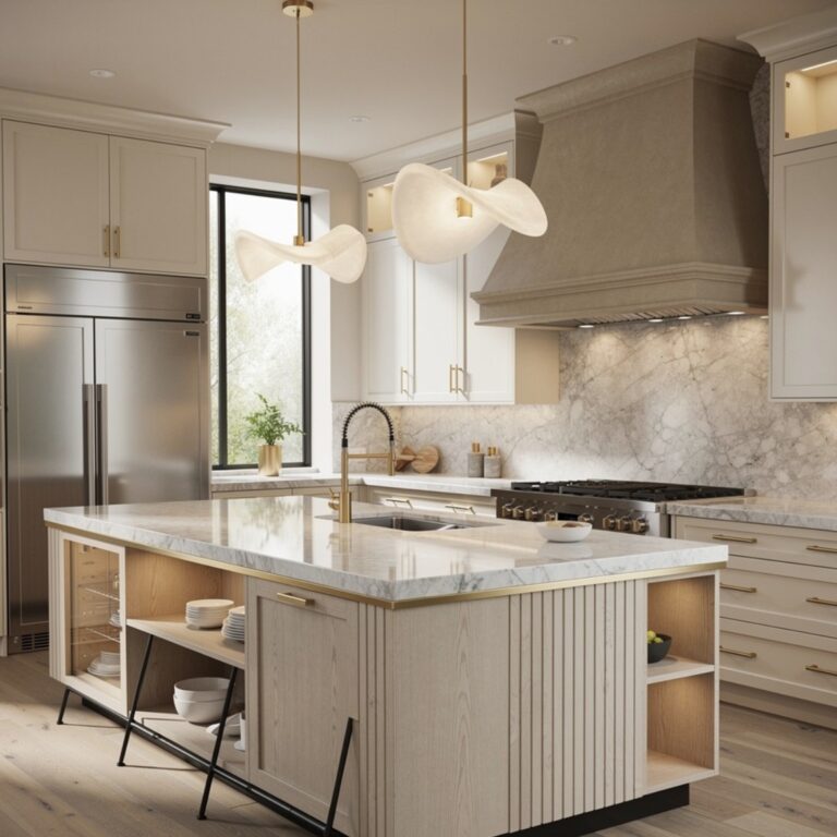
Warm white differs from a stark, cool-toned white by leaning slightly toward cream or beige, which tends to feel less clinical and pairs more naturally with wood tones and brass fixtures. This color works well in kitchens with abundant natural light, where a cooler white can sometimes read as flat or sterile. It remains one of the more versatile cabinet colors since it pairs with nearly any countertop or hardware finish. This idea suits kitchens that want a neutral palette without the starkness associated with older all-white kitchen trends.
| White Undertone | Pairs Well With | Feels |
| Warm White | Wood tones, brass | Soft, inviting |
| Cool White | Marble, chrome | Crisp, clinical |
| Greige | Both wood and stone | Balanced, neutral |
4. Terracotta
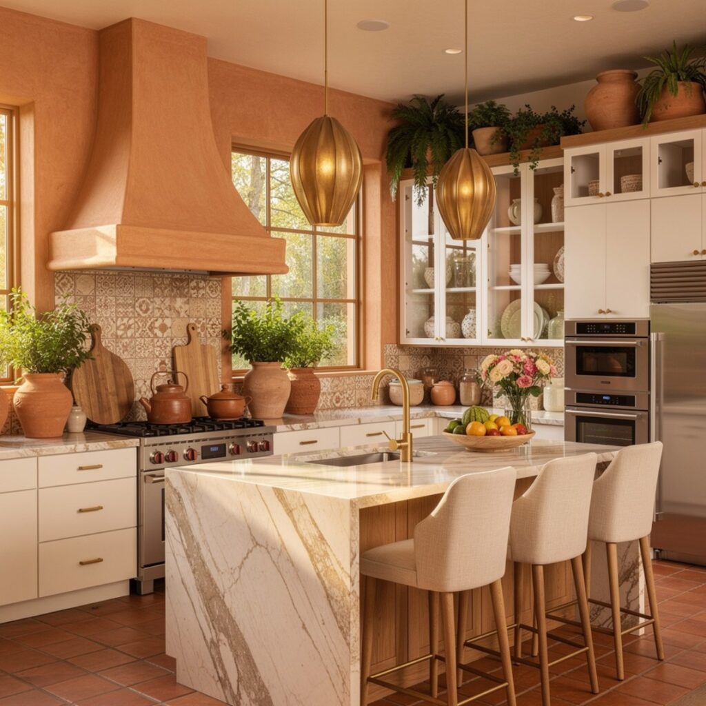
Terracotta cabinets bring a warm, earthy orange-red tone into the kitchen, often used sparingly on an island or a single wall of cabinetry rather than throughout the entire room. This color pairs well with white oak, brass hardware, and warm white counters, since it leans into a similarly warm palette rather than clashing with cooler tones. Because it’s a bolder choice, testing a sample against existing flooring and countertop materials is particularly important before committing to a full cabinet run. This idea suits kitchens looking for a distinctive, less common color choice.
Complete your dream kitchen with these creative kitchen ideas for small spaces that add warmth, style, and functionality.
5. Forest Green
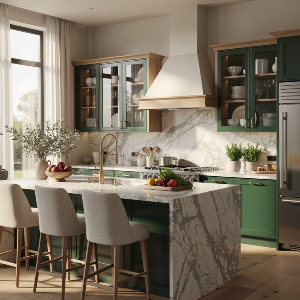
Forest green is a deeper, more saturated green than sage, often used on an island or a full cabinet run in kitchens aiming for a richer, more traditional feel. It pairs well with brass or unlacquered brass hardware and reads particularly well against white or cream countertops for contrast. This color tends to hold up visually over time better than trend-driven brighter greens, since it leans closer to a classic, muted tone. This idea works especially well in kitchens with existing dark wood floors or trim.
6. Two-Tone Navy and White
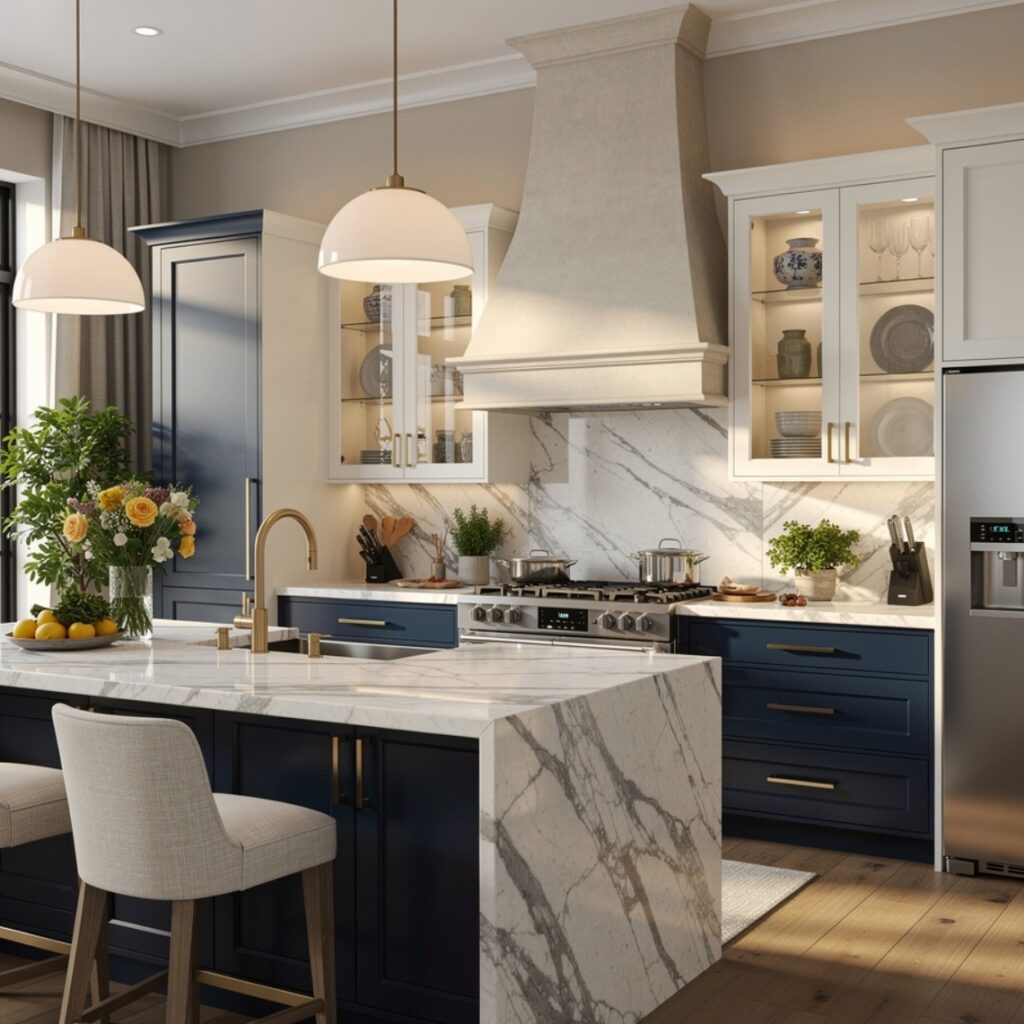
Pairing navy lower cabinets with white or cream upper cabinets is one of the more established two-tone combinations, offering contrast without requiring the whole kitchen to commit to a bold color. This layout keeps the upper portion of the kitchen feeling lighter and more open, while the lower cabinets add visual weight and hide daily wear better than an all-white kitchen would. Brass or matte black hardware both work well with this combination depending on the desired overall tone. This idea suits kitchens of nearly any size, from small galley layouts to larger open kitchens.
7. Greige Tones
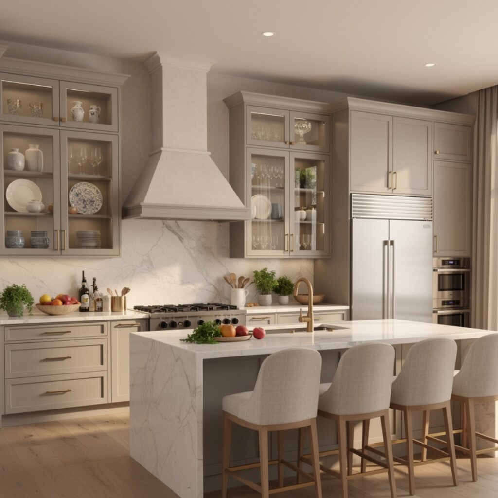
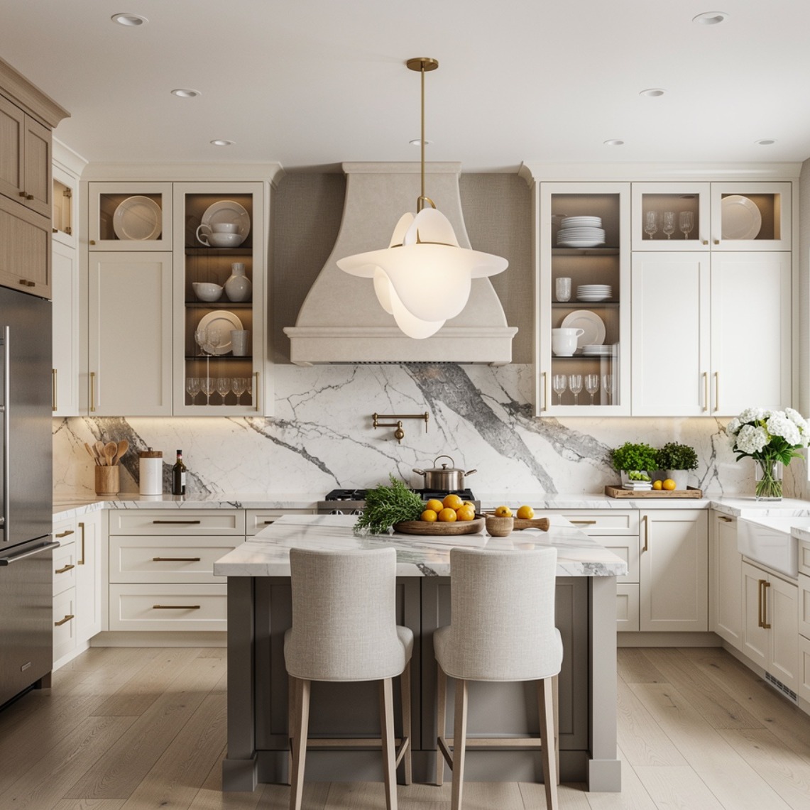
Greige, a blend of gray and beige, has remained a durable neutral choice because it avoids leaning too cool or too warm, making it easier to pair with a range of countertop and flooring materials. It works well in kitchens with mixed metal finishes, since it doesn’t clash with either warm brass or cooler stainless steel the way a true gray or true beige sometimes can. This color also tends to photograph consistently across different lighting conditions, which matters for anyone documenting a renovation. This idea suits homeowners who want a neutral base without committing to stark white.
8. Black Cabinetry
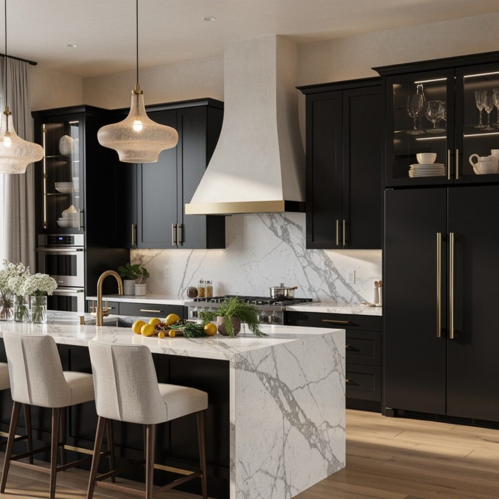
Black cabinets, whether matte or satin finish, create a dramatic, high-contrast look, often paired with lighter countertops and walls to avoid making the kitchen feel too enclosed. Matte finishes tend to show fewer fingerprints and water spots than a glossy black, making them a more practical choice for daily use. This color works particularly well in kitchens with strong natural light, since darker cabinets in a dim room can feel heavier than intended. This idea suits kitchens aiming for a bold, contemporary statement rather than a softer, traditional feel.
9. Muted Blue-Gray
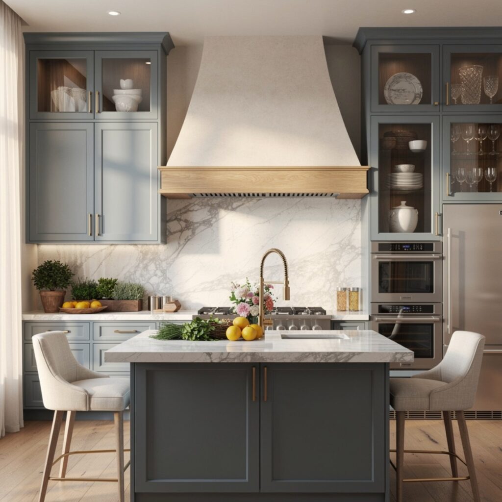
Muted blue-gray sits between a true gray and a soft blue, offering a cooler alternative to sage green while still reading as calm rather than stark. It pairs well with white or light stone counters and both brass and matte black hardware, depending on the desired warmth. This color tends to shift noticeably under different lighting, appearing more blue in daylight and more gray under warm artificial light, so testing at different times of day is particularly important. This idea suits kitchens that want a cooler palette without going as dark as navy.
| Cabinet Color | Undertone Shift Risk | Best Lighting |
| Sage Green | Moderate | Natural daylight |
| Muted Blue-Gray | High | Mixed daylight and warm light |
| Greige | Low | Any lighting |
10. Warm Wood Stain
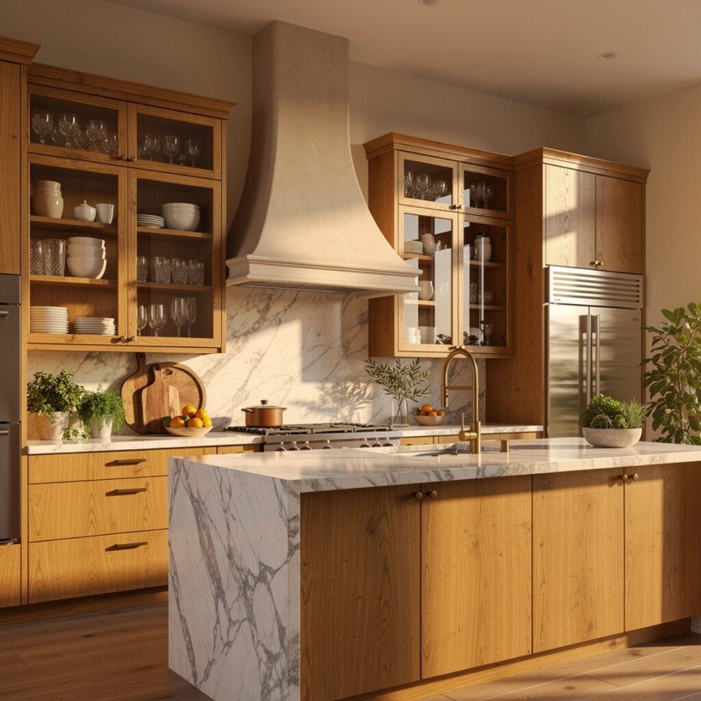
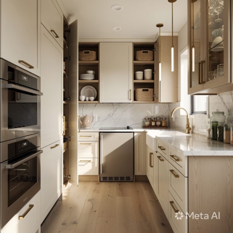
Rather than paint, a warm wood stain on white oak or walnut cabinetry skips color entirely in favor of natural grain and tone. This has become a popular alternative to painted cabinets, particularly paired with brass hardware and a lighter stone counter for contrast. Wood stain also tends to show less wear over time than painted finishes, since minor scuffs blend into the existing grain rather than chipping away paint. This idea suits kitchens aiming for a warmer, more textured look without introducing a bold paint color.
11. Soft Blush or Dusty Pink
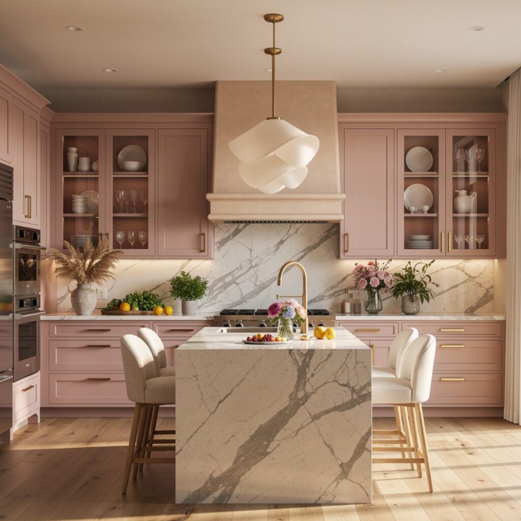
Soft blush or dusty pink cabinets offer a subtle, muted color option that reads more sophisticated than a brighter pink, particularly when paired with brass hardware and warm white counters. This color works best used sparingly, often on an island alone, rather than across a full kitchen, since a bolder application can feel more dated than a restrained accent. It pairs well with white oak open shelving for a softer, more textural balance. This idea suits kitchens that want a distinctive color choice without going as bold as terracotta or forest green.
12. Kitchen Cabinet Color Ideas for Resale Value
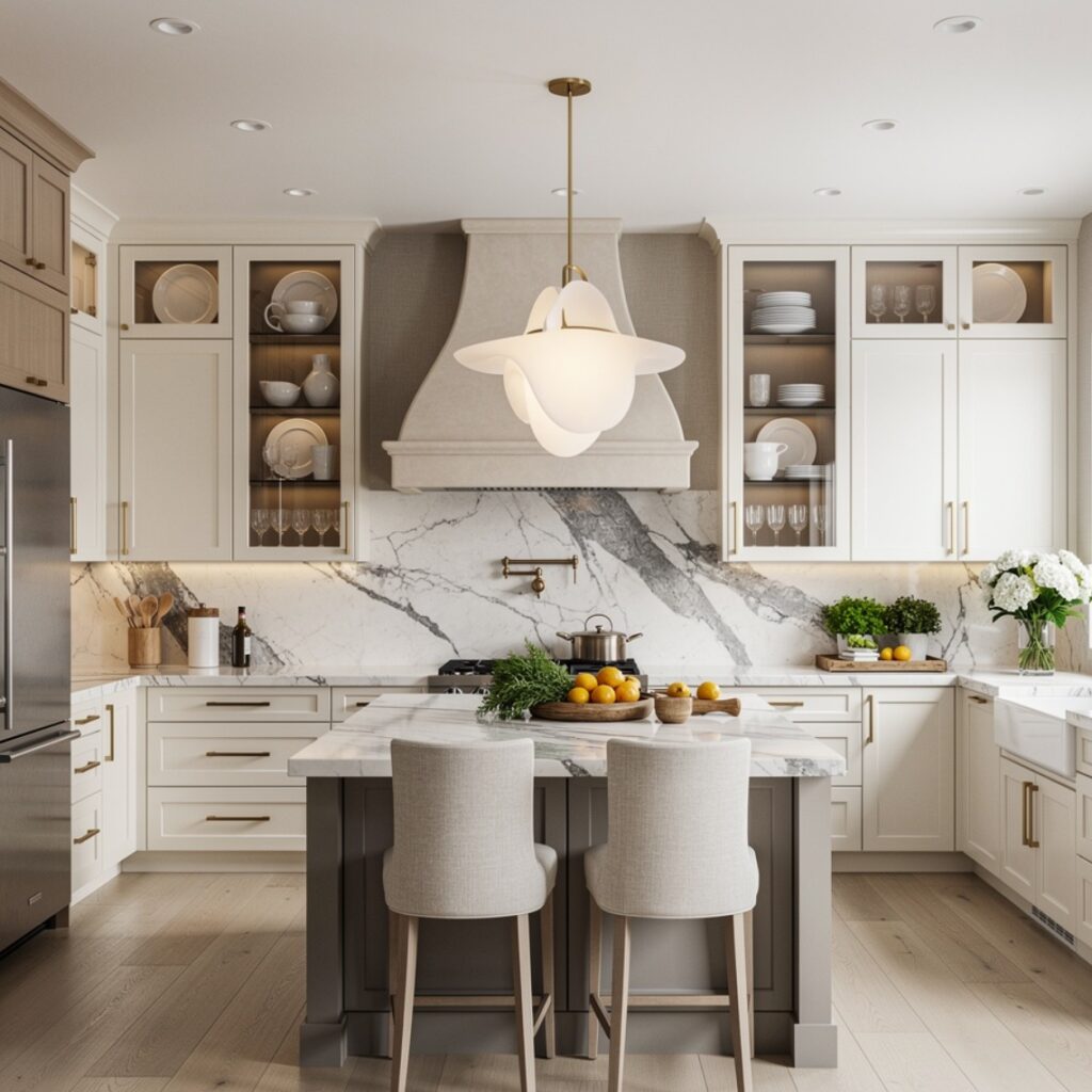
Among kitchen cabinet color ideas, neutral tones like warm white, greige, and light wood stains tend to hold the broadest appeal for anyone planning to sell within the next several years. Bolder colors like navy or forest green can still work well for resale when used only on an island, keeping the rest of the kitchen in a neutral tone that appeals to a wider range of buyers. This approach balances personal style with practical resale considerations, since a fully neutral kitchen sometimes reads as generic while an all-bold kitchen can narrow buyer appeal.
Shop the Look
For cabinets built around these colors, Benjamin Moore’s Farmhouse Red and October Mist are common paint choices for terracotta and sage tones, respectively, while Hale Navy remains a widely used option for deep navy cabinetry. Pair any of these with unlacquered brass hardware from Rejuvenation or House of Antique Hardware for a warm finish, or matte black pulls from Schoolhouse for a more contemporary look. A quart-sized sample pot from any major paint brand is worth testing directly on cabinet doors before committing to a full gallon.
Common Mistake to Avoid
The most common mistake is choosing a cabinet color from a small paint swatch rather than a larger sample painted directly onto cabinet doors or a poster board in the actual kitchen. Small swatches can look noticeably different once scaled up across an entire cabinet run, and lighting in a paint store rarely matches a kitchen’s natural or artificial light. Always paint a sample directly onto the surface, or a large board placed in the kitchen, and observe it across a full day before committing to the final color and sheen level.
FAQs
What is the most popular kitchen cabinet color right now?
Sage green and warm white have both remained consistently popular choices recently, offering a departure from stark all-white kitchens without committing to a particularly bold or dark color. Two-tone combinations, particularly navy or forest green paired with white uppers, have also grown in popularity as a way to introduce color without a full commitment. Popularity aside, undertone compatibility with existing countertops and flooring should still guide the final decision.
Do dark cabinets make a kitchen feel smaller?
Dark cabinets can make a kitchen feel smaller if the room lacks sufficient natural light or if the dark color is paired with an equally dark countertop and wall color. Pairing dark lower cabinets with lighter upper cabinets, walls, and counters helps balance the visual weight and keeps the kitchen from feeling too enclosed. In kitchens with strong natural light, dark cabinetry throughout can still work well without feeling oppressive.
Should kitchen cabinet color match the flooring?
Cabinet color doesn’t need to match flooring exactly, but the two should share a complementary undertone to avoid visual clashing. A warm wood floor paired with a cool-toned gray cabinet, for instance, can create an undertone mismatch that’s subtly noticeable even if neither color is objectionable on its own. Testing cabinet paint samples directly against existing flooring in the kitchen is the most reliable way to check for compatibility.
What sheen level is best for kitchen cabinets?
Satin or semi-gloss sheens are generally recommended for kitchen cabinets over a flat or matte finish, since higher sheen levels are more resistant to moisture, grease, and daily wiping down. A fully matte finish can look elegant but tends to show water spots and scuffs more readily in a high-use kitchen. Semi-gloss remains the more traditional, durable choice, while satin offers a slightly softer look with nearly comparable durability.
How often do painted cabinets need to be repainted?
Well-applied cabinet paint with a durable sheen typically holds up for eight to ten years before showing enough wear to warrant a full repaint, though high-touch areas like handles and edges may need earlier touch-ups. Quality of paint, sheen level, and daily use all affect this timeline significantly. Choosing a durable finish upfront and doing minor touch-ups as needed can extend the time between full repaints considerably.
Conclusion
These kitchen cabinet color ideas range from safe, resale-friendly neutrals to bolder choices like terracotta or forest green, giving you a starting point no matter your style or plans for the home. If one of these stood out, save this post to Pinterest for later, or check out our related guide on kitchen design ideas for more pairing inspiration.